
AGRO-AK
A brand that grew to the scale of an entire complex
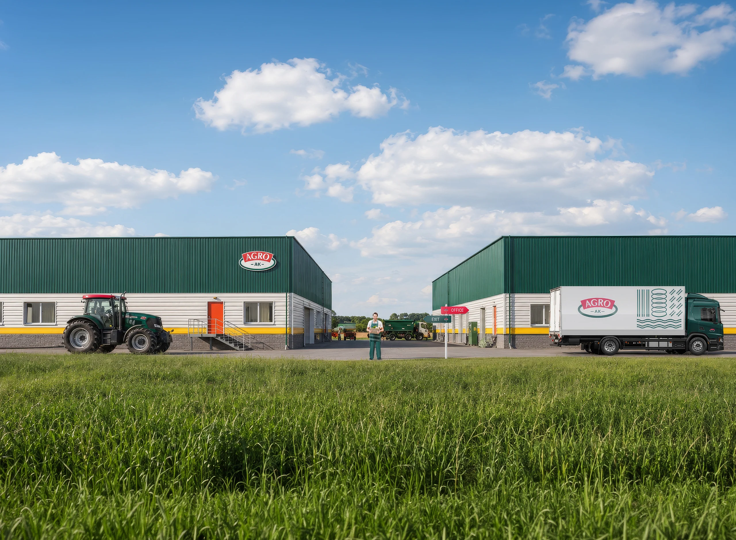
We developed an identity and extended it from packaging to equipment, wayfinding, buildings, and hangars across an agricultural business.
Context
An identity connecting products, equipment, and the entire site
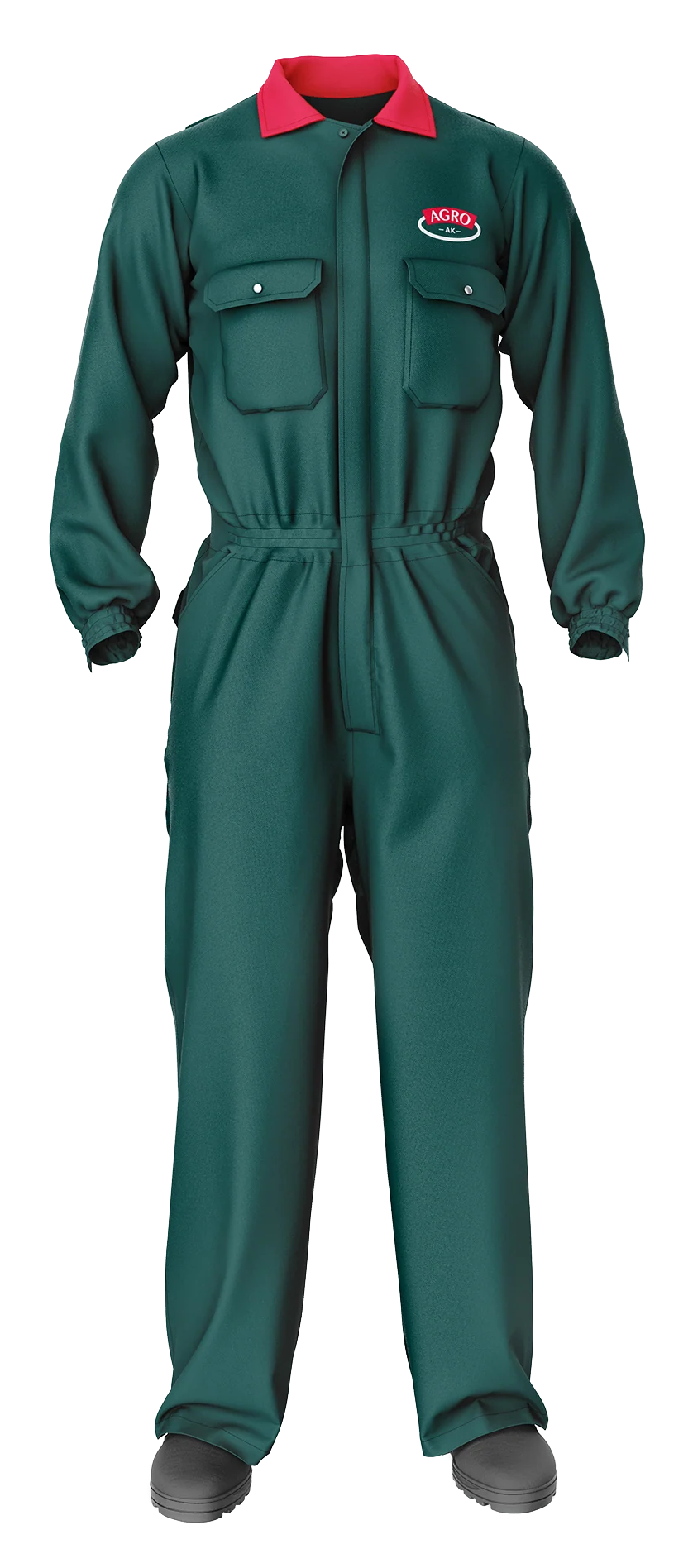
AGRO-AK is an agricultural complex whose brand extends beyond packaging. It appears on facades, workwear, equipment, wayfinding, and business communications.
We designed the identity at the scale of the entire environment. Every element needed to be clear up close and recognizable from a distance, bringing products and production together under one brand.
A strategy for standing out
Familiar in its category.
Distinctive as a brand.
Many established food brands share a similar structure: a compact emblem, a strong red accent, a light-colored name, and an enclosing outline. This is no coincidence. Familiar visual cues help shoppers quickly understand a product's category.
We deliberately embraced the category's visual language, then built differentiation through distinctive elements: the shape of a field, a sculpted red nameplate, a dark green line, the palette, and a system that works from a package to a warehouse.

Familiar cues identify the category, while distinctive graphic elements make the brand memorable.
Brand mark
Fields, grain, and a name in one emblem
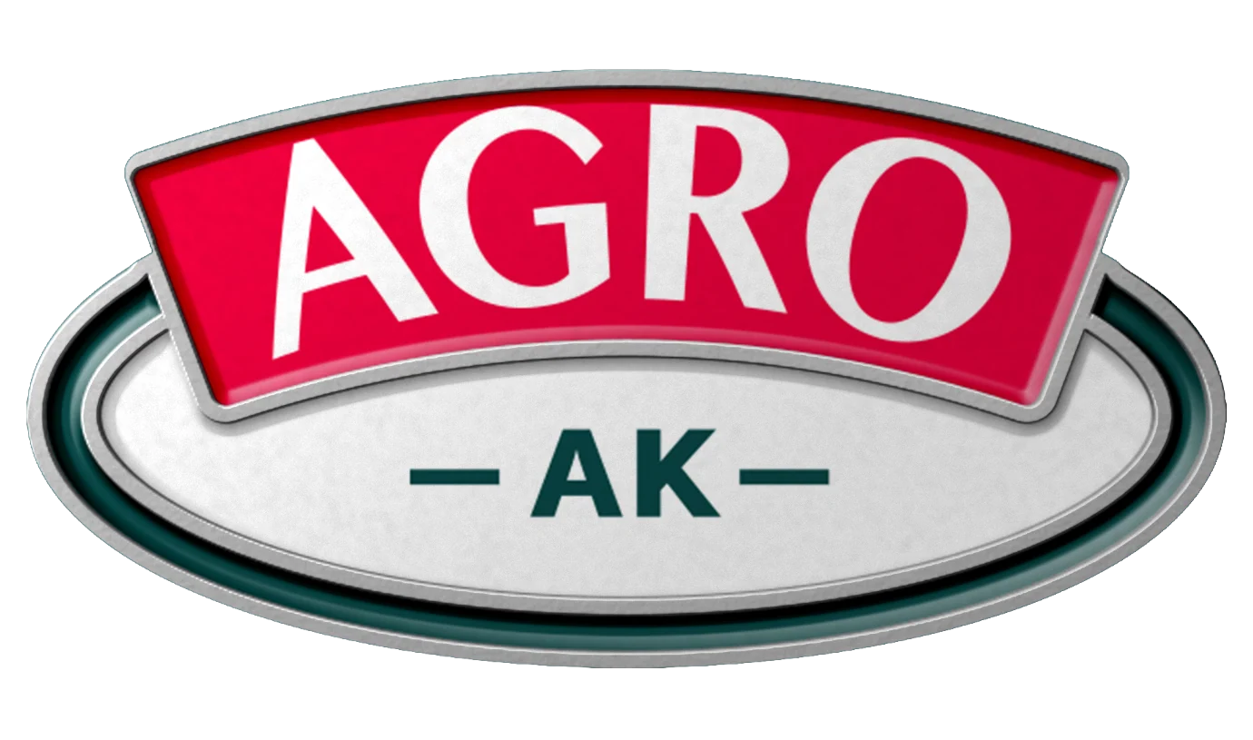
The symbol is based on an oval evoking a field and a planted seed. A red nameplate sits on its edge, creating contrast and keeping the name visible even from a distance.
The simple silhouette works equally well in print, on clothing, as a metal pin, and on large building signs.



Architectural concept
Identity becomes architecture
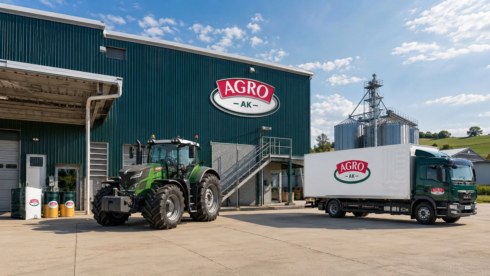
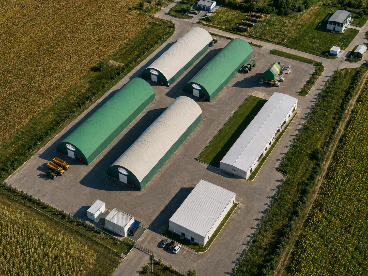
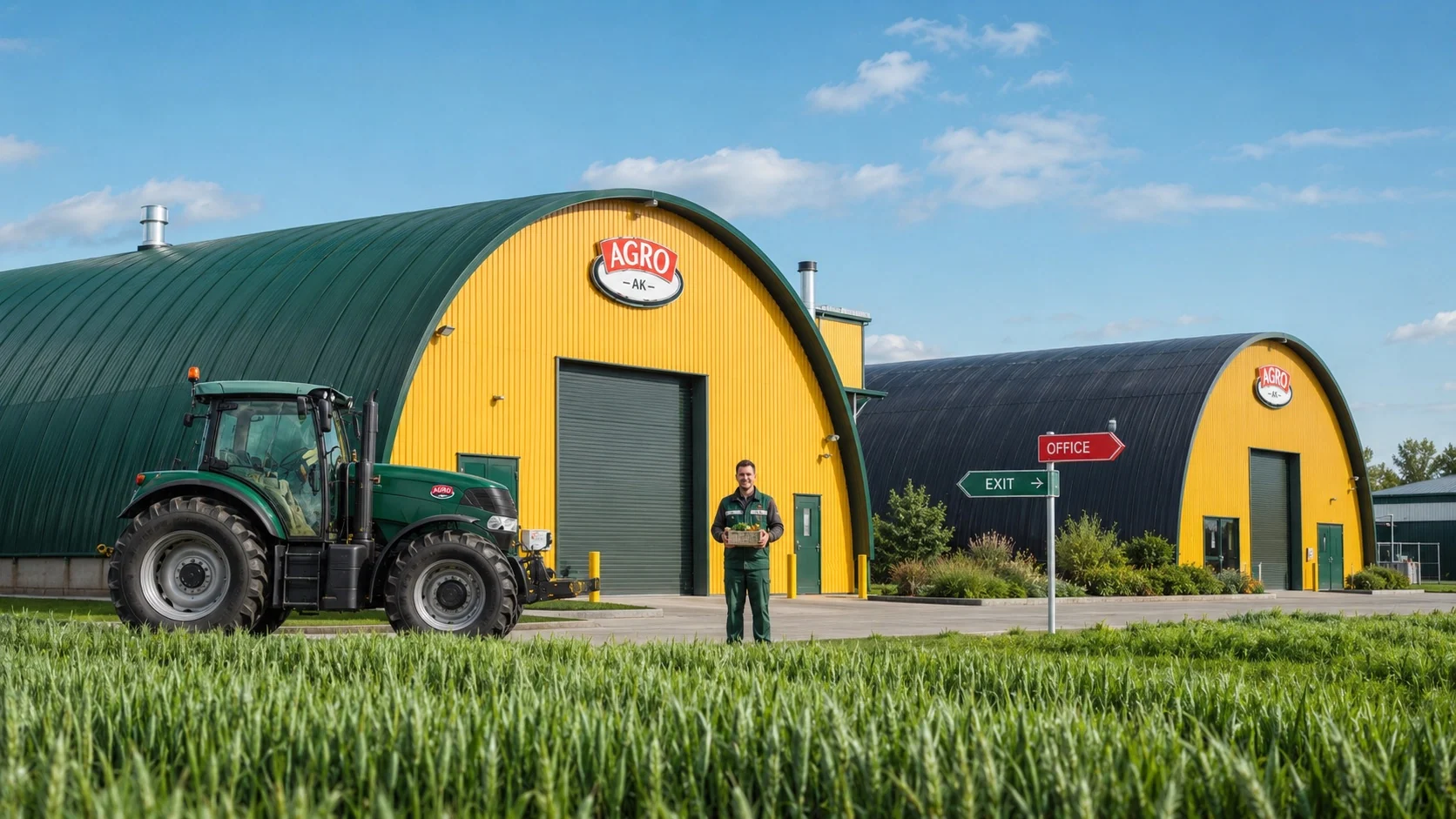
Color and graphics are integral to the building, not decoration added after construction. Dark green volumes connect to the agricultural landscape, a yellow line unifies long facades, and red details highlight entrances and key locations.
The logo is designed to be read from the access road. The same system distinguishes the office, production, and logistics areas of the complex.


Product system
One brand, multiple packaging formats
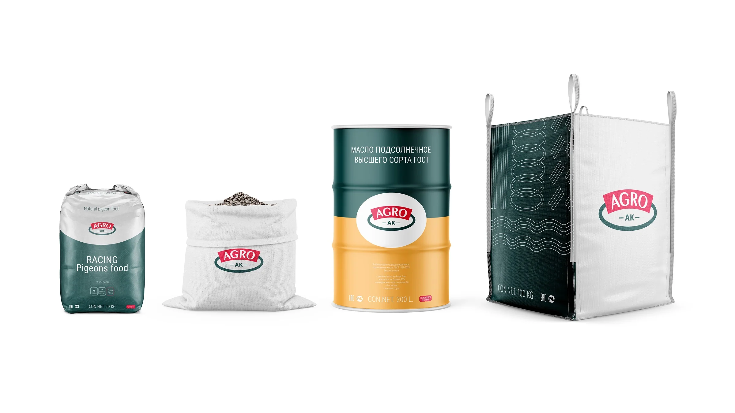
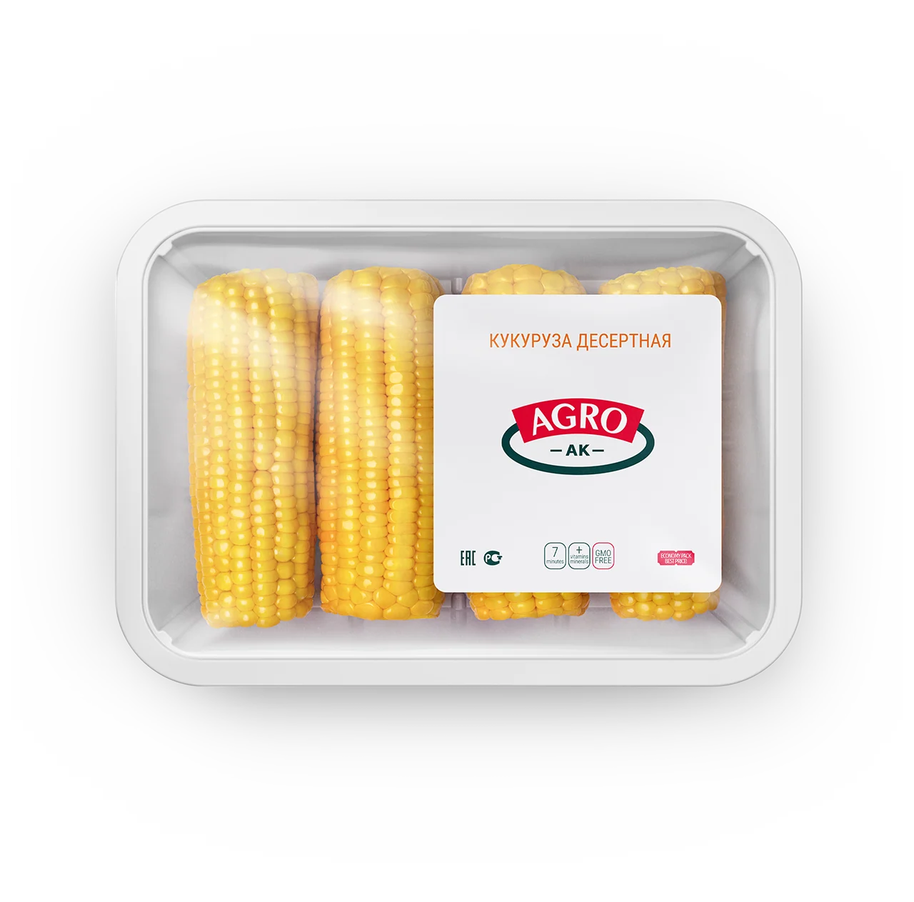
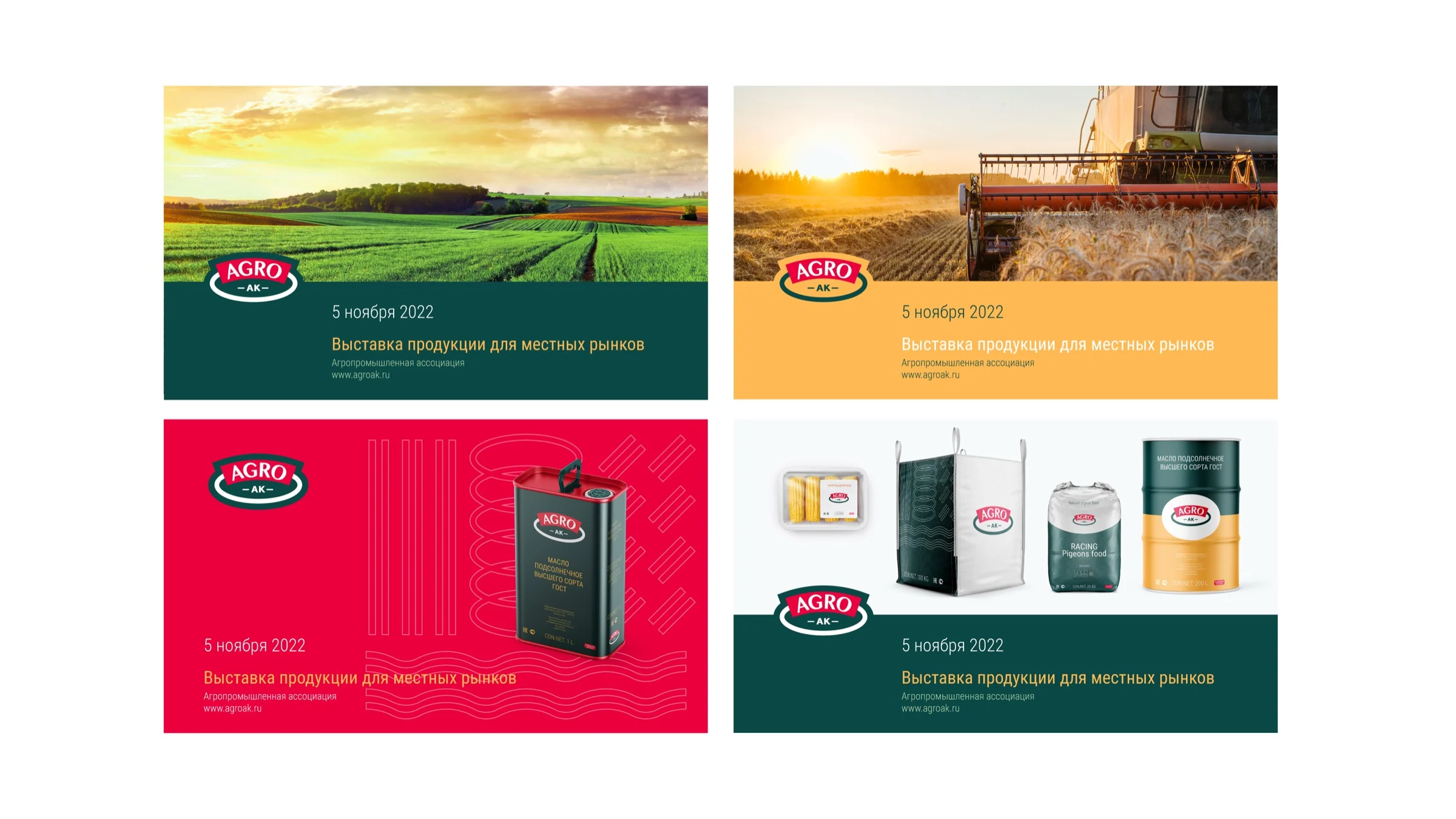
The range covers products with different purchasing and logistics needs: feed, grain, oil, canned foods, and industrial containers. The emblem remains the primary identifier, while color fields distinguish categories.
The system scales from a small label to a sack, drum, or bulk container without losing its character.


Communication and applications
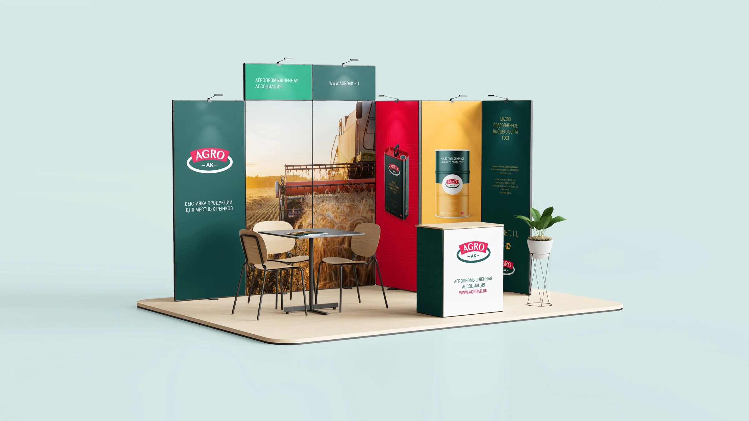
The brand is visible on-site and beyond
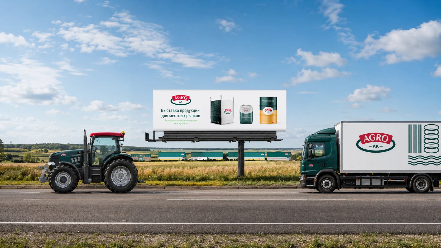
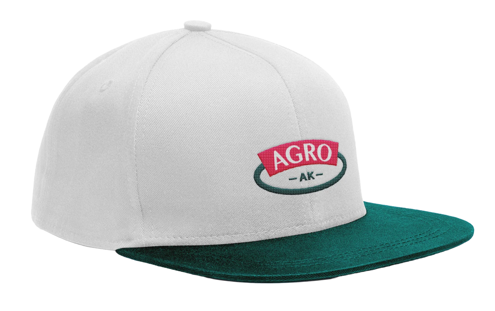
Outdoor advertising, digital materials, the website, and workwear follow shared guidelines. New applications can be added while keeping the brand recognizable.

Project outcome
From an emblem to the environment where the brand operates
AGRO-AK gained a connected system rather than a collection of individual layouts. It makes the company recognizable through a product, vehicle, or building, maintaining a consistent image across the complex.
- Logo and brand graphics
- Palette and typography
- Architectural concept for buildings and hangars
- Wayfinding and equipment branding
- Product packaging design
- Workwear, advertising, and digital applications
- Brand guidelines
The first conversation
Let's build your brand from product to space
Tell us where your brand needs to work. We will connect strategy, identity, packaging, and environment in one recognizable system.
Discuss your challengeAtlantic City, 126B Savushkina Street