
Define the brand's role, make a complex process clearer, and create a system equally effective in communicating with individual clients and partners.
Immigration services · rebranding and brand environment · 2021
GIC
CANADA
TEL AVIV / CANADA
From a restyling request to a system connecting brand, digital, and space
We built a strategic and visual foundation for an immigration company: positioning, platform, semantics, identity, web design principles, and an office environment.

The initial request
A logo refresh was not enough
When the project began, GIC CANADA had an outdated visual identity and lacked a unified platform, tagline, messaging system, and identity guidelines. The business was preparing to expand its office network and partnerships; disconnected solutions were no longer enough.
The symbol could change quickly. Without a shared idea, language, and application scenarios, it would remain an isolated image.
First, a clear direction for the brand.
Then, its form.
Brand platform
A clear path
to a new life
At the heart of the platform is support throughout a person's journey, rather than a list of programs: from initial questions and paperwork to relocation and settling in.
Understand the options and conditions without ambiguous promises.
Gather documents and work through each stage in sequence.
Maintain a sense of control during change.
Receive support after moving to a new country.
B2C
Individuals and families
They need clarity, honesty, and confidence in the next step.
B2B
Partners
They value expertise, processes, and predictable collaboration.
Responsibility
Do not pass the complexity of the process on to the client.
Honesty
Speak professionally and avoid false promises.
Openness
Respect people's different stories, goals, and circumstances.
Action
Turn intention into a concrete next step.

Verbal identity
Better future.
In Canada.
The tagline expresses the ultimate value without promising a specific outcome. It works as a modular system: the first part adapts to the audience's needs; the second keeps the direction consistent.
- Comfortable life. In Canada.
- Safety. In Canada.
- New opportunities. In Canada.

Identity
Familiar symbols.
A clearer system.
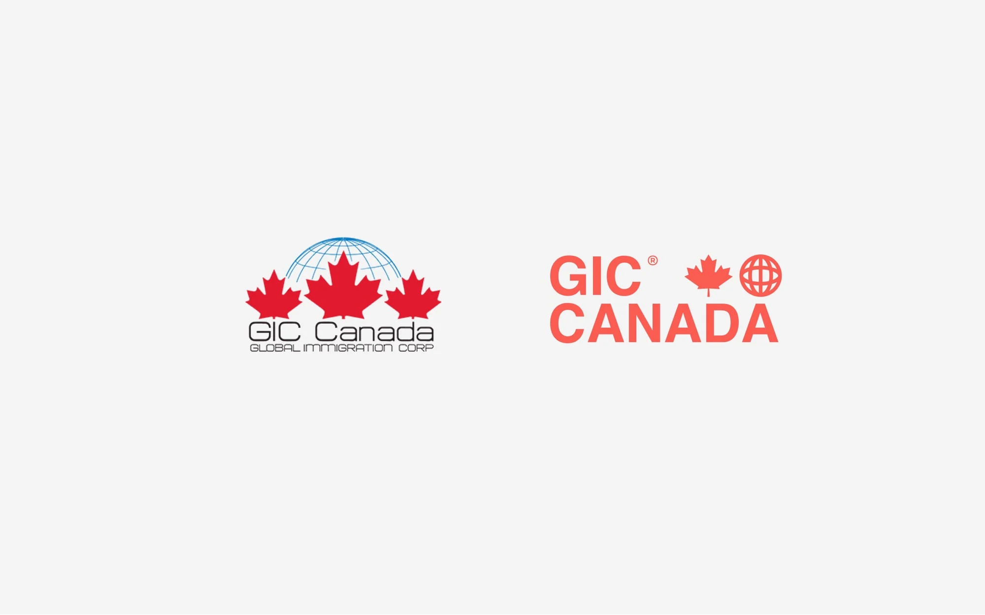
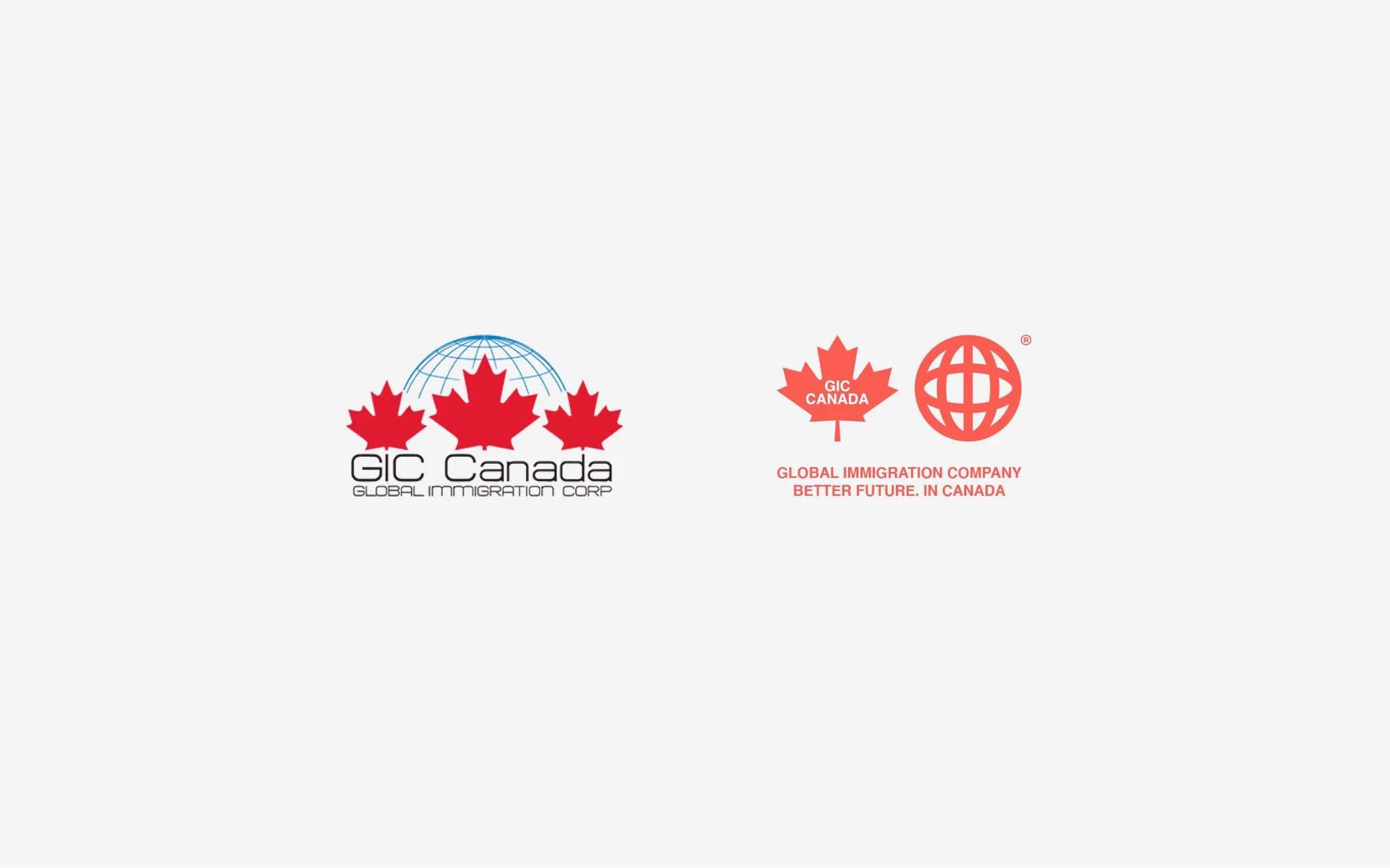
The updated mark preserves recognizable references to Canada and international movement. Decorative complexity gives way to clear geometry, open color, and elements that scale easily from documents to spaces.
 Primary horizontal version
 The pattern connects the maple leaf and globe
Better future.
In Canada.
HelveticaRegular / BoldThe web version uses a system Helvetica font stack without distributing a licensed font file.


Digital principles
A complex process explained step by step

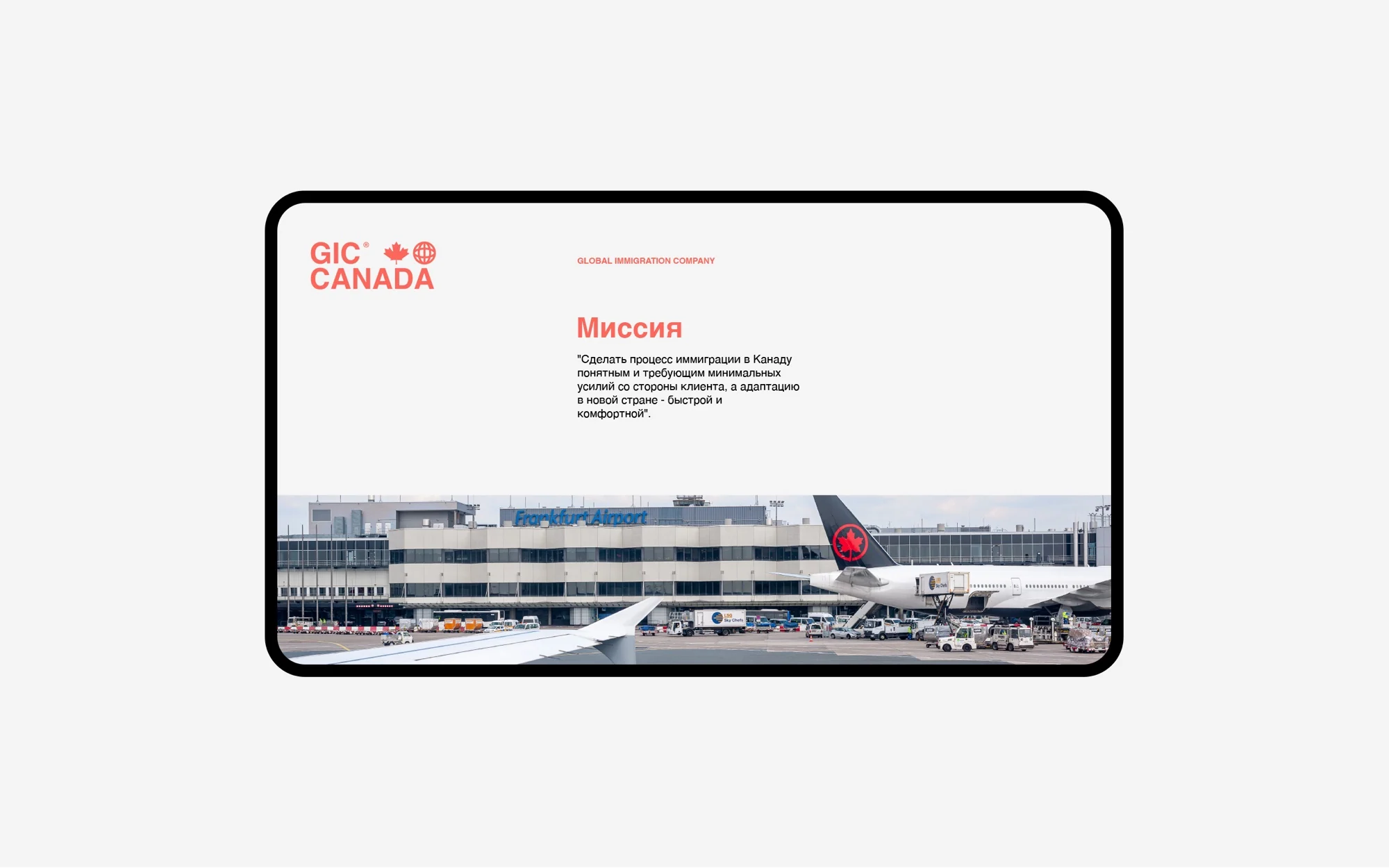
One screen, one question.
The argument depends on the audience.
The next step is immediately clear.
Implementing the system
The brand moved beyond the brand book
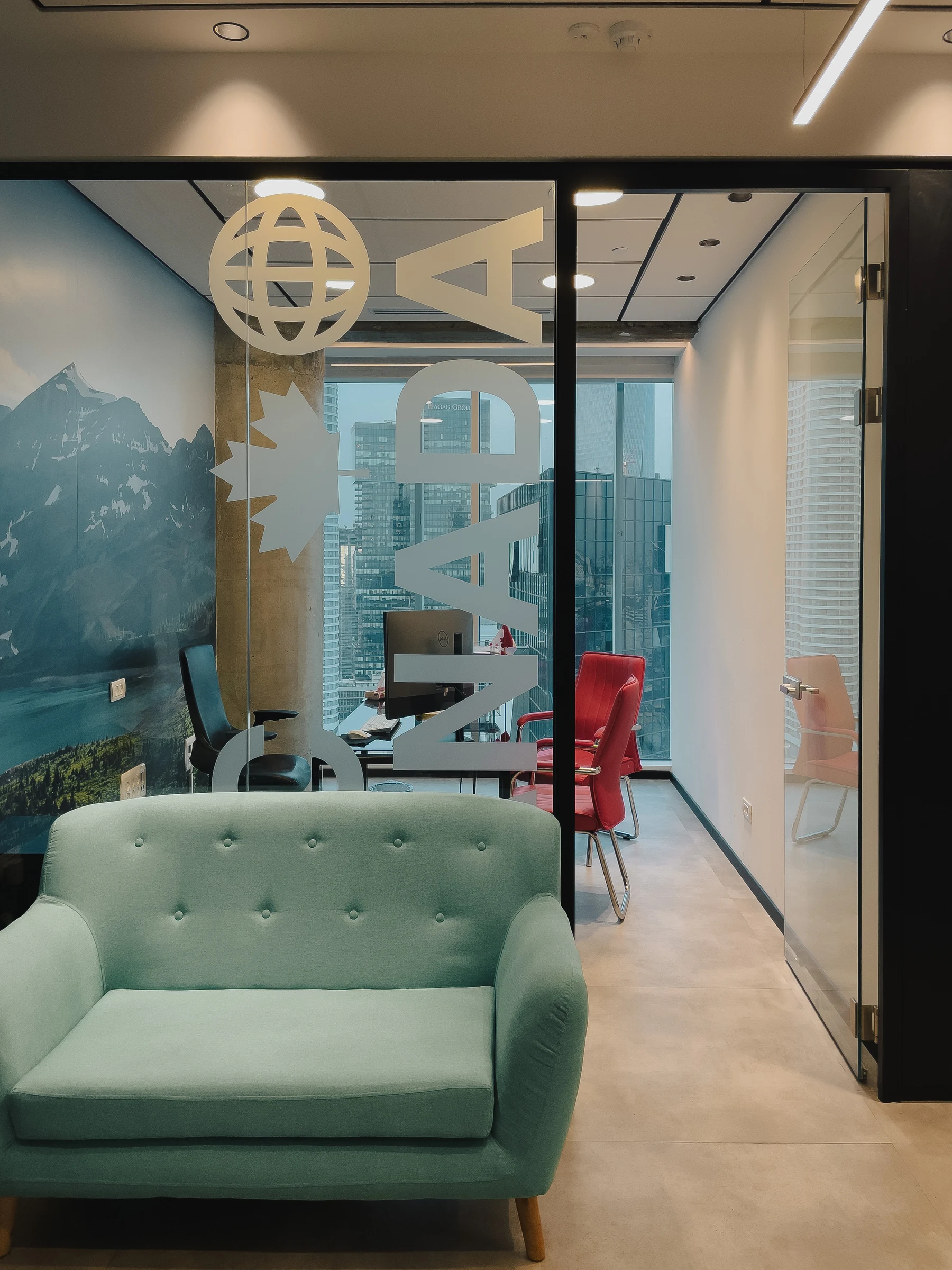
The identity was developed for advertising, business, digital, and spatial applications. The visualizations below show application designs; the office photographs show the completed environment.


Brand environment
The office continues the conversation

Principle
We integrate the brand into the client's journey through the office
The maple leaf, globe, color, and large typography help zone the space while preserving a sense of openness.
Project outcome
One system, from promise to space
The project transformed a request for a visual refresh into a connected brand, giving the company a foundation for consistent communication with clients and partners across channels.
- Positioning and brand platform
- Archetypes, values, and communication principles
- Tagline and messaging system
- Logo restyling and visual identity
- Brand guidelines and application system
- Web design principles
- Office environment concept and design


Project team
GORYANIN BROTHERS × GIC CANADA
Next case study
ORBIT360
Strategy, brand, and a spatial architectural concept—another project where the system works across scales.
View ORBIT360 Next project ↗
The first conversation
We identify where brand development should begin
Tell us what is changing in your business and where the old system no longer helps. We will determine what to build first: positioning, language, identity, or a connected brand environment.
Discuss your challengePhone+7 921 791-93-18
OfficeSt. Petersburg
Atlantic City, 126B Savushkina Street
Atlantic City, 126B Savushkina Street