
Music identity
Infinite Guitar
We created a visual identity for a private guitar school: loud, lively, and as unstoppable as an electric guitar on a blues stage.
Context
Guitar is more than an instrument
The guitar is perhaps the world's most popular musical instrument. Today, it represents something much larger than an instrument alone.
The guitar earned its place in popular culture, becoming a symbol of blues, country, flamenco, and rock, with fans around the world.

Guitar school identity
The mark sounds like a short guitar riff
The possibilities of guitar playing are limitless, and the search for new sounds never stops. The founder chose the name Infinite Guitar, and we built a colorful, energetic visual language around it.


#c73d1bBlack
#111111White
#f4f3ef
Poster system
Typography sets the rhythm. Photography gives it a voice.
Black-and-white musician portraits, rich texture, and red lettering form a series. Every layout is different, yet the communications are instantly recognizable.

Applications
One voice, from posters to vinyl
The identity retains its energy at different scales: in the school, on festival posters, and on objects of music culture.


Digital
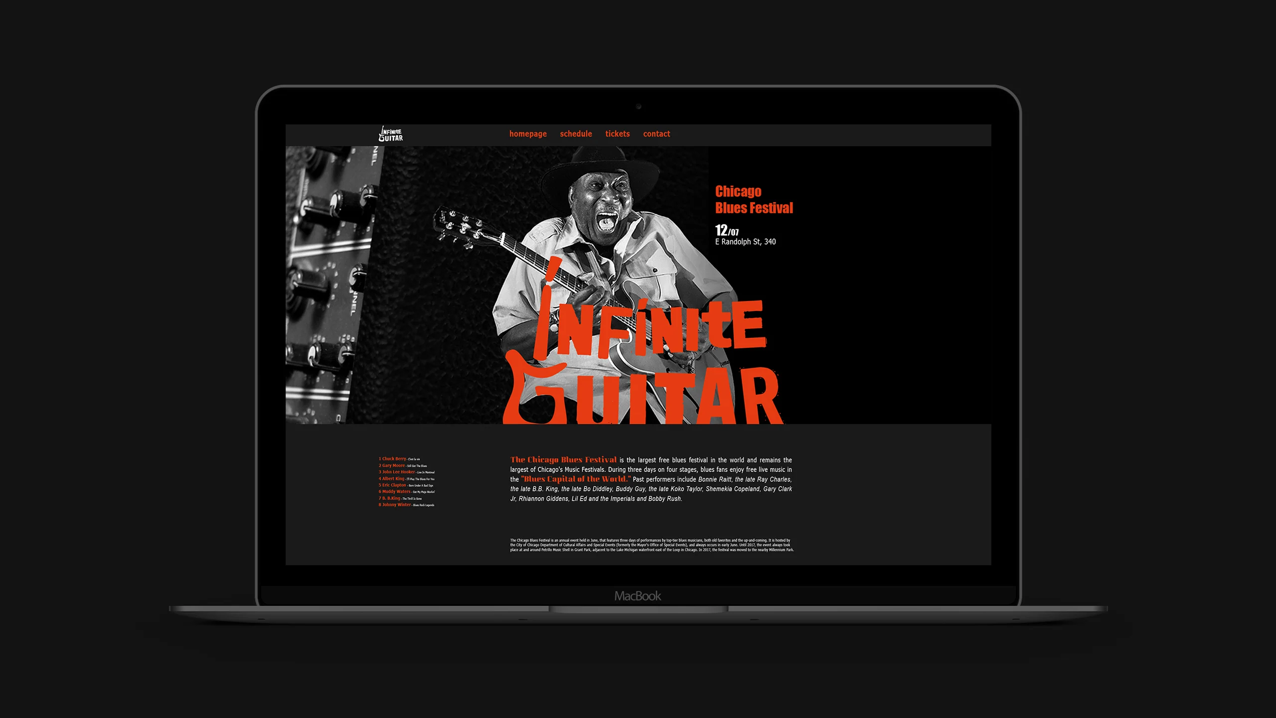
The website extends the stage's visual language
A black screen, red accents, and large photography carry the identity's character into the interface. Schedules, tickets, and contacts remain a short, clear journey.
Outcome
The school gained a visual identity with its own volume
We built a cohesive visual system where the symbol, typography, photography, and applications work like a single musical composition.
- Logo
- Brand palette
- Poster system
- Spatial applications
- Website concept
The first conversation
A brand needs its own tone
Tell us about your challenge. We will build a visual system that works with equal confidence in spaces, print, and digital.
Discuss your challengeAtlantic City, 126B Savushkina Street