

Orthodontists who value a clear protocol, professional support, and confidence when introducing a new system into their practice.
LINOVAX — clear aligner brand
Naming · brand platform · identity · packaging · 2025
ORTHODONTIC SYSTEM / 01
Next-level aligners
A clear aligner brand built around the orthodontist's work
We renamed WAVE LIGNE and built an independent product brand within the ORTOZENIX architecture, from strategy and voice to a visual system and packaging.
Context
A new product name within a shared brand architecture
WAVE LIGNE needed a name that conveyed the product's innovation, connected to ORTOZENIX, and remained distinctive within the product portfolio.
Parent brandORTOZENIX×
BRACELUXbracket system
LINOVAXaligners
More than a product label: a confident partner for practitioners—knowledgeable, composed, and approachable.
Naming
The name connects lines, innovation, and the ORTOZENIX architecture
Ligne / Line, aligners, Light, life — lines, alignment, lightness, and life.
New and innovation — a new solution and forward motion.
A connection to the parent brand and a unified product architecture.
WAVE LIGNE→LINOVAX
Light. Lux. Luminous.
Light, lightness, and visual clarity become part of the brand language.
Brand platform
A professional system with human support
The practitioner is at the center of the platform. The brand explains complex topics without unnecessary academic language and builds a sense of partnership at every stage of aligner treatment.
Brand essence
LINOVAX is the orthodontist's reliable partner.
Expertise, thoughtful design, and a technological approach.
Care, guidance, and reduced uncertainty.
Expertise
Professional context and precise language instead of grand promises.
Innovation
Modern technology as a tool for a clearer process.
Accessibility
Clear wording, understandable structure, and simple communication.
Support
Communication that answers clinicians' questions step by step.
Transparency
An honest conversation about the system's capabilities and limitations.
Tone of Voice
Confident, clear, and expert, without unnecessary academic language
Facts over noise
Communication draws on the professional context and explains benefits without advertising hyperbole.
Complex ideas in plain language
Protocols and technologies are explained progressively, without jargon for its own sake.
The doctor is never on their own
The tone is friendly and calm: the brand is there whenever a question arises.
Predictability as a communication theme
The system emphasizes control and an individual approach without replacing clinical judgment.
For doctorsprofessional and composedFor clinicsstrategic and to the pointFor patientsclear and supportive
Visual identity
The aligner outline becomes a recognizable frame for the wordmark
The wordmark retains technical precision, while the soft blue outline echoes the product's shape and brings a more human feel.
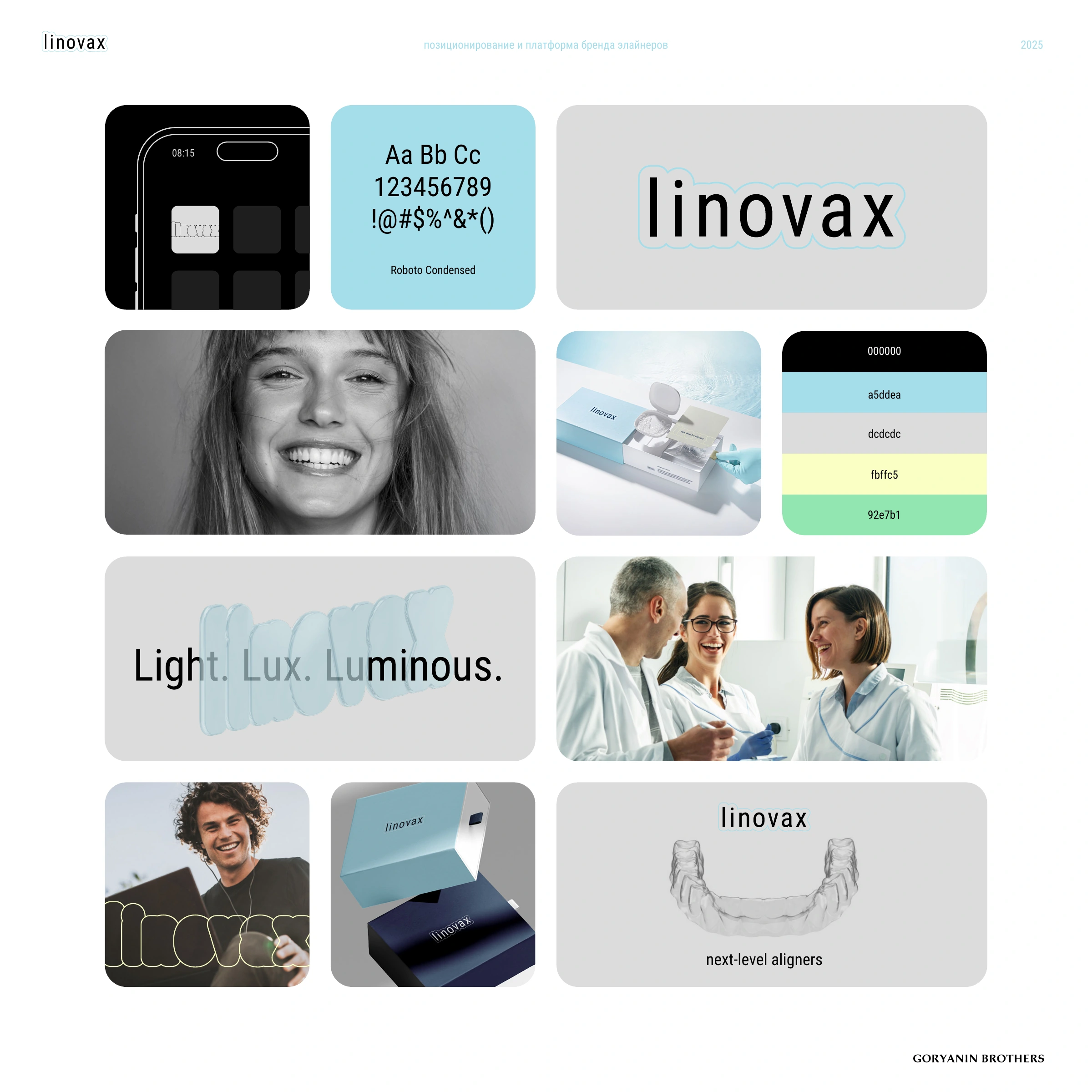
Dimensional texture
The name takes material form
In digital applications, letters become smooth, translucent forms. The system carries the aligner's geometry from outline into volume.


Packaging system
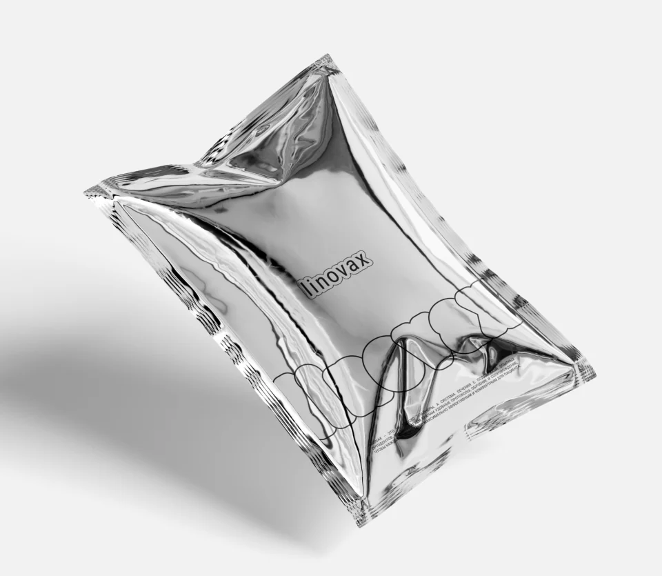
Visual identity in packaging elements
The guidelines define a modular system of formats. The images below are design visualizations and diagrams, not claims of a produced run.


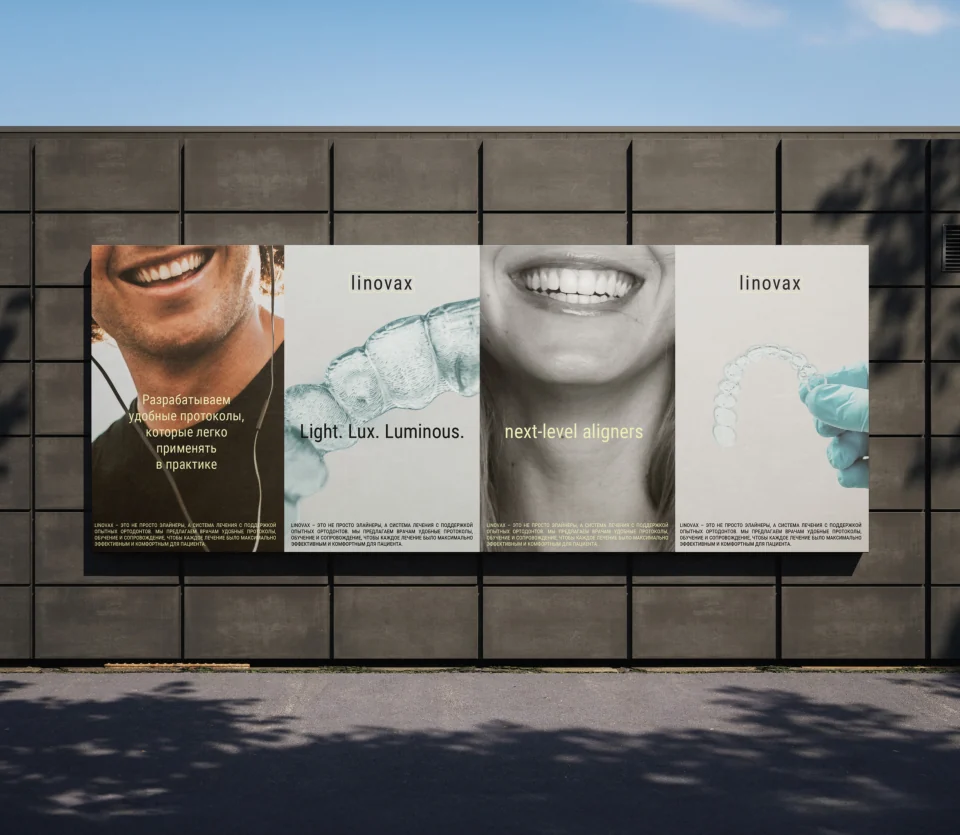
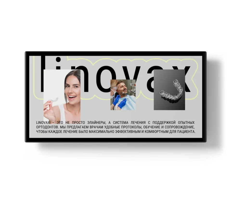
The system in application
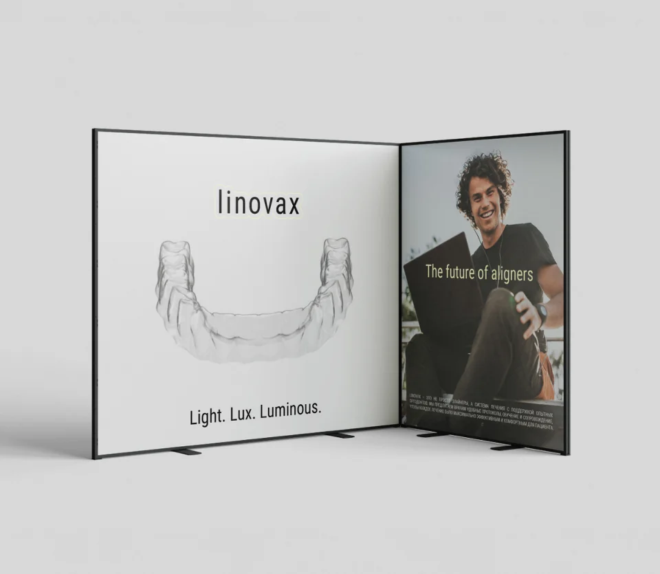
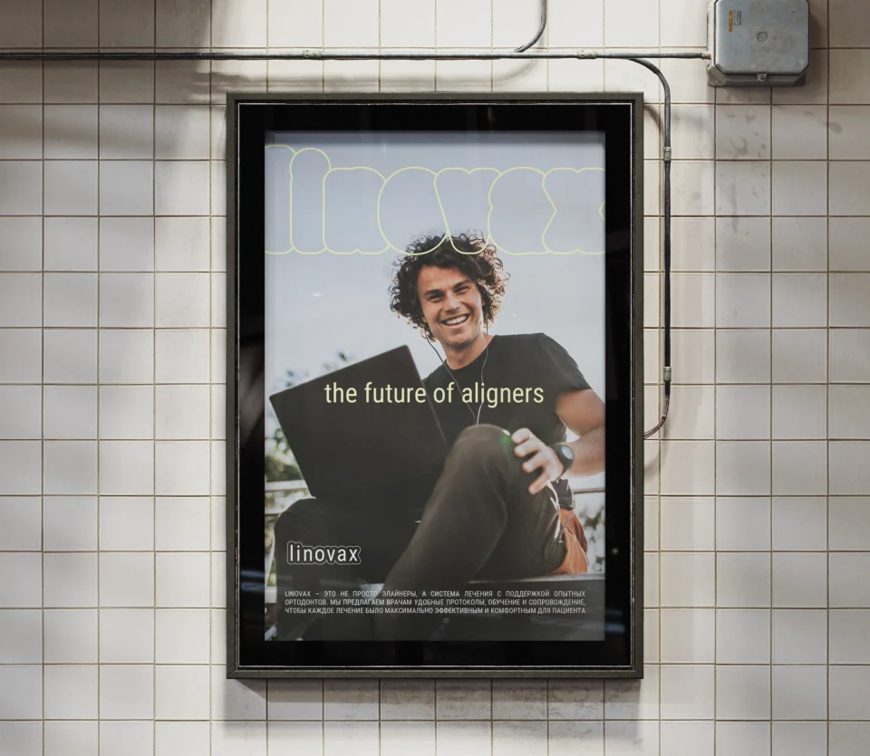
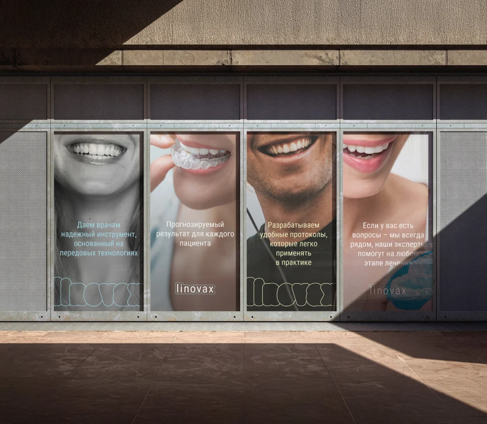
One language, from packaging to outdoor advertising
All scenes below are design renderings from the final guidelines. They demonstrate the system's scalability and do not confirm implementation or production.
System
A new product gained a name, character, and guidelines for growth
The case study documents the design outcome: a complete strategic and visual foundation for LINOVAX within the ORTOZENIX ecosystem. No commercial or clinical performance claims are made.
- Renaming WAVE LIGNE → LINOVAX
- Name concept and descriptor
- Positioning and brand architecture
- Audiences, values, and archetypes
- Tone of voice and communication principles
- Logo, pattern, and dimensional texture
- Color palette and typographic system
- Packaging system and instructions
- Application guidelines
Project
GORYANIN BROTHERS × LINOVAX
2025
Naming · brand platform · positioning · verbal identity · visual identity · packaging · guidelines.
The case study is based on the final 82-page guide and confirmed final exports. Competitor materials and the reference folder were not used. Mockup scenes are explicitly labeled as visualizations.Related case study
ORTOZENIX
The parent brand whose architecture includes LINOVAX and the BRACELUX bracket system.
Explore ORTOZENIX Related project ↗
The first conversation
A product system needs clear architecture
Tell us about your product, audience, and its place in the portfolio. We will connect strategy, name, visual identity, and applications.
Discuss your challengePhone+7 921 791-93-18
OfficeSt. Petersburg
Atlantic City, 126B Savushkina Street
Atlantic City, 126B Savushkina Street