
Research Institute–Regional Clinical Hospital No. 1 — medical complex identity and wayfinding

Identity · wayfinding · medical complex
KrasnodarWe developed an identity and wayfinding system for a major medical complex, from the mark and 3D map to interior signs and outdoor totems.
The brief
One system for the site, its buildings, and thousands of daily journeys
Professor S. V. Ochapovsky Research Institute–Regional Clinical Hospital No. 1 is a large medical complex where visual identity must also serve as a wayfinding tool.
The new identity needed to support the institution's leading position while remaining practical across many buildings, departments, and types of information.
We connected identity and wayfinding through one logic: the mark sets the character, color codes the buildings, a modular grid organizes signs, and a 3D map shows the entire site.
The symbol's meaning
The number one, Star of Life, and a human figure unite in one symbol
The symbol refers to the hospital's number, leadership in medicine, and the six-pointed Star of Life. The Vitruvian Man introduces the idea of harmony between physical and spiritual health.

 01
01

Brand system
The primary pink unites the brand. Secondary colors help people navigate.
The broad palette is not simply decorative. Each color can identify a building and remain recognizable on documents, signs, and digital screens.
#D3505E#7DBFAB#4B77BA#98A2D2#F4C851#798688#656CAB#BA614C#7CB7E9


Map and digital
First understand the whole complex. Then find your route.
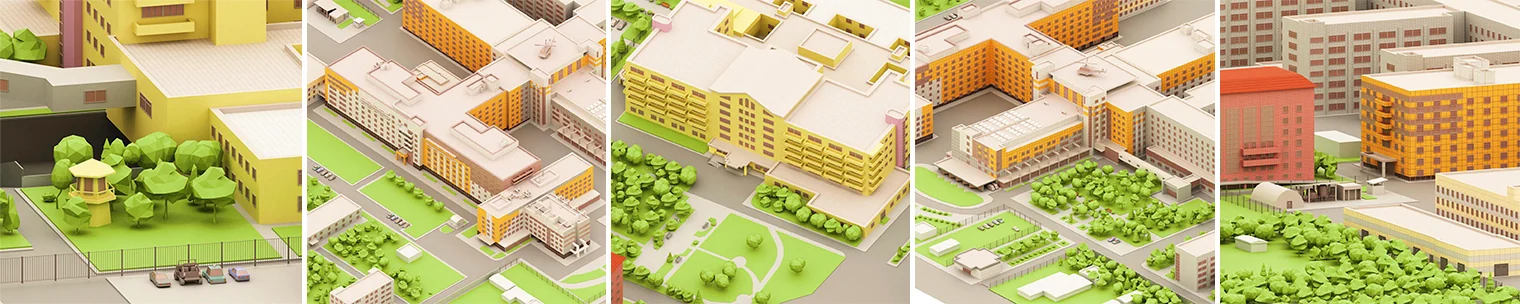
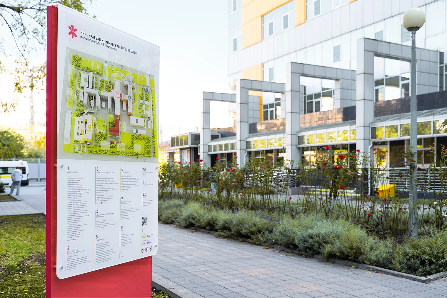
The three-dimensional map became the shared foundation for outdoor and indoor wayfinding. In the website design concept, the same modular logic organizes complex information into clear blocks.

Color coding
01Clinical building
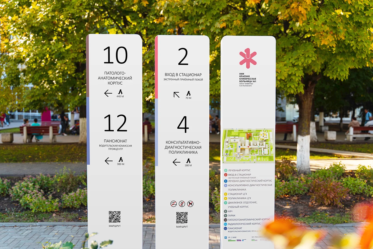
The number and color repeat on the map, outdoor totem, and signs inside the building.


Interior wayfinding
Color becomes an address, and the module a unit of information
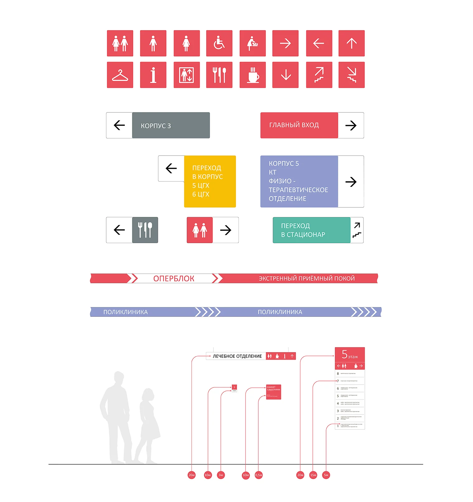
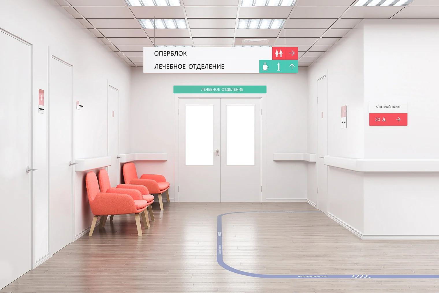
Each building's interior color matches its designation on the 3D map. Signs, icons, arrows, and floor lines use standard modules, maintaining one language across varying amounts of information.



Outdoor system
On the grounds, distances matter as much as directions
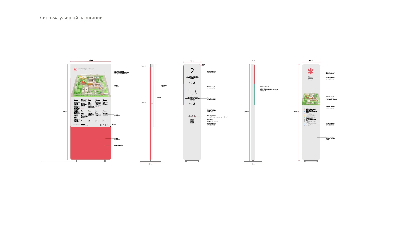
The complex uses several totem types: welcome, large map, medium, and small directional signs. At key points, they display building numbers, directions, and distances.



Editorial system
The identity continues in the Medical Bulletin
A modular grid was created for the print publication: colored blocks change between issues while the typographic structure remains recognizable.


Project outcome
The visual identity became a working system for the medical complex
One visual language connects documents, the publication, digital concept, and wayfinding. Visitors can identify the right building by number and color, then continue along coordinated signs inside.
The project shows identity becoming infrastructure: it does not merely decorate a place, but helps people make decisions in a complex environment.
- Visual identity concept and brand symbol
- Logo guidelines and color system
- Business stationery and applications
- 3D map of the complex
- Icons and modular system
- Interior wayfinding
- Outdoor totem design
- Website design concept
- Print publication concept
Project scope
GORYANIN BROTHERS × Research Institute–Regional Clinical Hospital No. 1
Related healthcare case study
SOGAZ MEDICINE
Redesigning the brand system of a large medical group, from guidelines and digital to uniforms, vehicles, and wayfinding.
Explore the case study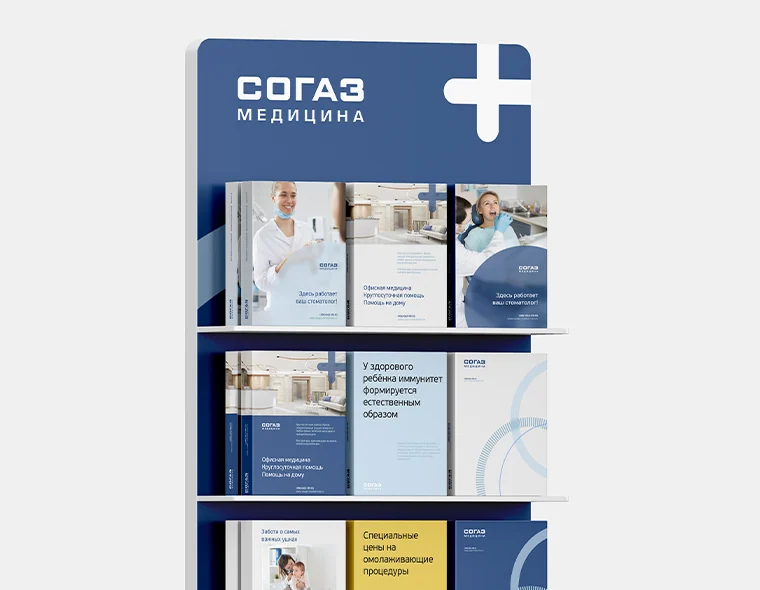 Healthcare branding ↗
The first conversation
A large system should be clear at every scale
Tell us where people get lost: in the brand, the information, or the space. We will identify what to build first: the overall logic, visual language, or wayfinding journey.
Discuss your challengePhone+7 921 791-93-18
OfficeSt. Petersburg
Atlantic City, 126B Savushkina Street
Atlantic City, 126B Savushkina Street