Alexander Goryanin
Category and audience analysis, platform, positioning, verbal identity, copy, and communication strategy.
 Contact
Laundry care · brand rebuild · 2025–2026
02 / OCTO
We rebuilt the platform and positioning, developed the octopus idea embedded in the name into verbal and visual systems, and created packaging architecture for multiple formats.
View the product at Golden AppleThe existing brand needed more than new packaging
When we joined, OCTO already had a name, products, and an assortment framework. The task was not to discard this foundation or design a single SKU.
Expanding the range required a shared category position, a distinctive voice, and principles that could connect products and formats. We began by analyzing the product context, audience, and competition.
Strategic idea
OCTO's updated positioning centers on a brand that explains its products clearly, helps customers navigate the range, and retains a consistent personality across categories.
“Smart” became a criterion rather than a marketing word: communication should be clear, graphics recognizable, and packaging flexible enough for new formats.

INTELLIGENCE AGAINST STAINS
The existing name gained new depth

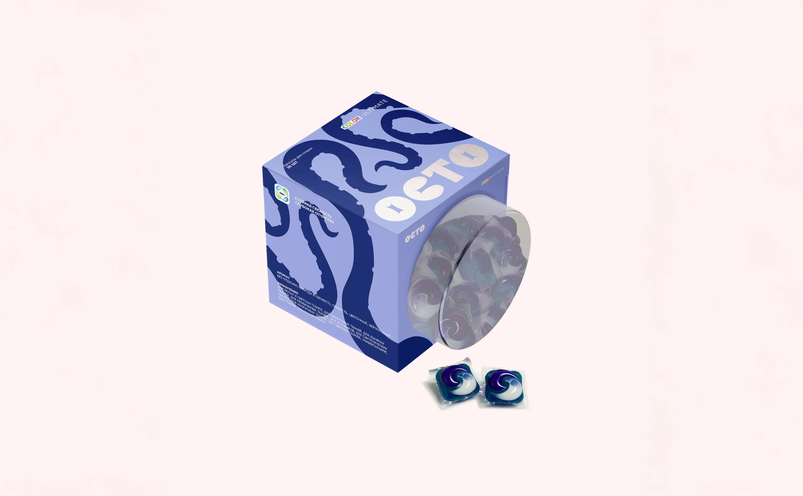
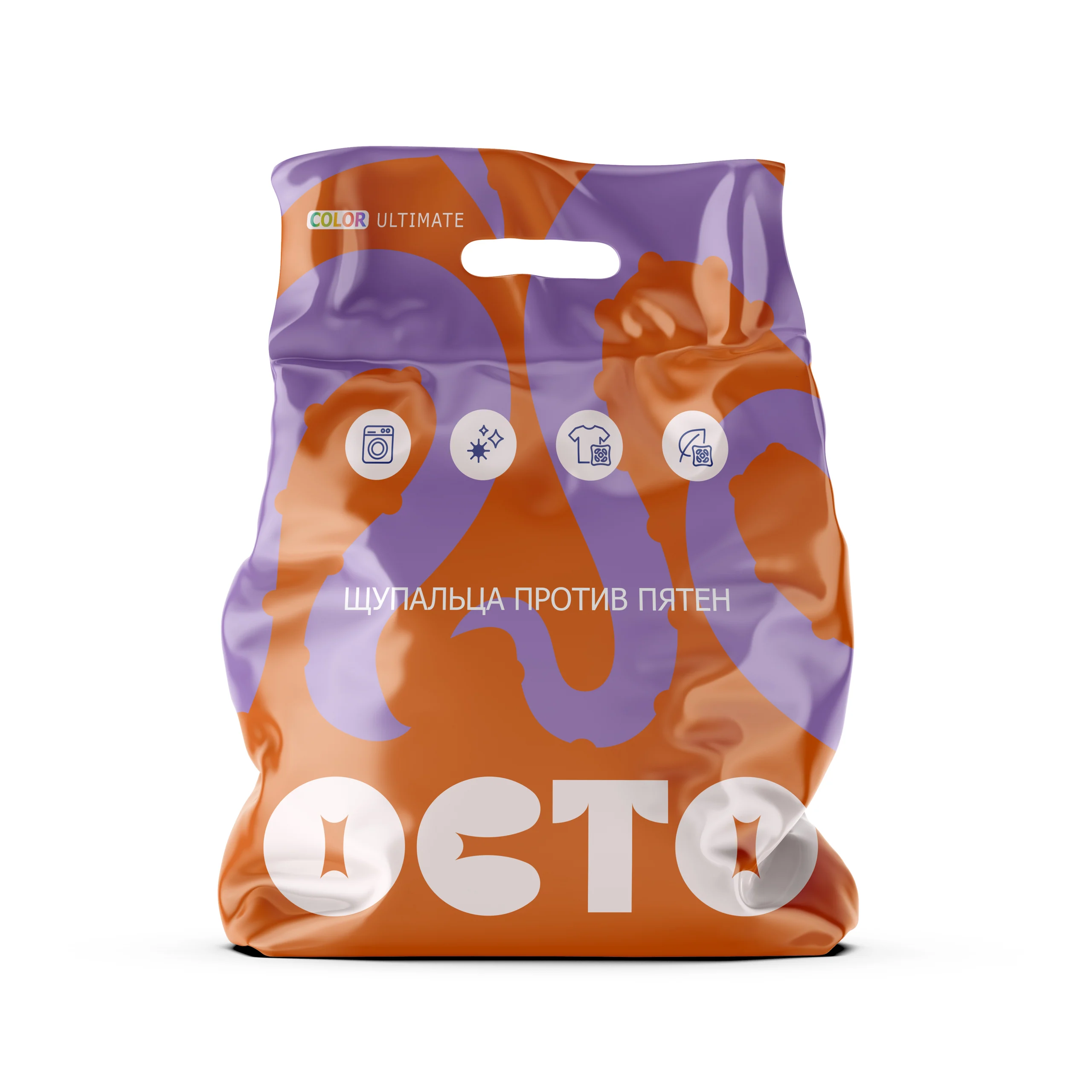
The forms of tentacles and suction cups became the symbol's shape, pattern, and packaging. For OCTO, we developed the brand voice principles, messaging system, and advertising directions.
One idea carries through words, the mark, color, pattern, and product architecture.
Visual identity


Packaging architecture
The symbol, tentacle shapes, information hierarchy, and color differentiation remain constant. Geometry and volume adapt to the category.



From system to implementation
The client's team produced OCTO fresh all in one capsules in the updated system, now available at Gold Apple.
The OCTO team handled packaging engineering, printing, production, and retail launch. GORYANIN BROTHERS was responsible for the strategic, verbal, and visual systems and packaging design.
View the product

Project team
Category and audience analysis, platform, positioning, verbal identity, copy, and communication strategy.
Art direction, identity, graphic system, packaging design, and architecture.
Initial product framework, packaging engineering, manufacturing, printing, and retail launch.
The first conversation
If the name, assortment, and communication are not yet working as one system, we'll start by identifying what to preserve and what genuinely needs rebuilding.
Discuss your challenge