


Sports nutrition
Orange
Black
We created the visual identity, packaging for two products, and online store design for dietary supplements.
The brief
Moving beyond sports nutrition's visual clichés
Orange Black is a dietary supplement range for active, modern people. The brand needed a strong shelf presence that was easy to understand without the usual bodybuilder imagery or metallic effects.
We built the system on straightforward typography, contrast, and large product identifiers. The packaging gained an athletic character while remaining precise and functional.
Brand system
Strength through direct contrast
An uppercase name and three core colors work like a sports uniform: black brings focus, white brings clarity, and orange brings energy and an immediate accent.

No visual clutter.
Just the name, product, and dose.
#ff5424Black
#171717White
#f4f3ef
Packaging design
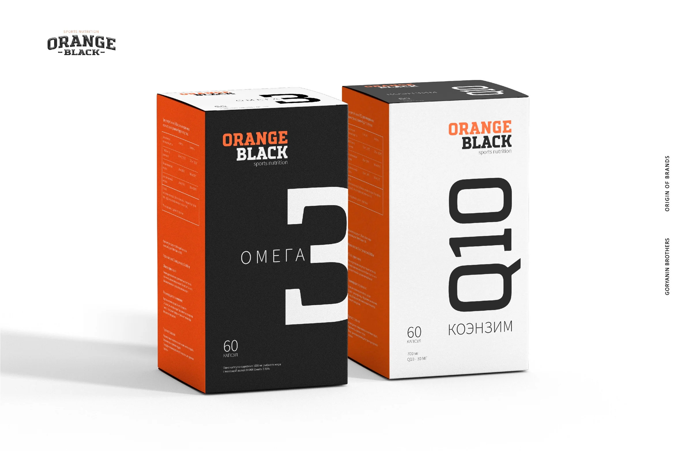
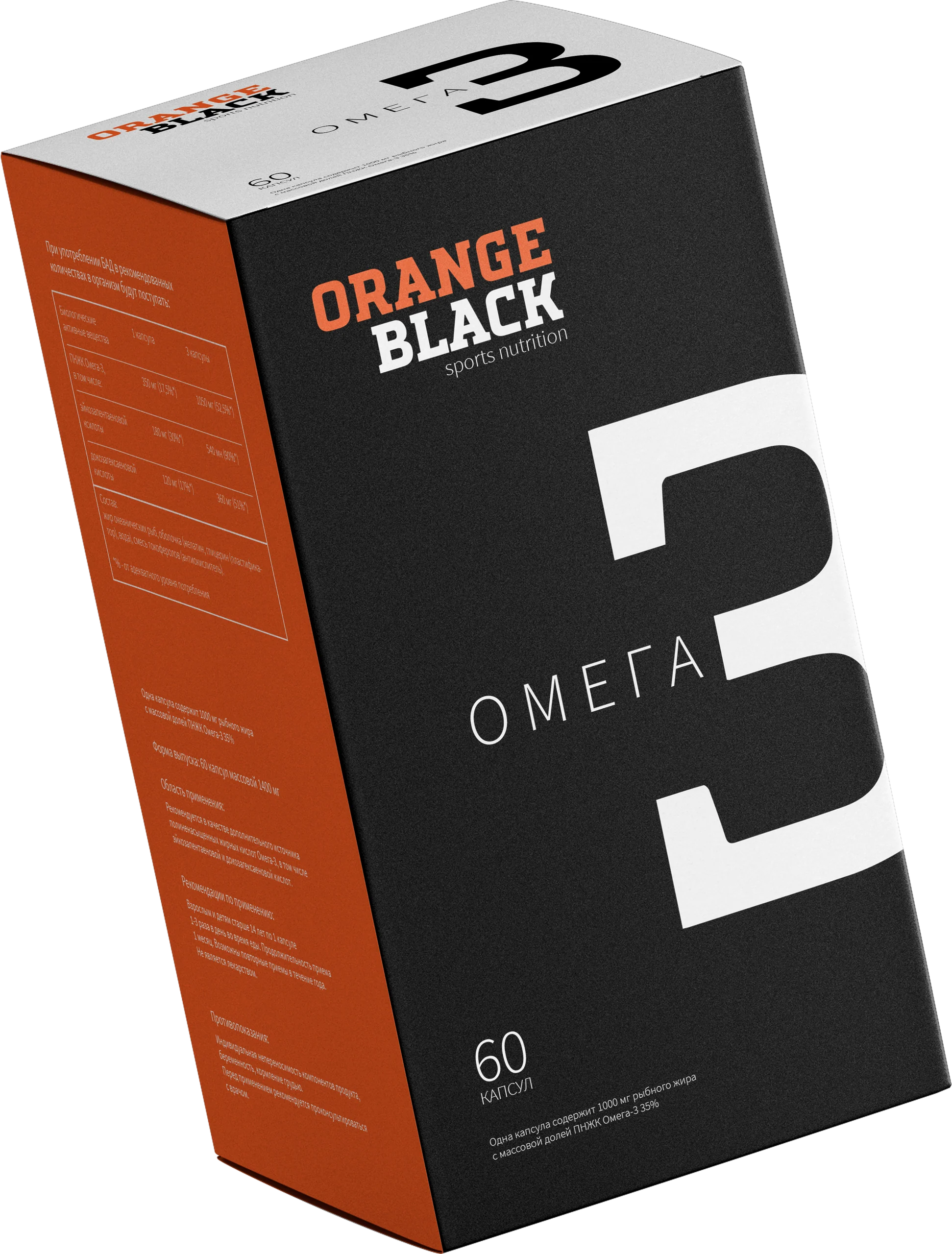
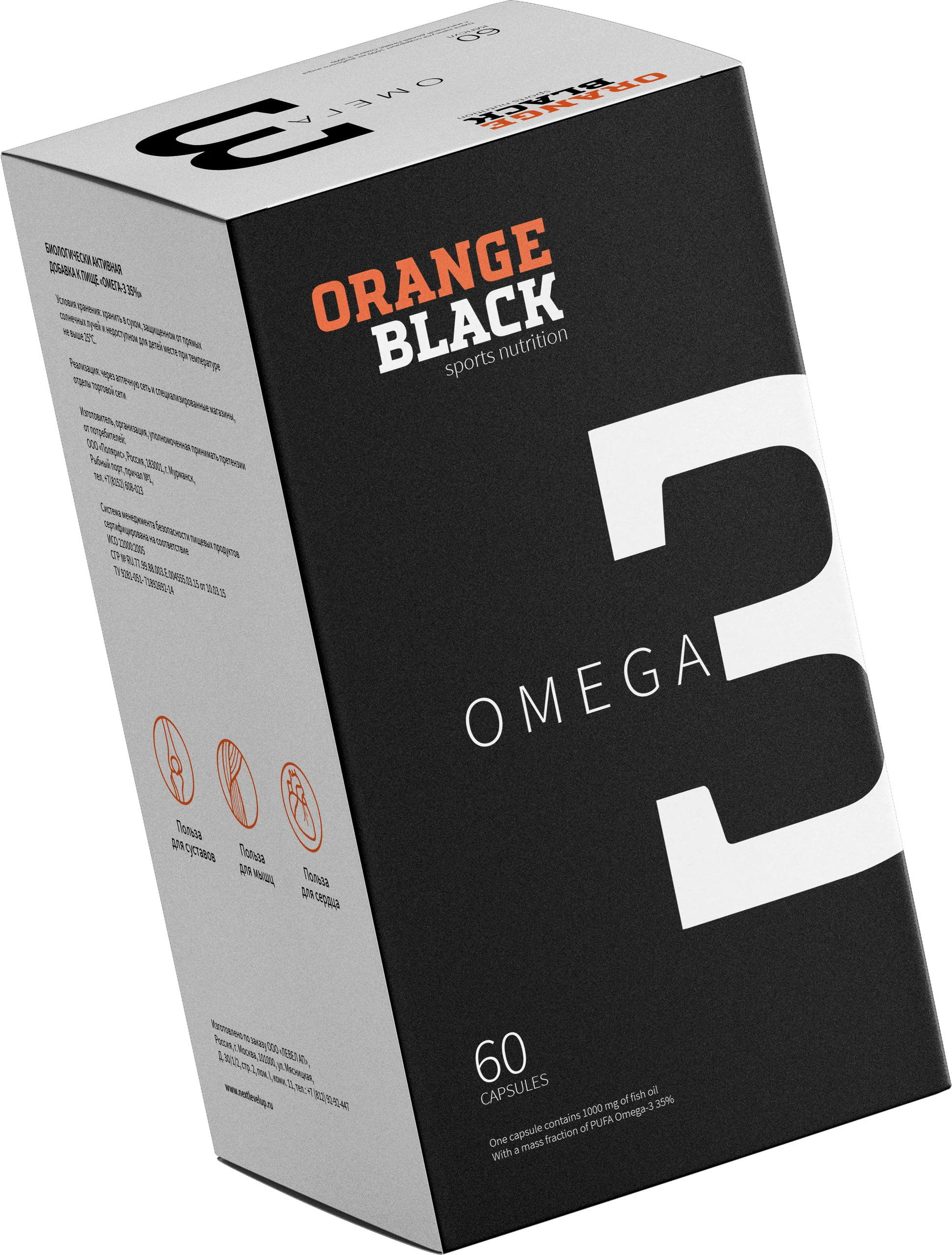
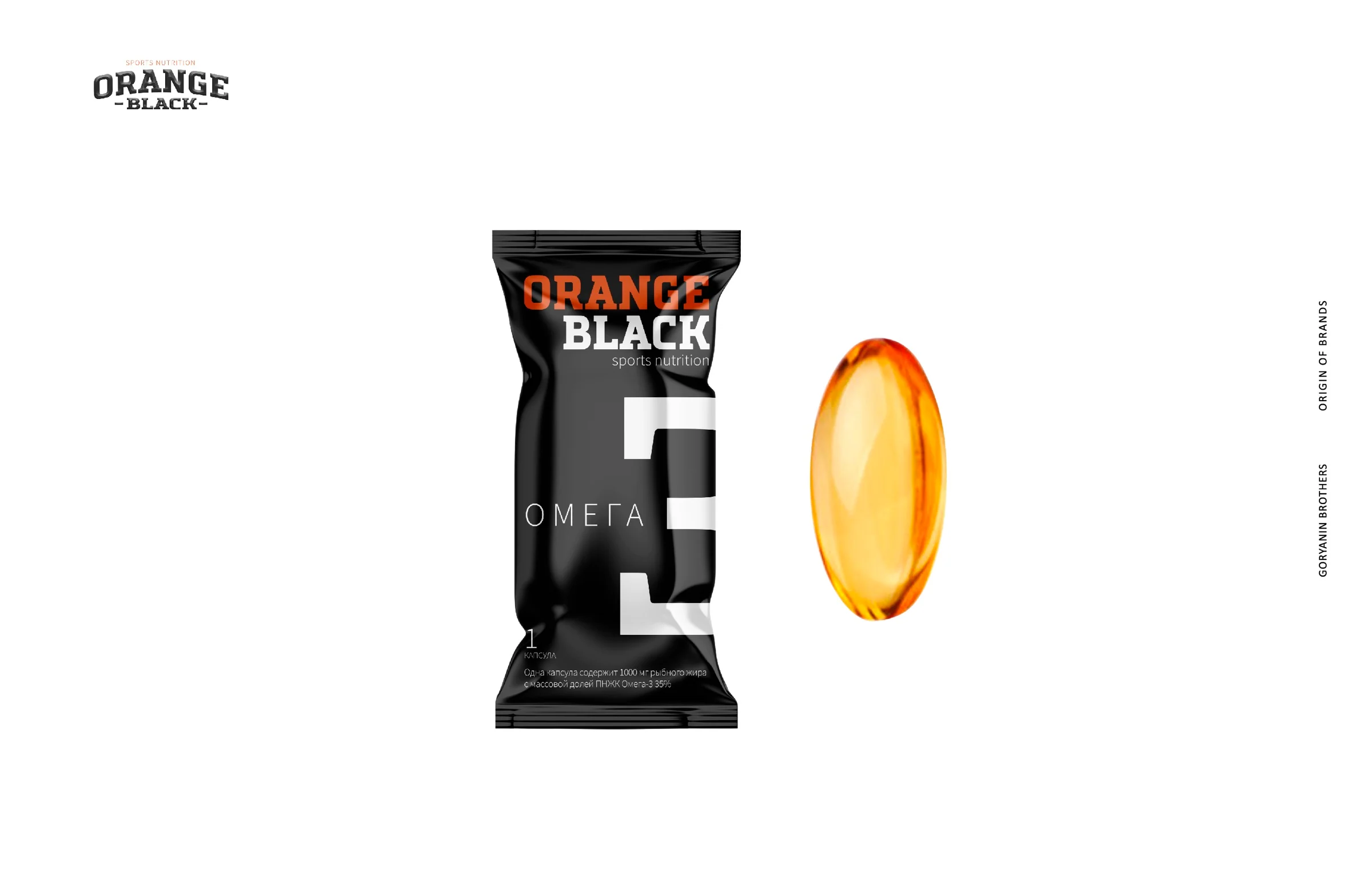
A large index turns the ingredient into a symbol
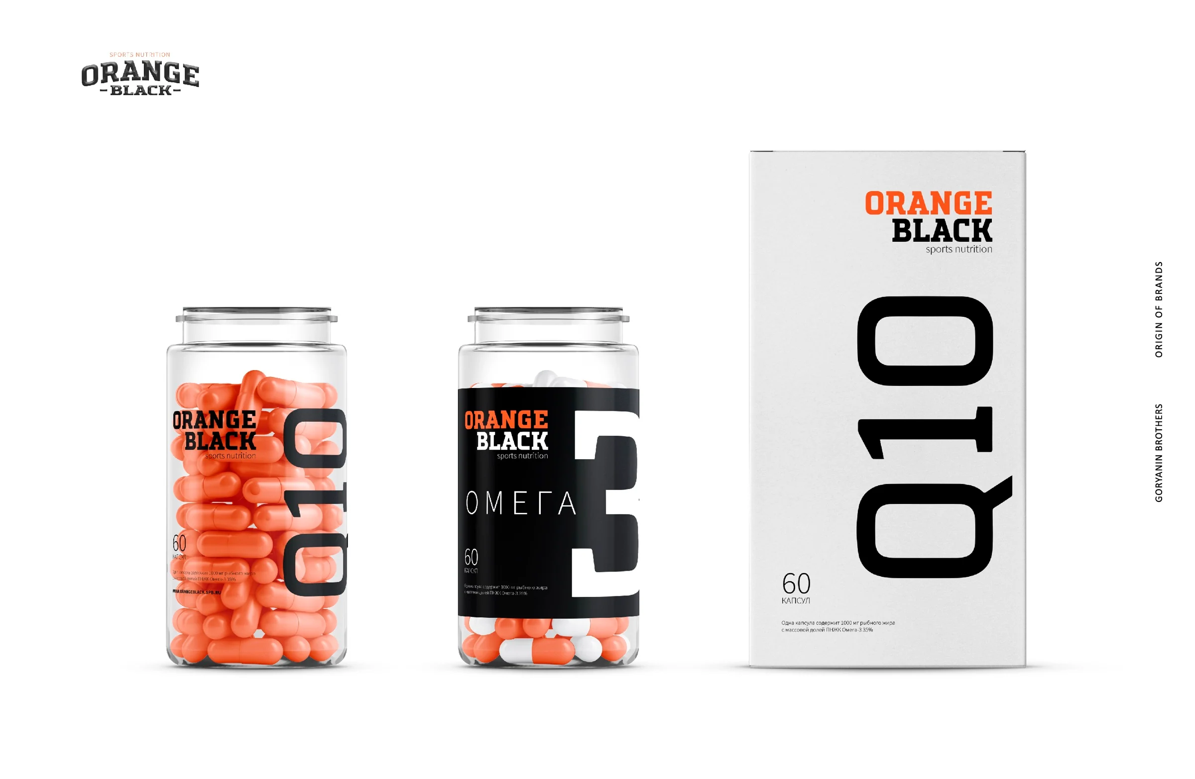
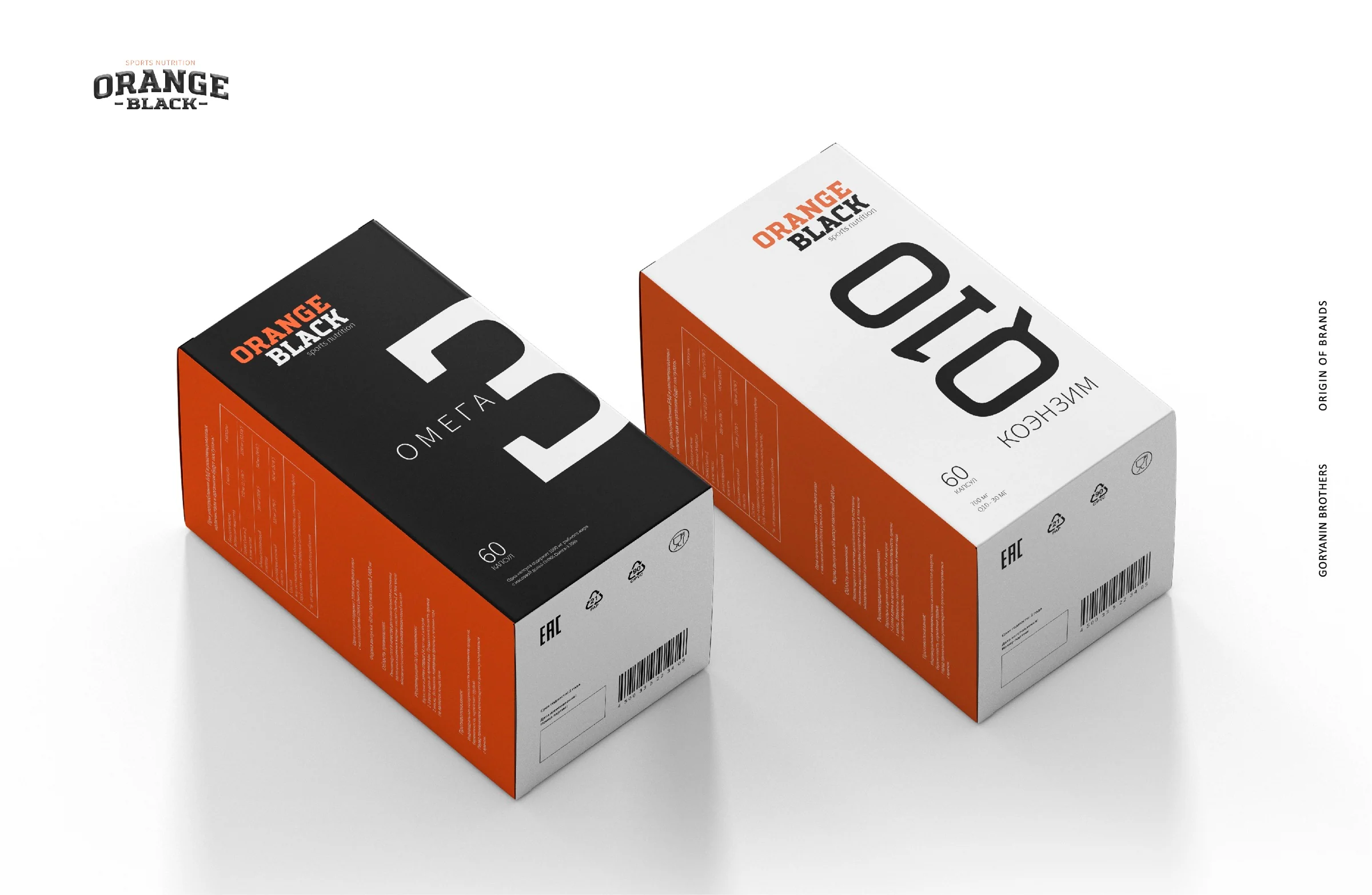
The numeral 3 for Omega-3 and the Q10 designation for coenzyme become the primary identifiers. They are visible from a distance, while alternating light and dark treatments help distinguish the products instantly.
Product range
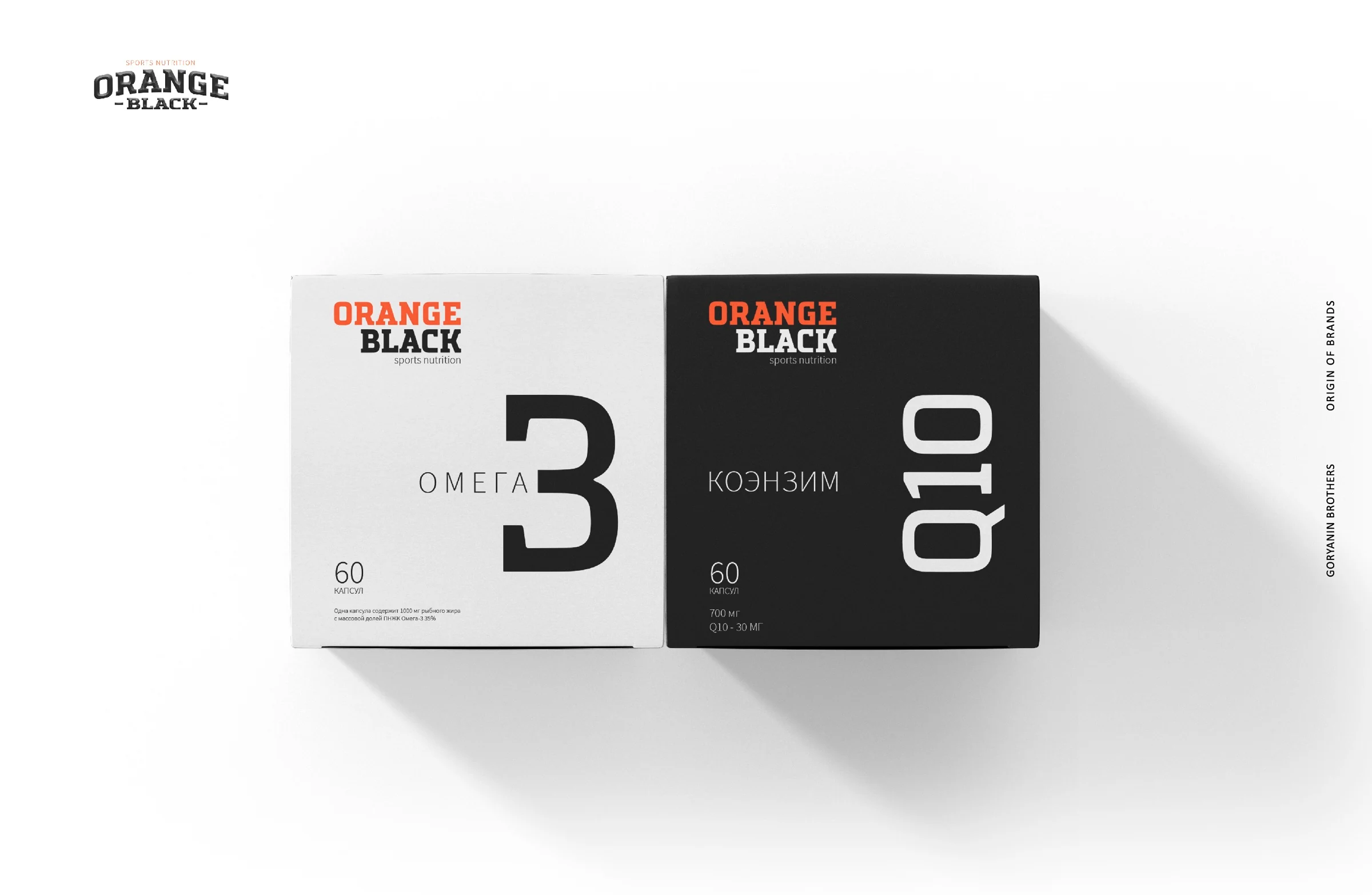
Different in character.
Brought together.
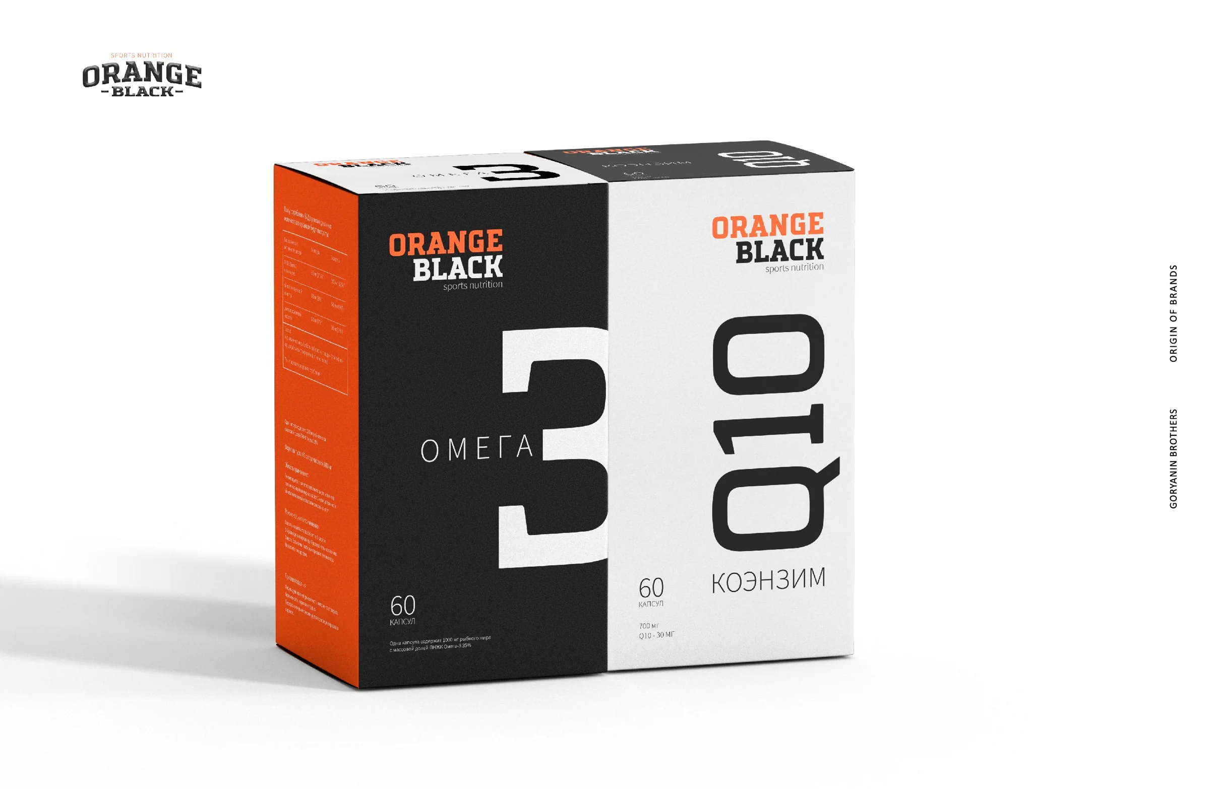
Black and white designs form a pair. Together, the products read as one block, while orange side panels connect the system from every angle.
Website UX/UI
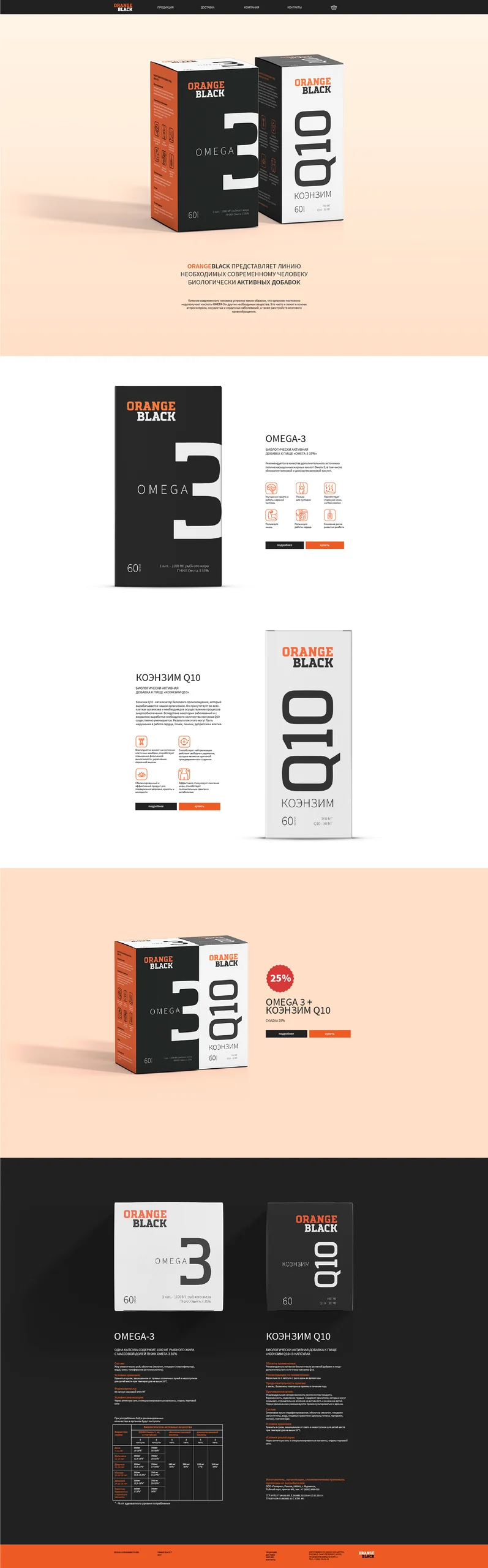
The online store extends the packaging's visual language
On the website, large product images, concise arguments, and icons quickly explain ingredients and benefits. Black, white, and warm backgrounds preserve the packaging's contrast on screen.
 Website design · desktop
Outcome
The brand gained a distinctive presence on the shelf and online
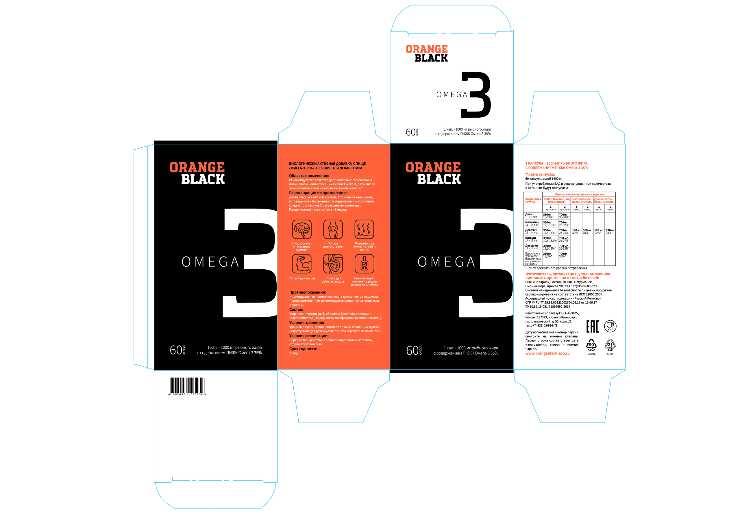
We created a complete system for launching two products: identity, box and bottle design, instructions, pictograms, and website layouts.
- Visual identity
- Logo and palette
- Omega-3 packaging
- CoQ10 packaging
- Icons and instructions
- Online store UX/UI
The first conversation
Packaging should explain the product before someone picks it up
Tell us about your product and market. We will build a system that works on the shelf, in the catalog, and online.
Discuss your challengeAtlantic City, 126B Savushkina Street