Alexander Goryanin
Audit, brand strategy, platform, positioning, naming, and verbal identity.
 Contact
Womenswear · Brand transformation · 2026
03 / RUEPORTE
The project already had products, manufacturing experience, and an audience. We conducted an audit, rebuilt the platform and positioning, created the RUEPORTE name and verbal and visual systems, and carried them into a multilingual digital environment.
Visit rueporte.ruConceptual editorial series for the RUEPORTE brand
An open brief
There was no predefined list of services: first, we needed to understand what the project actually required.
Before our involvement, clothing was produced under the name ALEKSANDRA. The product and manufacturing existed, but the public-facing system did not express the potential of an independent consumer brand.
The task was not to reinvent the product, but to give established expertise an independent brand framework.
Why a visual refresh was not enough
The strategic foundation guided every subsequent decision, from name and voice to visual language and website.
Positioning
RUEPORTE clothing extends personal character. Quality, fit, material, appropriateness, and the freedom to create an individual look are central.
The brand speaks calmly and confidently, without showiness. Communication with shoppers and professional partners uses different registers while remaining part of one system.

The code of elegance is not a fixed rule, but a way to compose your own look.
Naming and verbal identity

The name connects associations with the city, clothing, fabric, cut, and movement. It became more than a decorative replacement for the old name: it became the foundation of a new voice and visual language.
Concise, carefully considered phrasing
Quiet confidence without pressure
A consistent tone across B2C and B2B
Visual identity
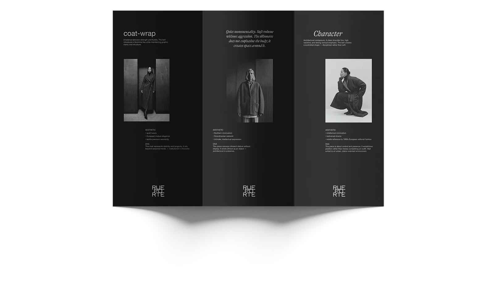
Typography, composition, palette, texture, brand lockups, and editorial imagery work as a unified system, from business stationery to digital.





Material status
Business stationery, packaging, labels, catalogs, social media, and retail materials are presented as developed layouts and conceptual applications. The publicly implemented part of the system is the RUEPORTE website.
Editorial system



Multilingual catalog website
RUEPORTE.ru operates in Russian, English, and Kazakh. The website introduces the brand's story and product catalog, accepts inquiries from individual customers, and includes a separate section for stores and showrooms.
Visit rueporte.ru


Observed outcome
The existing business moved from its previous name and fragmented public communication to an independent RUEPORTE brand system with a working multilingual digital storefront.
Project team
Audit, brand strategy, platform, positioning, naming, and verbal identity.
Art direction, visual system, identity, digital direction, and website.
Product, manufacturing, collections, operations, and business development.
The first conversation
Tell us about your business, its current stage, and the challenge. In our first conversation, we will identify what to preserve, what to rethink, and how to move forward.
Discuss your challenge