T-SOFT brand arrow

Technology company rebrand

T-SOFT

Brand platformIdentityBrand guidelines

T-SOFT rebranding project

Deep expertise.
An image smaller than the business's true scale.

Positioning and platformBrand visual identityBrand meaningBrand guidelines

T-SOFT develops automation, mathematical modeling, and staff training solutions for petrochemical and industrial businesses. Despite its expertise and complex products, the brand did not reflect the company's scale or depth and lagged behind international competitors in perception.

Our task was a comprehensive rebrand that would give the company a stronger, more contemporary, confident identity in the B2B technology market.

We developed updated positioning and a brand platform, focusing on the company's key role as a technology partner supporting the safety, resilience, and efficiency of industrial processes. We defined a new mission reflecting its contribution to industry through innovative solutions.

T-SOFT visual system overview
Rebranding concept overview · design system

Brand platform

Under complete
control

The new platform translates complex technological expertise into a simple promise: security, reliability, and predictable processes.

Mission

Provide enterprises with comprehensive solutions for the safety, reliability, and sustainable development of industrial processes and people.

Vision

We envision a future where technology and automation play a central role in sustainable industrial development. In this future, software becomes the foundation for more efficient, safer, and more reliable processes.

We believe automation and intelligent learning systems will become integral to every business, supporting growth and steady development in a rapidly changing world.


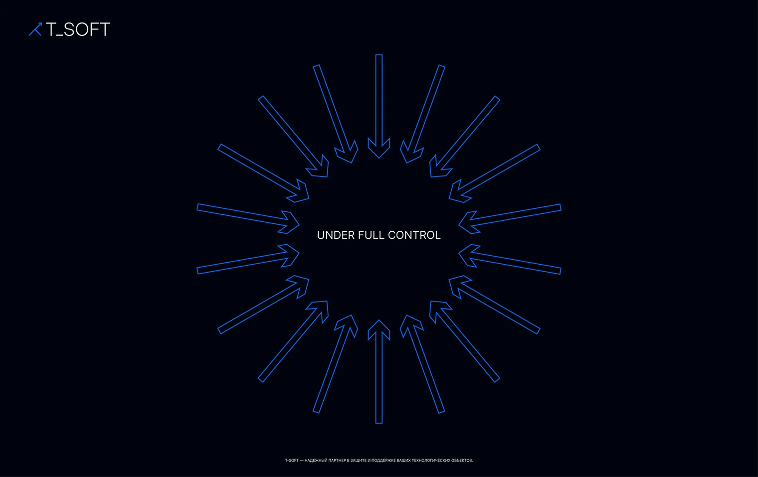
Circular composition of T-SOFT brand arrowsThe system prevents risks before they become incidents.
01

Security and reliability

Long-term safety, efficiency, predictability, and operational stability.

02

Innovation

A drive to create solutions ahead of their time.

03

Expertise

A deep understanding of technological processes and how to model them.

04

Support

Developing employees' skills through advanced simulators and training systems.

Brand character

Protects.
Transforms.

We focused on combining the Parent and Magician archetypes: care for business security on one hand, and the ability to transform processes through technology on the other. This moved the brand beyond a dry engineering image, adding emotional depth while preserving expertise.

01 / Caregiver

Prevents risks and protects equipment and people.

T-SOFT safeguards the safety and stability of industrial businesses. The brand becomes a reliable partner for mission-critical processes.

02 / Magician

Transforms production through knowledge and technology.

Mathematical models and precise process emulation turn complex systems into manageable environments and unlock new levels of efficiency.

Visual identity

A graphic language of precision and control

The next stage was a new visual identity. We developed a graphic language expressing technological capability and systematic solutions: modular forms, a digital aesthetic, and dynamic compositions create a sense of control and precision.

A blue-led palette reinforces reliability and safety, while accent elements bring a contemporary visual character.

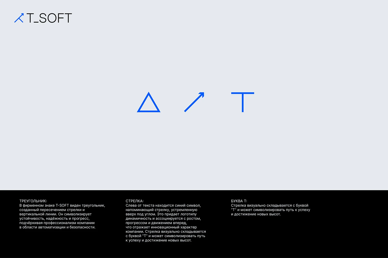
Meaning of the T-SOFT mark's elements

TriangleThe T-SOFT mark contains a triangle formed where an arrow meets a vertical line. It symbolizes stability, reliability, and progress, emphasizing the company's expertise in automation and security.

ArrowA blue symbol to the left of the wordmark suggests an arrow rising at an angle. It brings energy and associations of growth, progress, and forward movement, reflecting the company's innovative character. The arrow visually combines with the T and can suggest a path toward success and new heights.

The letter TThe arrow visually combines with the letter T and can symbolize the path to success and reaching new heights.

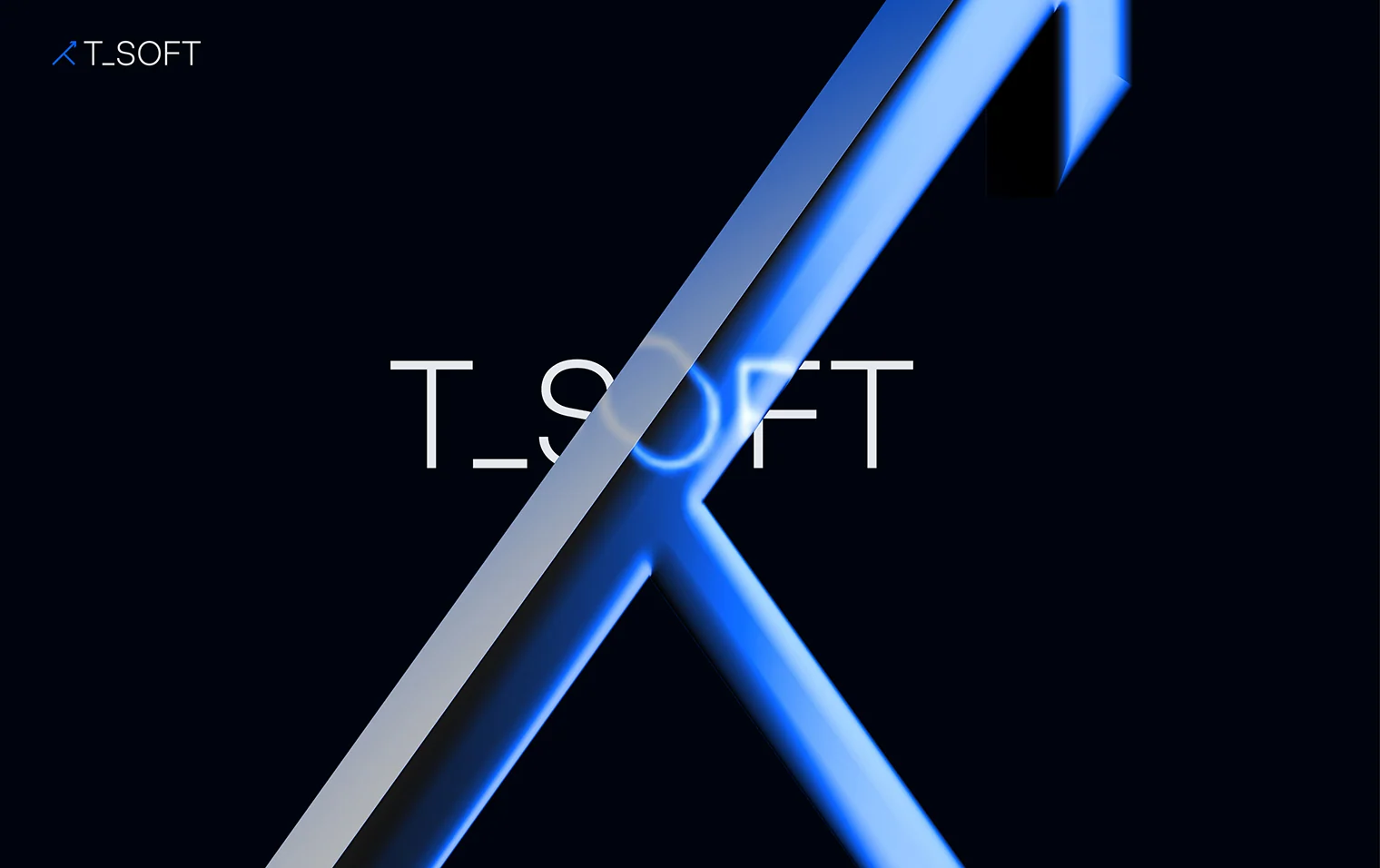
The brand arrow as a symbol of movement and managed growth
T-SOFT dynamic composition
Dynamic composition · moving arrows
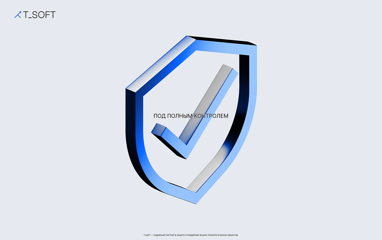
T-SOFT shield
Protection and risk prevention
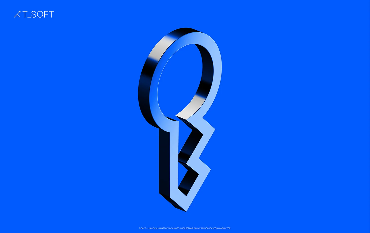
T-SOFT key
The key to seamless IT project management
Ring of T-SOFT brand arrows
Modular arrow system

Digital and motion

Identity works in motion

The arrow becomes both a mark and a principle of movement: directing attention, organizing compositions, and connecting interfaces, presentations, and video in one system.

The brand system in a motion scene
Digital concept and interface scenarios
Communication for industrial audiences

Application system

From the operator's screen
to business stationery

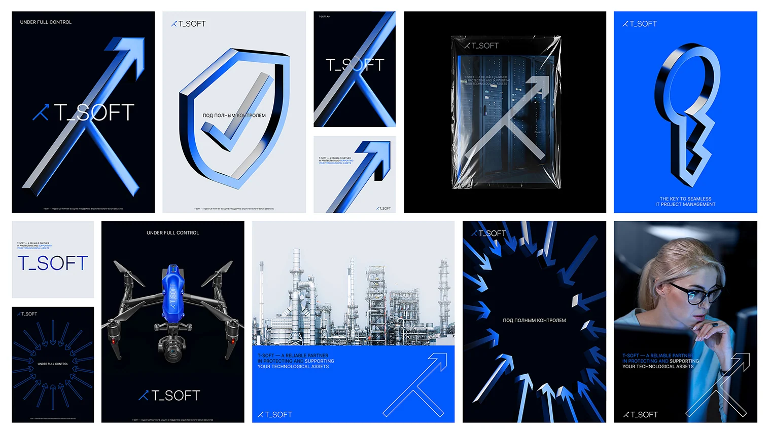
The visual system was developed across key touchpoints: presentations and digital communication, business materials, apparel, and corporate environments. Below are design concepts and application visualizations.

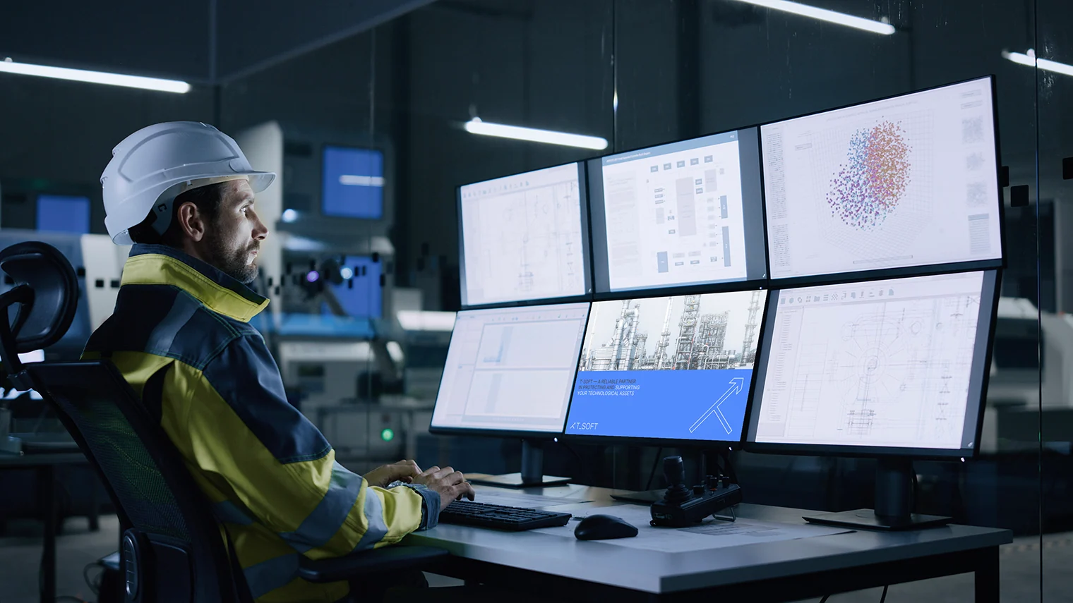
Industrial control center in T-SOFT communication
Product context: industrial process control
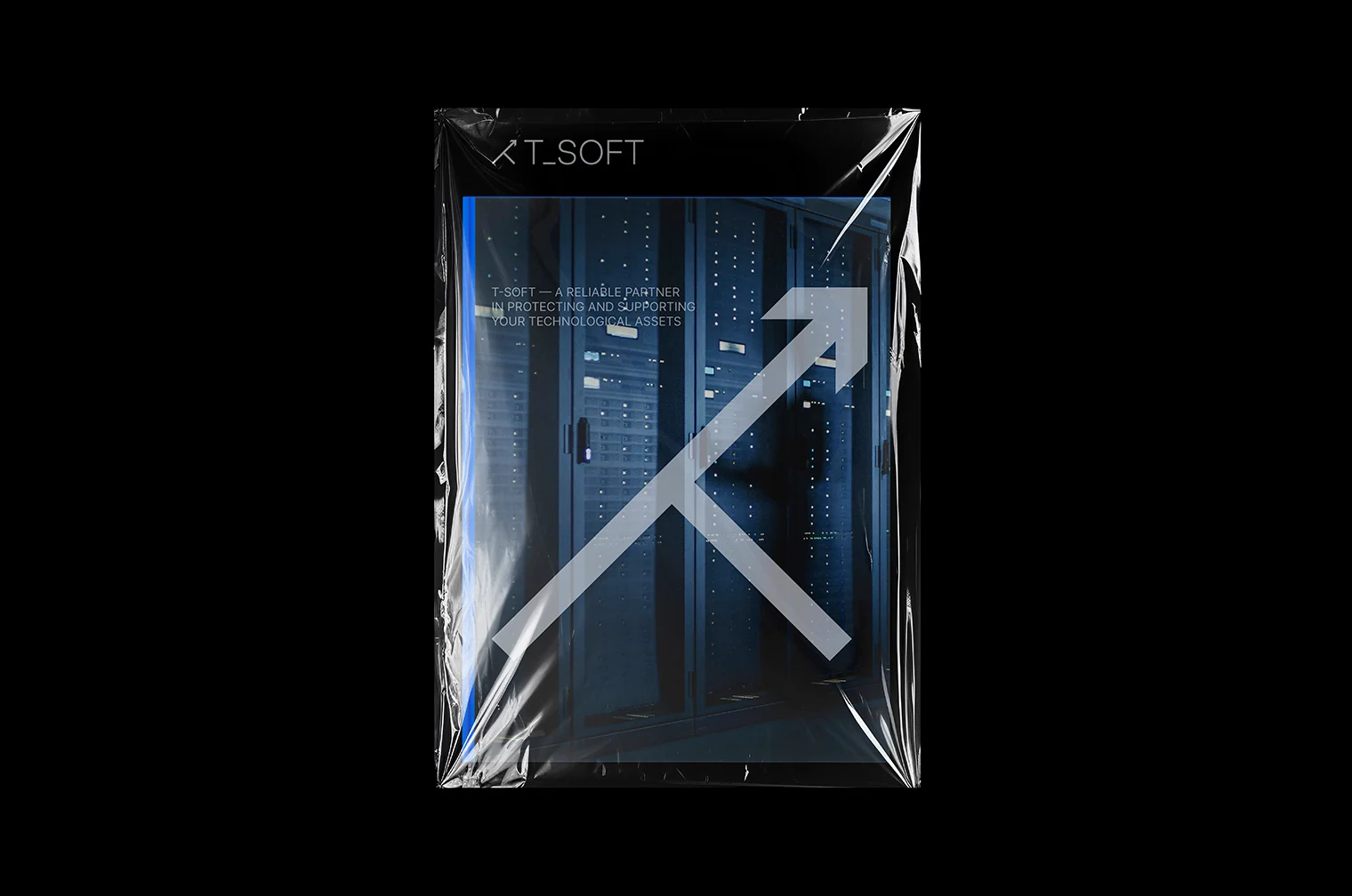
Server rack in a T-SOFT packaging concept
Object-based communication
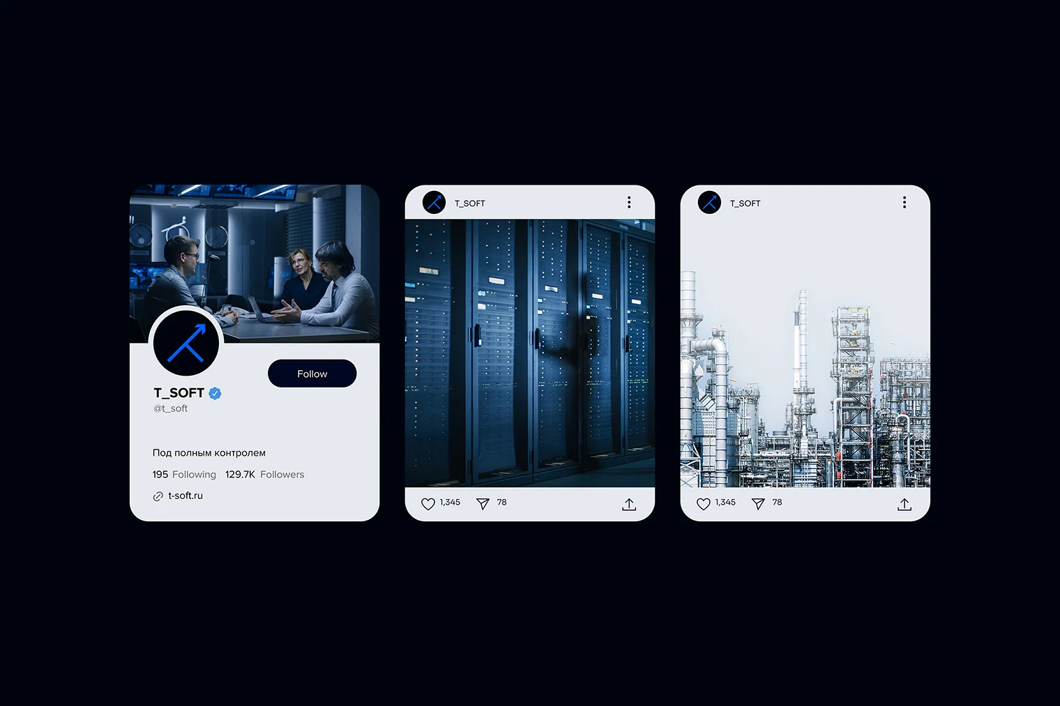
T-SOFT social media concept
Digital communication system
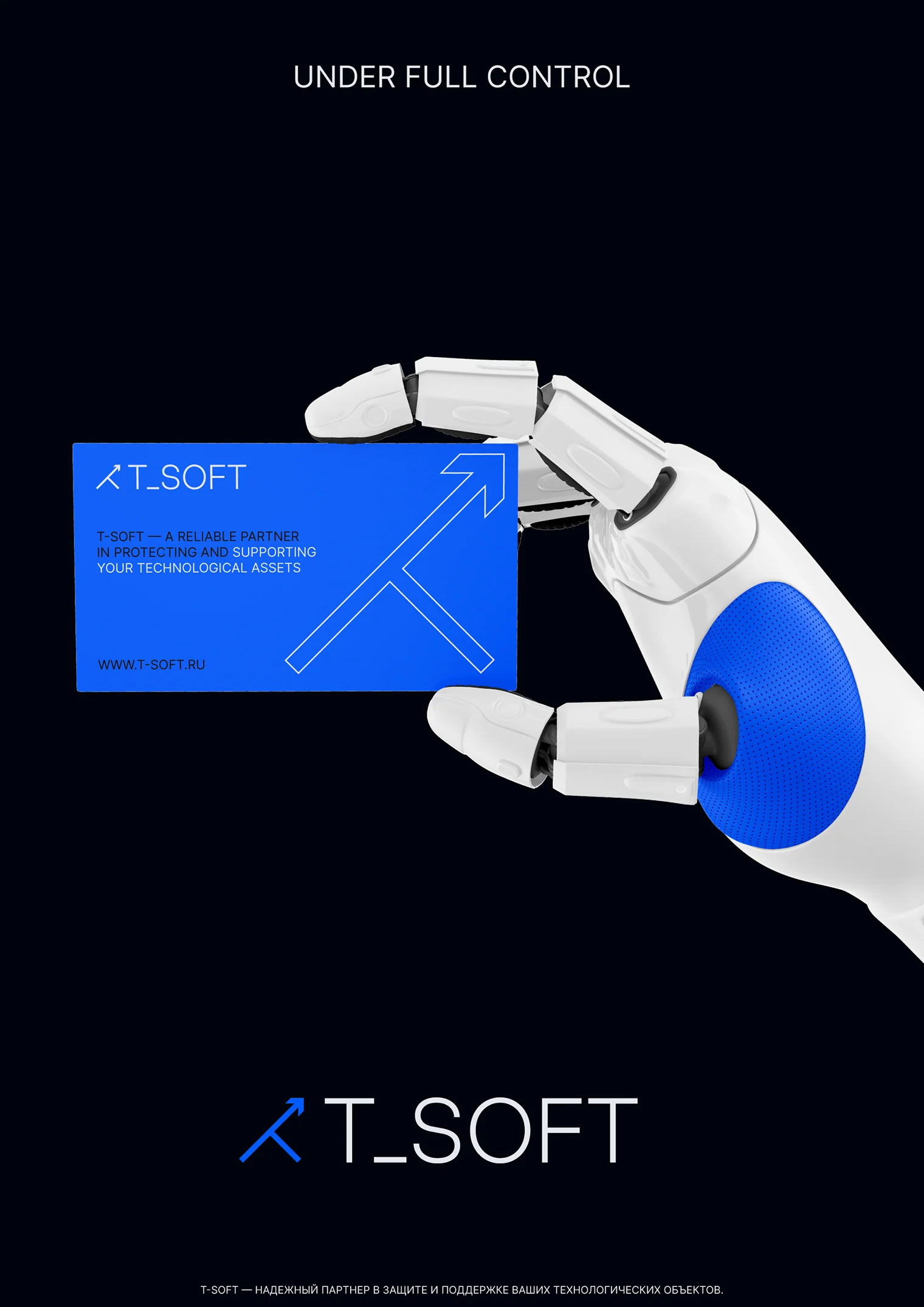
T-SOFT business card in a robotic hand
Business stationery
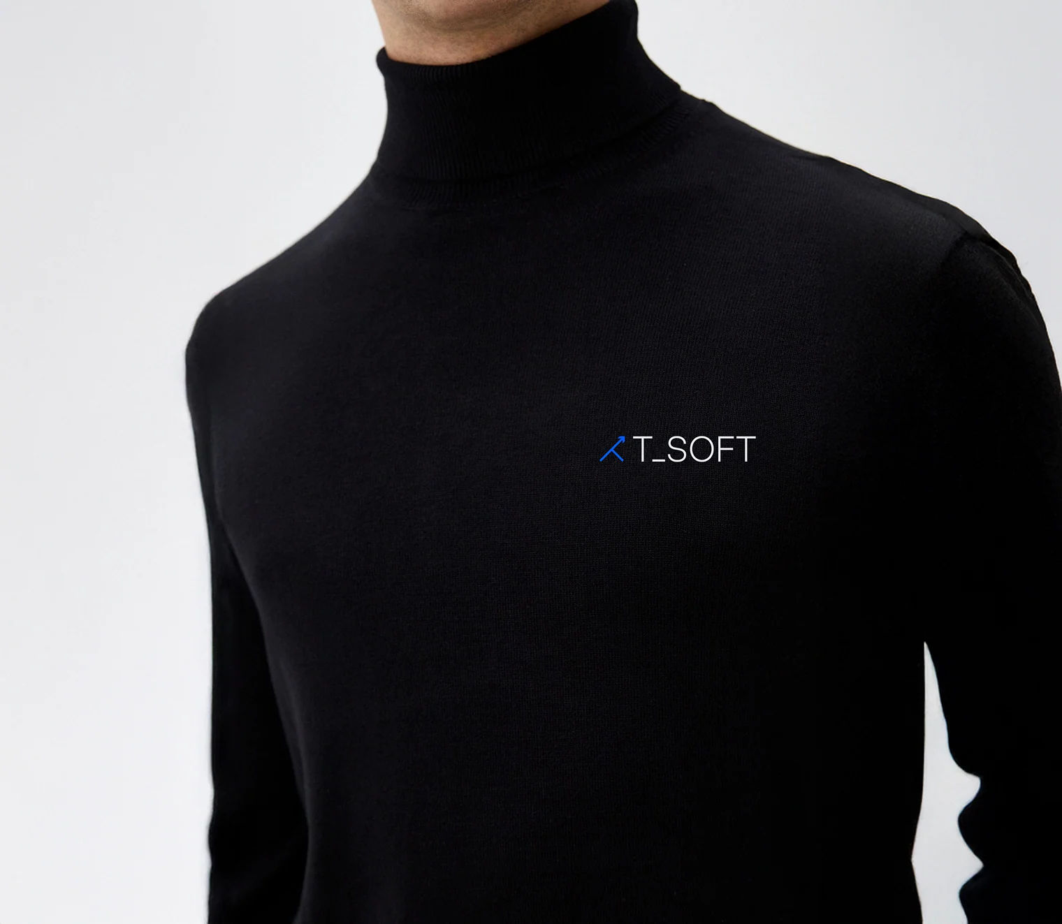
T-SOFT branded clothing
Branded clothing
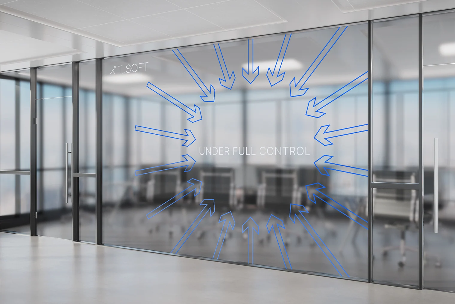
T-SOFT brand graphics on a glass partition
Corporate environment
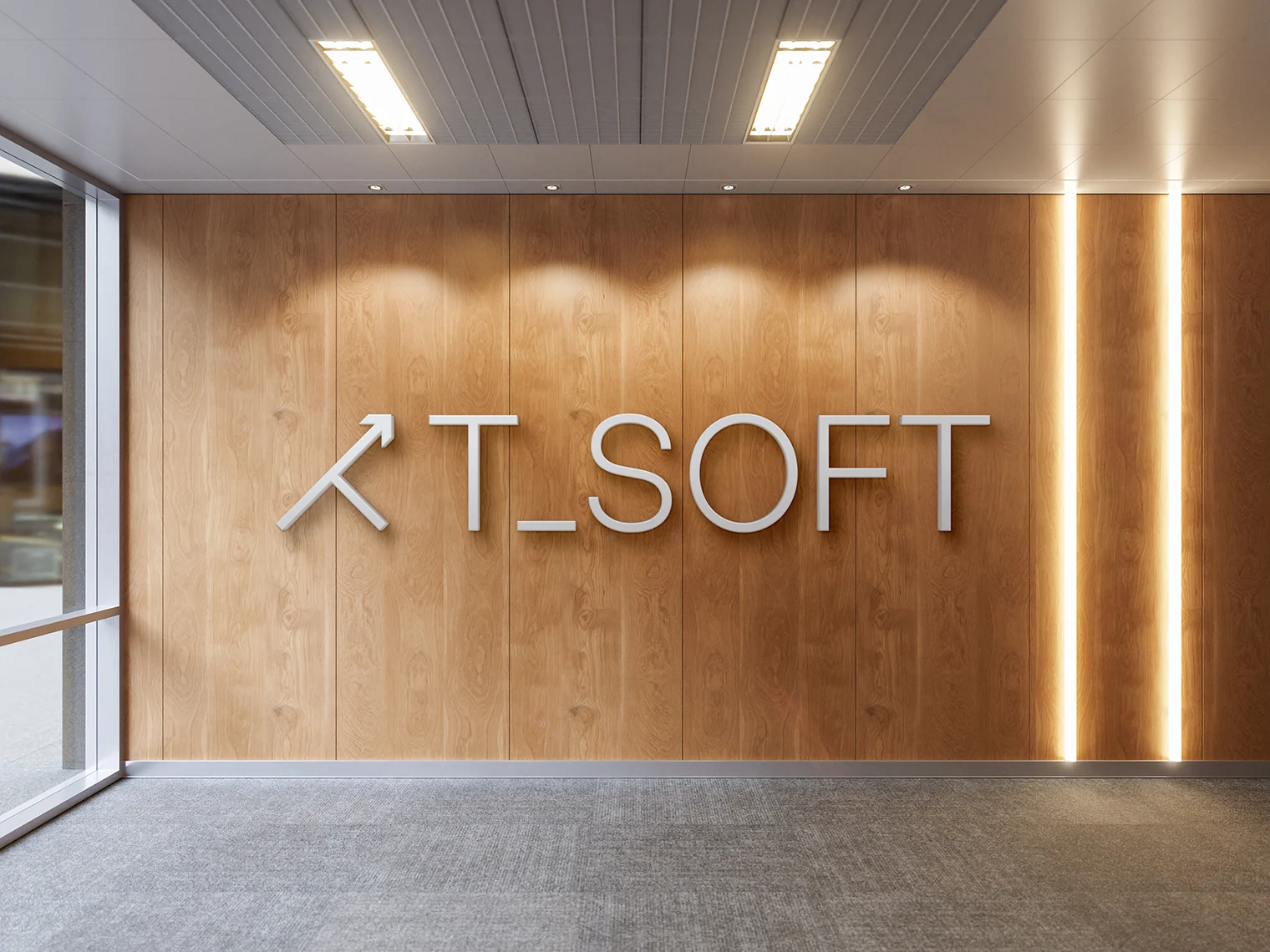
T-SOFT logo in an office space
Office wayfinding
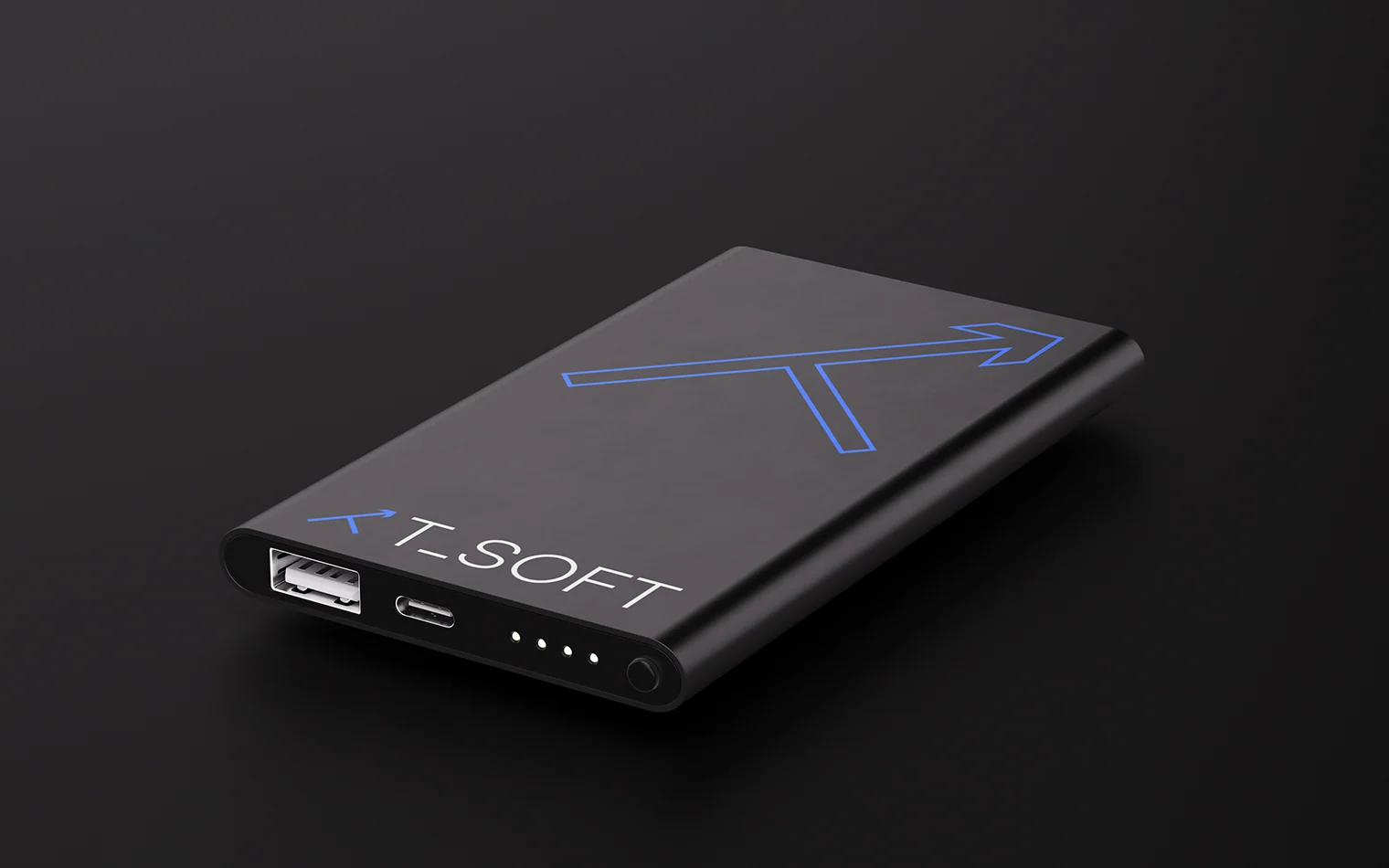
T-SOFT branded power bank
Corporate application
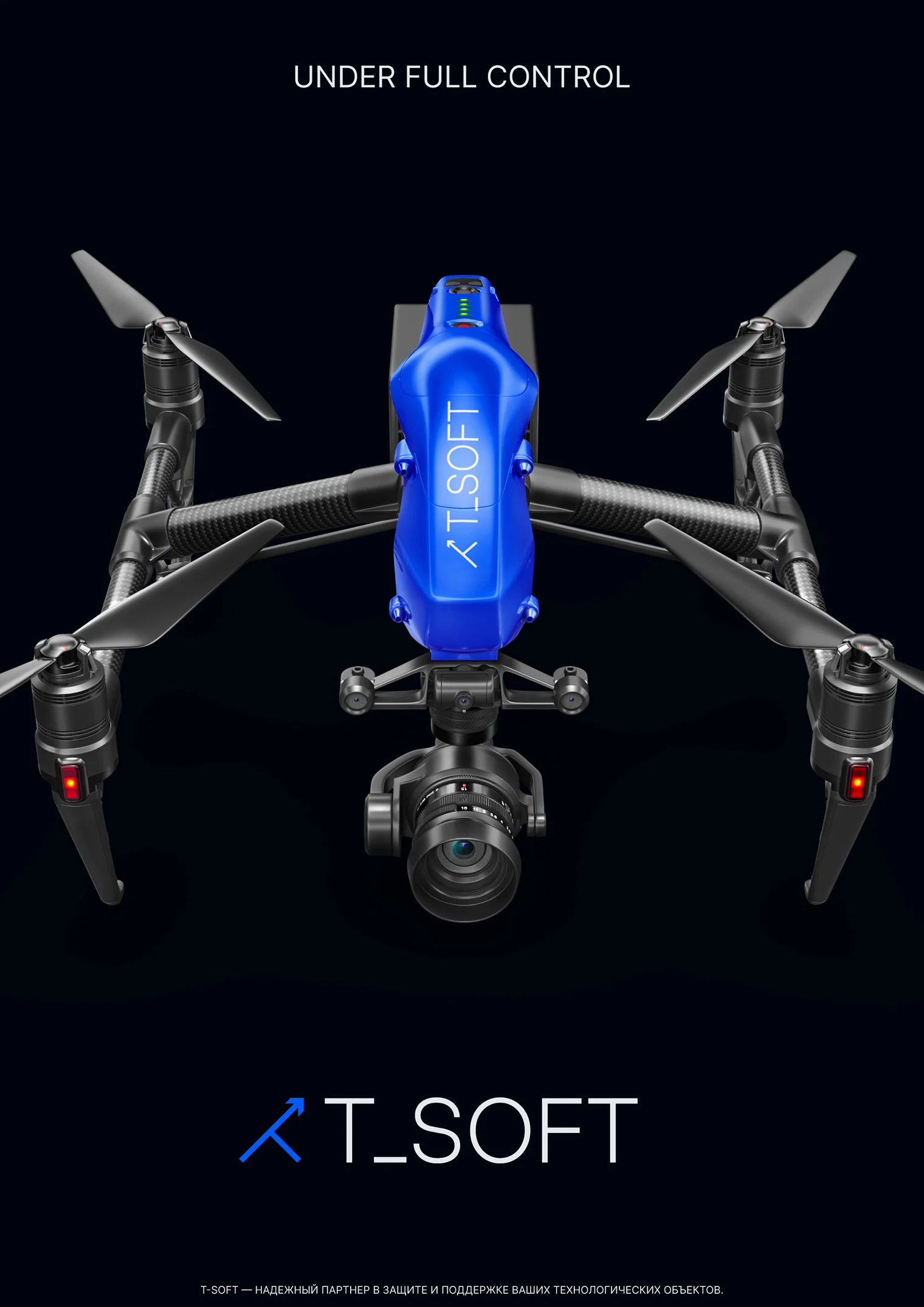
Drone in the T-SOFT brand style
Object-based communication

Project outcome

Strategy and form
brought together in one system

The brand book brings together strategy, communication principles, tone of voice, and visual system usage rules.

These guidelines support consistent brand development, from website and presentations to business materials and corporate environments.

  • Updated positioning and mission
  • Brand platform and values
  • Archetypes and personality
  • Core message and communication tone
  • Logo and visual language
  • Motion principles and digital scenarios
  • Brand guidelines and application system
T-SOFT

Efficiency and safety
through innovation and technology.

Under full control

Project team

GORYANIN BROTHERS × T-SOFT

Alexander GoryaninStrategy, positioning, brand platform, and semantics
Evgeny GoryaninArt direction, logo, visual system, motion principles, brand book
This page presents the rebranding concept and visualizations of identity applications.

The first conversation

A technology product needs an image that matches its scale

Tell us what has changed in your company and where the current brand no longer reflects the business. We will start with the challenge and determine what to build first.

Discuss your challenge
Telegram@goryanin_aEmaildesign@goryaninbrothers.ru
OfficeSt. Petersburg
Atlantic City, 126B Savushkina Street