

Connection
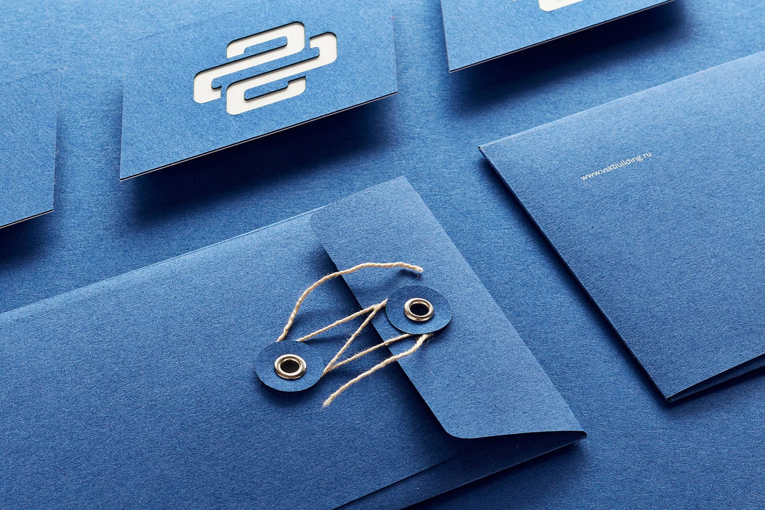
Two directional forms come together in one symbol, like different disciplines within one project.
 Contact
Identity · website · copy · photography
Technically complex spaces in one brand language.
VSK BUILDING / St. Petersburg
We developed the visual identity for VSK Building, a St. Petersburg construction company that designs, builds, and renovates buildings, creates engineering systems, and equips technically complex public spaces.
The company works with medical facilities, educational buildings, and infrastructure where construction quality directly affects people's safety. The new identity needed to reflect that level of responsibility.
Later, we designed and developed the entire website, wrote the copy, built stories around completed projects, and worked with photographer Anatoly Vasilyev to photograph them.

Visual identity
We built the system on a contrast of white and cool blue, disciplined lettering, and a modular mark. It connects construction logic, movement, and interrelated engineering processes.
The identity needed to work equally well on documents, construction sites, vehicles, and equipment—as an identification tool rather than decoration.


Two directional forms come together in one symbol, like different disciplines within one project.
The module scales from a small business card to vehicles, wayfinding, and digital interfaces.
A cool palette and clean typography support the image of a responsible, technology-driven company.

Applications
Quality materials, die-cutting, embossing, and thoughtful construction emphasize VSK Building's professional standards. Practical applications remain restrained yet recognizable.




Full website development
We developed the complete VSK Building website: architecture, interface, responsive system, copy, and case study structure. Large typography, a dark environment, and a precise grid define its visual language.
The first screen turns the brand symbol into a living object. Below, the full home page works inside the case study, scrolls in its own window, and does not depend on an external website loading.
Copy and content
We rebuilt the company's language around concrete outcomes: what was done, in what context, and which problem each building solves. This makes engineering expertise understandable without advertising noise.
The website demonstrates the company's scale through projects, details, and accountability rather than simply describing it.

Photography of completed projects
We assembled fifteen project case studies for the website. The photographs document not only completed spaces but also engineering solutions, wayfinding, and use scenarios.


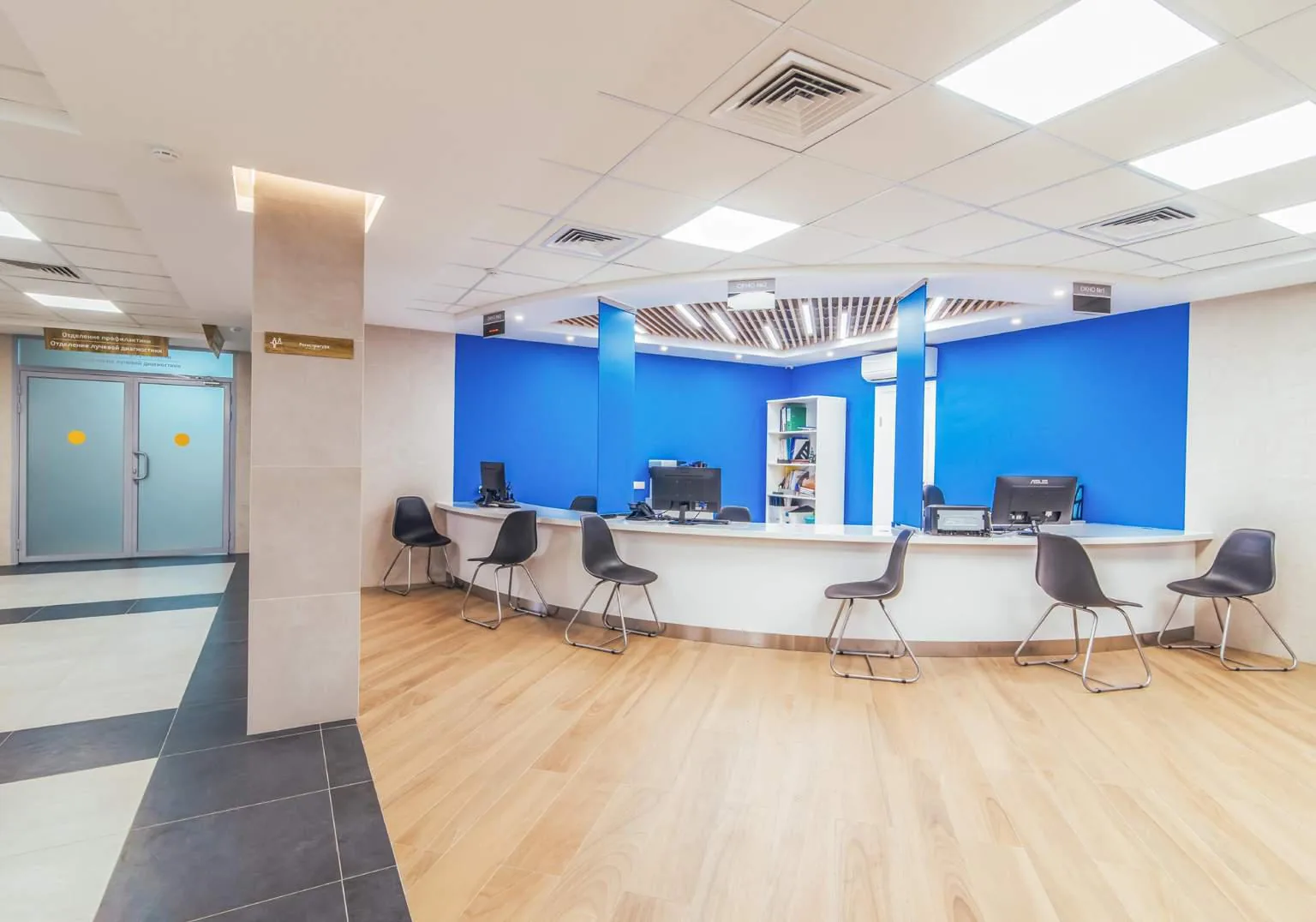


Photography — Anatoly Vasilyev with the GORYANIN BROTHERS team.
Project outcome
We started with the identity and extended it into a complete communication environment. The mark, print, vehicles, website, copy, and photography now speak the same language.
The system needs no separate “branding” layer: it is embedded in the company's everyday work, from first contact on the website to the team's presence on a construction site.
Project team
Next case study
Another project bringing brand, digital, and a spatial concept into one system.
View ORBIT360 Next project ↗
The first conversation
Tell us where your company's image no longer reflects its work. We will start with the challenge and build a system that holds up both online and on site.
Discuss your challenge