

Yourbackpack
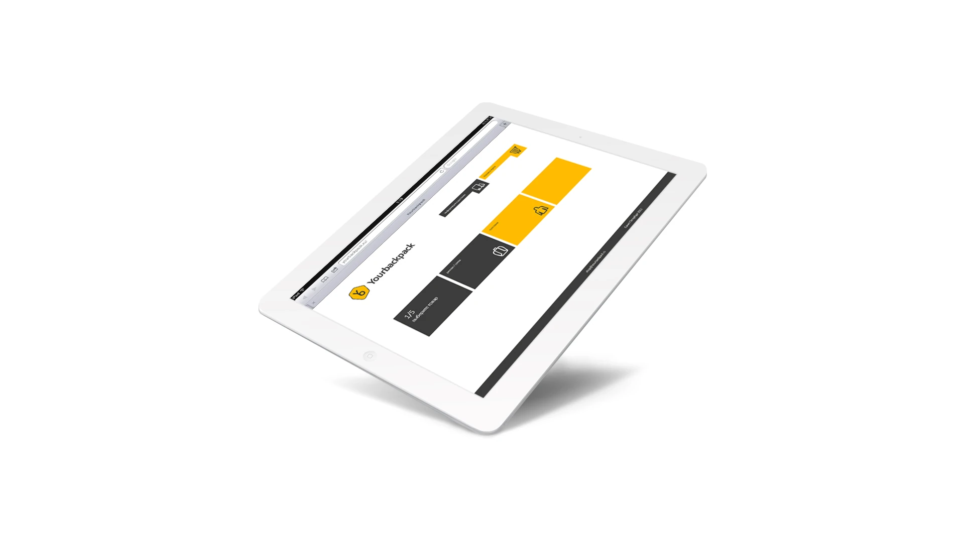
We created an identity and a clear online store interface that turns choosing into a short journey.
Context
A simpler path to choosing
Yourbackpack is an online store for young people. Our goal was to make its interface intuitive and easy to use.
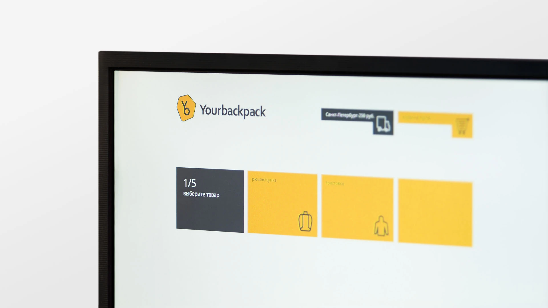
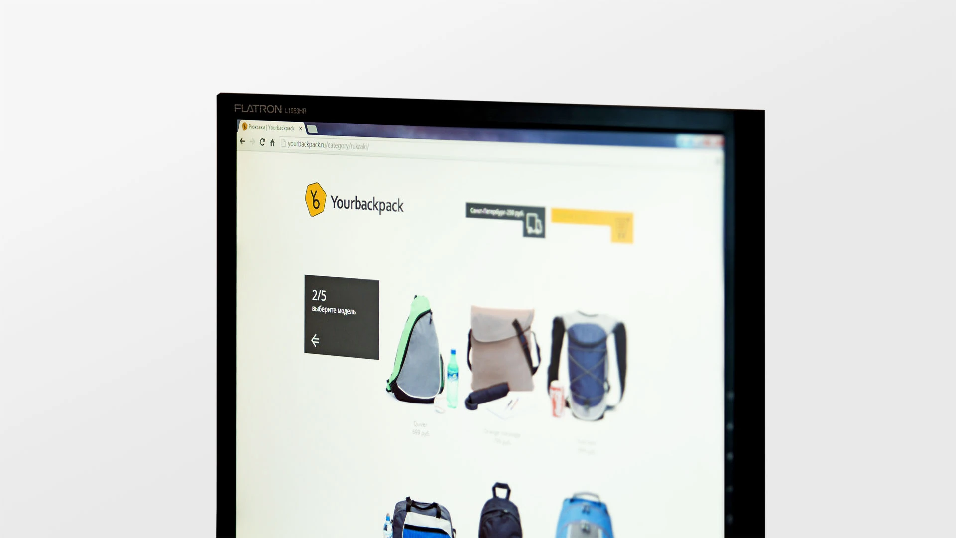
We built a clear sequence: simple forms, contrasting colors, and numbering help people quickly understand the next step.
Brand mark
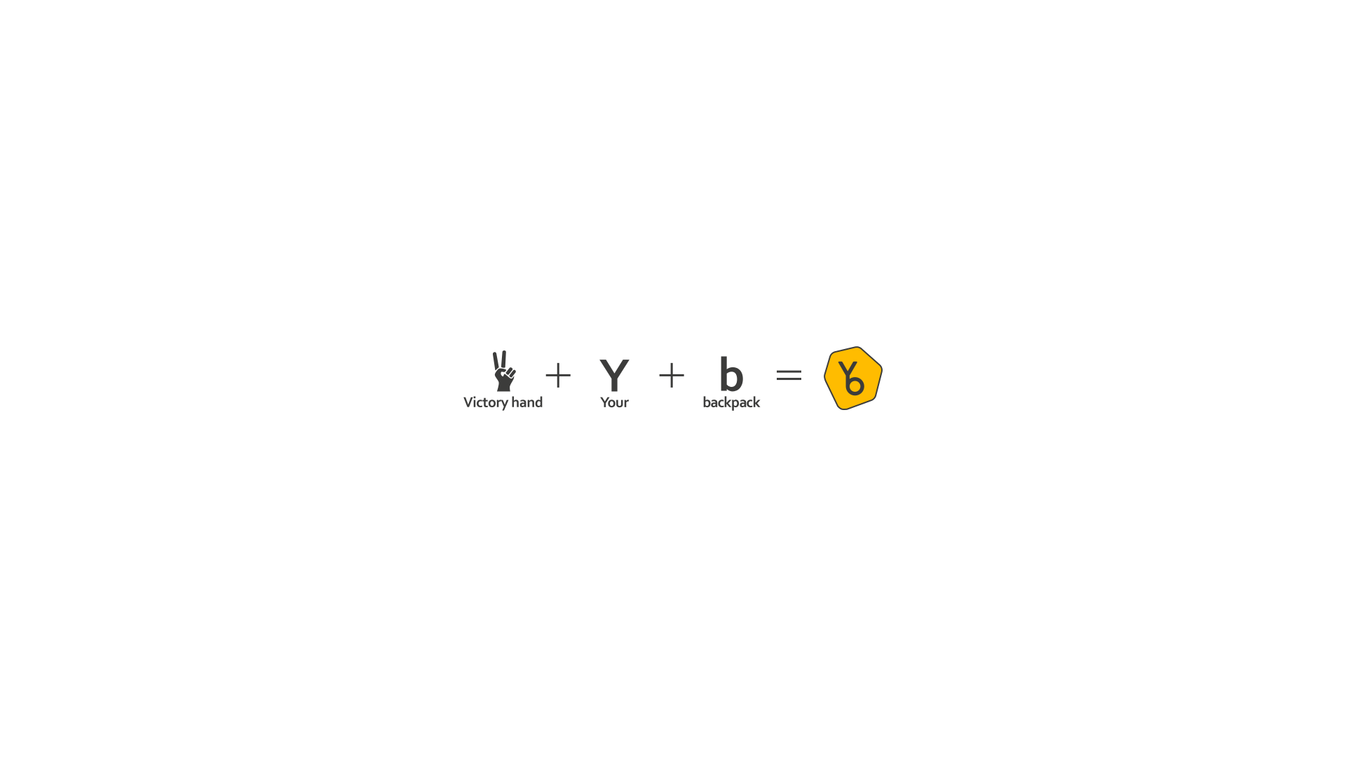
Y + b become a victory gesture
An uppercase Y and lowercase b sit inside an irregular hexagon. Together they resemble a victory hand gesture, a message of victory and peace familiar to a young audience.
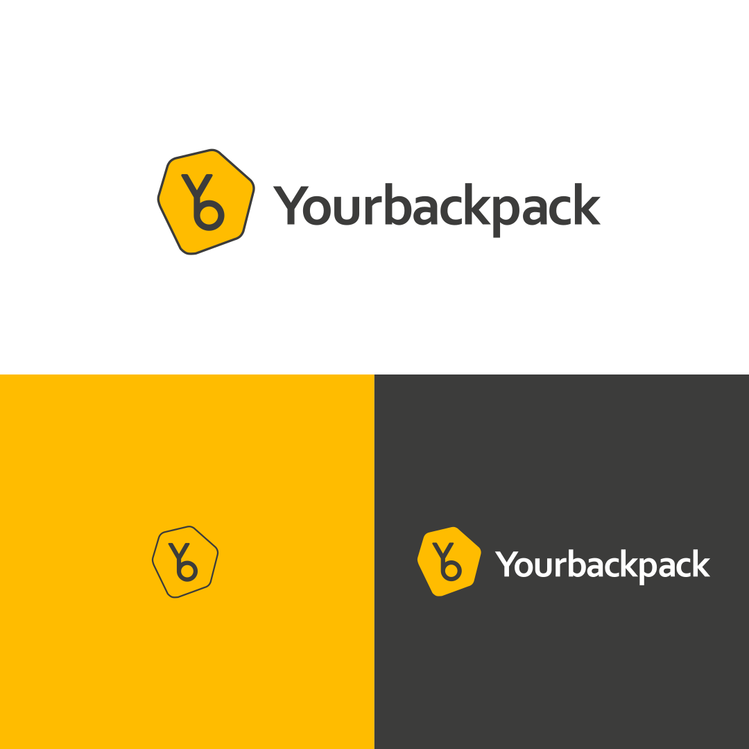
#ffbc00Graphite
#3c3c3bWhite
#ffffff
Online store UX/UI
The interface explains the journey step by step
Dark, warm graphite supports the primary yellow, a color of energy and activity. Geometric blocks and page numbers maintain hierarchy and guide visitors to the product.
Applications
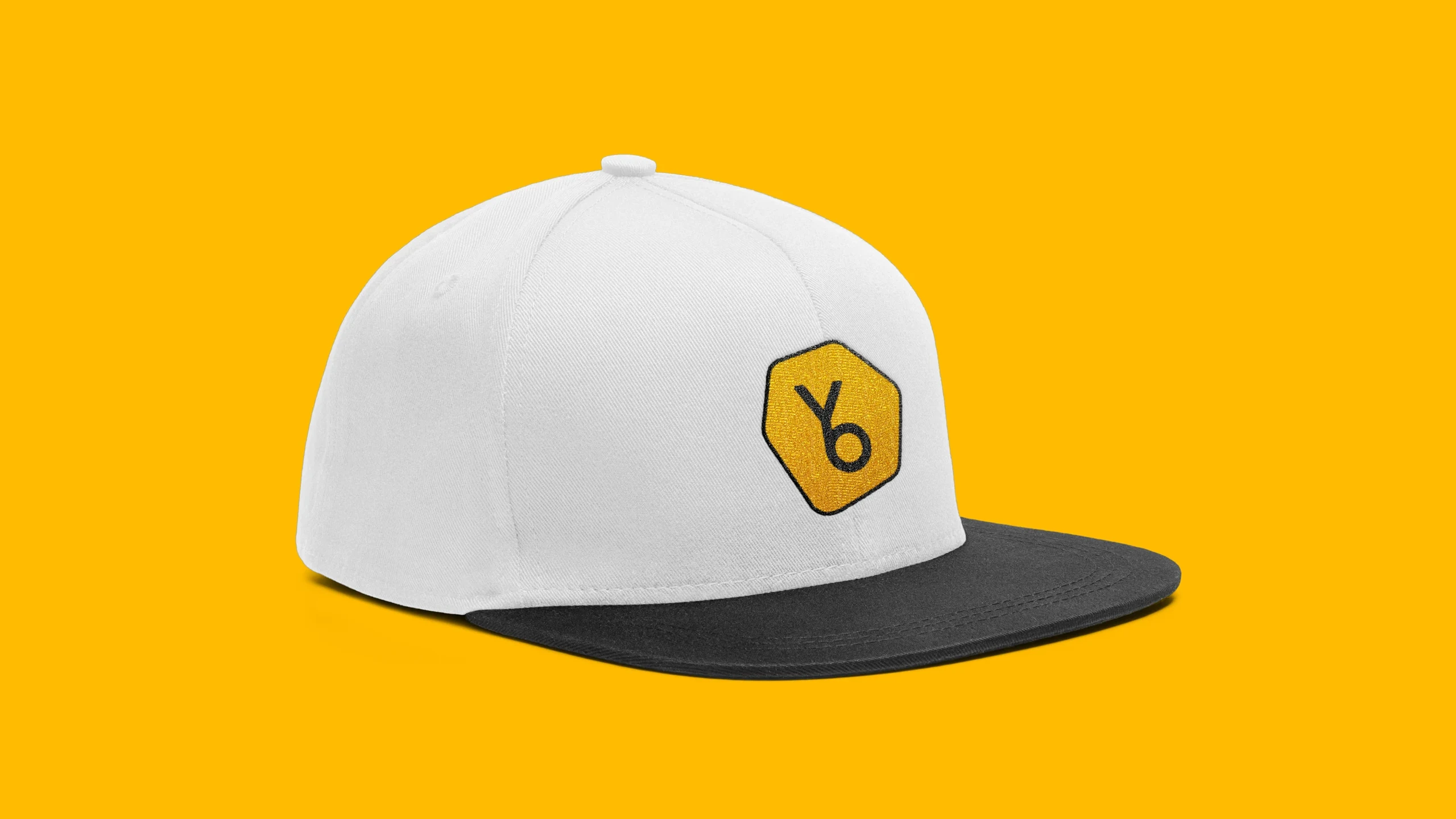
The symbol stays visible at every scale
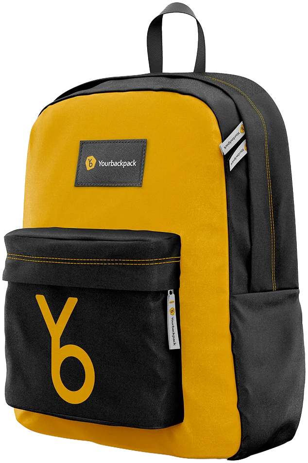
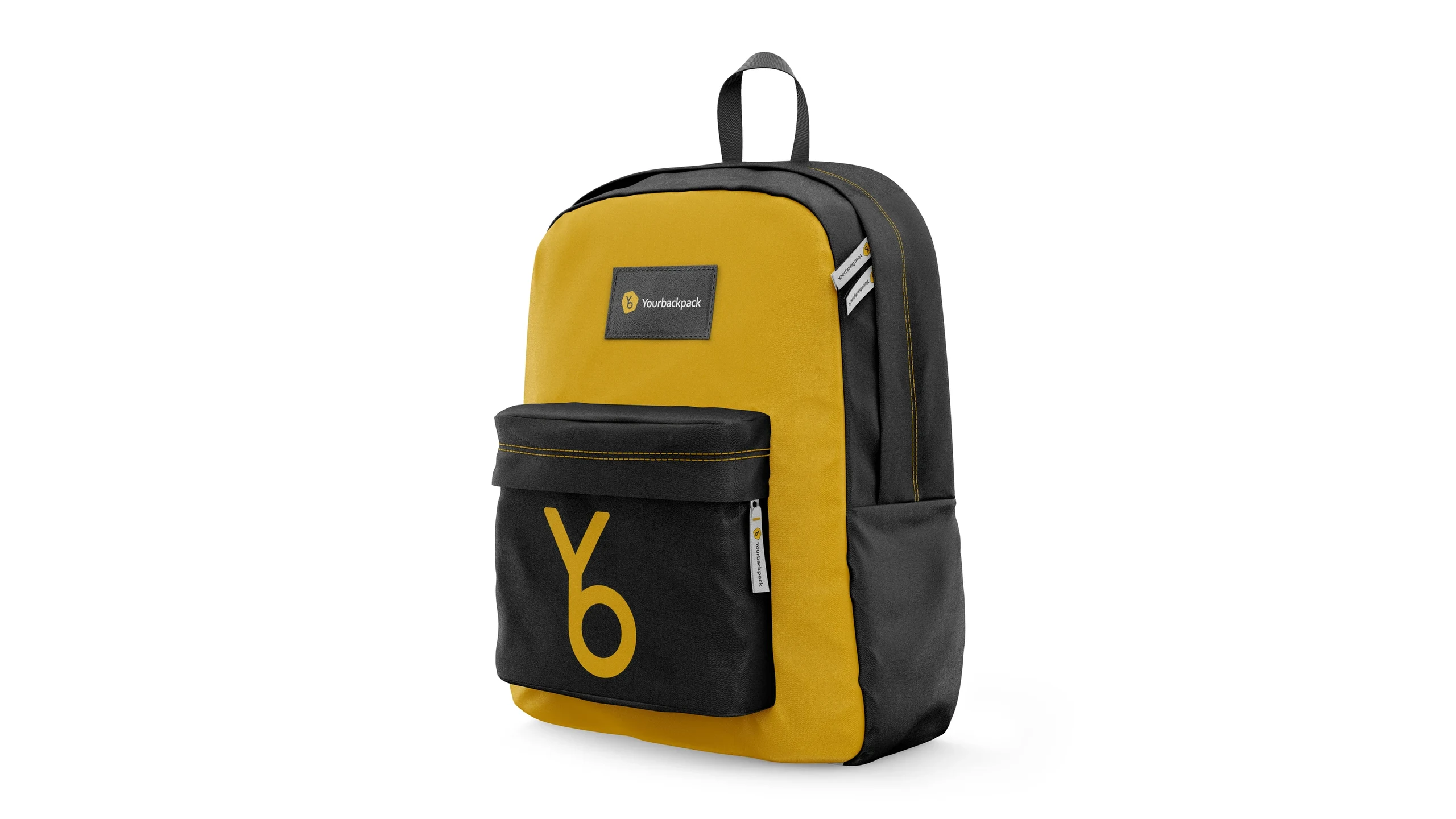
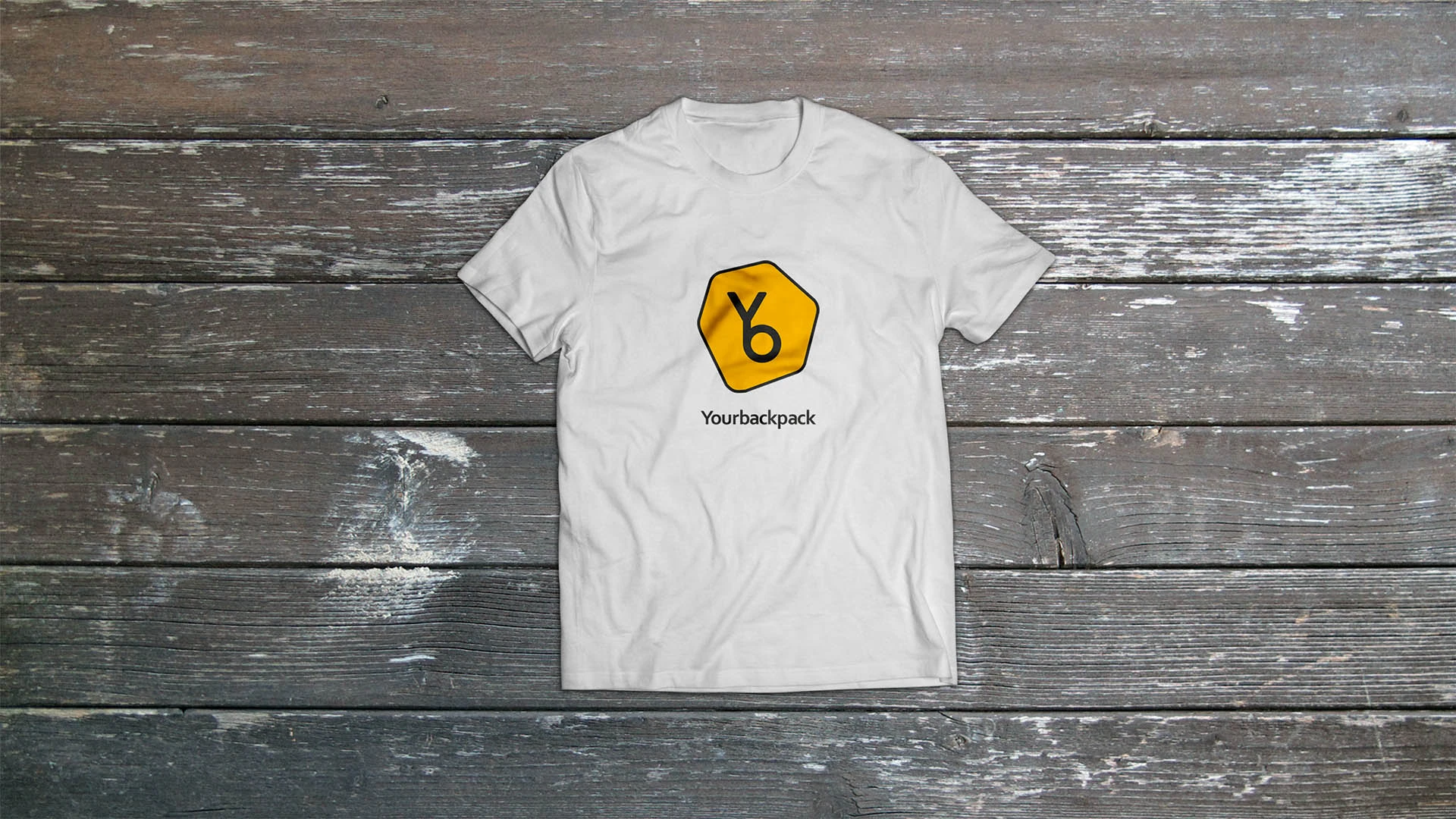
The high-contrast system moves easily from screens to objects, working as both a small patch and a large graphic.
Outcome
One character, from symbol to purchase
Identity and interface form one system: high-contrast, energetic, and clear at every step of choosing.
- Logo and symbol
- Brand palette
- Store UX/UI
- Navigation system
- Brand applications
The first conversation
We will create a short route to your product
Tell us about your project. We'll connect identity, interface, and communication in one working system.
Discuss your challengeAtlantic City, 126B Savushkina Street