
Identity for a medical research organization
Nonprofit
RNIM
We developed an identity for an organization advancing medical research.

The brief
A visual language where medicine meets technology
The organization's name explained its field but did not create a distinctive visual identity.
We made the symbol the focal point of the identity and built a cohesive system around it: logo, palette, graphics, photography guidelines, physical applications, and digital.
The look needed to feel contemporary and medical without becoming sterile or anonymous: clean, bright, fresh, and minimalist.

The idea behind the mark
A Petri dish and a circuit board come together in one symbol
The organic circular shape evokes the study of life, while the rhythm of the lines suggests technology, data, and precision.

The apex and crossbar of the A, the crossbar of the Cyrillic N, and the tapered O echo the symbol's lines. The symbol and wordmark therefore read as a unified structure.

Brand system
Blue and cyan create a clean, technological character
Deep purple creates contrast, while pale tones give the system breathing room and medical clarity.
#1E0E68Deep violet#0079E0Research blue#45D0E6Cyan#E7F7FALab air


Contrast
Bright medical imagery sits alongside deep fields of color.
Brevity
Information is presented simply and boldly, without unnecessary decorative layers.
Consistency
The symbol's lines become a pattern that maintains recognition in any format.
Brand applications
The system works from business cards to presentation materials
A shared layout, color, and pattern connect business documents, print, merchandise, and exhibition formats.


Website and social media
One visual rhythm connects desktop, mobile, and social posts
The single-page website introduces the organization. Contrasts and concise sections make a complex subject approachable and clear.

The system at scale
The mark retains its character at large scales
We tested the identity in environmental and vehicle visualizations: the contrasting color pair remains visible from a distance.
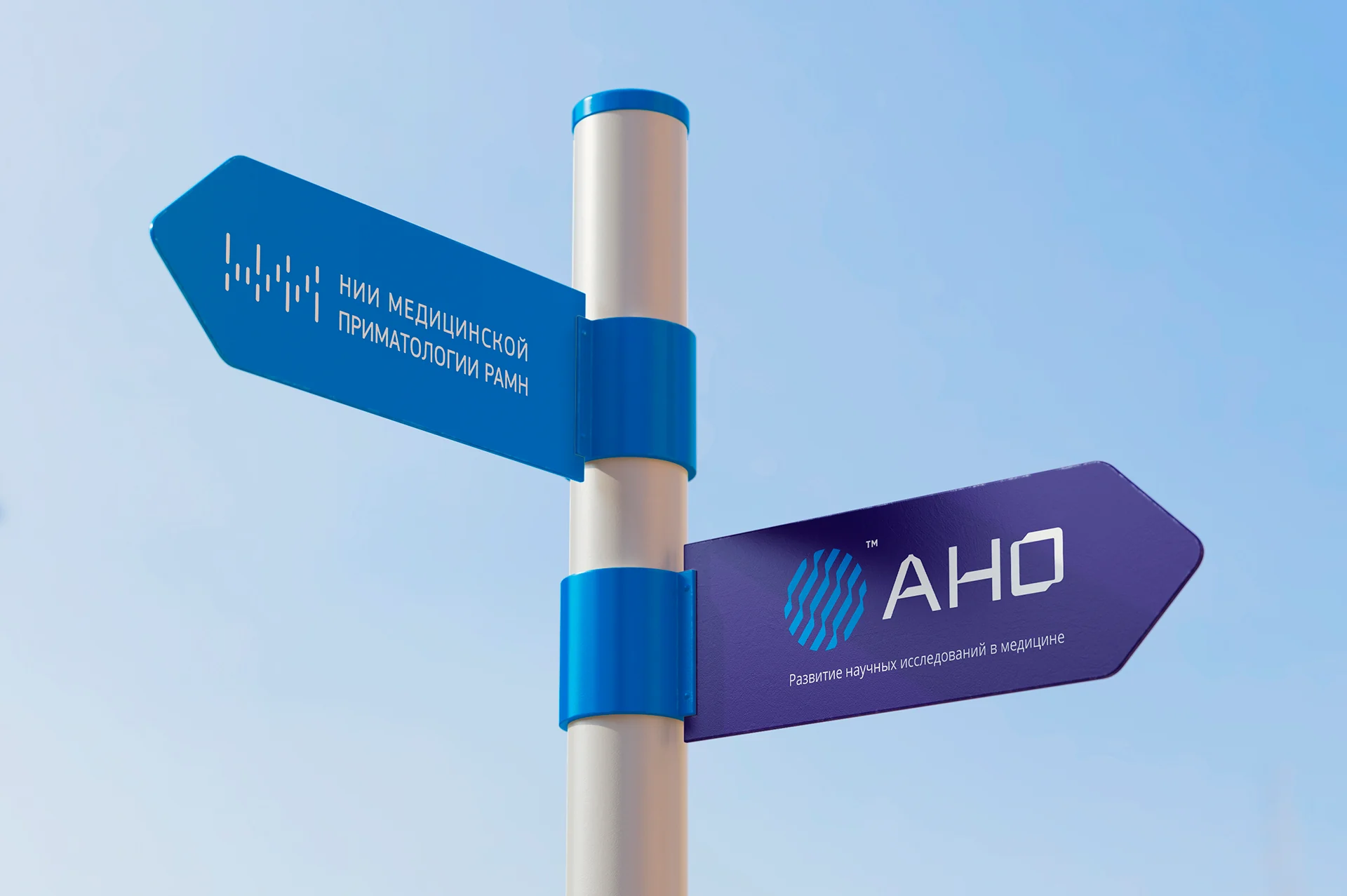

These images show conceptual applications of the identity, not evidence of actual implementation.
Project outcome
One symbol became the foundation of a coherent medical research brand
The mark combined laboratory and technology references, while custom lettering carried its character into the name.
The palette, pattern, photography, and layout guidelines brought fragmented communications into a recognizable system, from documents to the website and social media.
- Brand mark and original lettering
- Logo and usage rules
- Palette, pattern, and brand photo treatment
- Typography system
- Brand guidelines
- Business, advertising, and merchandise applications
- One-page website and mobile version
- Social media post templates
Project scope
GORYANIN BROTHERS × RNIM nonprofit
Related healthcare case study
Research Institute–Regional Clinical Hospital No. 1
Identity and wayfinding for a major medical complex: a mark, color coding, 3D map, and signs.
Explore the case study Medical identity ↗
The first conversation
Complex subjects need a clear visual language
Tell us about your challenge, audience, and brand environment. We will identify where to start: with the mark, system, applications, or digital experience.
Discuss your challengePhone+7 921 791-93-18
OfficeSt. Petersburg
Atlantic City, 126B Savushkina Street
Atlantic City, 126B Savushkina Street
Scroll to explore the series