

Identity · packaging · 3D modeling · production
SPK / 18
Prigorodny agricultural cooperative
Premium packaging for a product with character.
View case studyThe brief
Identity and branded packaging for a cheese dairy
Category researchLogo and monogramGraphic systemPackaging concepts3D modelingPhotographyProduction preparation and manufacturing
The Prigorodny cheese dairy needed an identity that conveyed product quality before the first taste and worked equally well for everyday purchases and gifts.
We started with a monogram and built two connected systems around it. The dark premium line relies on materials, tactile qualities, and restrained graphics. The standard line distinguishes varieties through color and individual symbols.
We took the work from concept and 3D models to layouts, photography, and a production run in oak, ceramic, and cardboard.
The system's foundation
The SPK monogram became the cheese dairy's mark
Three uppercase letters form a compact symbol. It works on its own, inside a circular text border, and in a brand lockup with the name.




Color and typography
BLACKSILVER5265 C1235 C
GruyèreABRIL FATFACE · DISPLAY
The case study's editorial headings follow the GORYANIN BROTHERS system. Brand typography appears only within the identity and brand panel.
Premium range
Packaging in wood, ceramic, and cardboard
A premium product deserves packaging worth keeping. We built the system around weight, texture, and the sequence of opening, rather than decoration.


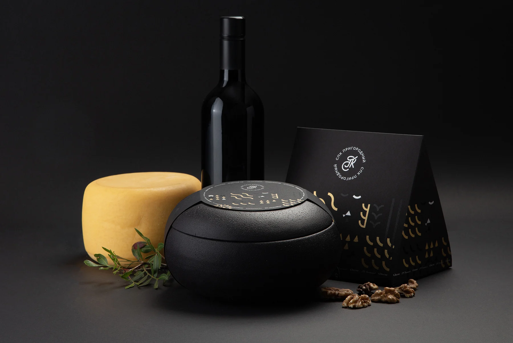

 Oakgift case body
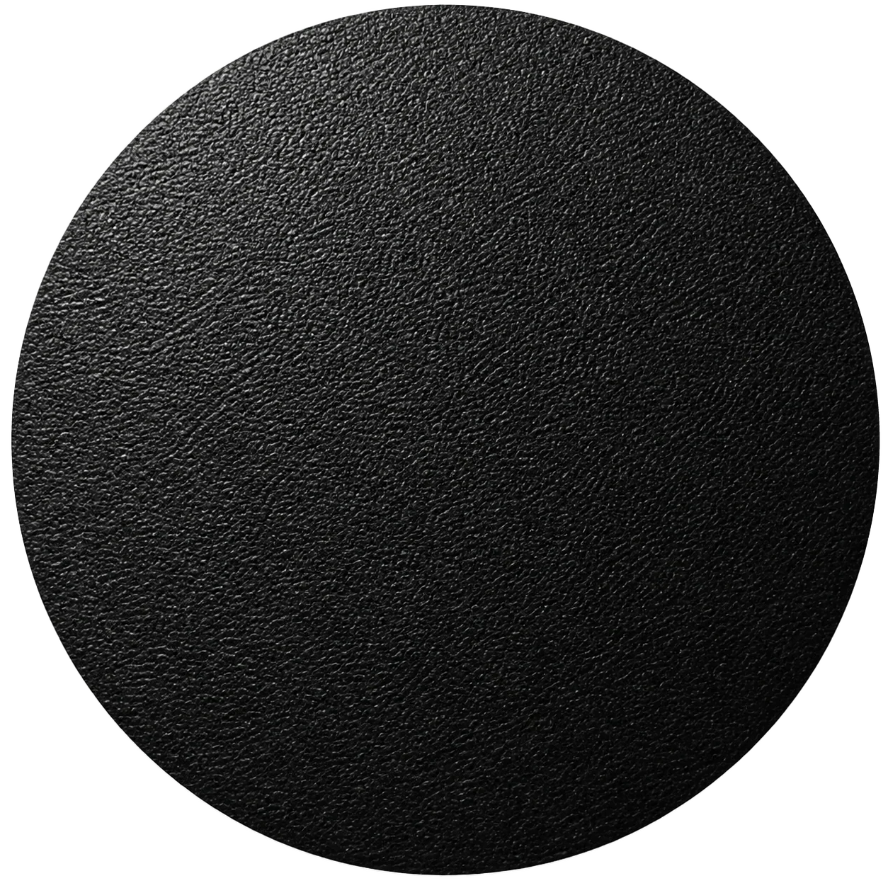 Leatherband and round label
 Black porcelaintwo-piece case
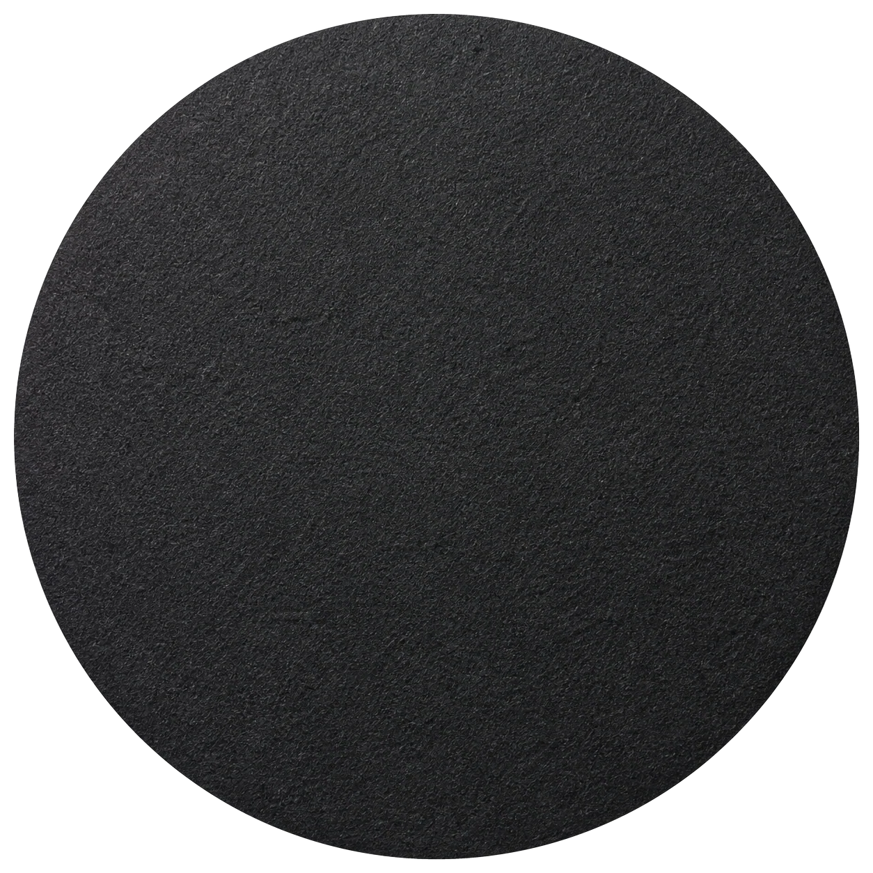 FedrigoniBlack Pepper, 250 g/m²
 PaperboardCrystal Pack, 250 g/m²
Packaging structure
From 3D model to manufactured production run
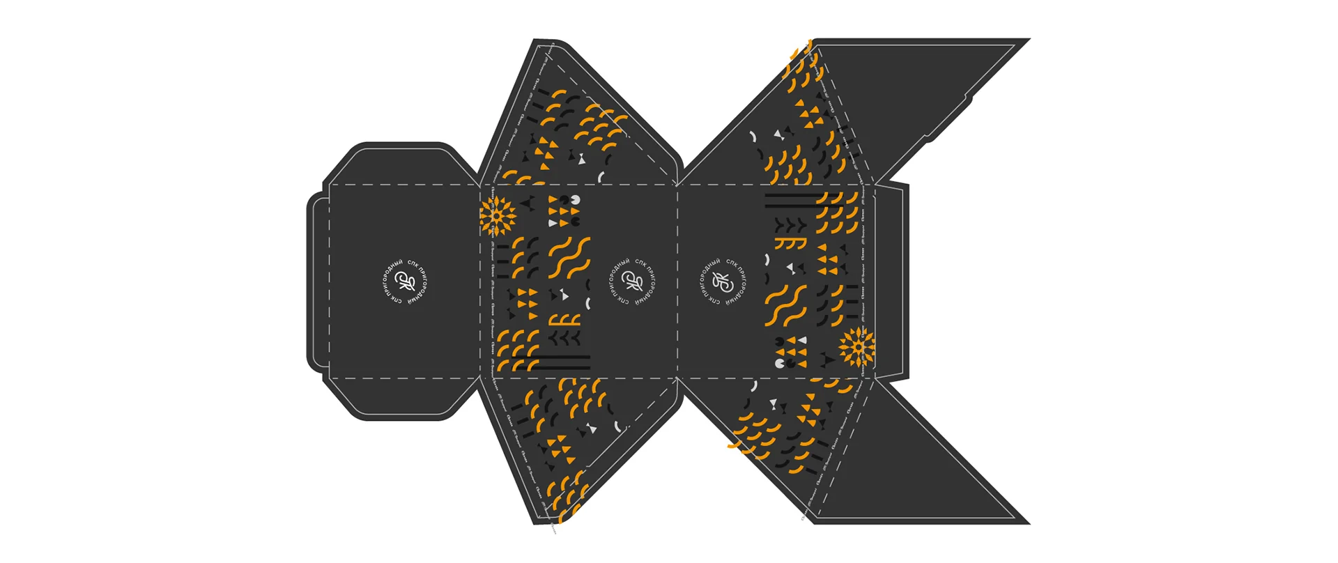
We developed the round case forms, prepared the cardboard prism dielines, and connected every structure to one graphic system.

Standard line
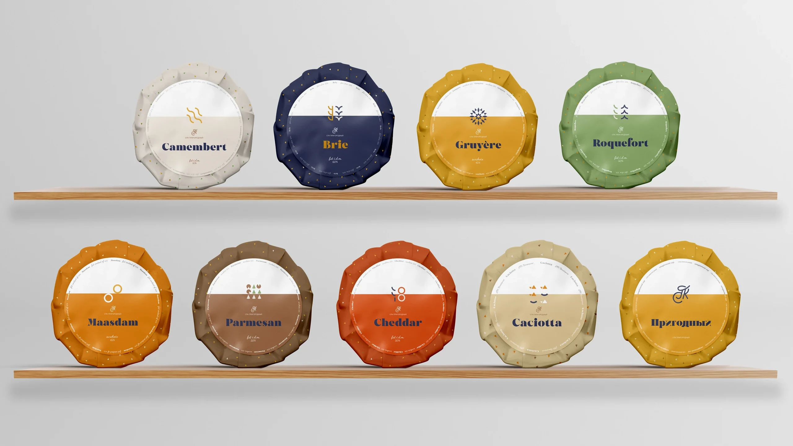
Each cheese received its own color and symbol
For the everyday line, we retained the monogram and variety symbols while making products quicker to choose. Eight segments can form a complete circle, like a selection on a cheese board.

Art direction and photography
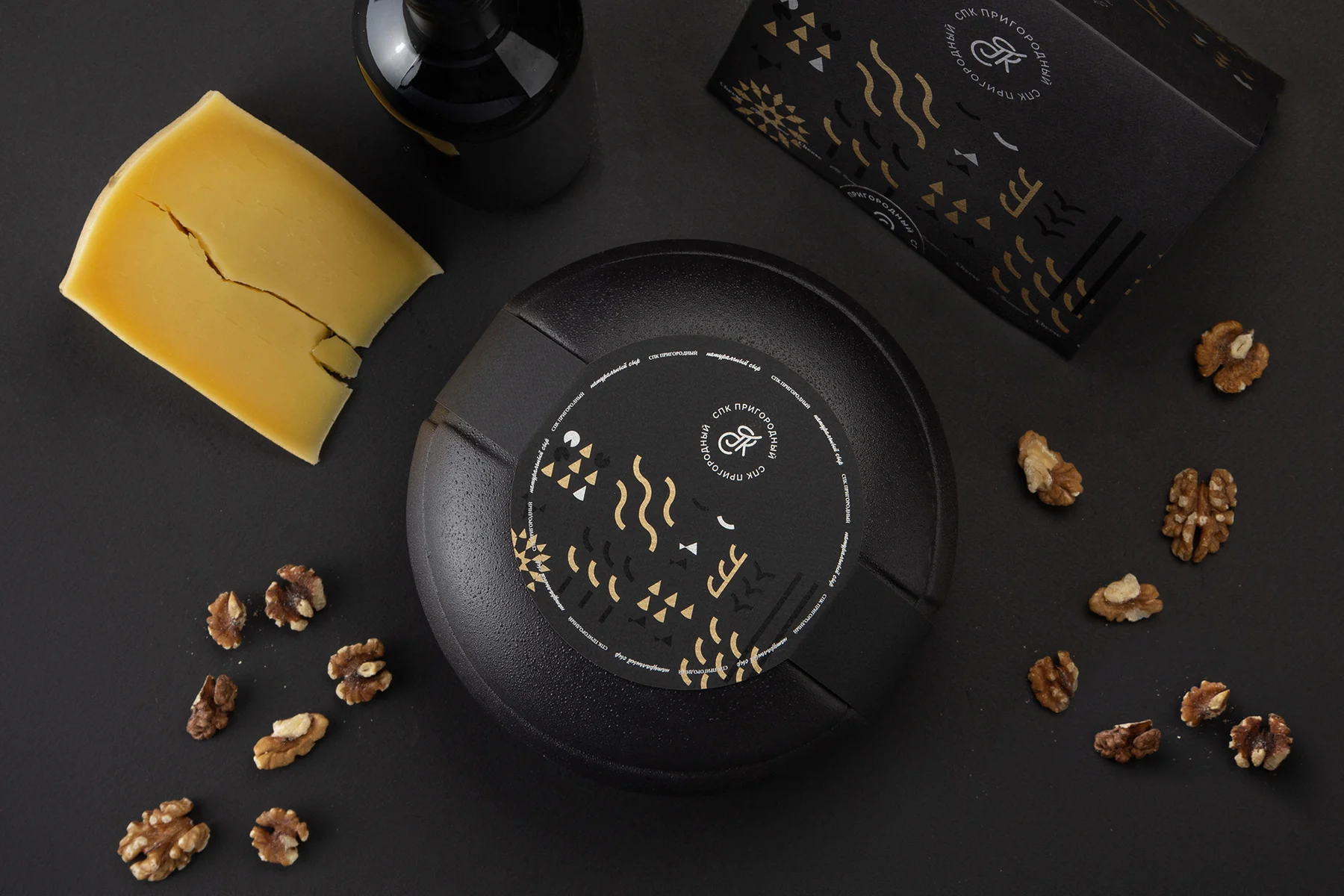
Material becomes part of the product's image
The still-life series shows both the packaging and the gift experience: dark wood, black ceramic, leather, cheese, and wine form a unified composition.



01 / 04
International recognition
Bronze
Pentaward
2021
FOOD · B.13
LIMITED EDITIONS

Gift packaging for the private creamery won bronze at Pentawards, an international packaging design competition. In 2021, the jury reviewed over 2,000 entries from 60 countries.
Project outcome
Packaging communicates value before the first taste
We created a complete system for Prigorodny, from a monogram and cheese variety symbols to two packaging ranges, engineered structures, and product photography.
The premium series turns the product into a gift through its materials and the ritual of opening it. The standard line helps shoppers quickly distinguish varieties while recognizing the producer.
- Logo, monogram, and brand lockup
- Graphic element and eight variety symbols
- Premium and standard ranges
- Wooden and ceramic cases
- Cardboard prism and labels
- 3D modeling and technical layouts
- Manufacturing the production run
- Art direction and photography
Next case study
HANDWICH
Identity, packaging, communication materials, and sonic branding for a fast-food sandwich shop.
View project →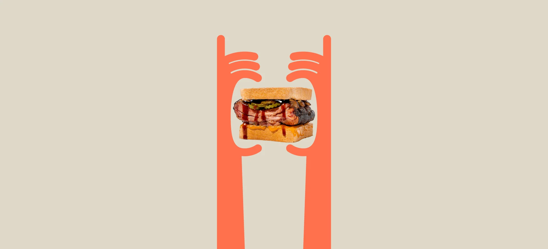 Identity · packaging · audio branding
Discuss a project
Need packaging people value before opening?
Let's discuss your product, range architecture, and the path from concept to production.
Discuss a projectPhone+7 921 791-93-18
OfficeSt. Petersburg
Atlantic City, 126B Savushkina Street
Atlantic City, 126B Savushkina Street