
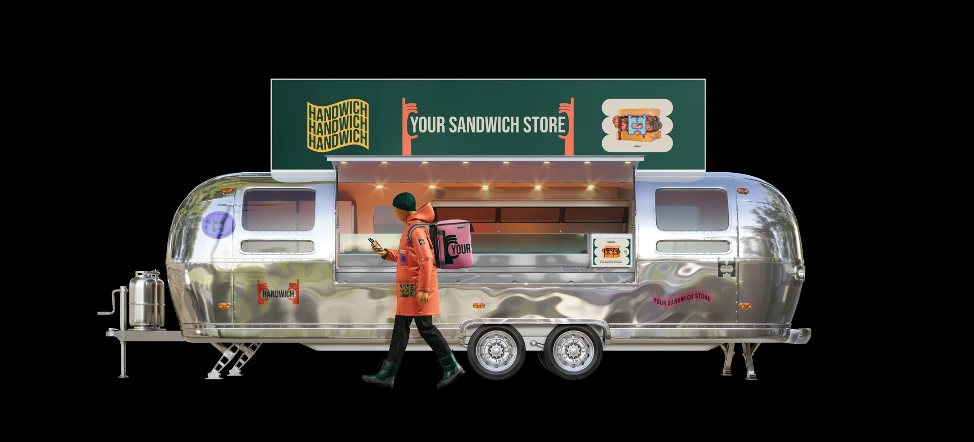
The hands form a frame, support the name, and show how people interact with the product.
HANDWICH — visual identity and sonic branding
Fast food · visual identity · guidelines · sonic branding · 2024
HW / 24

A brand you can
literally hold in your hands
The brief
Create a bright, recognizable language for a young fast-food chain.
The starting idea
One name.
One clear gesture.
HANDWICH is a fast-food sandwich shop. The system centers on an action rather than a particular dish: two hands carefully holding the product.
The public case study describes the style as “dopamine-driven”: bright, positive, and friendly. It combines jester and hedonist archetypes.
More than a symbol beside the product.
A symbol that holds the product.
Logo
Hands become the structure
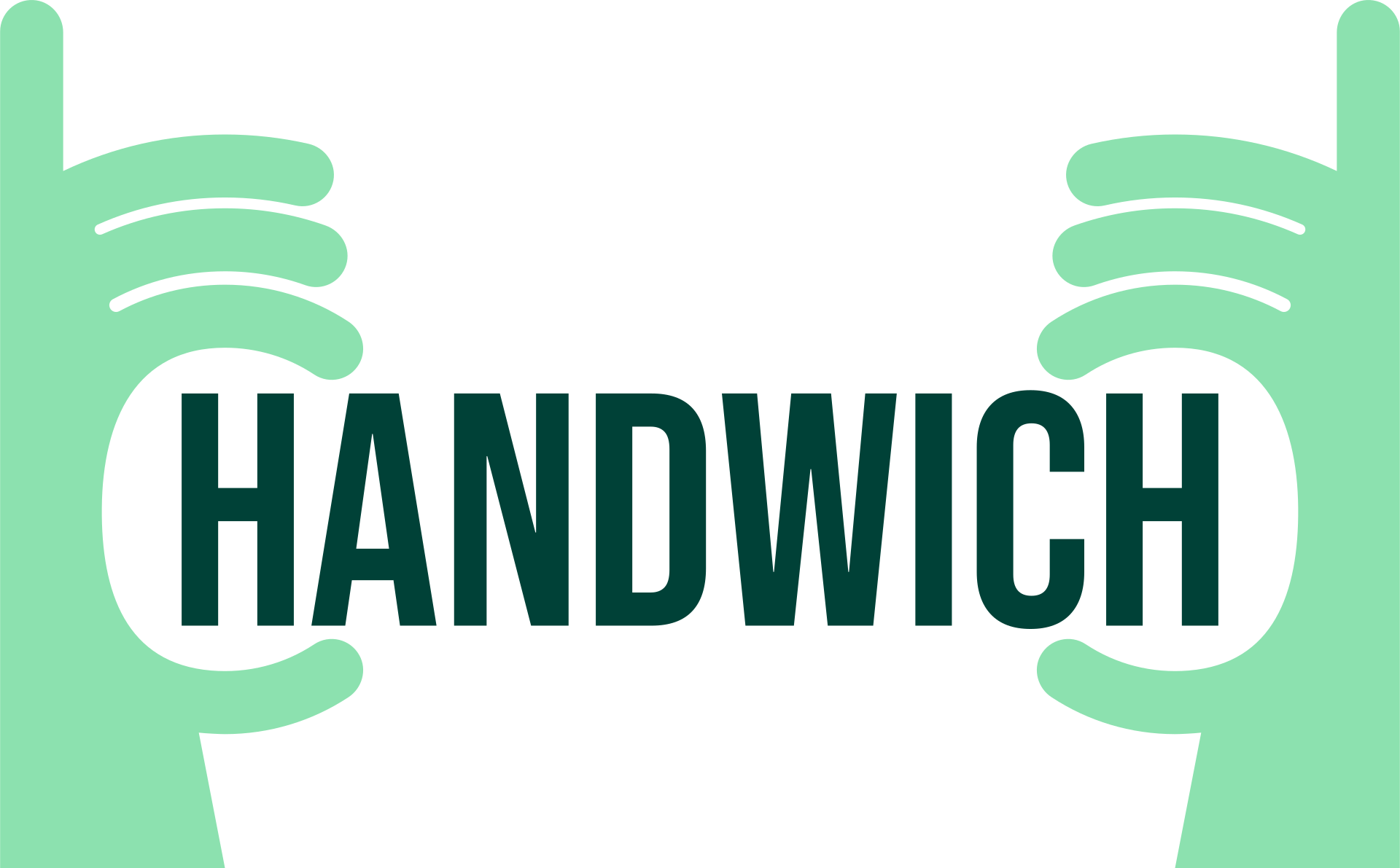
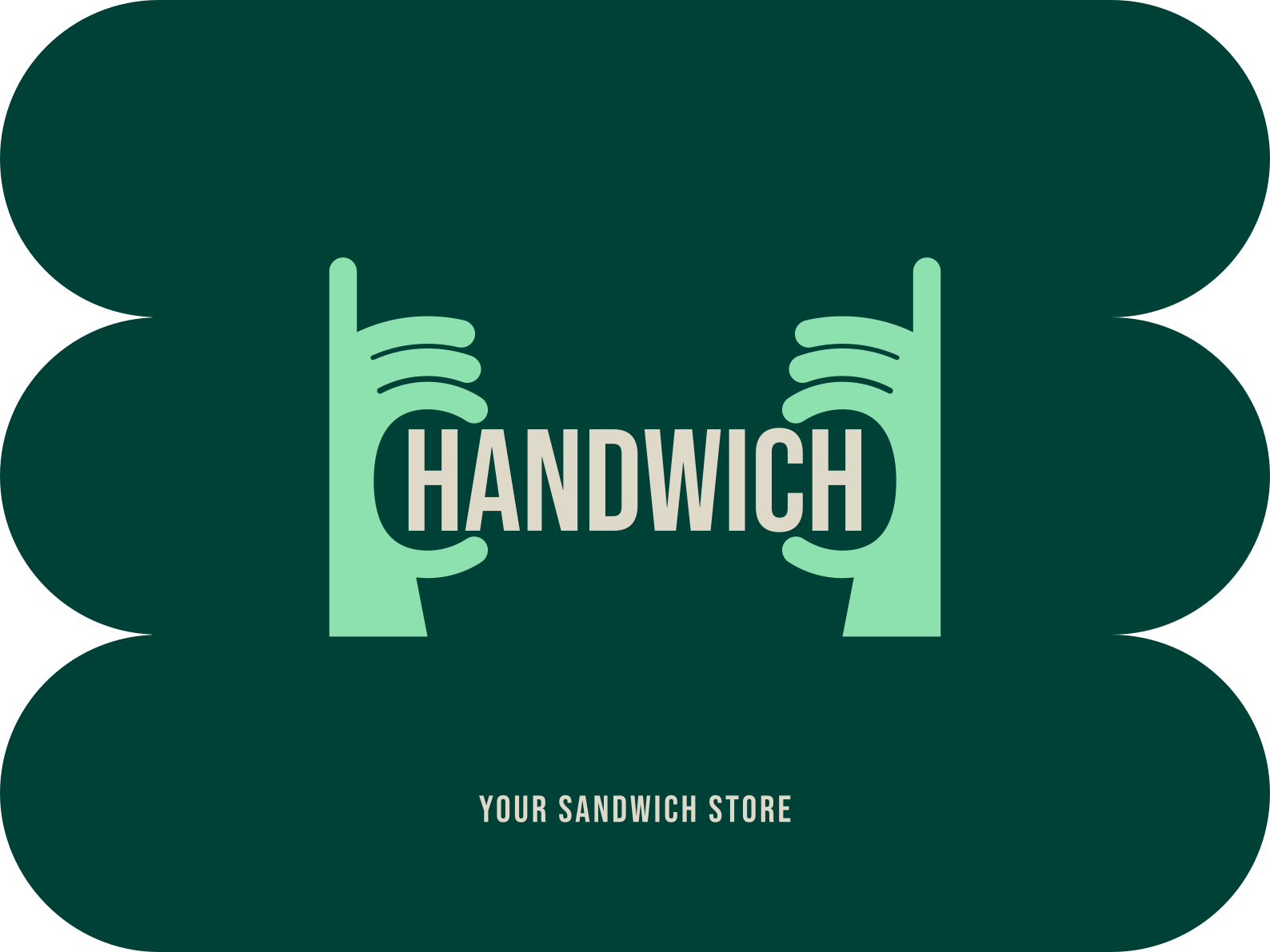
The hands and wordmark form a single structure. The guidelines explicitly prohibit stretching or compressing the logo.
Photography uses a contrasting logo version or a separate branded panel.
No shadows or outlines are added; the metaphor already contains its own expressive form.
Visual identity
A feel-good palette.
Grounded in clear rules.
The core colors are dark green, mint, coral, and a warm light tone. Pink, yellow, purple, black, and white extend the system without compromising recognition.
BEBAS NEUE
HEADLINES / LABELS / PACKAGINGOswald
REGULAR / MEDIUM · SUPPORTING TEXT
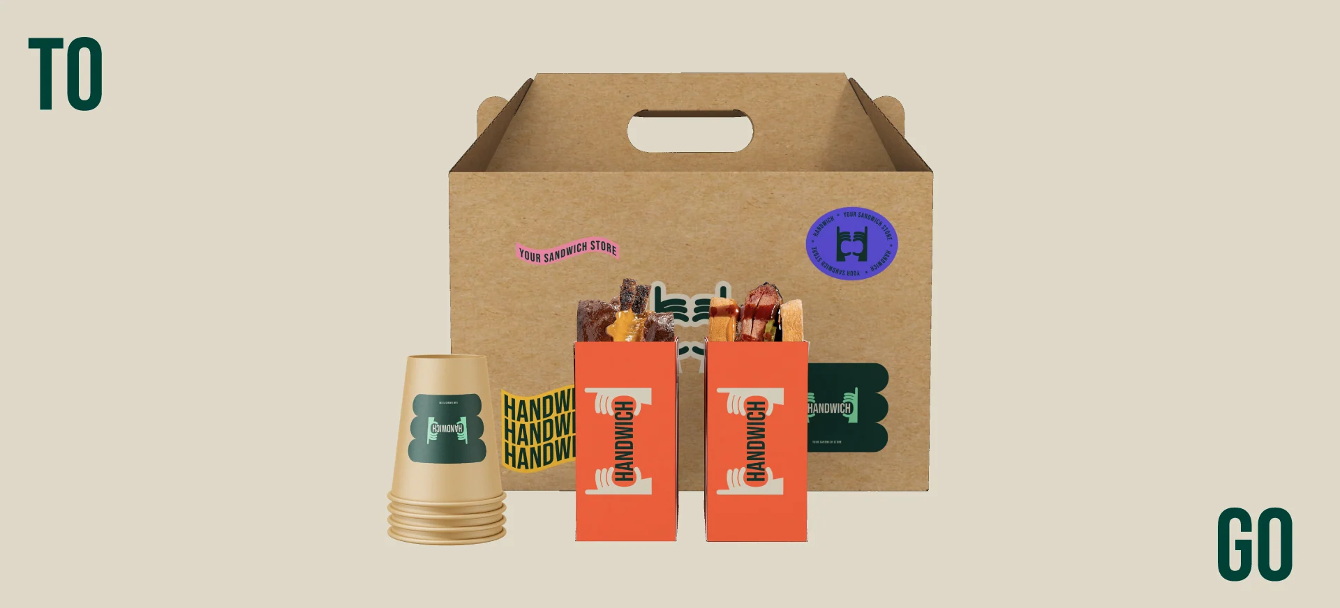
Application system
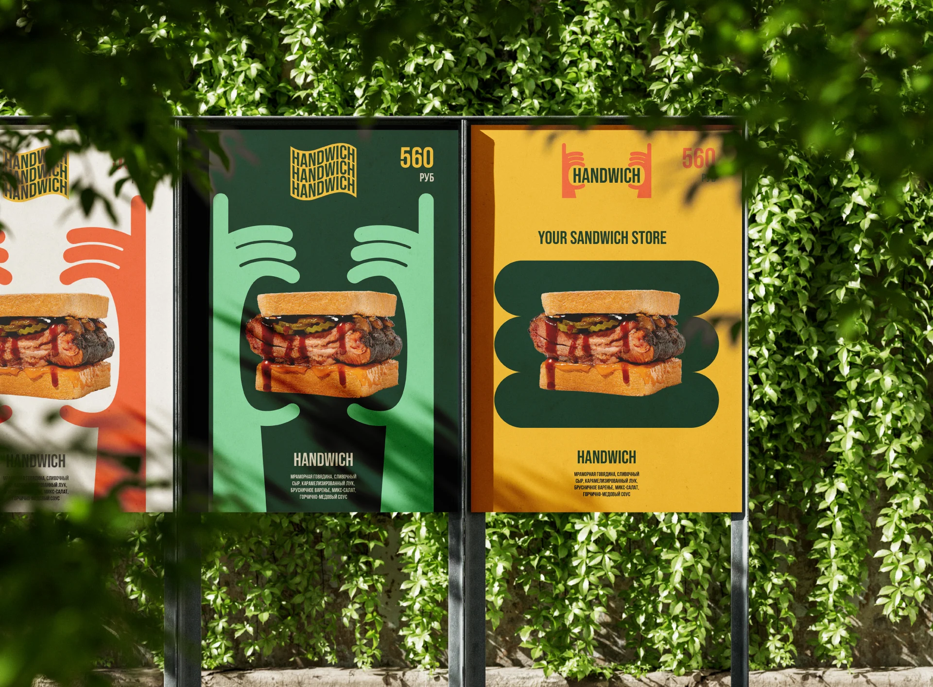
One gesture works at different scales


Sonic branding
The brand found its own voice
We created a brand jingle for HANDWICH: a short musical signature for social media and promotional materials. In this case study, it extends the bright, friendly visual character into sound.
The brand in motion
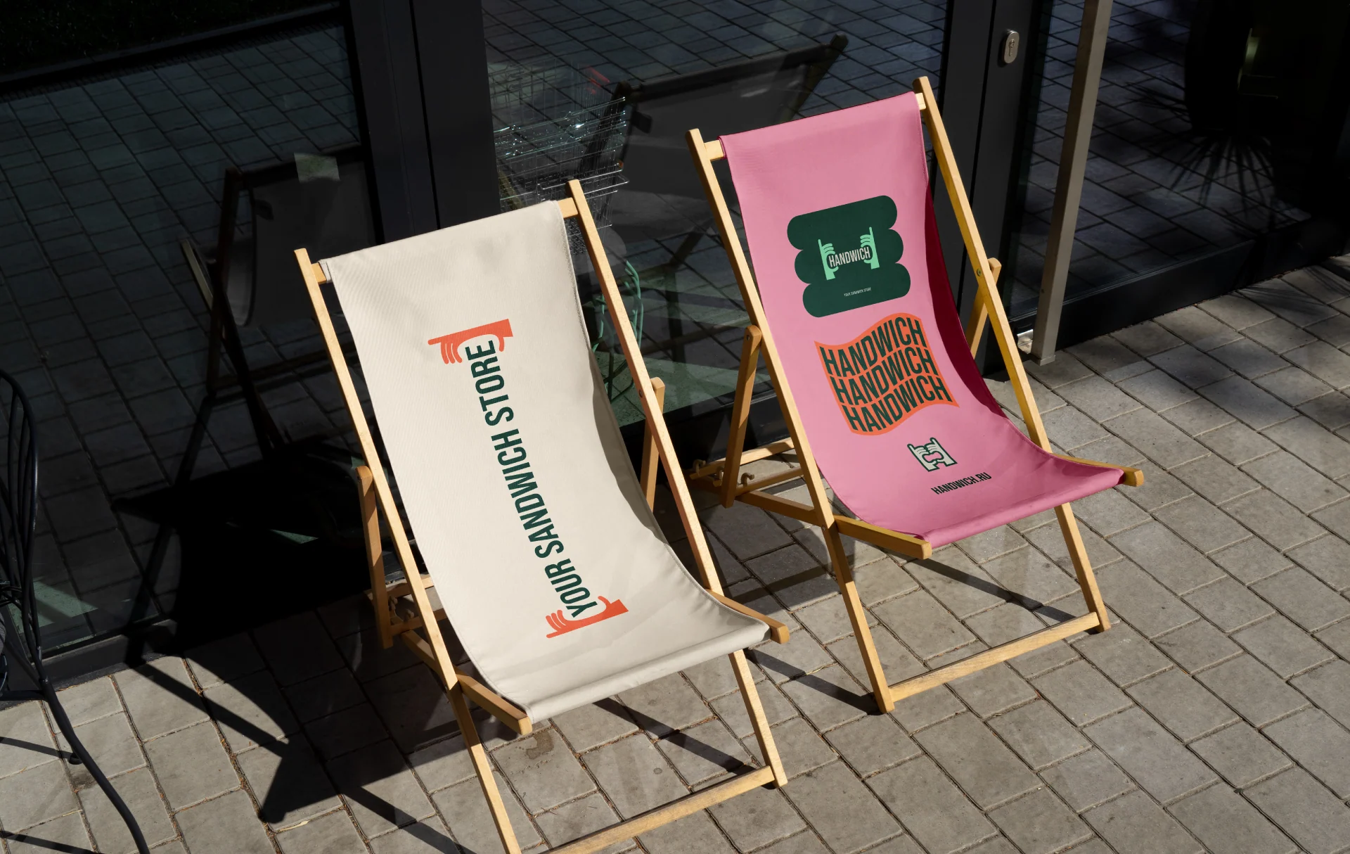
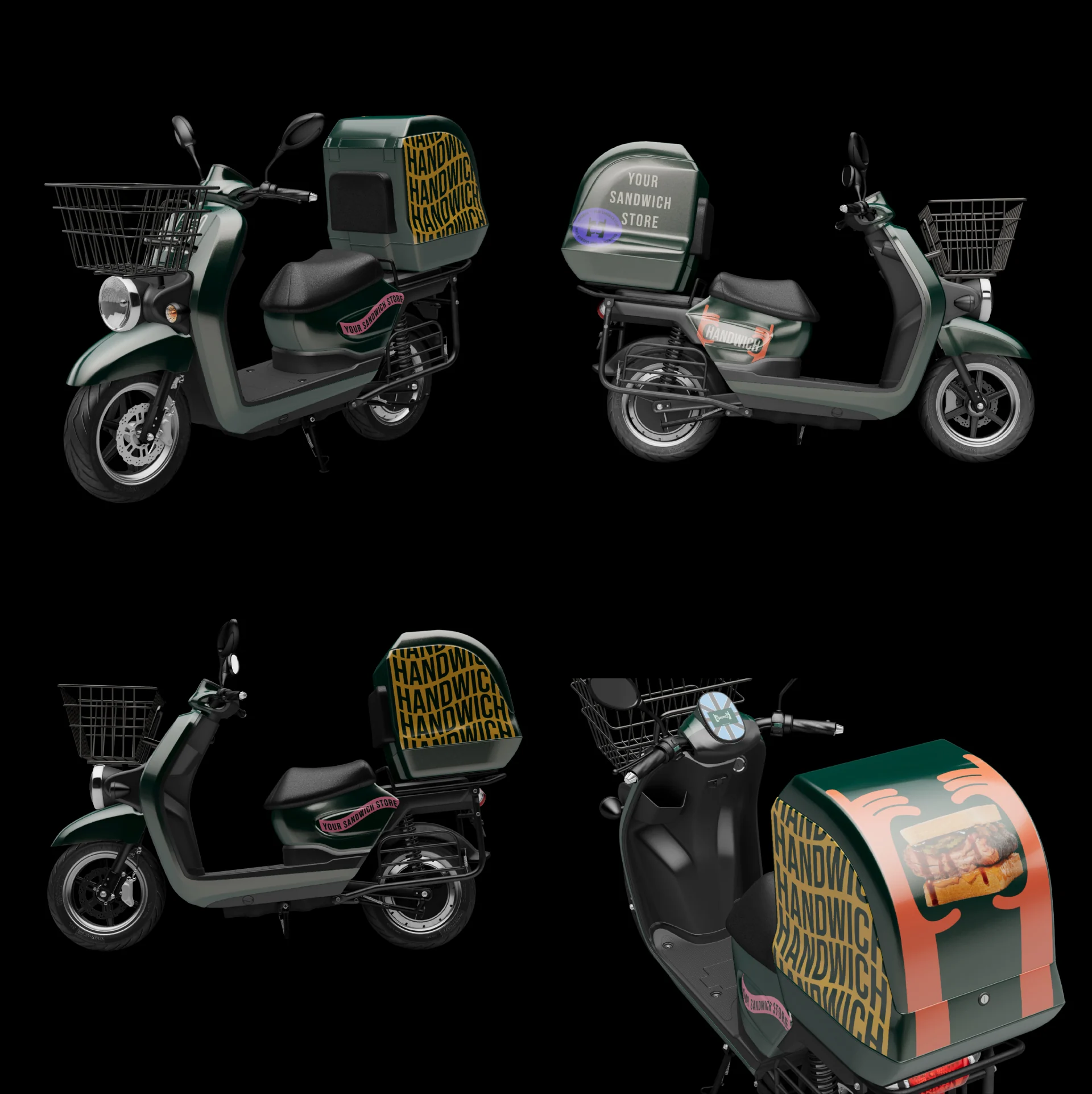
From lounge chairs to delivery
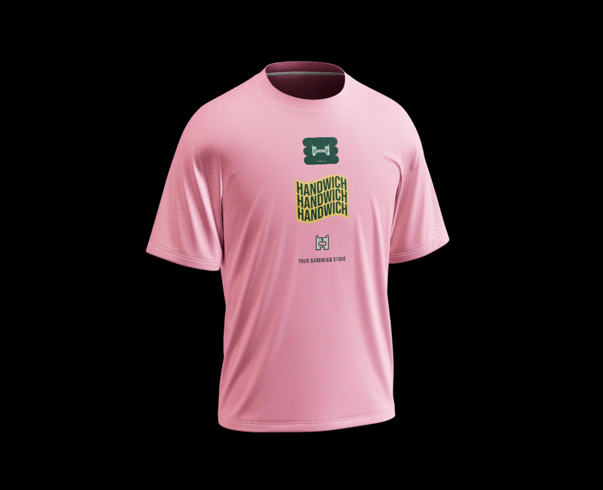
These images visualize applications of the design system. They do not claim that the items were mass-produced or launched.

Project outcome
We brought the identity together in a practical guide
The HANDWICH system connects the mark, color, typography, graphics, packaging, social templates, and sound. Everything is collected in a 65-page identity guide for ongoing use.
- Logo and brand lockup with descriptor
- Primary and secondary palettes
- Brand typefaces and typography guidelines
- Eight groups of graphic elements
- Business stationery
- Social media design system
- Posters, badges, and packaging
- Brand jingle

Confirmed scope
GORYANIN BROTHERS × HANDWICH
Next case study
GIC CANADA
Strategy, verbal and visual systems, digital principles, and a brand environment for an immigration company.
Explore GIC CANADA Next project ↗
The first conversation
Brand character should engage every sense
Tell us about the product you are launching and where people will encounter it. We will help decide what to build first: strategy, visual identity, packaging, environment, or sound.
Discuss your challengePhone+7 921 791-93-18
OfficeSt. Petersburg
Atlantic City, 126B Savushkina Street
Atlantic City, 126B Savushkina Street