
Identical figures express the opponents' mutual respect.
Northwestern Federal District Judo Federation
Strength comes from discipline
We refreshed the federation's visual identity and created a symbol that combines equality between opponents with the energy of a throw.
The brief
A new federation identity without brute-force clichés
The leadership of the Northwestern Federal District Judo Federation approached us to update the organization's visual identity.
Judo is a sport, a martial art, and a discipline with its own philosophy. The symbol therefore needed to avoid the aggression-led emblems common in boxing and combat sports.
We sought an image of inner strength, self-control, and respect for an opponent. Judo's Japanese origins inspired the concise form, while the moment of a throw gave the system its internal movement.
Strength is expressed through precision and discipline, not aggression.
Central symmetry turns the mark into an endless throw.
The symbol's meaning
Two equal figures. One continuous throw.
The symbol consists of two identical judoka rotated relative to one another. Turned 180°, it remains the same; only the athlete leading the movement changes.
Identical formEqual standingCentral symmetry
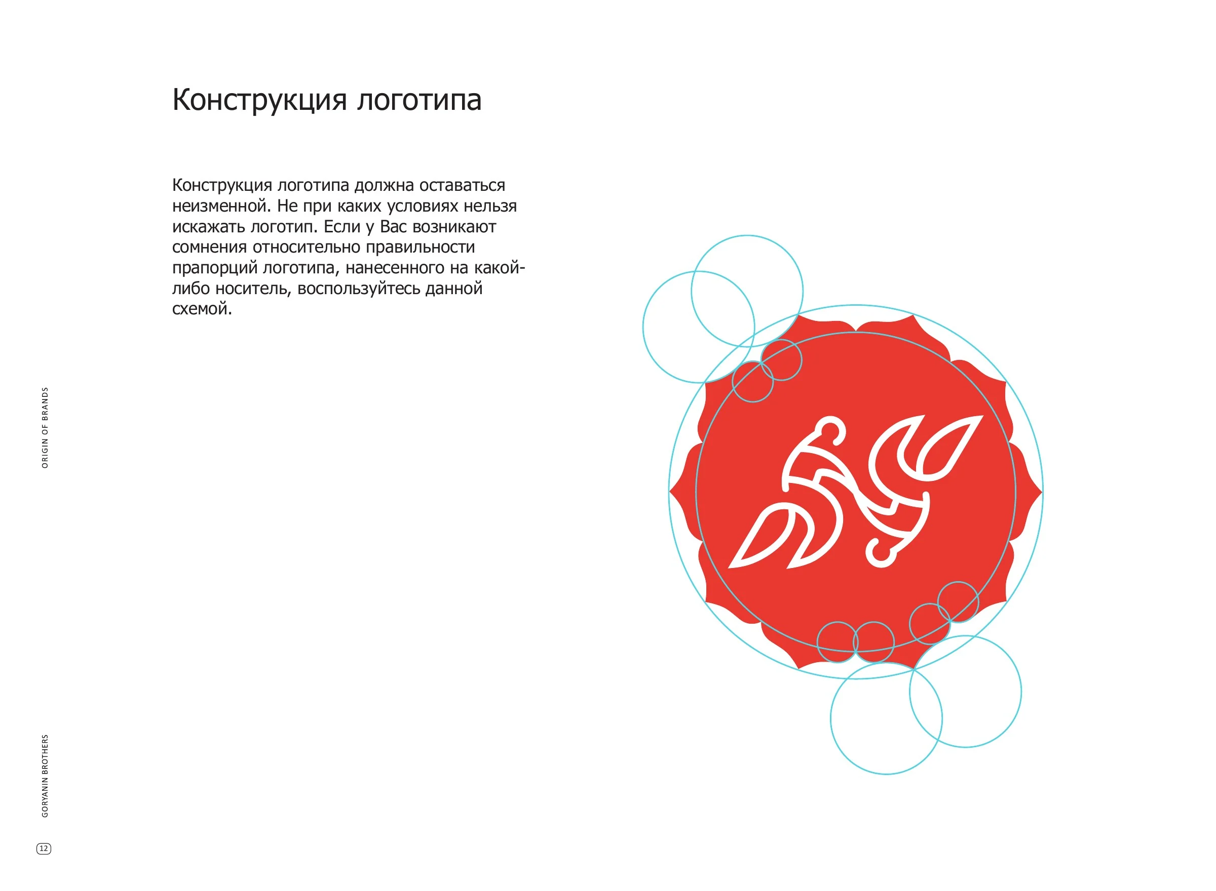
Federation emblem
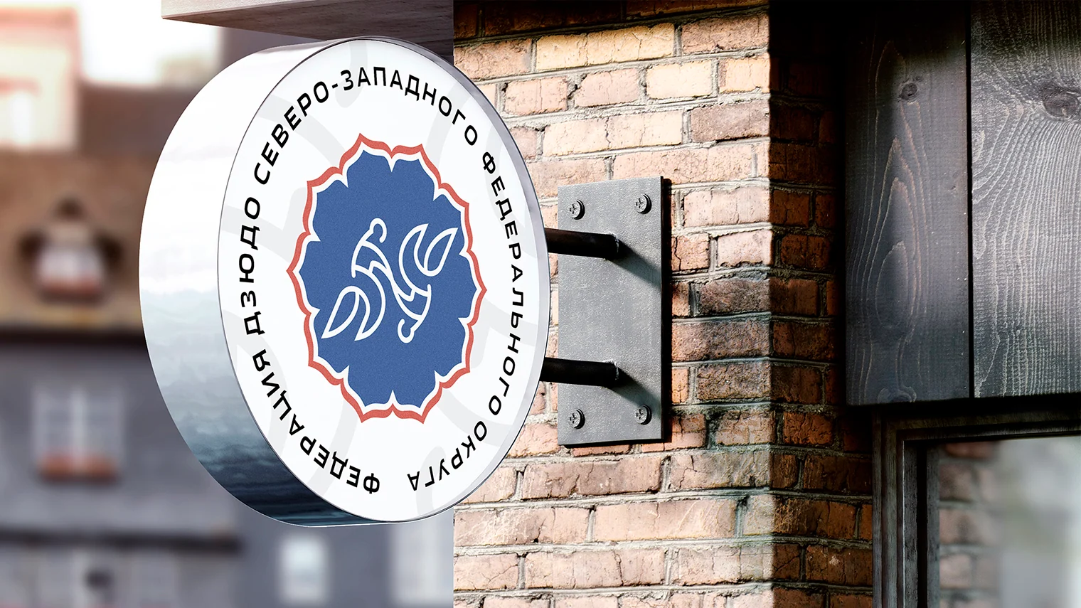
The symbol works on its own and inside a multi-petal shape
The original system's outline united ten petals, one for each region in the association at the time of development. Inside, the central story remains: two equal athletes meeting.

Brand system
Red provides momentum. Blue maintains balance.
The two primary colors work like a pair of opponents: contrasting yet part of one system. White preserves sporting clarity, while secondary shades extend the palette for documents and event materials.
Primary horizontal lockupBrand typography
TahomaRegular / BoldDiscipline
Respect
Motion
Guidelines and stationery
Guidelines keep the symbol precise at every scale
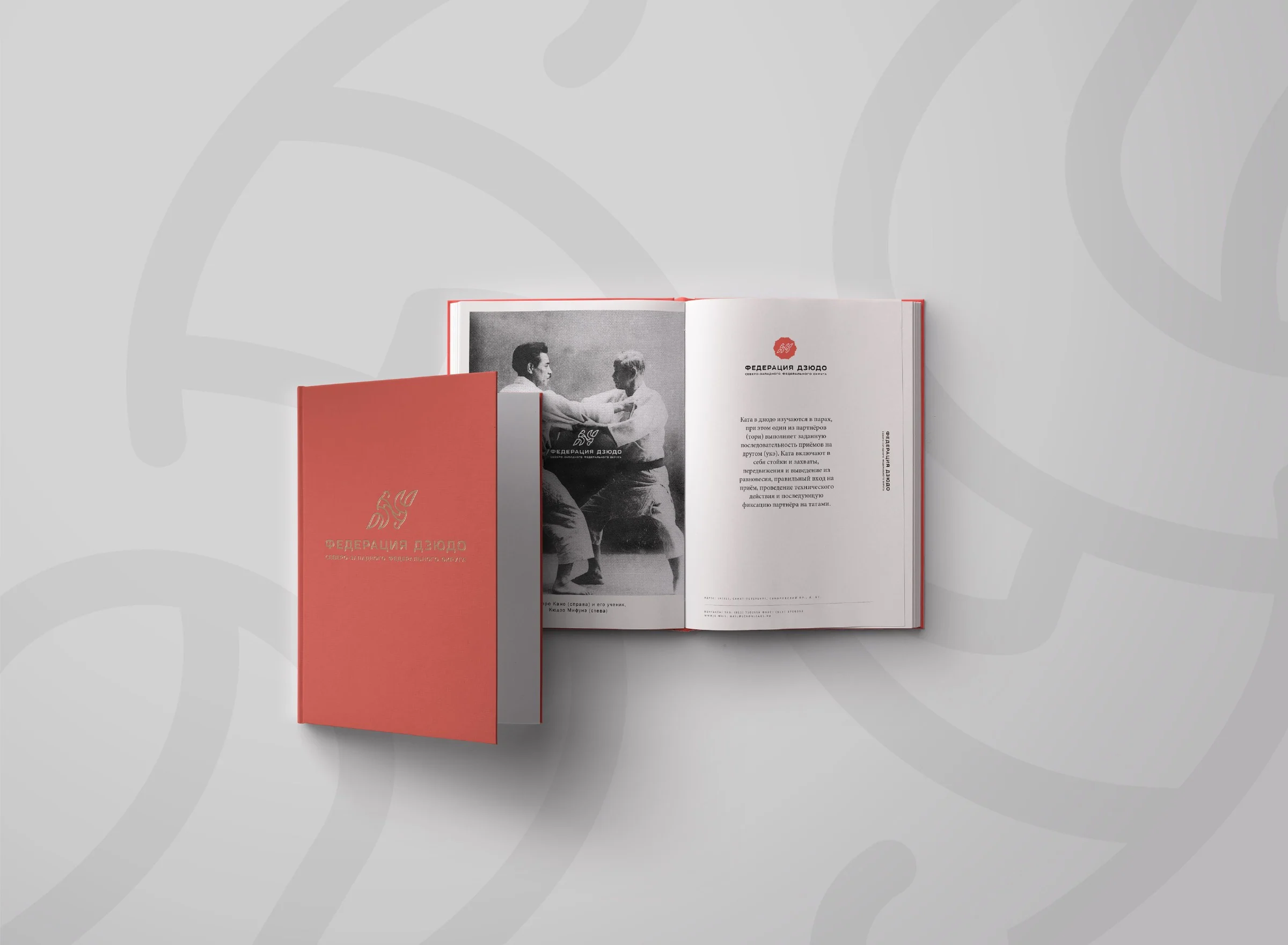
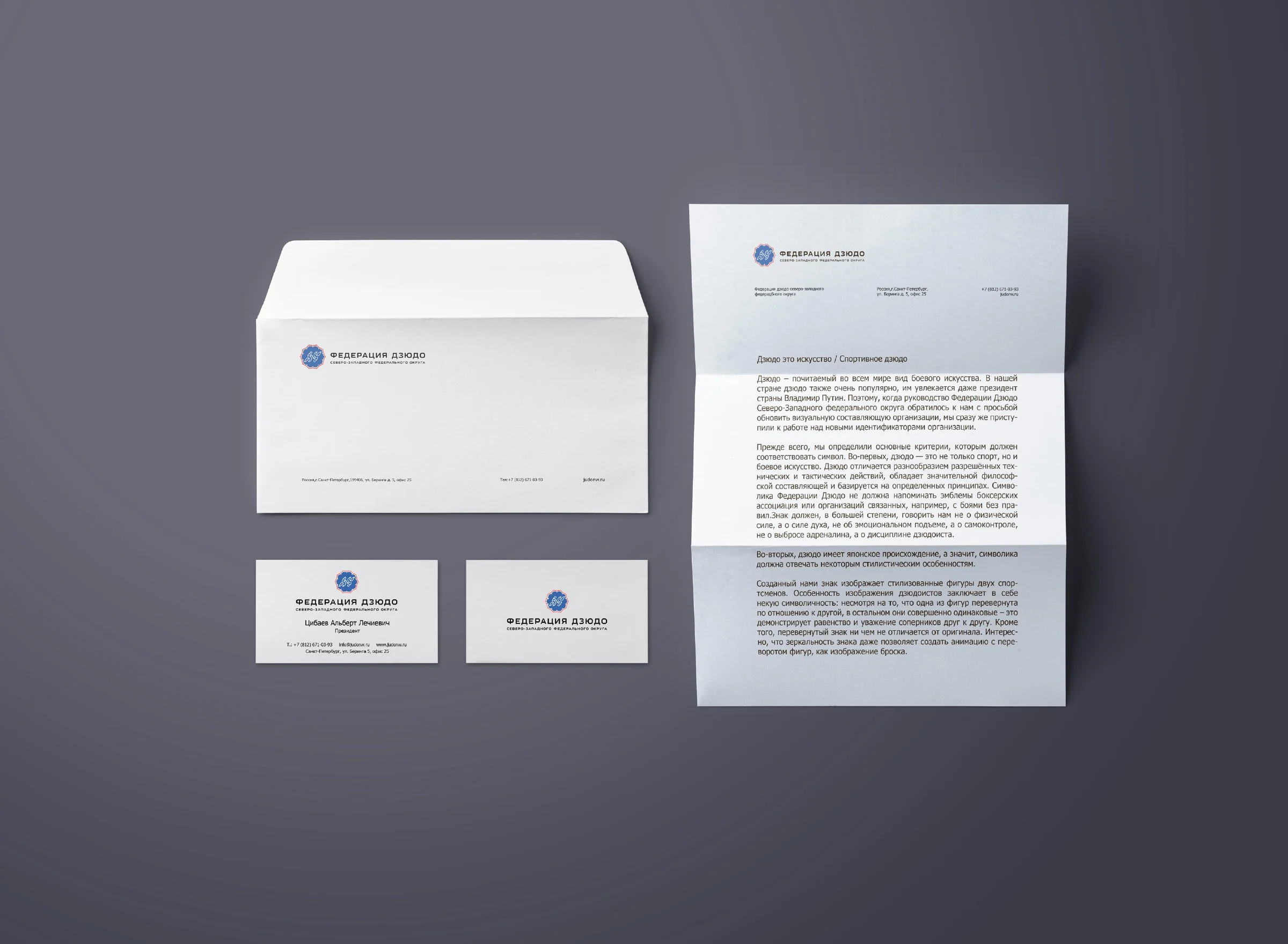
The logo guide defines lockups, clear space, palette, typography, pattern, and image principles. The system is designed for both official documents and sporting environments.
Sports applications
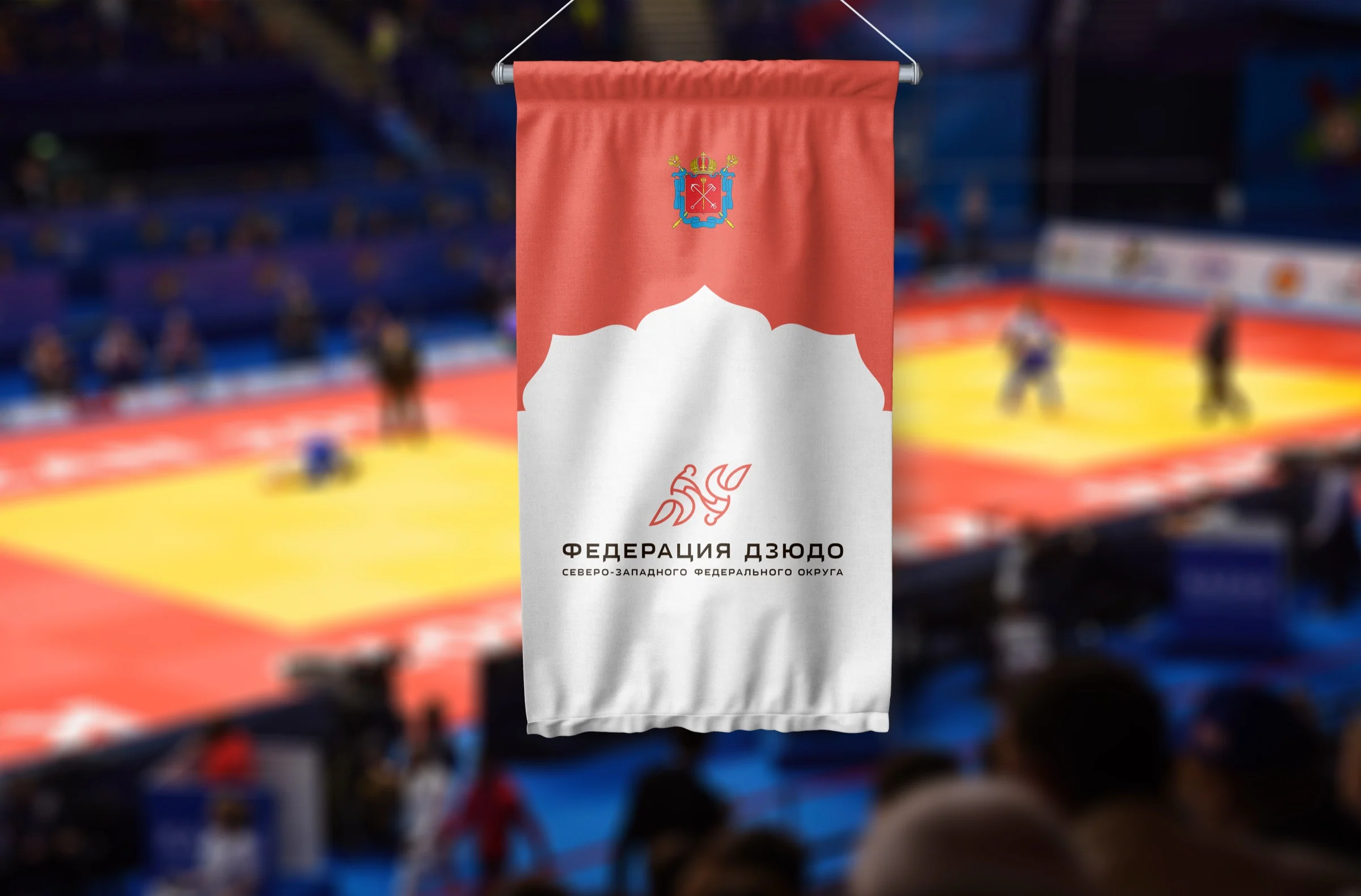
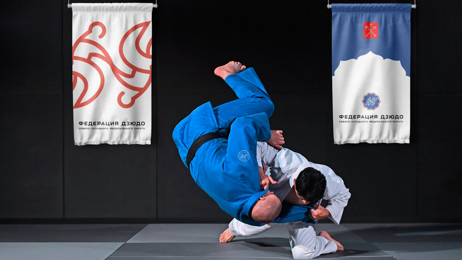
The identity enters the dojo with the athlete
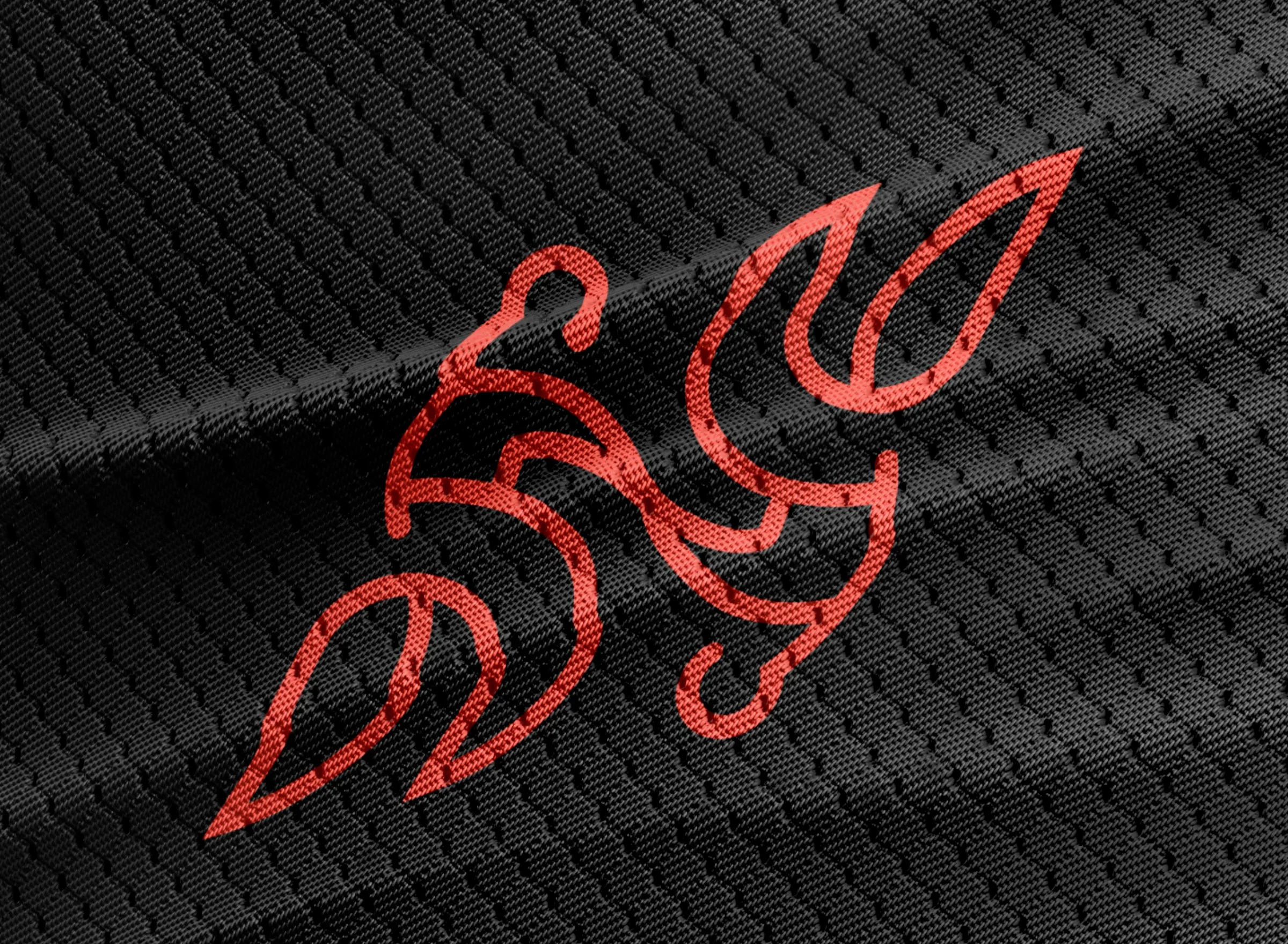
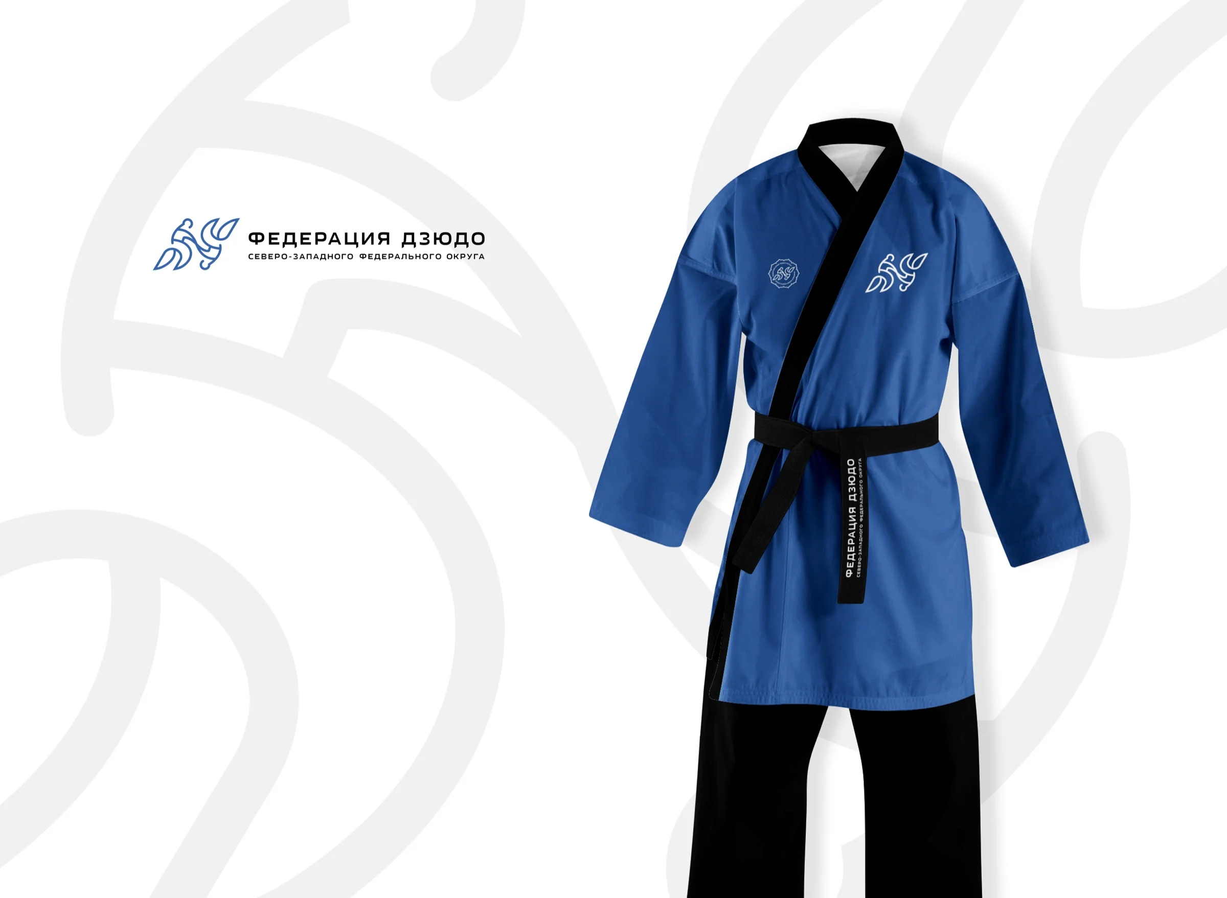
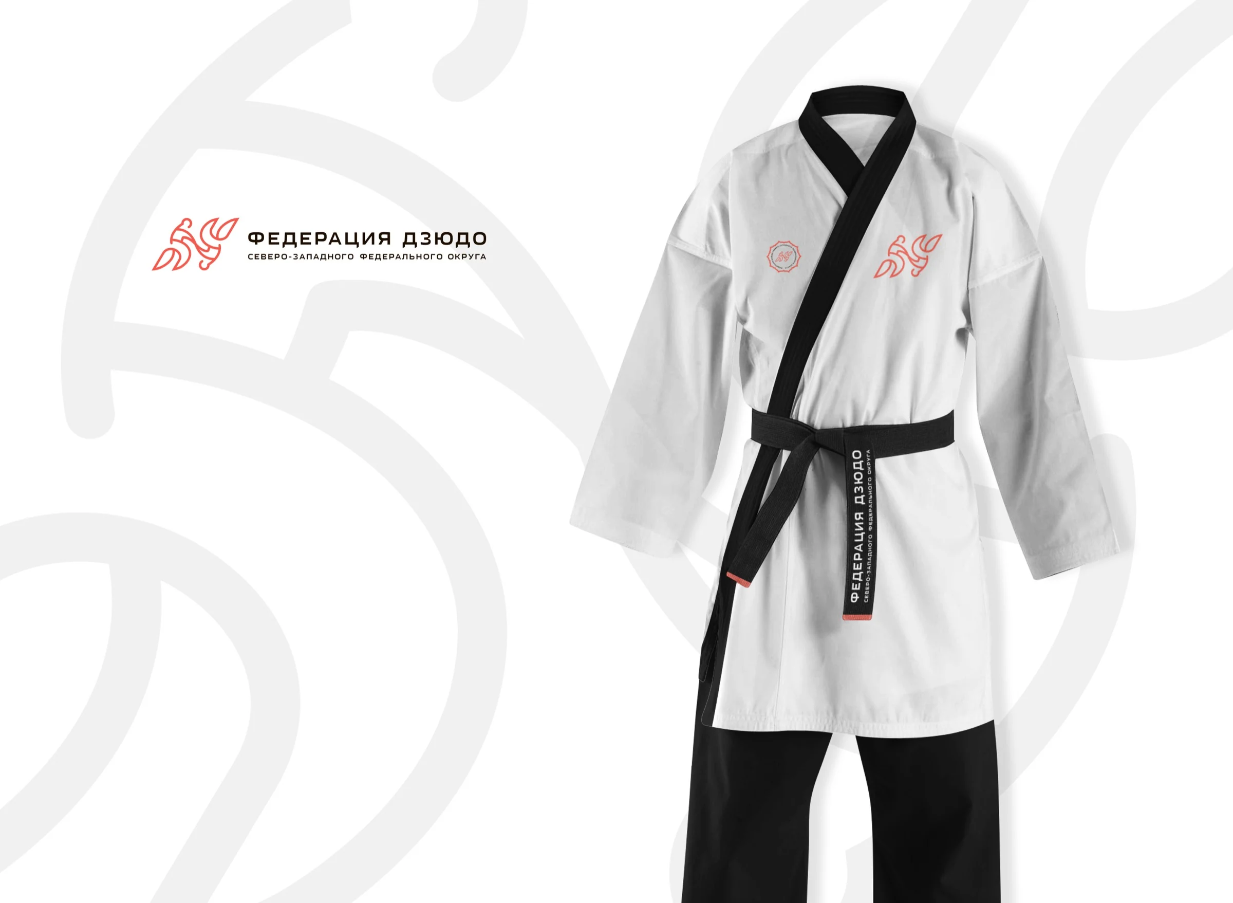
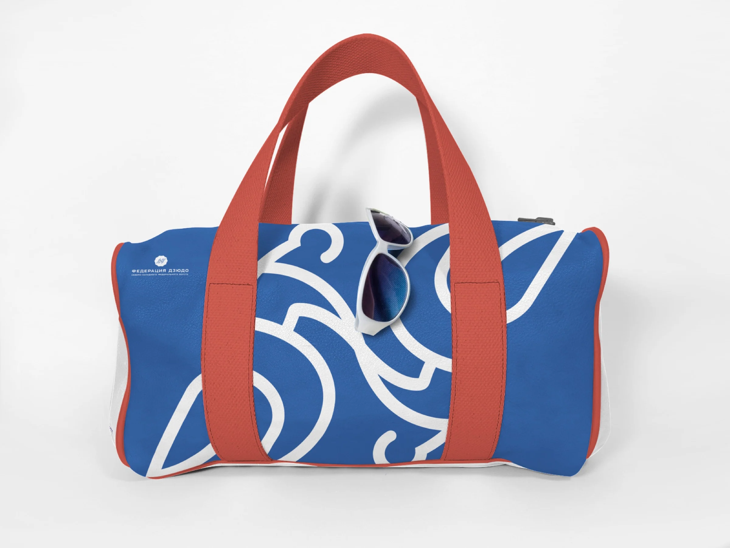
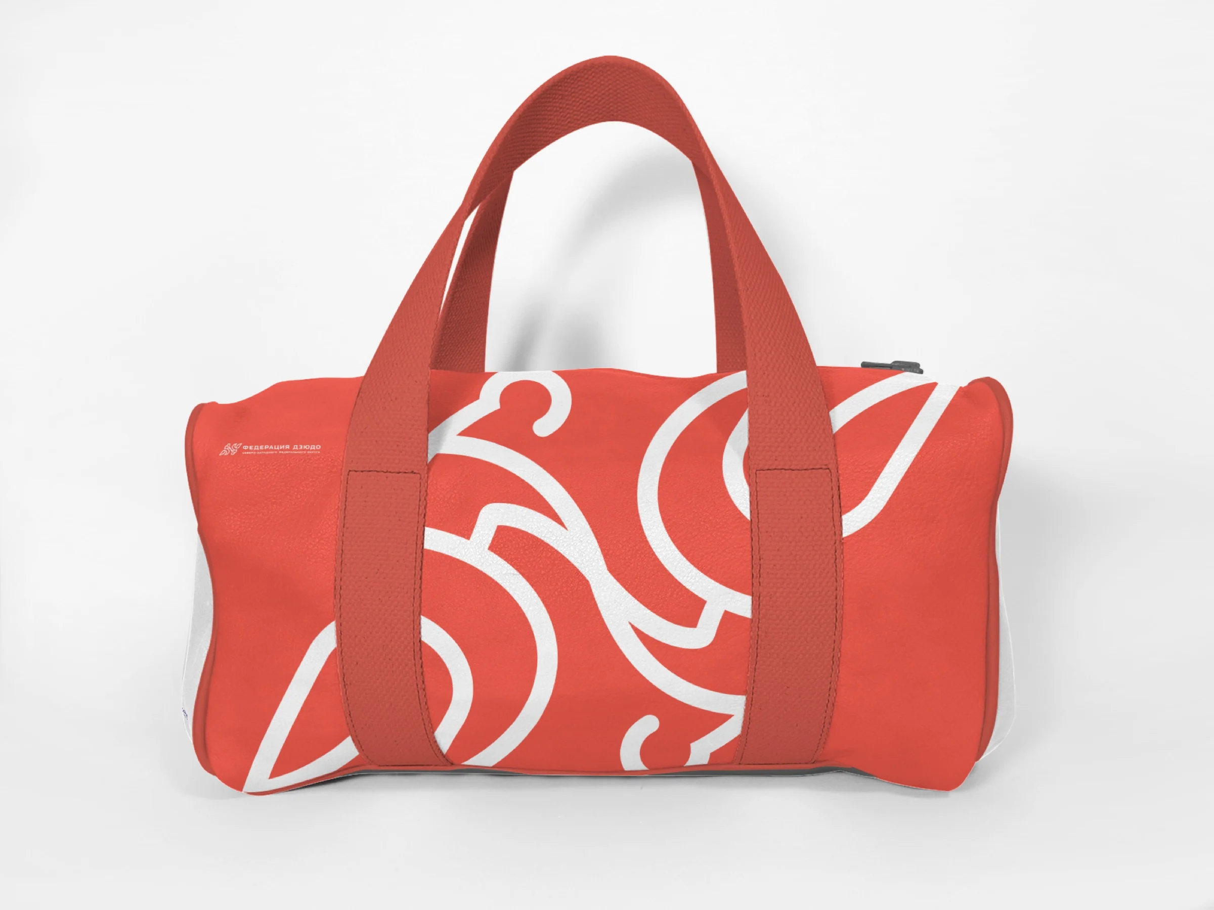
Uniforms, bags, pennants, and awards show the system in different materials and scales. These are concept visualizations; manufacturing the items is outside the stated scope of work.

The symbol in motion
Rotating the mark expresses the motion of a throw
Rotational symmetry provided a ready-made animation principle. A half-turn expresses the exchange of roles: one athlete leads, the other responds, and the motion repeats.
Project outcome
The mark brought together judo's philosophy and the federation's work
We created an identity for a discipline rather than an emblem of force. Two identical figures make respect for the opponent visible, while symmetry keeps the symbol recognizable both still and in motion.
The brand system scales from official documents to uniforms, sports equipment, digital, and event design.
- Brand mark concept
- Primary and compact lockups
- Brand palette and typography
- Pattern and photography guidelines
- Logo guidelines
- Business stationery
- Sports and merchandise application concepts
Project scope
GORYANIN BROTHERS × Northwestern Federal District Judo Federation
Next integrated brand case
Research Institute–Regional Clinical Hospital No. 1
Identity and wayfinding for a large medical complex: symbol, color coding, 3D map, and signage system.
Explore the case study Identity · wayfinding ↗
The first conversation
A strong mark holds its meaning through every movement
Tell us what should bring people together around your brand. We will define the idea, find its precise form, and build a system that works in communication and physical space.
Discuss your challengePhone+7 921 791-93-18
OfficeSt. Petersburg
Atlantic City, 126B Savushkina Street
Atlantic City, 126B Savushkina Street