
Leningrad Regional Clinical Hospital
Because
what matters most is
people
We reimagined a public healthcare institution and built a friendly system, from its mark and communication to kiosks and wayfinding.

The brief
A public hospital should speak to people, not an anonymous stream of patients
Outdated forms, disconnected emblems, and confusing wayfinding reinforced the image of a bureaucracy. Behind it, it was hard to see the doctors, patients, and direct human interaction.
We began with medicine's defining characteristic: it is a person-to-person profession. Doctors and patients communicate directly, so the institution's language should be clear, welcoming, and accessible to all ages.
The new identity needed to work as a hospital mark, a communication foundation, and a wayfinding tool in a complex environment.

The unifying idea
“Person to person”
At the center of the system are relationships between those providing help and those who need it, rather than the institution as a machine.

Tagline by GORYANIN BROTHERSBecause people come first
Motto proposed by the chief physicianEvery life matters
Brand mark
One silhouette unites doctor and patient
A stylized human figure serves both roles. A small cross clarifies the medical field without turning the mark into a conventional state emblem.


Visual identity
Simple symbols, open colors, and calm typography
The pattern combines a person, a plus, a minus, a pulse line, and a smile. Eight brand colors keep the system lively yet consistent.
#0098DB#D24D57#49C5B1#FFCD00#3EB75A#C4D4DA#7C878E#8B84D7


GUI and digital concepts
The same clarity works on the terminal screen
We designed the interactive kiosk interface and electronic queue elements. Large modules, a calm hierarchy, and familiar colors continue the brand language.

Wayfinding and implementation
The system helps people find their way and recognize the hospital at every touchpoint
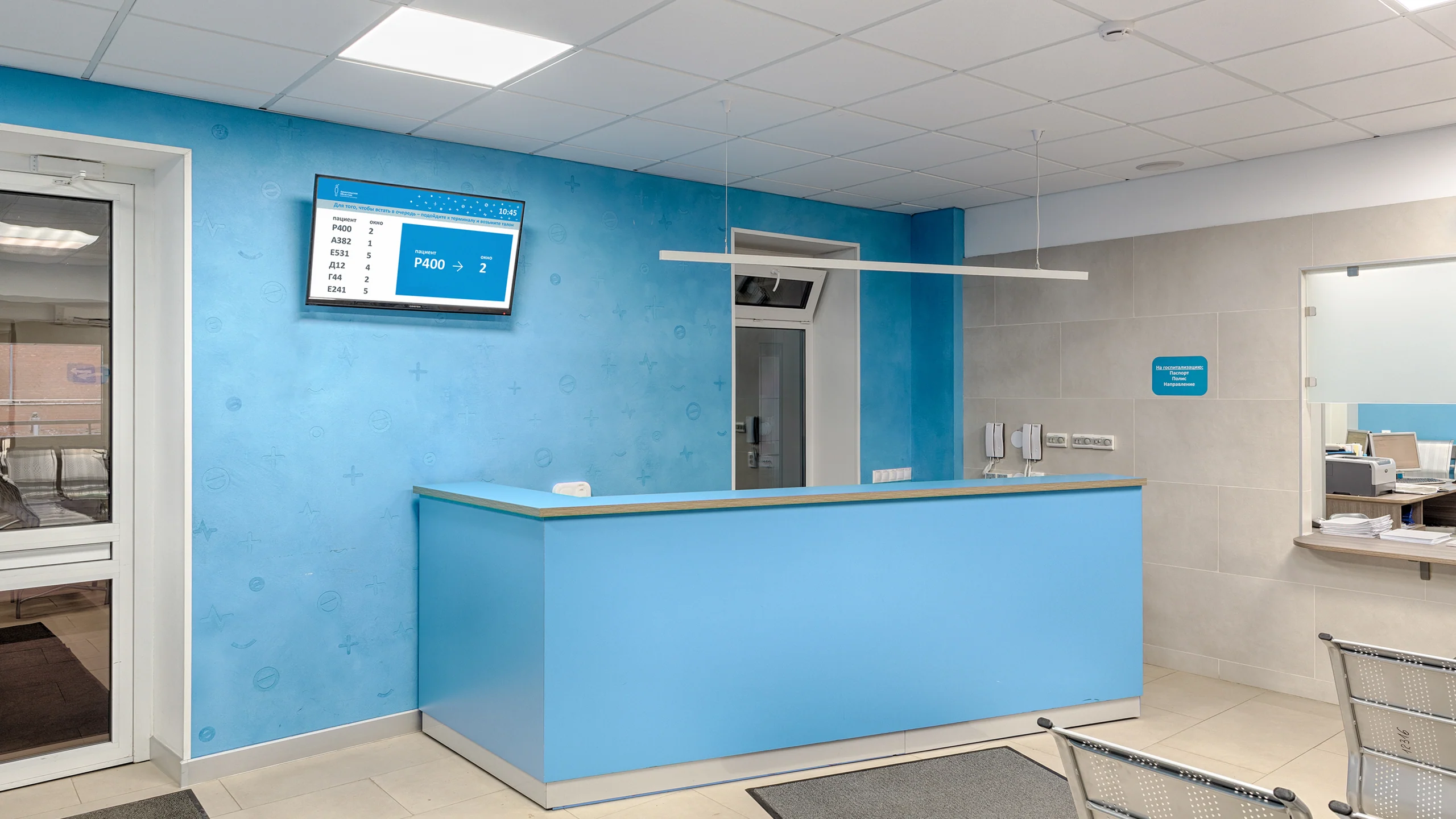
The logo, suspended signs, passes, terminal, and queue display graphics work as parts of one language.


The photographs show the environment where the identity, interface, and wayfinding were implemented. Architecture and interior design were not part of GORYANIN BROTHERS' work.
Concept applications
The system scales from hospital textiles to medical transport
These images show possible extensions of the brand language. They are visualizations, not confirmation of manufactured applications.


Project outcome
A human-centered idea became a complete brand and environmental system
The hospital gained a unified identity: a recognizable human figure, a clear palette, and a direct human voice, replacing a collection of disconnected medical symbols.
The system retains its character on posters and documents, in digital concepts, kiosk interfaces, wayfinding, and completed environmental elements.
- Visual communication concept
- Logo and wordmark
- Logo guidelines, palette, typography, and pattern
- Business stationery and poster system
- Branded and informational materials
- Interactive terminal GUI
- Digital concepts and screen design
- Wayfinding system and environmental graphics
Project scope
GORYANIN BROTHERS × Leningrad Regional Clinical Hospital
A separate project for LOKB
2020/2048 Calendar
The dual-year calendar continues the brand system but remains a separate case study, distinct from the rebranding.
View the separate case study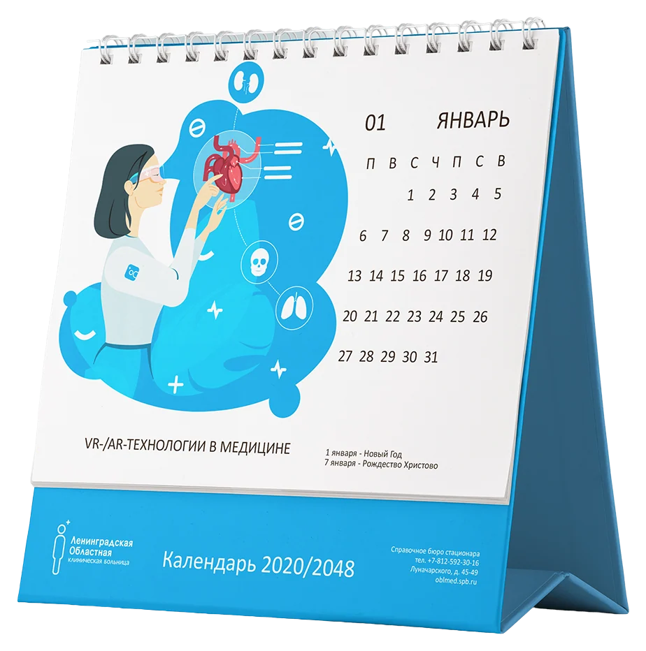 Calendar design ↗
The first conversation
A healthcare brand needs clarity and a human voice
Tell us about the challenge, audience, and environment. We will find the starting point: platform, overall system, digital, or a wayfinding journey.
Discuss your challengePhone+7 921 791-93-18
OfficeSt. Petersburg
Atlantic City, 126B Savushkina Street
Atlantic City, 126B Savushkina Street