
Connect cultural heritage, a contemporary approach to cuisine, hospitality, and a high service standard in one clear position.

Restaurant · brand platform and identity
MIS
SOCHI / ADLER
Tradition and modernity at one table
We built the restaurant brand's strategic and visual foundations: positioning, platform, meaning, logo, brand graphics, and detailed system usage guidelines.
The initial request
We uncover a restaurant's character and express it through design
MIS was developing as a restaurant with Armenian roots and a focus on meat and regional cuisine. But the brand needed to go beyond a national or product-based definition: it required an idea that could bring people together and leave room for the menu to evolve.
Create a system that works from facade and menu to social media, wayfinding, packaging, and business materials.
Bringing people together through hospitality and wonderful food.
Brand platform
Old and new.
Shared hospitality.
The brand platform defines duality as the combination of national culinary traditions and chefs' fresh perspectives, Caucasian hospitality and contemporary standards, cultural motifs and a modern setting.
The idea behind the brand
Traditions and a contemporary outlook, united by a love of good food.
Traditions
Respect for cultural heritage and national cuisine without literal imitation.
Connection
The table as a meeting place for loved ones, friends, and the local community.
Experiences
New culinary experiences, atmosphere, and the pleasure of good food.
Archetype
ExplorerThe brand introduces guests to culture and cuisine, encourages them to try something new, and tells stories through dining experiences.
Brand meaning
The restaurant
that brings us together
MIS is not confined to one category. The main tagline expresses the restaurant's role, while descriptors and headlines adjust the emphasis for each communication.
- Meat & Spices
- We share your love of meat
- A contemporary take on ethnic cuisine
- Bringing people together through a love of good food
MEAT & SPICESTHE RESTAURANT THAT BRINGS US TOGETHERMEAT & SPICES
Identity
A table full of dishes
becomes the word MIS
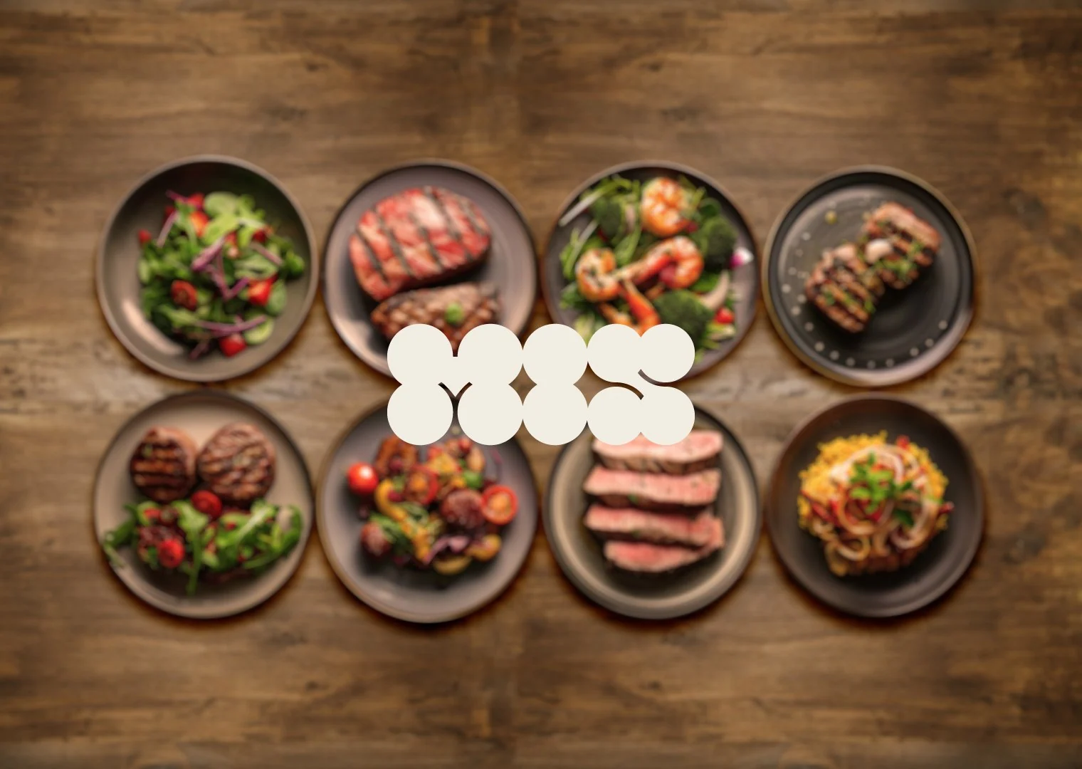
The mark is built from ten circles. Seen from above, it resembles a table with plates and bowls; rounded geometry adds friendliness, while a cohesive silhouette stays recognizable at different scales.
 Primary logo version
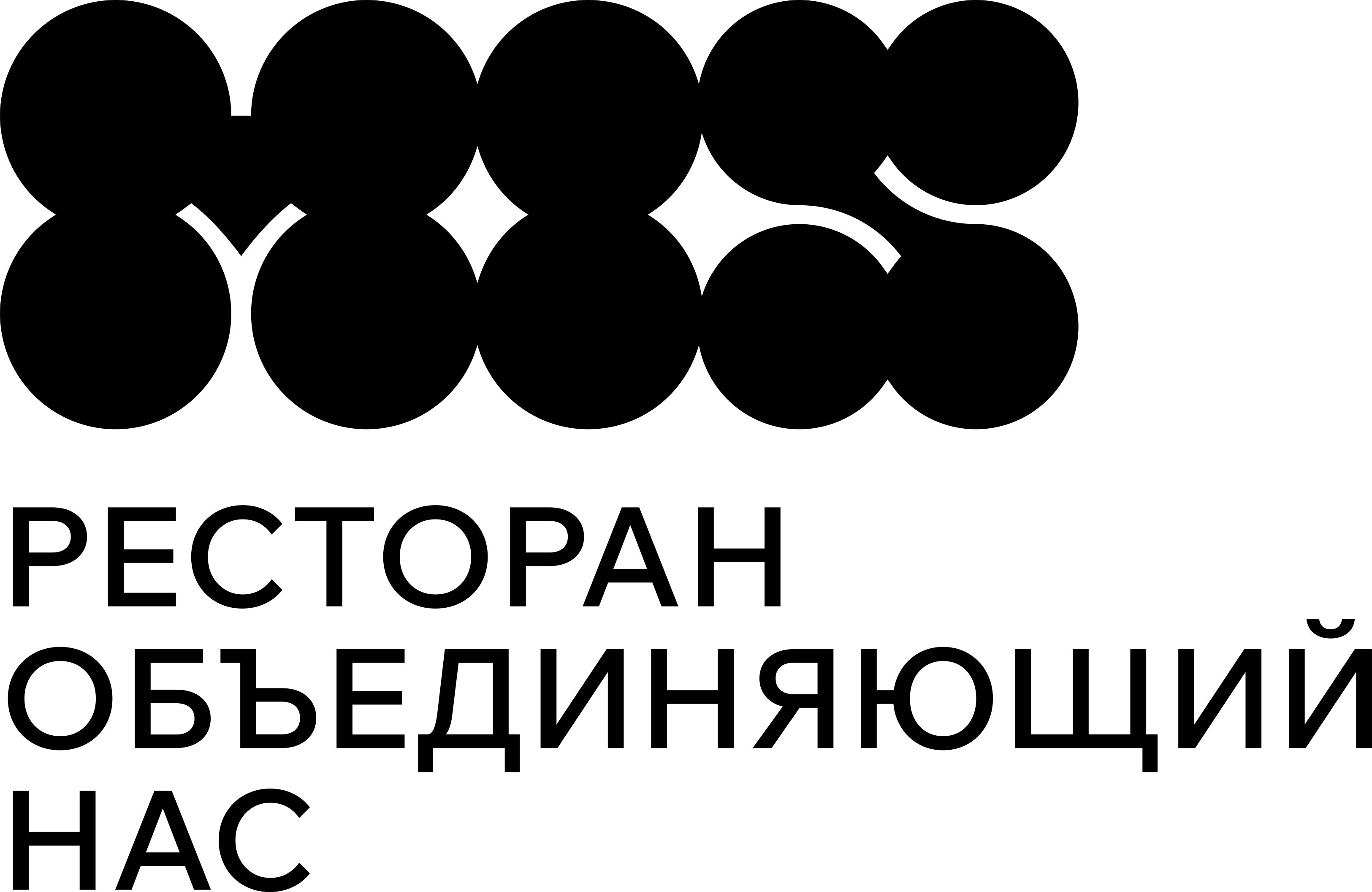 Brand lockup · logo and descriptor
The restaurant that brings us together
Wix Madefor DisplayPrimary brand typefacePodkovaAccent display typeface
 Weaving motif
 Modular graphics
 Wayfinding accent
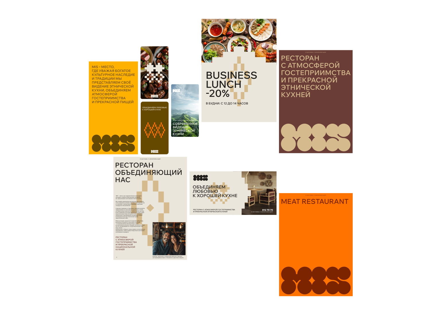
The system in application
The identity works
in the guest experience
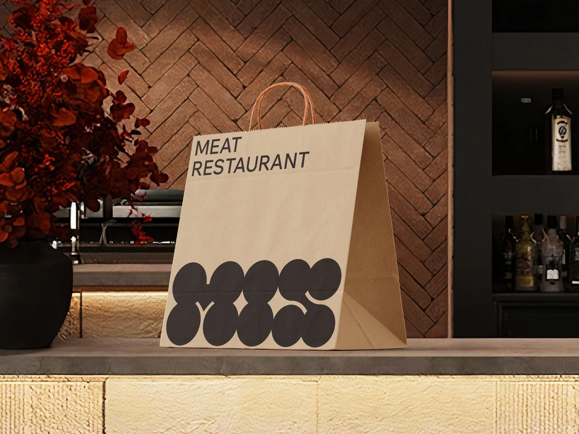
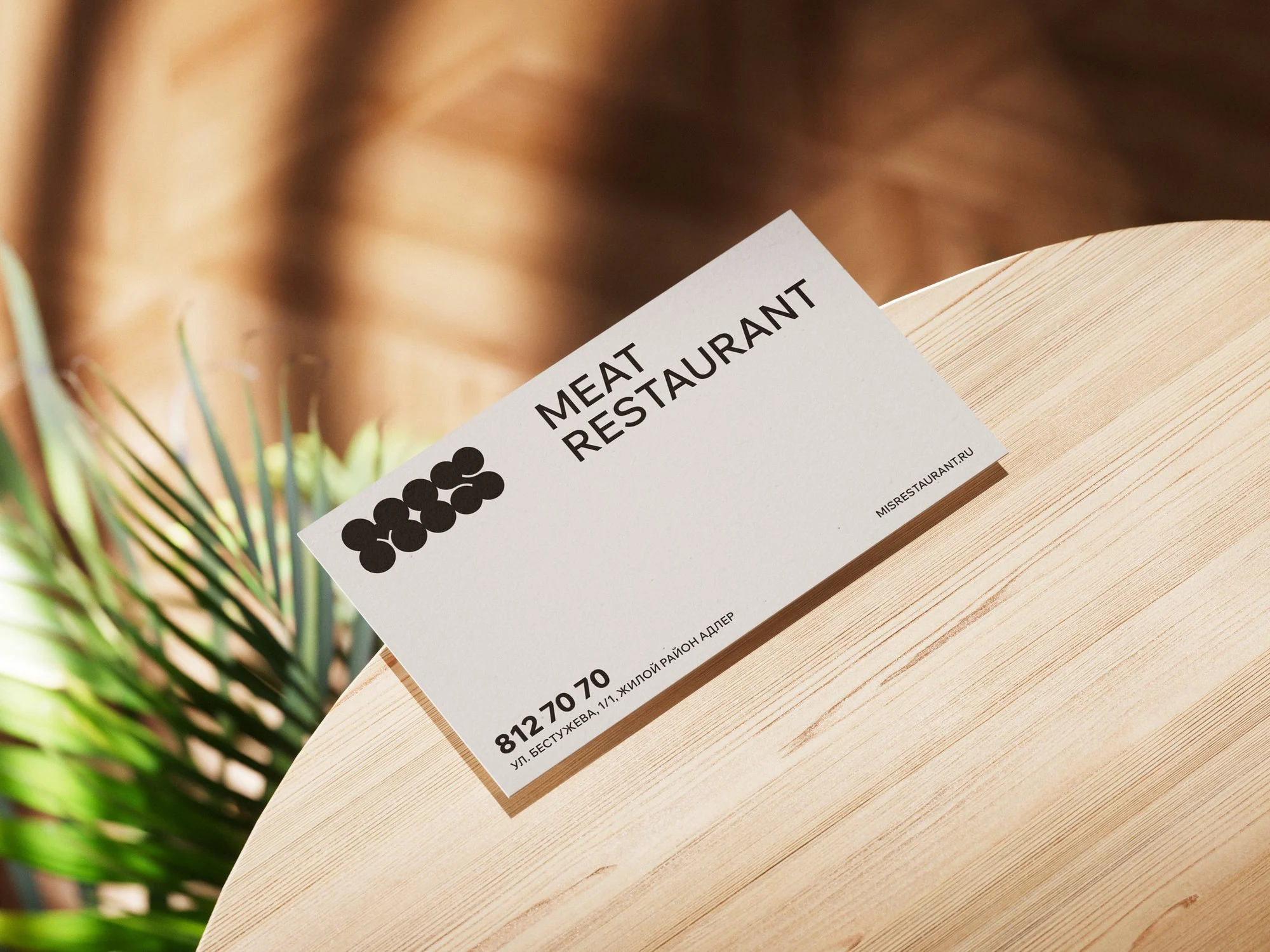
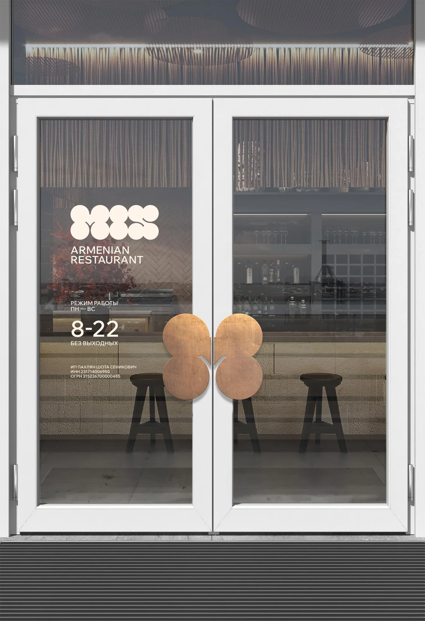
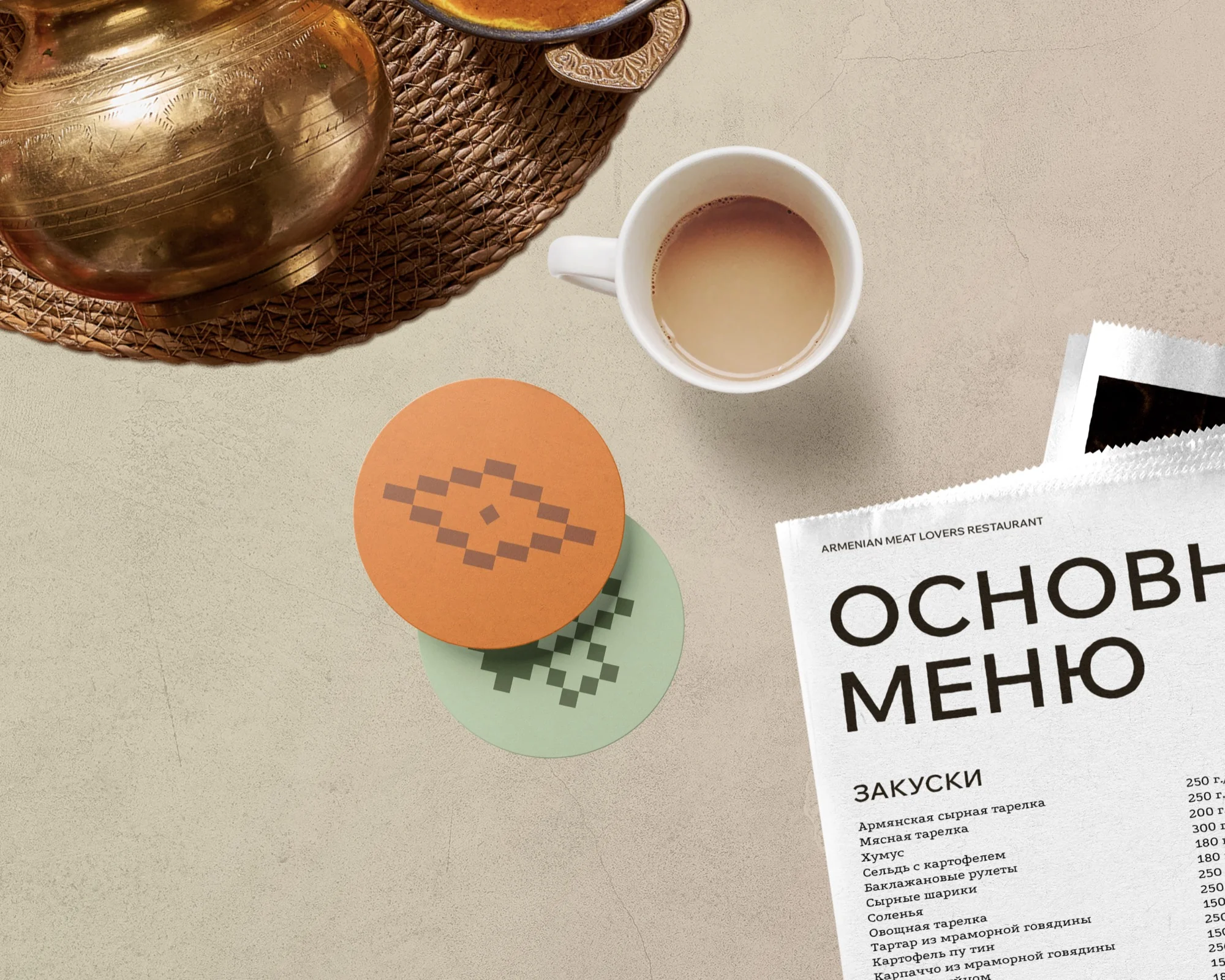
The materials below are design visualizations and layouts from the project's working files. They document the system we developed, not the production of physical quantities.
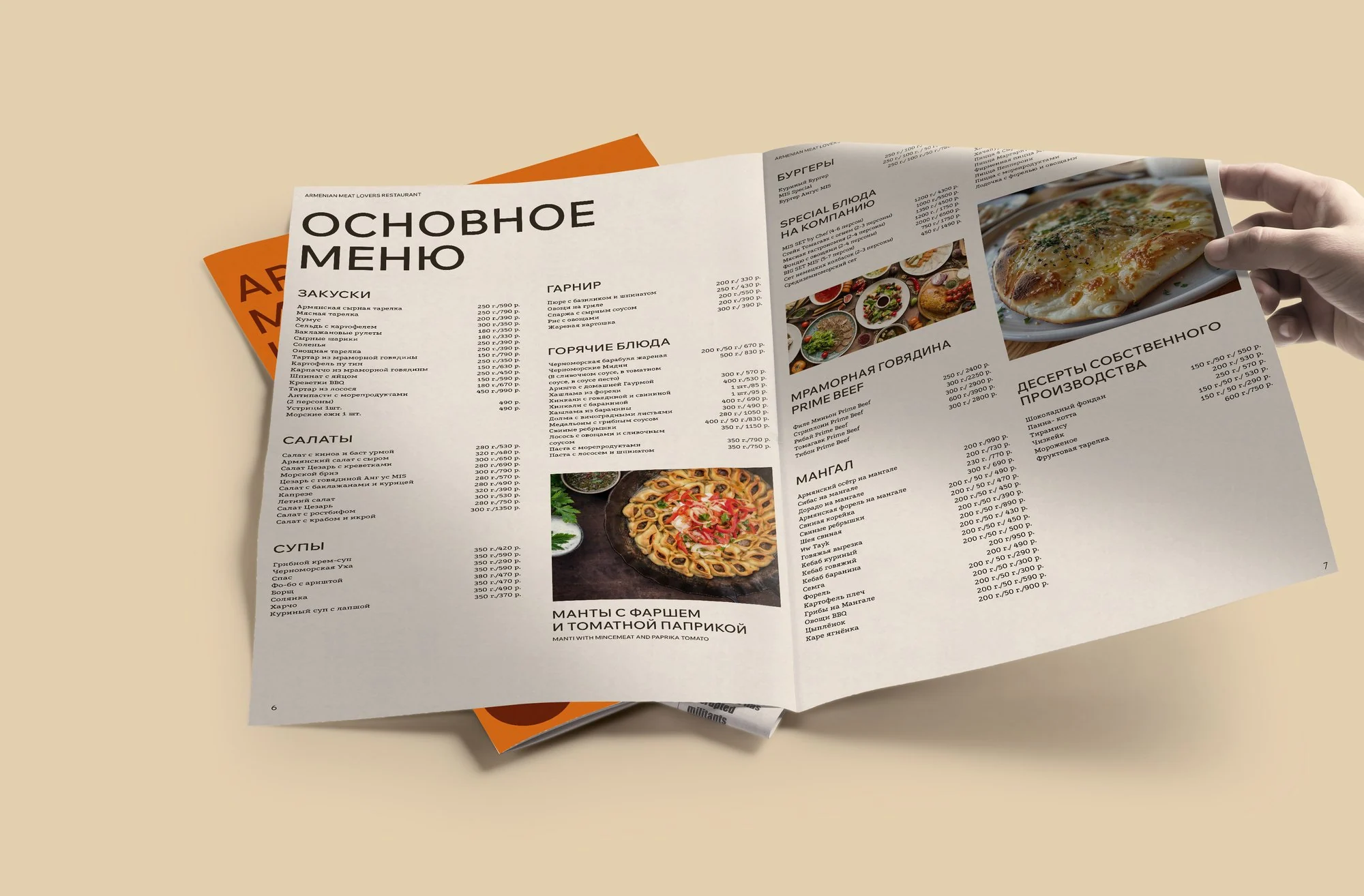

Digital system
One language, different reasons to visit
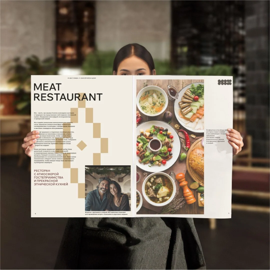
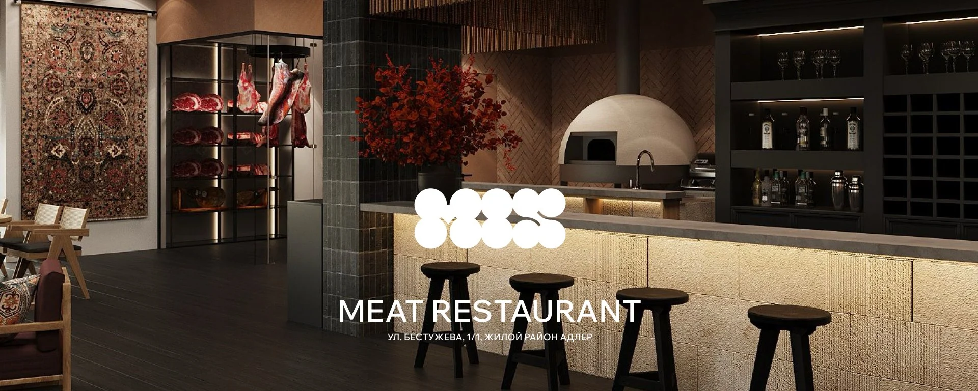
Application context
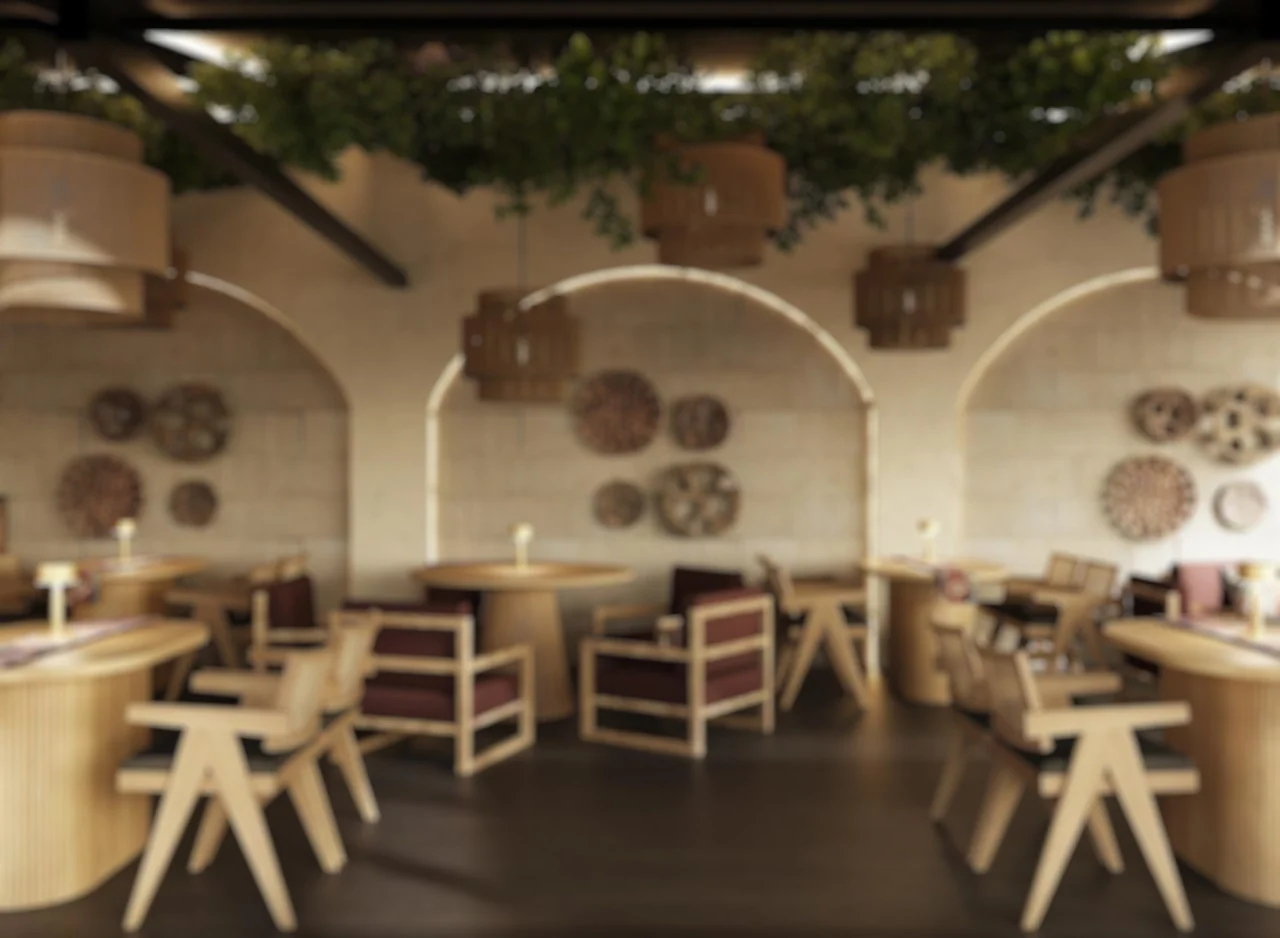
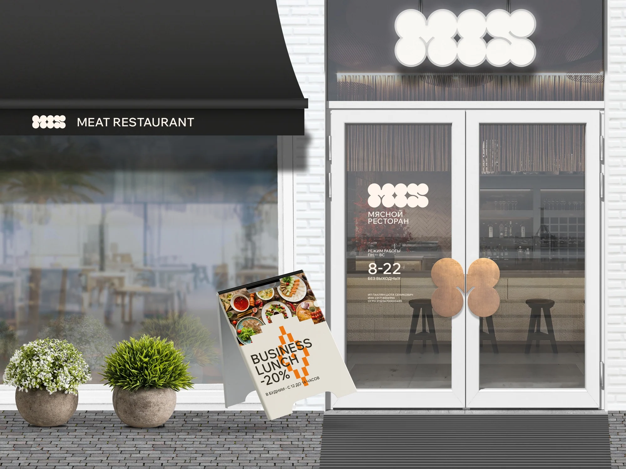
The system responds to the restaurant's real environment
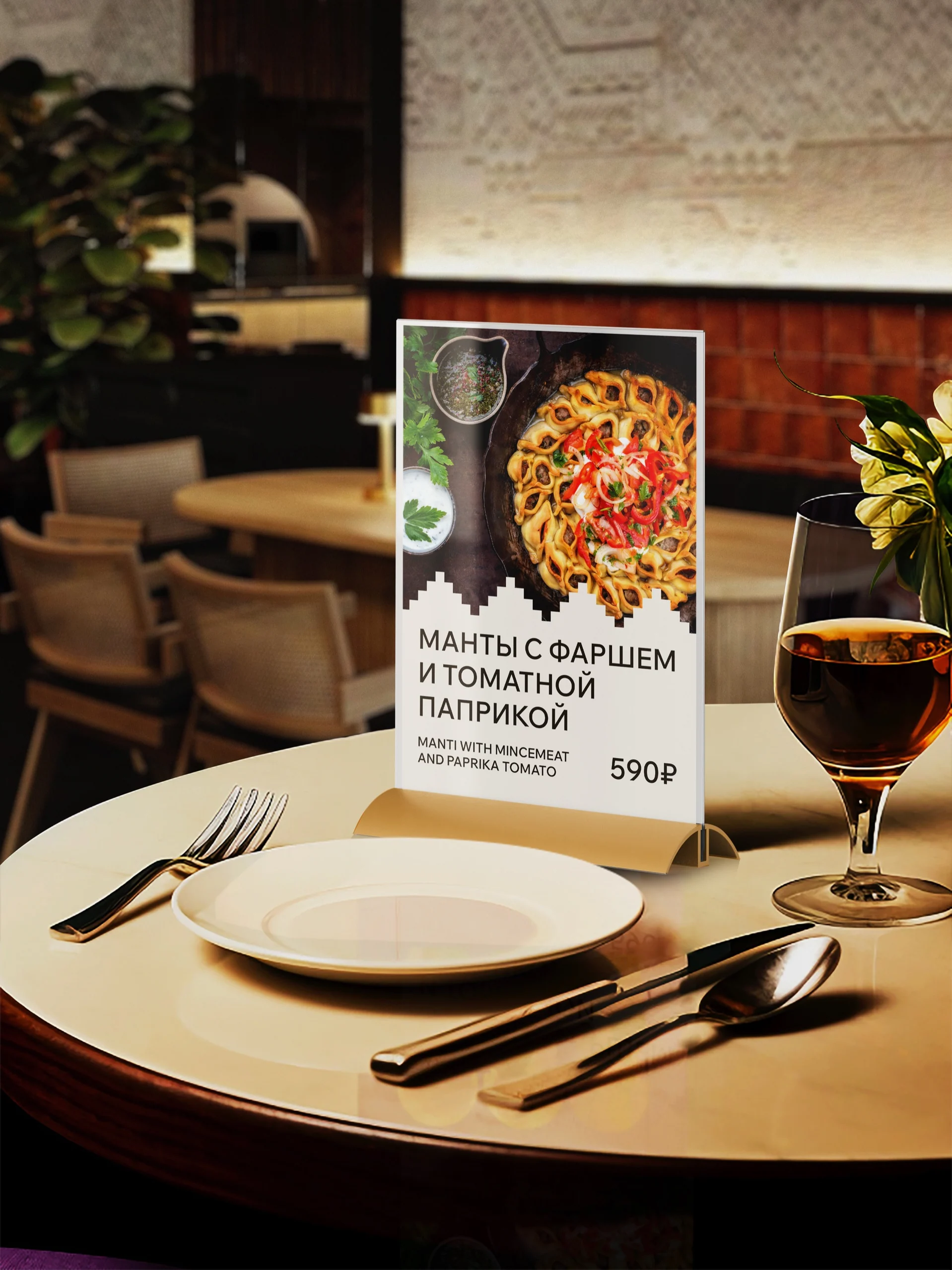
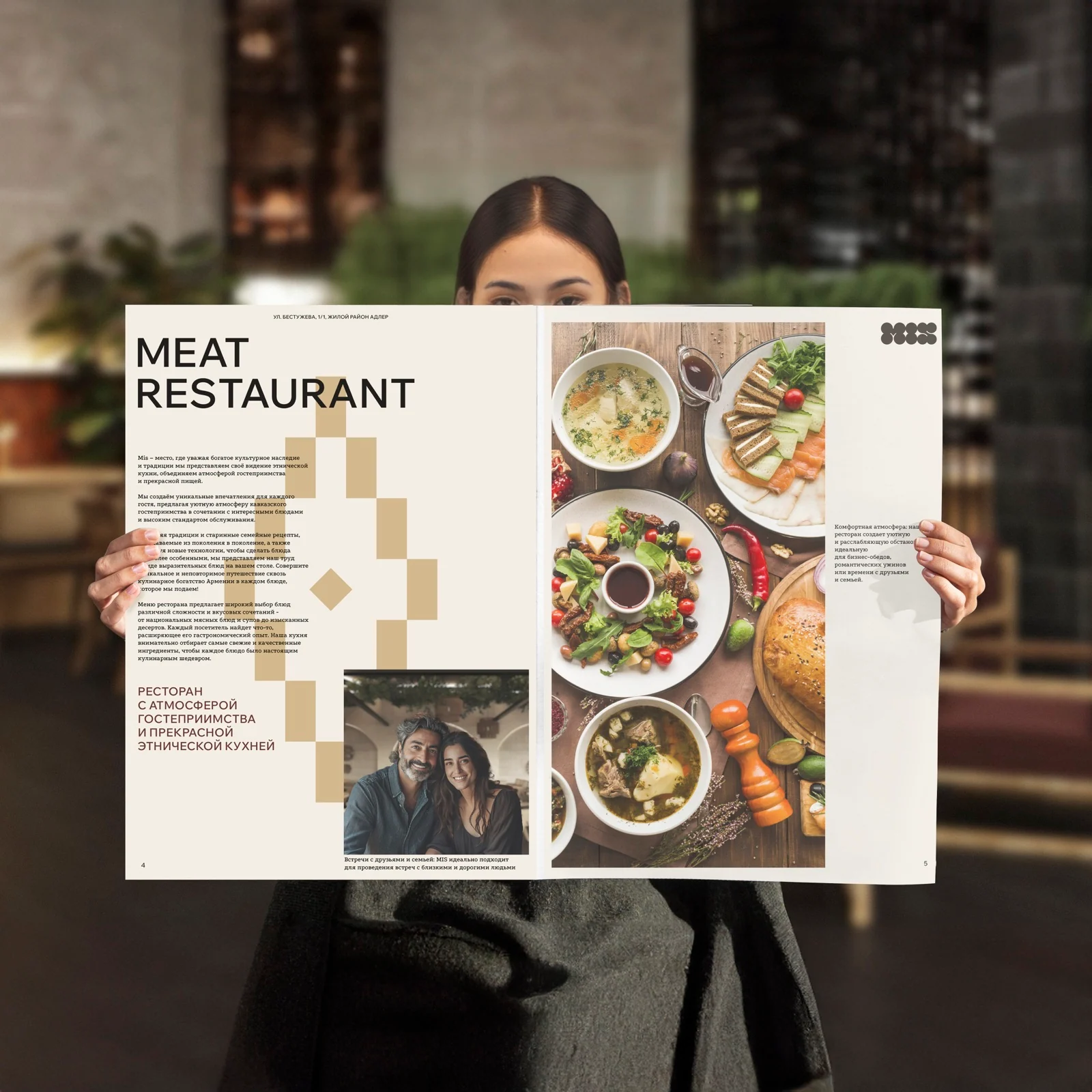
Project outcome
The brand gained a verbal and visual system
The project established a foundation for consistent work by the MIS team and contractors, from the central idea to logo placement rules and communication templates.
- Positioning and brand platform
- Philosophy, values, mission, and audience
- Archetype and communication strategy
- Tagline, descriptors, and headlines
- Logo, brand lockup, color, and typography
- Graphic elements and application system
- Brand book and visual identity guidelines
Next case study
HANDWICH
Another restaurant project: identity and practical guidelines for a fast-food format.
Explore HANDWICH
The first conversation
We find the idea that brings the brand together
Tell us what is changing in your project and where the old system no longer helps. We will determine what to build first: positioning, language, or identity.
Discuss your challengePhone+7 921 791-93-18
OfficeSt. Petersburg
Atlantic City, 126B Savushkina Street
Atlantic City, 126B Savushkina Street