
PASTEIS & COFFEE · interiors
Pastéis
and coffee.
Portuguese character
in a café setting.
and a seat at the next table.
From Portuguese motifs to a physical space
One character.
Different cafés.
The look of Pastéis and Coffee grew from Portuguese painted azulejo tiles. We developed a brand ornament from them and brought it into the interior.
We did not make every café identical. Each location responds to its surroundings, while Portuguese motifs and recognizable details connect the network.
Counter, finishes, light
Ornament
becomes
material.
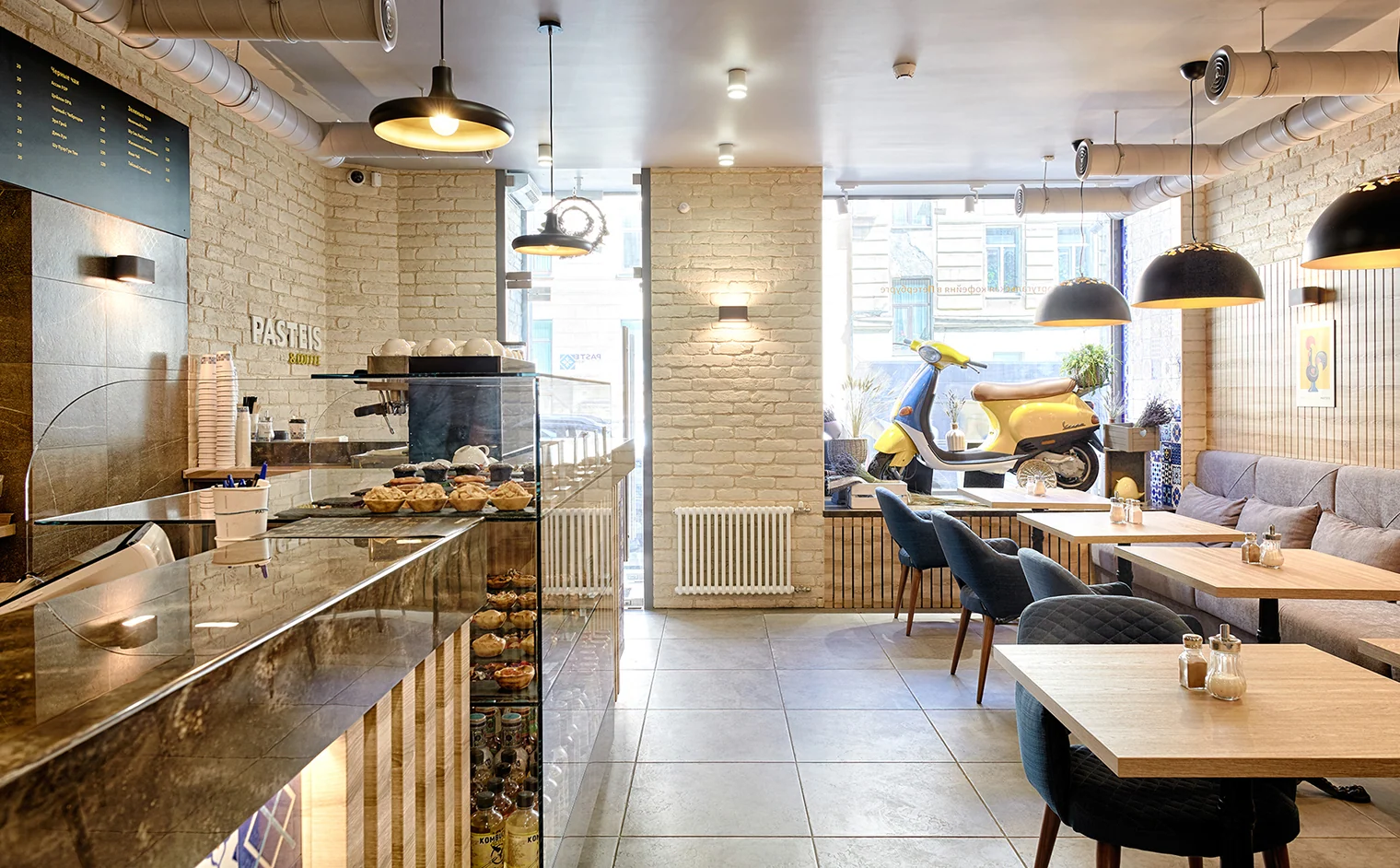
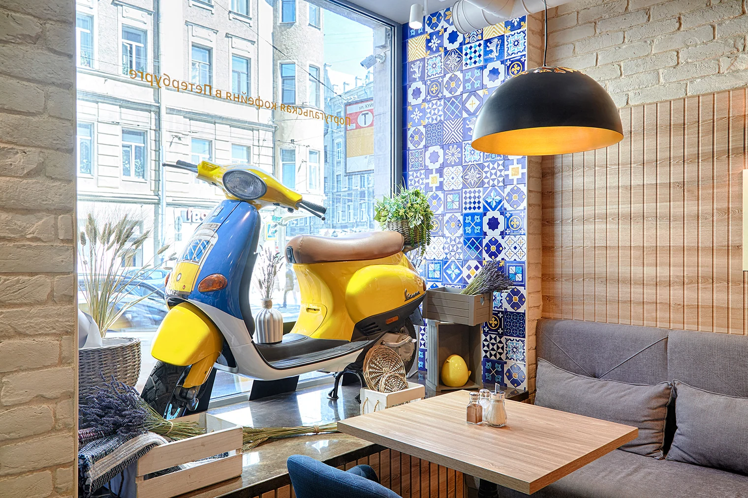
Blue-and-white tiles with yellow accents highlight the coffee counter and window reveal. Light brick, wood slats, and a dark countertop sit alongside them.
The menu strip, pendant lights, and shelf lighting define the ordering area. The brand symbol is integrated into the interior, appearing both on the wall and in the tile pattern.


Guest area
Places for unhurried coffee and conversation
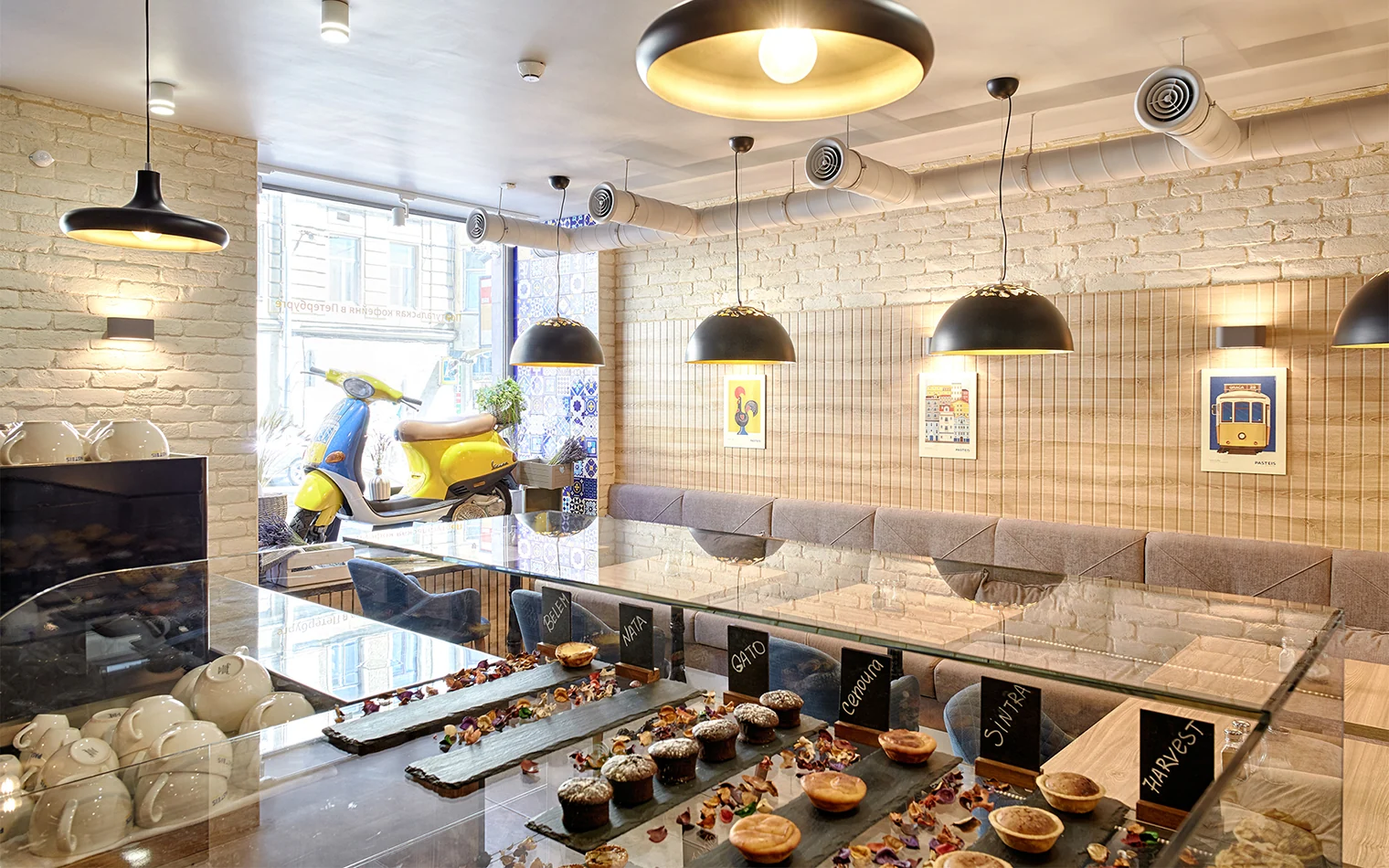
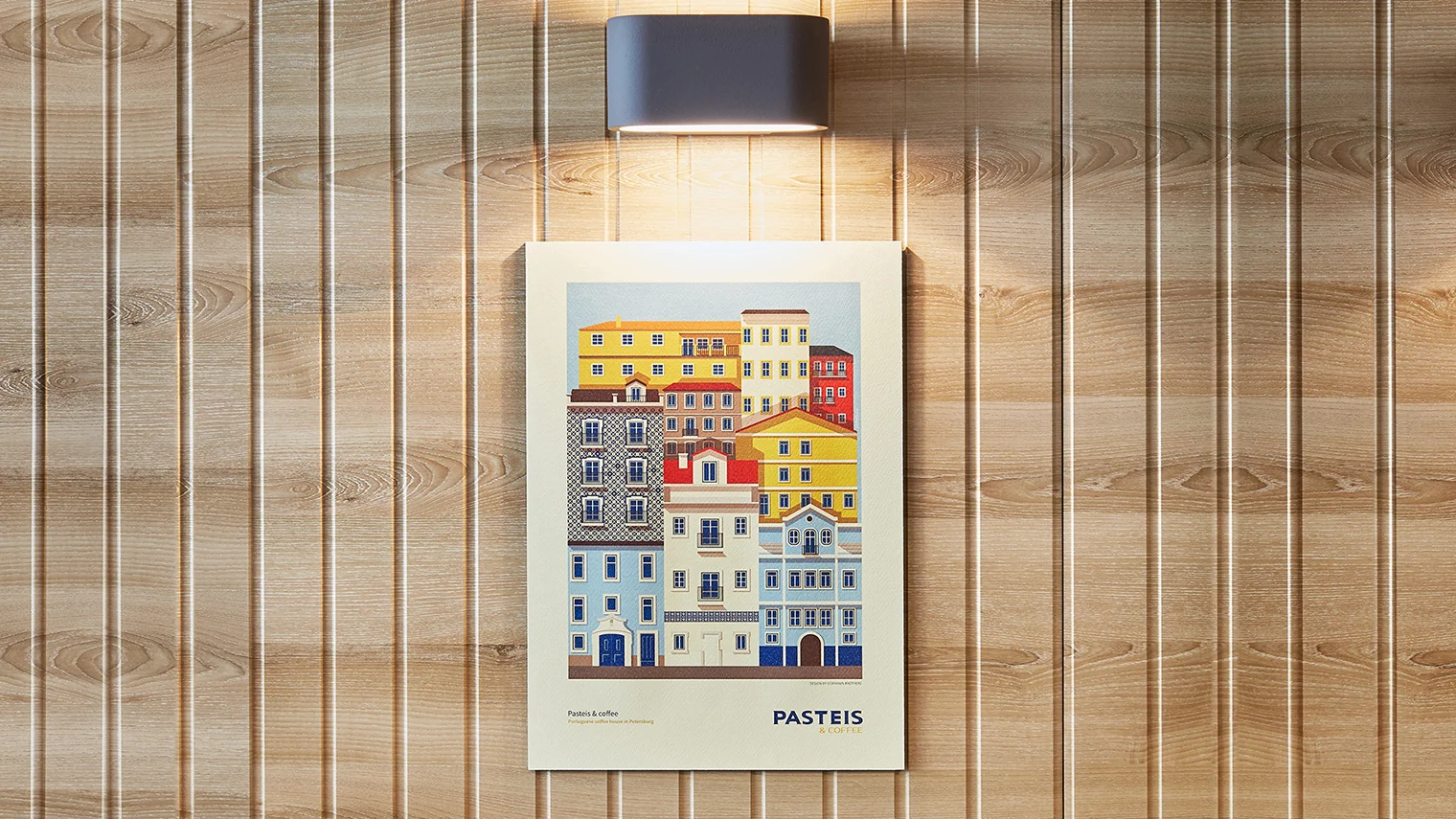
A long upholstered sofa and small tables line the wall. Black pendants with warm light define each seat, while Portuguese-themed posters continue the sense of travel.
Details continue the idea
From pattern
to texture.
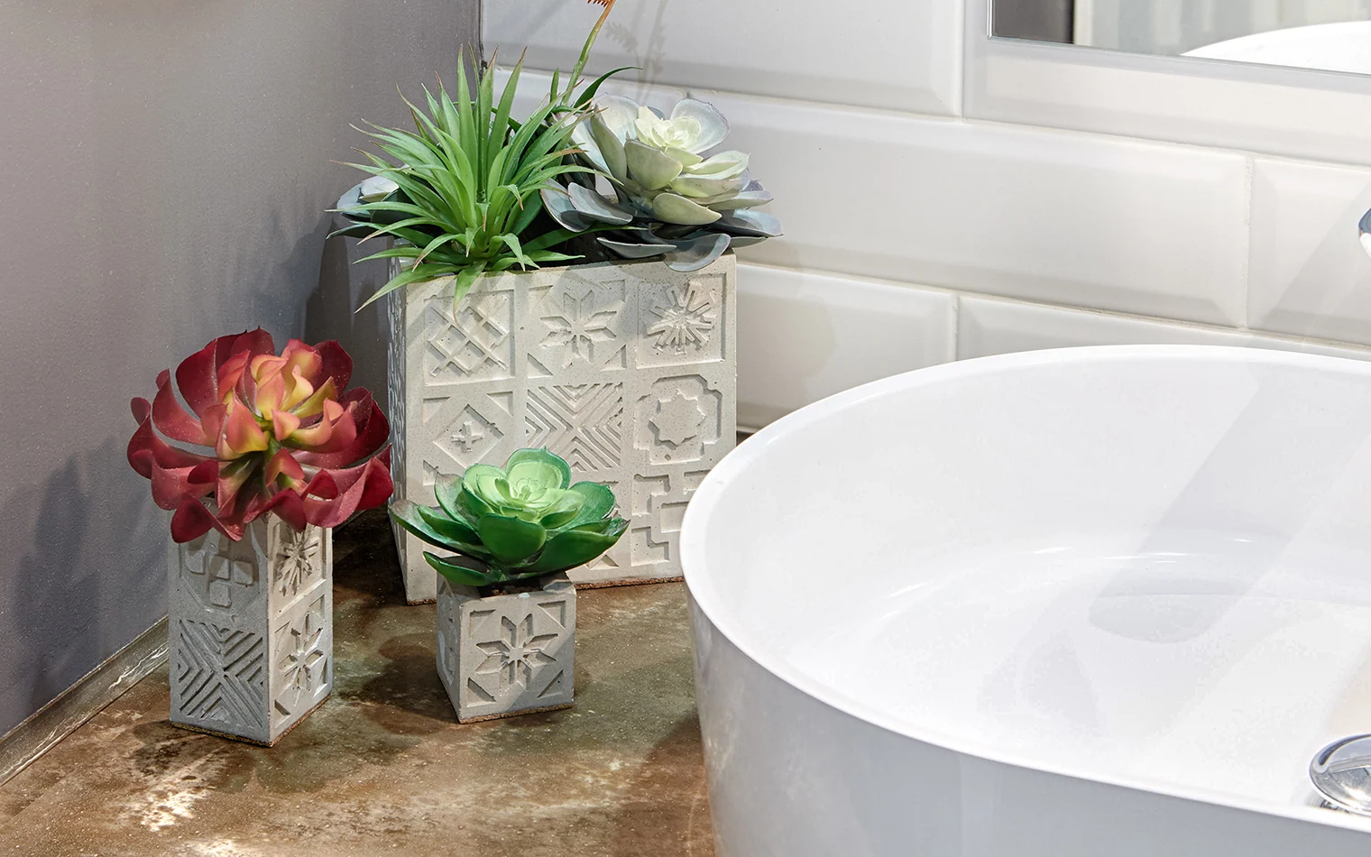
Relief patterns on small planters support the ornamental theme. Posters, lighting, and objects complement the main finishes.
Practical design solutions
Space
in drawings.
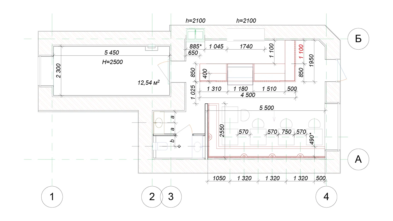
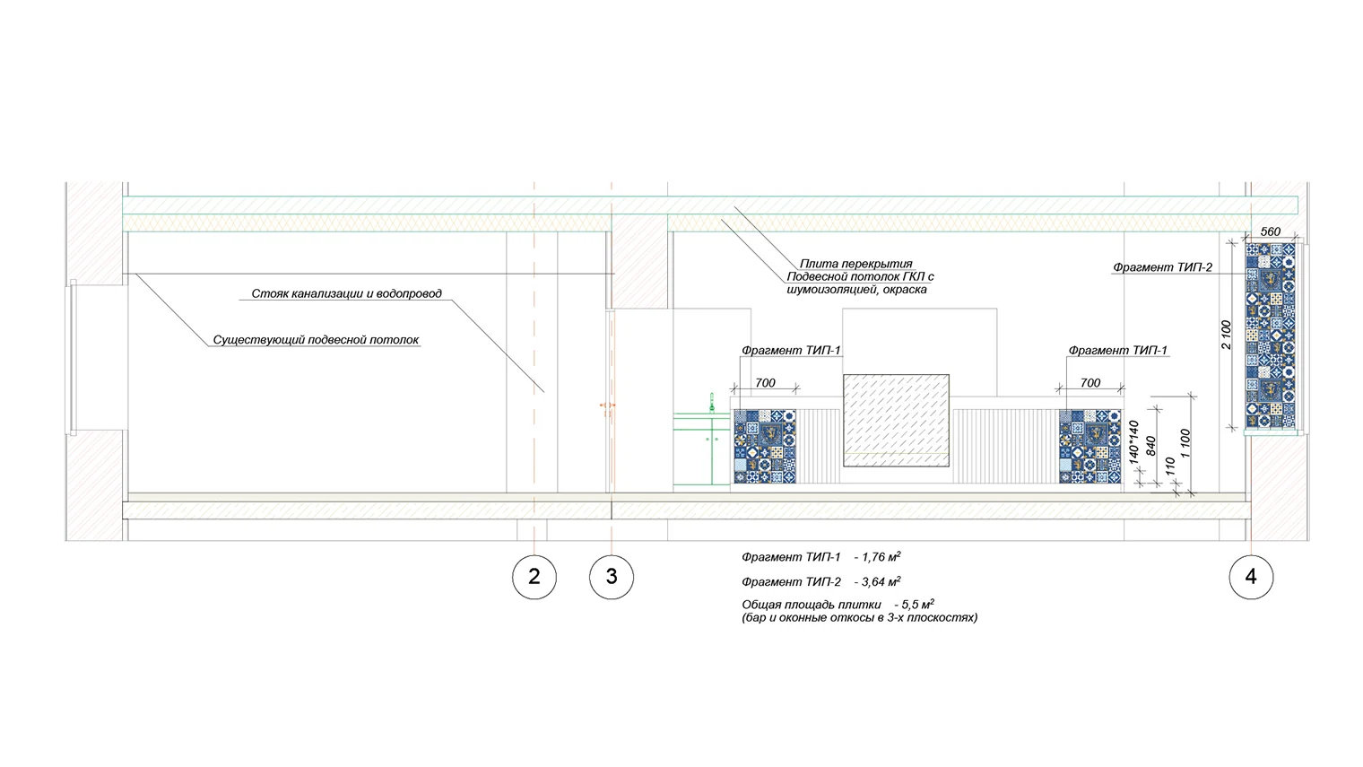
The plan shows the relationship between the counter, equipment, and seating. The elevation identifies azulejo cladding areas, dimensions, and heights.
Developing the interior system
Recognition
without repetition.
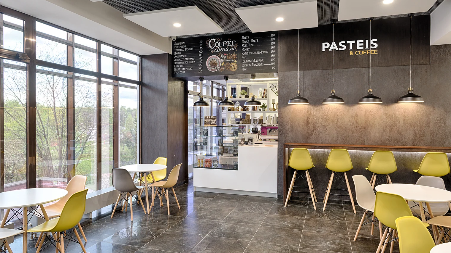
Another café in the network has large windows, compact tables, and bar seating. Its different layout retains the shared palette: light surfaces, dark accents, and yellow details.
the chain's brand↗