
 01Wordmark
Portuguese café chain · identity · packaging · interiors
St. Petersburg / 2017 — system developmentPastéis and coffee
Portuguese character, from product to space.
We built the identity around azulejo, the painted tiles that connect the logo, packaging, interiors, and the café network's communication.
The brief
How to make an unfamiliar product understandable without simplifying its character
The brand needed a system that explained the product's origins, worked in a fast-paced urban format, and stayed cohesive across the chain.
Visual identityPackagingWebsiteSMMInteriorsPhotographyPromotion
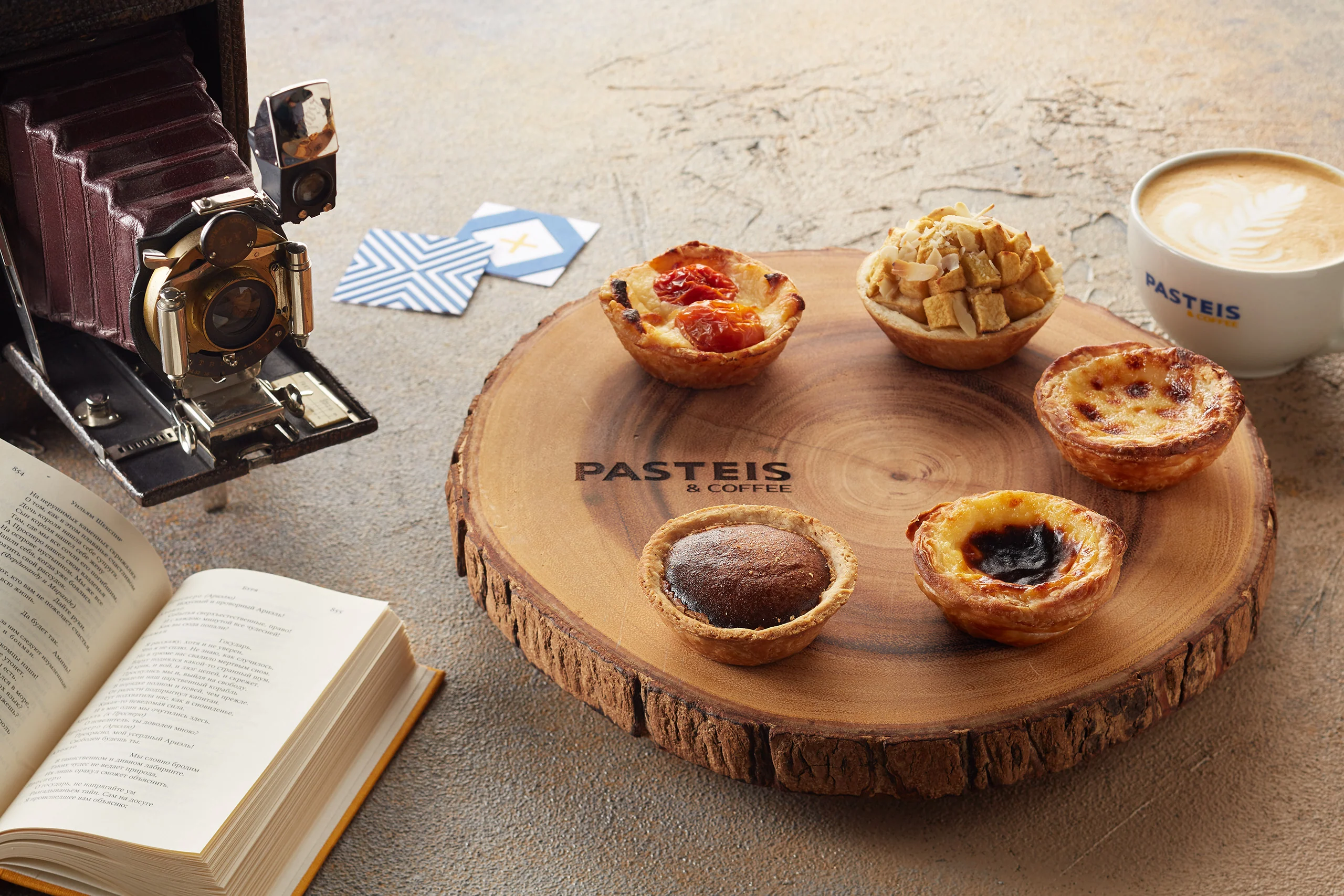
PASTEIS & COFFEE is a Portuguese café in St. Petersburg. At its heart are pastéis: a refined pastry tradition in a convenient takeout format.
We looked for a visual language that connected traditional recipes, café warmth, and the pace of city service, without the usual coffee-branding clichés.
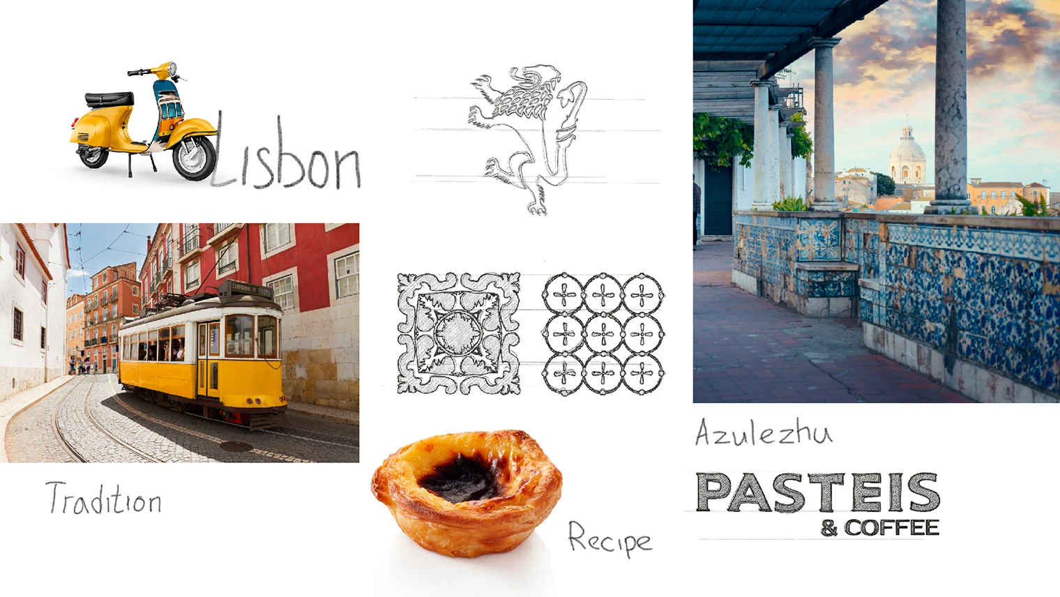
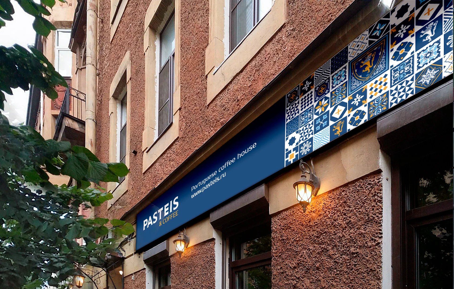
Portuguese national motifs were our starting point. Painted azulejo tiles gave the system its own rhythm and made the brand recognizable across applications.
Visual identity
Azulejo became the foundation of the brand language
We turned the character of Portuguese painted tiles into a set of modules. They form compact symbols, dense ornaments, and large spatial compositions.
01Wordmark 02Heraldic emblem
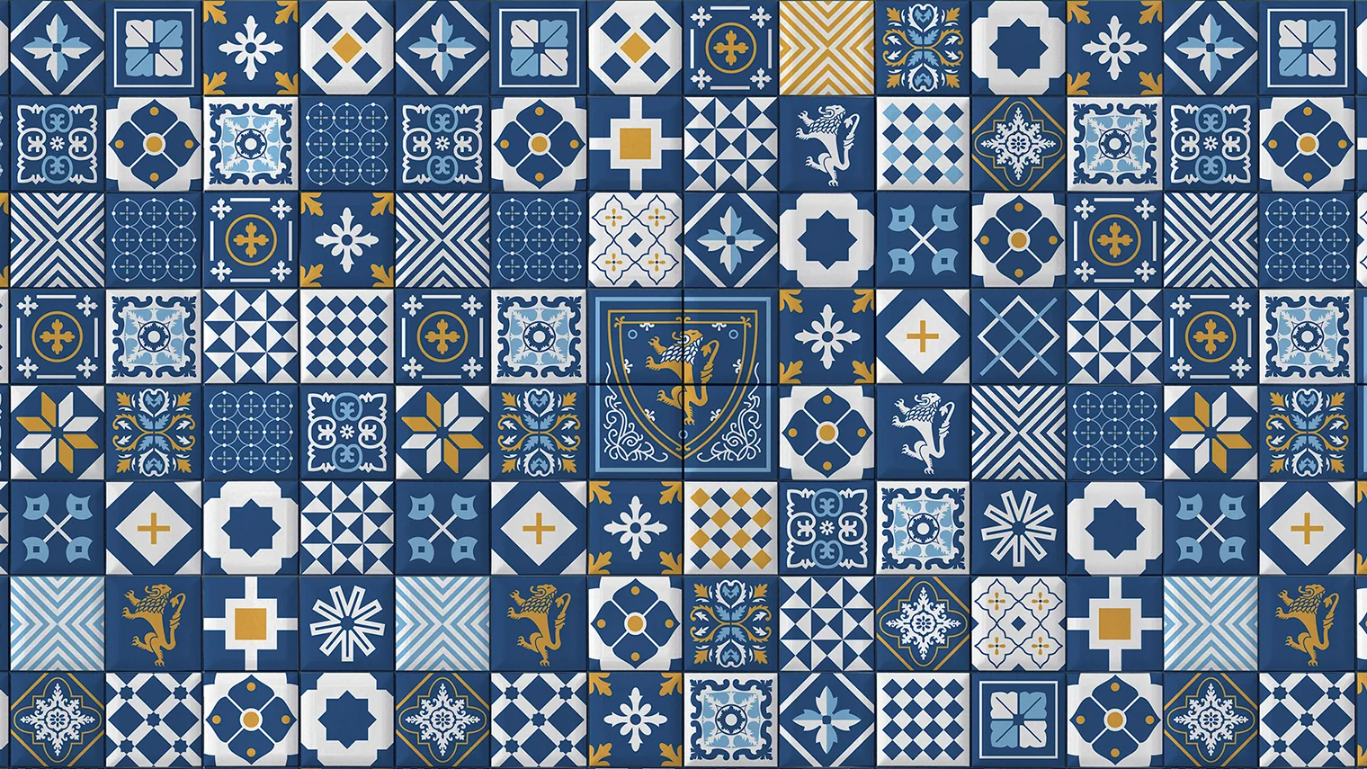
 03Brand pattern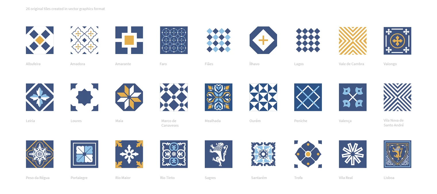
The name stayed. The meaning became clearer.
The brand already had a name. We added the descriptor “A Portuguese café in St. Petersburg,” immediately explaining the format and the product's origins.
#3E5483
#DBAE4F
#94BCE5
#F6EFE6
Packaging
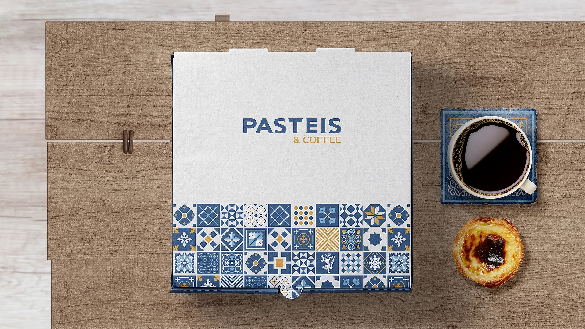
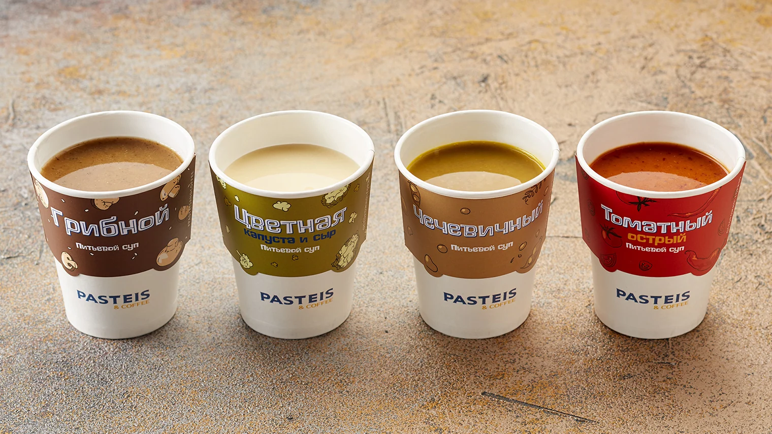
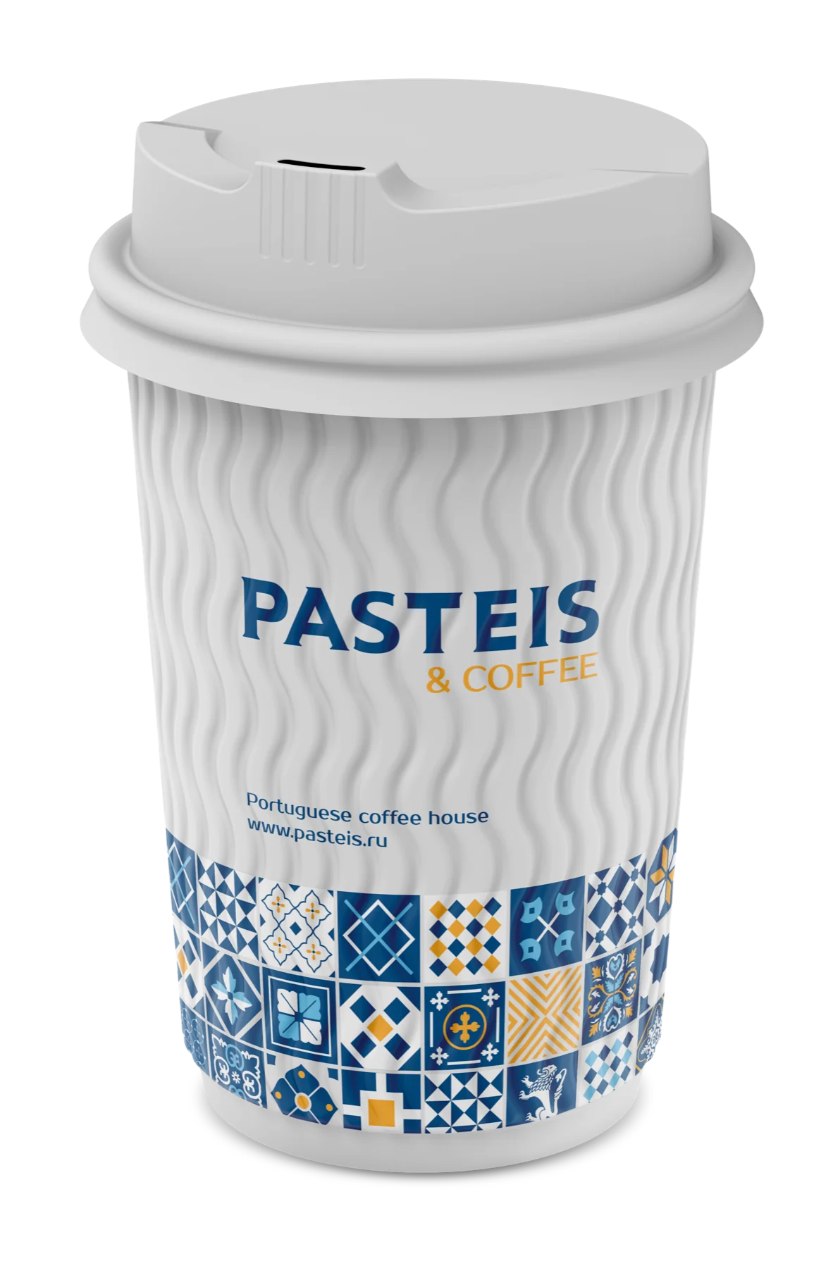
Packaging becomes part of the product
Every café visitor encounters it, so the brand system needs to be especially clear here. The pattern sets the packaging apart from conventional coffee design and unites different-sized formats.
Brand development
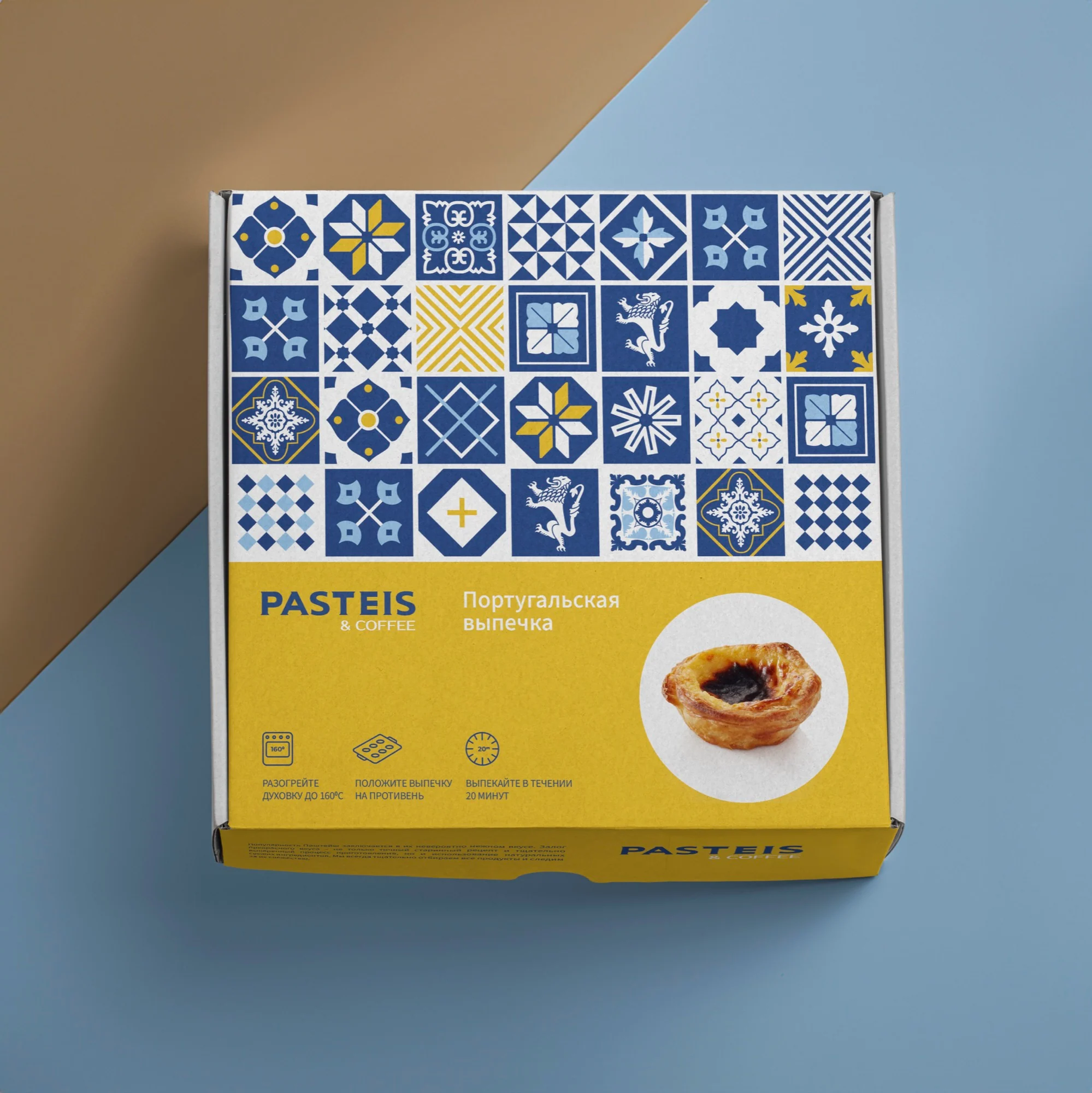
Years later, the same visual language informed a delivery box. A new application remained a recognizable part of the original system.
Chain interiors
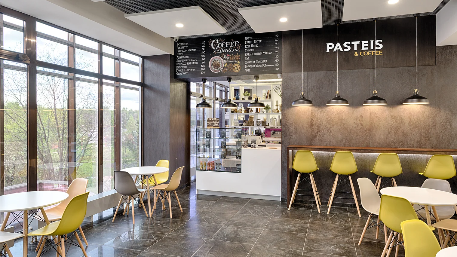
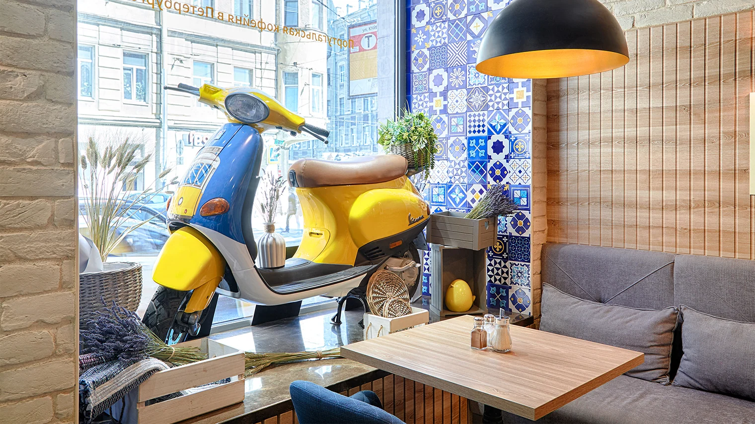
One identity, different spaces
We did not standardize every interior. Each café retains its own character and fits naturally into its surroundings, while azulejo and branded details maintain the connection to the overall system.
Communication
The brand extended into the city and digital
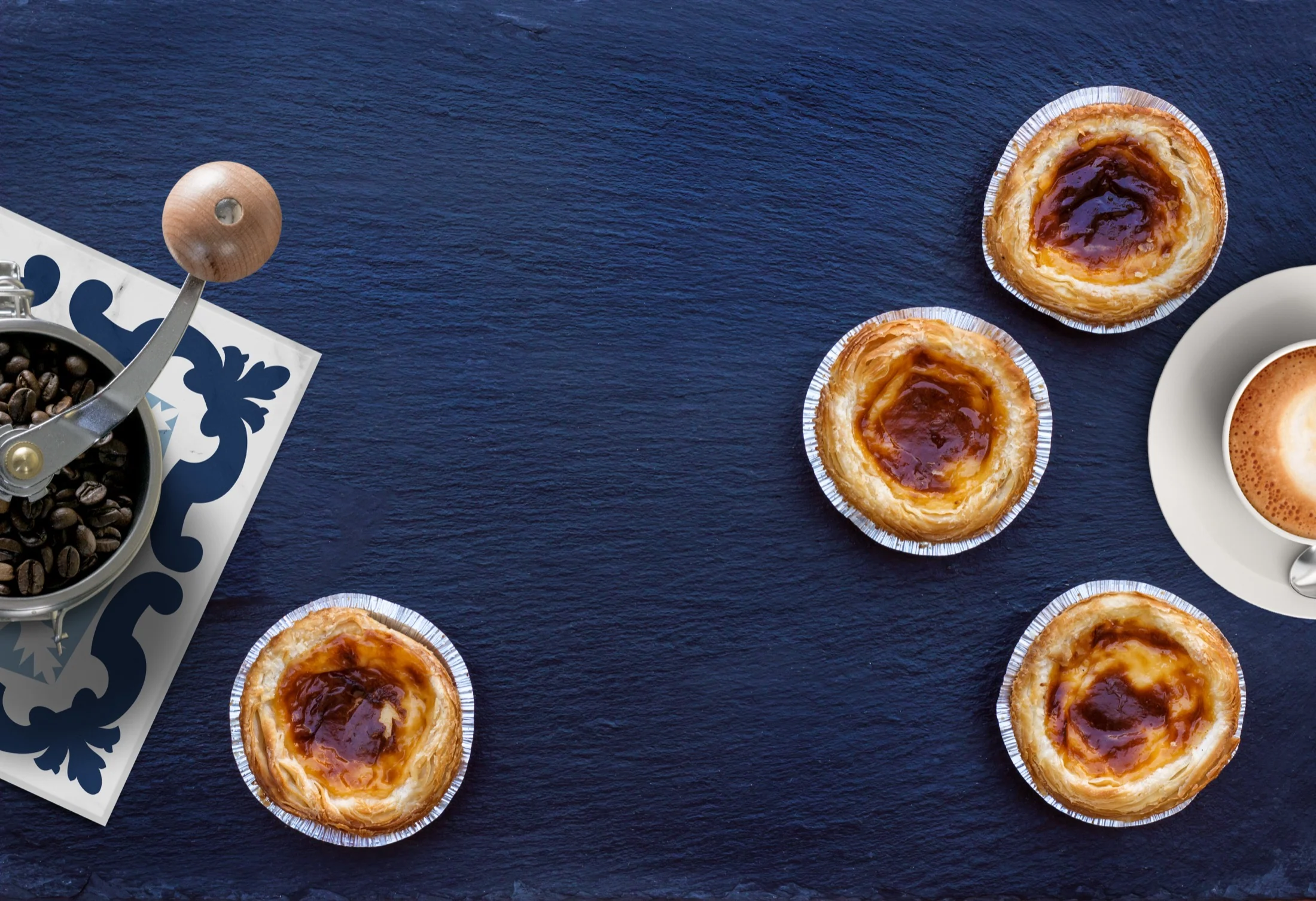
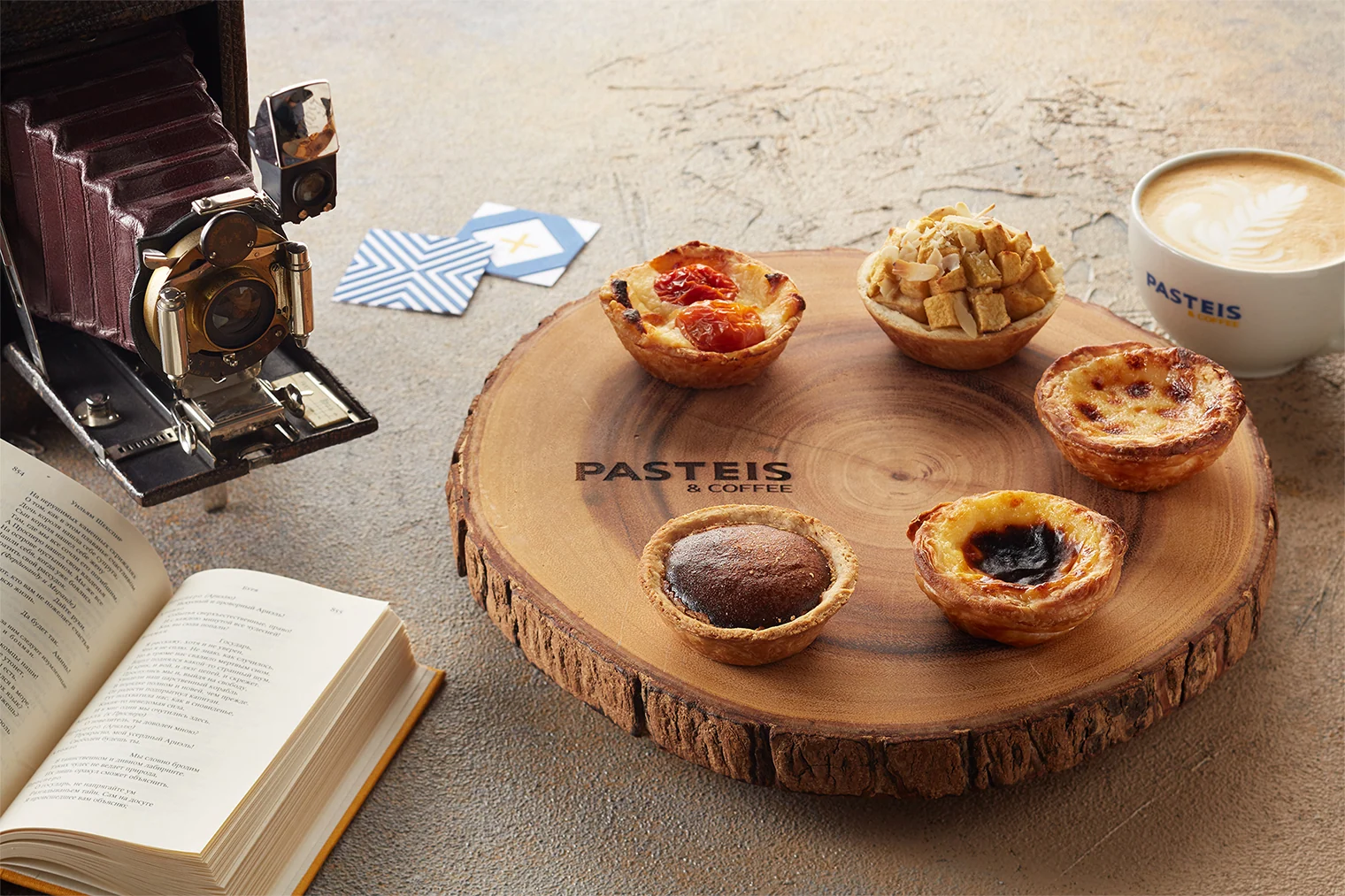
We designed the cafés' map listings and social media presence, photographed products, and created content. The products and Portuguese imagery play an equal role alongside the graphic system.

Digital and guidelines
A working website and 326 pages of brand guidelines
We developed the café website and detailed identity guidelines. You can explore the website within the case study and browse the entire brand book in 27 seconds, pausing the video on any page.
pasteis.ru / live
Open separately ↗
Complete guidelines
326 pages.
12 pages per second.
A fast page-through reveals the system's actual scope, from identity principles to applications. All 326 pages pass before your eyes in 27 seconds.
27 seconds · silent · loopedProject scope
A brand system, from mark to space
This case brings together our work for the network: visual language, packaging, physical locations, and everyday communication.
The pattern became a fundamental element of the identity, but the system is more than a single device. It maintains a consistent character across scales, from cups and boxes to facades and interiors.
This case study presents materials from the main project and subsequent applications, without claims about commercial performance.
- 01Visual identity
- 02Packaging design
- 03Website
- 04Social media and content
- 05Café interiors
- 06Photography
- 07Promotion
2017
St. Petersburg · Portuguese café network
The main project and ongoing development of applications.Next case study
ZURI
A restaurant brand in Sochi where the platform, visual identity, and digital experience shift with the rhythm of the day.
View ZURI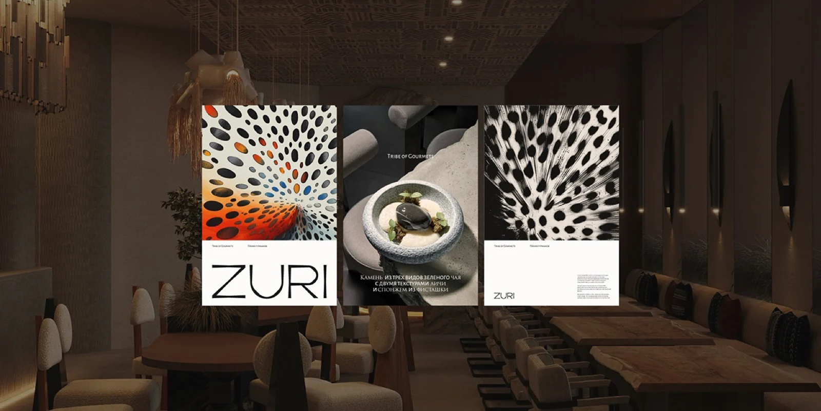 Next project ↗
The first conversation
A brand begins with the product and continues through every touchpoint
Tell us about the format, product, and scale of your future chain. We will help determine what to build first: strategy, identity, packaging, or space.
Discuss your challengePhone+7 921 791-93-18
OfficeSt. Petersburg
Atlantic City, 126B Savushkina Street
Atlantic City, 126B Savushkina Street