


Italy, Spain, the Balkans, Turkey, and North Africa are sources for an original interpretation, not literal quotations.
The restaurant changes with the rhythm of the day
For a restaurant serving original Mediterranean cuisine, we built a brand around the connection between people and nature, its gifts, biorhythms, and cultural memory.
View case studyContext
The restaurant's mood changes with the time of day
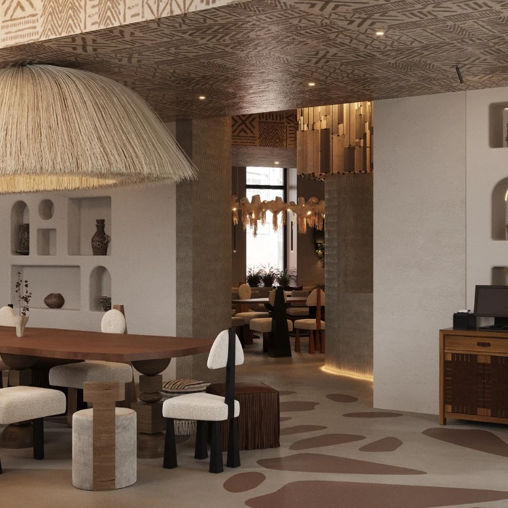
ZURI was conceived as a contemporary Mediterranean restaurant in Sochi: a place to relax, meet, and talk during the day, becoming a livelier setting for a young, style-conscious, creative audience at night.
Connect cuisine, atmosphere, and communication through one idea, without limiting the restaurant to ethnicity or a conventional fine-dining category.
Food becomes a way to remember that we are part of nature.
Brand platform
Connecting people, nature, and cultural memory
The brand connects original dishes with an atmosphere reflecting natural cycles: sunrise and night, changing seasons, the flow of energy, and the return to a shared table.
Mission
Bring flavors and atmosphere together so guests can step out of the city's pace and spend time together, more attentive to food, nature, and one another.
Authenticity
An individual perspective rather than a literal reproduction of cultural codes.
Quality
Attention to ingredients, dish details, and the consistency of the experience.
Aesthetics
Flavor, light, material, and composition form one experience.
Hospitality
Comfortable conversation and a sense of belonging around a shared table.
Sensuality, beauty, pleasure, and closeness.
Travel, new flavors, and the freedom to discover.
Name
ZURI
beautiful / wonderful
In Swahili, ZURI means beautiful. The short name sounds natural and open, without tying the restaurant to one cuisine or time of day.
A tribe of food lovers
The descriptor turns the audience into a community: people are united not by status, but by curiosity about flavors, atmosphere, and shared experiences.
Biorhythms
One brand.
Three states.
 01 / Dawn
Beginning
Calm, lightness, and the energy of a new day.
 02 / Midday
Strength
Peak energy, meetings, and flavor in full light.
 03 / Night
Attraction
Music, inspiration, and a freer rhythm of conversation.
SpringSummerFallWinter
Visual identity
Precision of form.
Organic texture.
A minimalist wordmark is paired with natural tones, organic structures, and compositions that feel alive yet disciplined.
 Primary logo
 Brand lockup · logo and descriptor
A civilization of flavors
Tribe of gourmets
Trajan Pro 3 × Alegreya Sans SCBrand texture
A natural pattern becomes a portal
The texture suggests skin, stone, water, and ancient ornament at once. It scales from a fine outline to an expressive field in its own right.

The system in application
From menus to urban communication
The applications below are design visualizations. They demonstrate the system's principles and do not claim a manufactured production run.


Social media
Communication follows the mood of the day



DAWNMIDDAYNIGHTa consistent visual rhythm
Project outcome
The strategic idea gained its own rhythm, voice, and visual form
The project established a cohesive foundation for the restaurant brand, from the name's meaning and the space's role to communication guidelines and applications.
- Brand platform, mission, vision, and values
- Positioning and audience profiles
- Lover and Explorer archetypes
- Tone of voice and the tagline “Tribe of gourmets”
- Logo and brand lockup
- Color palette and typographic system
- Textures, patterns, and biorhythm icons
- Rules for business, print, and digital applications
Project
GORYANIN BROTHERS × ZURI
2024
Brand platform · positioning · verbal identity · visual identity · usage guidelines.
This case study uses materials from the final guidelines. Mockup scenes are labeled as renderings; no claims are made about commercial performance or production of the applications.Next case study
MIS
A restaurant brand with Armenian roots, where strategy, semantics, and identity create a contemporary interpretation of regional cuisine.
View MIS Next project ↗
The first conversation
A brand can change its mood and remain itself
Tell us about the place, product, and people you want to bring together. We will help find an idea that connects strategy, space, and communication.
Discuss your challengePhone+7 921 791-93-18
OfficeSt. Petersburg
Atlantic City, 126B Savushkina Street
Atlantic City, 126B Savushkina Street