


Brand platform · identity · digital · interior
&PLACE! / 20Creating a coworking brand
Branding a chain of
coworking spaces
The brief
We build a coworking brand around people's needs
Audience researchCoworking positioningBrand platformMeaning and tone of voiceVisual identityBrand guidelinesWebsite and presentationsIntegrating the identity into the interior
Other coworking brands talked about desks, internet, and meeting rooms. We began with a different question: why do people come to a space, and how do they want to feel when they leave?
We segmented the audience, identified values and insights, then shifted the focus from renting a desk to people's possibilities: creating, meeting, learning, launching ventures, and changing how they work.
This became one system: positioning, meaning, visual identity, brand book, website, presentations, and visual principles for physical locations.
Brand platform
A place for creativity and self-expression
A person is more than a job title. Today they lead a project; tomorrow they build a team; in the evening they learn or try something new. &PLACE! does not label people or divide work from interests; the brand becomes a helper.
Not prescribing a scenario, but making room for your own.
Supporting both a fast start and calm, focused work.
Help people meet partners, like-minded people, and new ideas.
Put people's interests ahead of a list of services and facilities.
Brand mark
& means being there
The ampersand expresses belonging and a supportive role. The exclamation point adds energy, while the restrained wordmark preserves the chain's professional character.


- 01&Inclusion, connection, support, and a person's place within a community
- 02placeA professional brand foundation without unnecessary decoration
- 03!Energy to act, openness to new ideas, and a confident character
#423799primary#CA75D2lilac#00CBCCturquoise#FBC800yellow#FF7239orange
Meaning and tone of voice
One brand, different tones
For inspiration, the brand speaks vividly and emotionally. For knowledge, development, and principles, it is calmer and more restrained. The tone changes with the content, but recognition remains.





01 / 08
Visual grammar
A visual identity built as a system
The word “you,” residents' faces, a compact symbol, and a modular pattern form a lively construction kit. It adapts to the person, format, and communication theme.



you
your idea
your people
Identity in application
Visual identity in everyday use
Folders, cups, and totes extend the visual system into physical objects. The logo, pattern, and brand faces connect business materials, services, and resident merchandise.


01 / 02
Digital and presentations
Website and communication design for a coworking chain
We carried the brand principles into the website, presentations, and screens within the space: prominent content, clear navigation, brand shapes, and a consistent rhythm across formats.
Brand in space
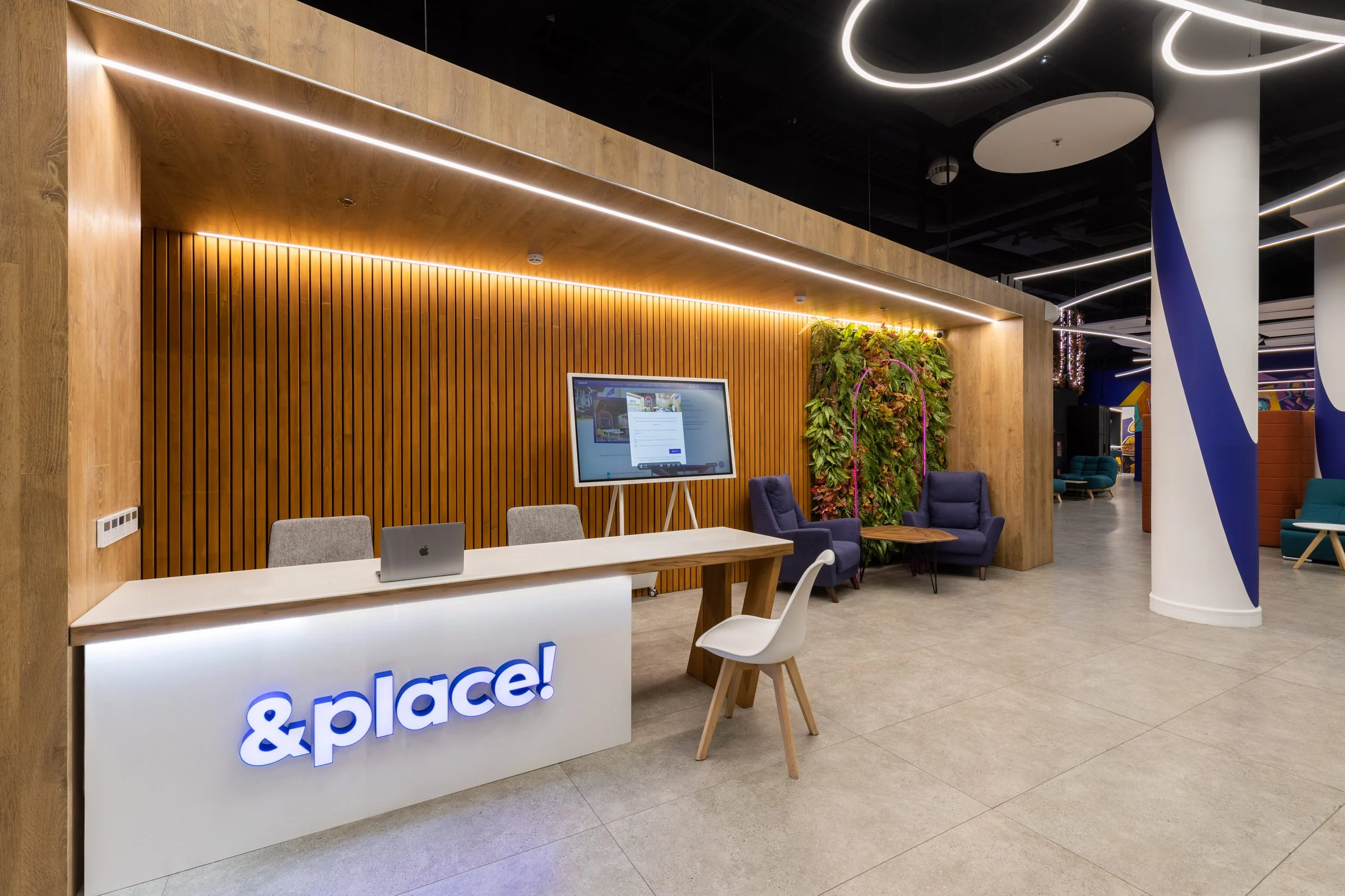
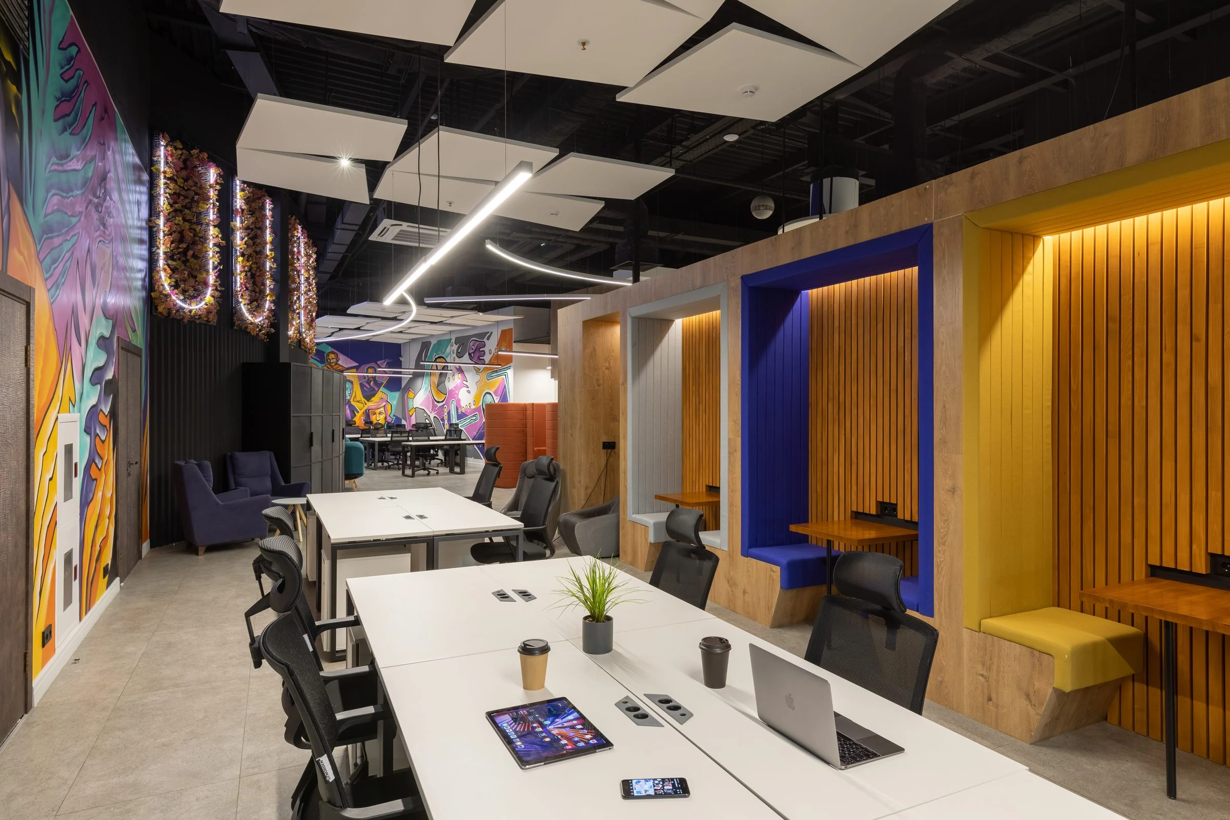
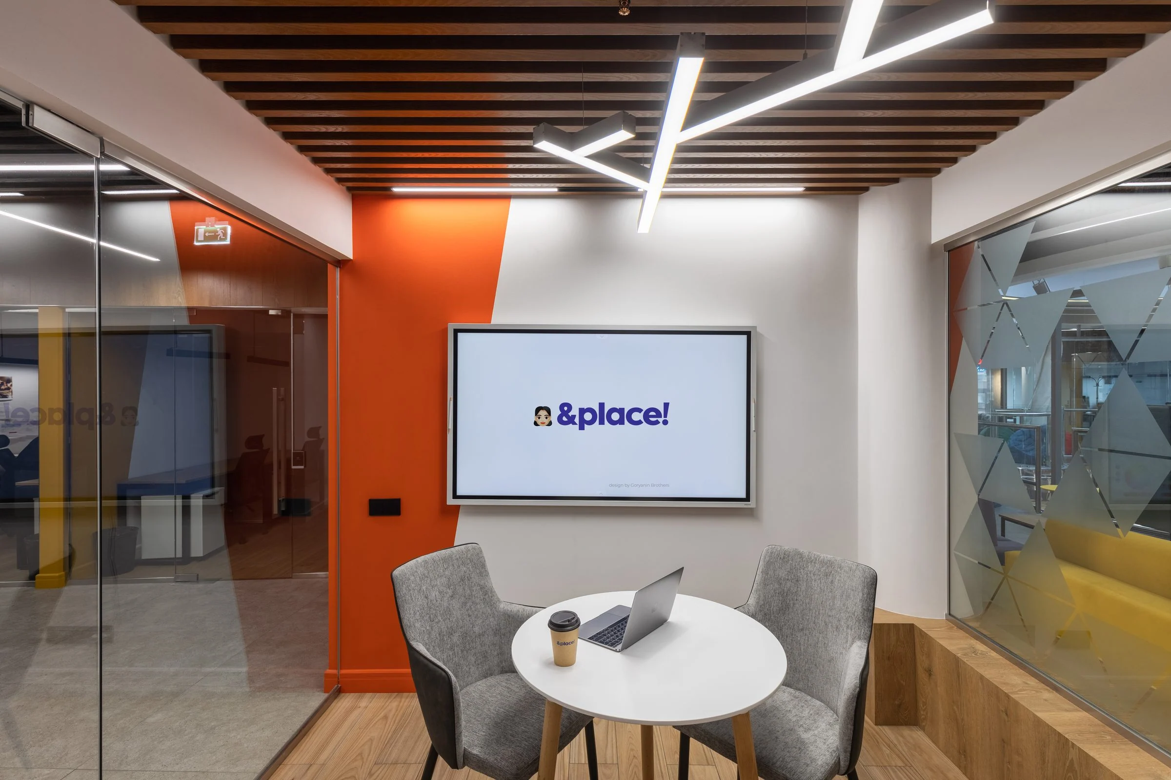
Identity becomes interior
Color, wayfinding, pattern, and tone moved from the brand book into real locations. The system now works in residents' daily journeys, not just in layouts.

Project outcome
From brand platform to interior
We created for &PLACE! a cohesive system in which strategy immediately becomes design. Freedom and self-expression come through in the name, messages, color, applications, digital, and space.
The brand can use different tones, collaborate with partners, and appear in new locations without losing its character. Recognition comes from connected verbal and visual logic, not a single device.
- Audience research
- Positioning and brand platform
- Meaning and tone of voice
- Logo and compact symbol
- Brand palette and typography
- Pattern and graphic compositions
- Business applications and merchandise
- Brand guidelines for a coworking network
- Website and presentation design
- Integrating the identity into the interior
Related case study
&PLACE!
Atrium
A separate interior project for the venue: architectural concept, wayfinding, furniture, and spatial scenarios.
View the interior case study →Interior · wayfinding · implementation
Discuss a project
Need a brand that works online and in physical space?
We will study the audience, find the central idea, and build a system, from positioning to real touchpoints.
Discuss a projectPhone+7 921 791-93-18
OfficeSt. Petersburg
Atlantic City, 126B Savushkina Street
Atlantic City, 126B Savushkina Street