
Visual identity and wayfinding
Maternity hospital
№10
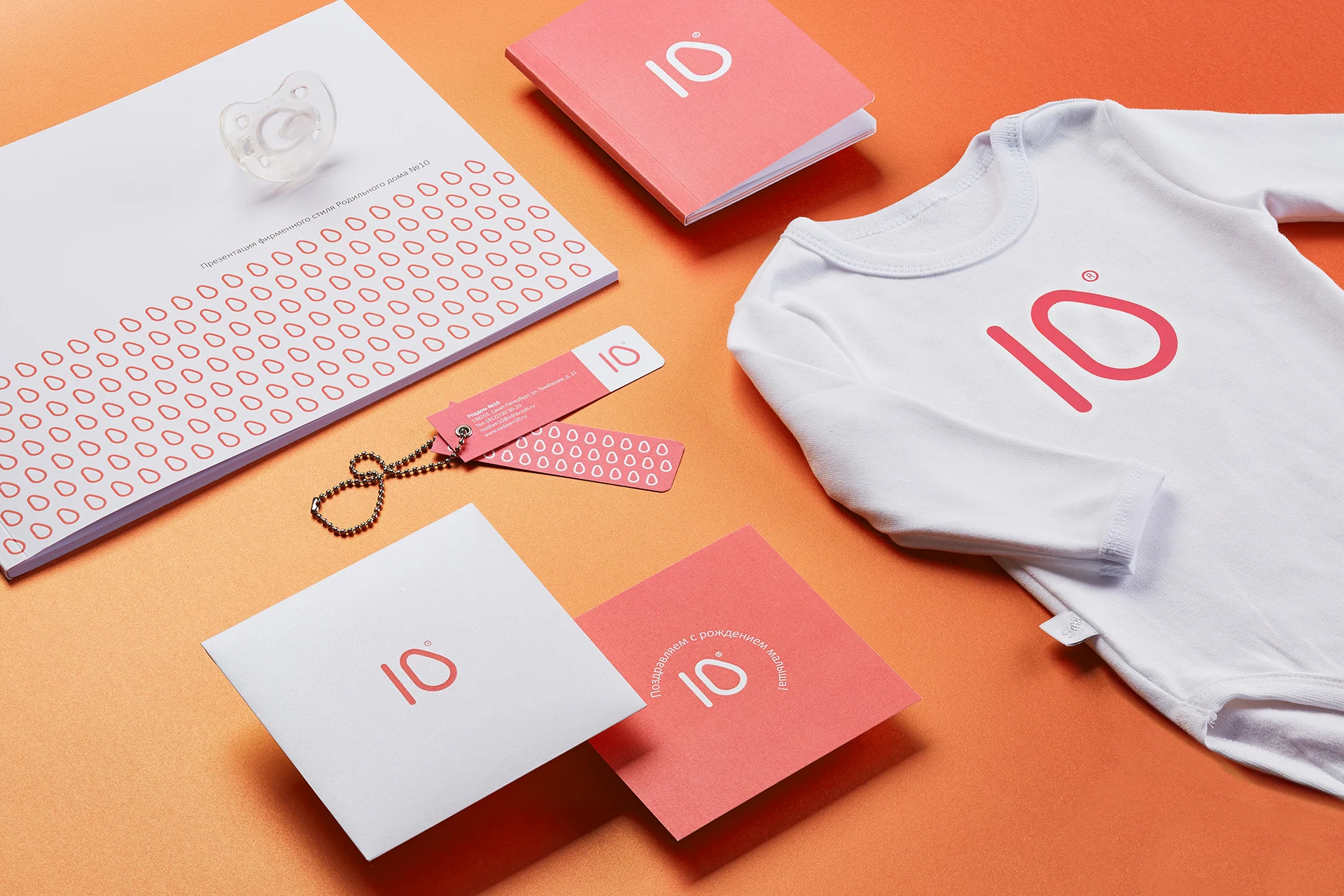
We built a warm, calm system around the most recognizable part of the name: the number 10.
The brief
Find a recognizable identity within a familiar public institution name
“Maternity hospital” describes an institution type without distinguishing it. For Maternity Hospital No. 10, the number was the only unique element of the name.
We made the number 10 the primary identifier and built a visual system around it, from the symbol and identity guidelines to applications, a digital service concept, and wayfinding.
The identity needed to be modern and precise without feeling cold: calm, warm, and human for expectant parents.
The idea behind the mark
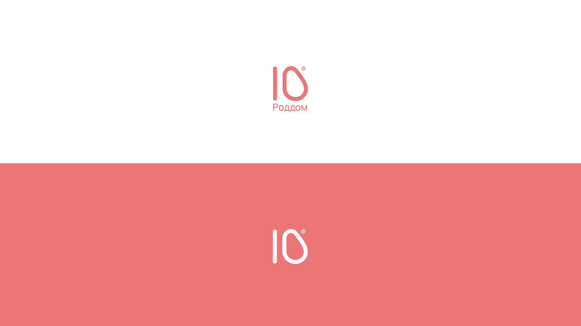
The number 10 became a metaphor for awaiting new life
We began with simple numerals and reshaped the zero to gently suggest a pregnant silhouette.
maternity hospital
The familiar words “maternity hospital” beneath the mark both identify the organization and explain its role. They make the mark distinctive without weighing it down with the full official name.
Brand system
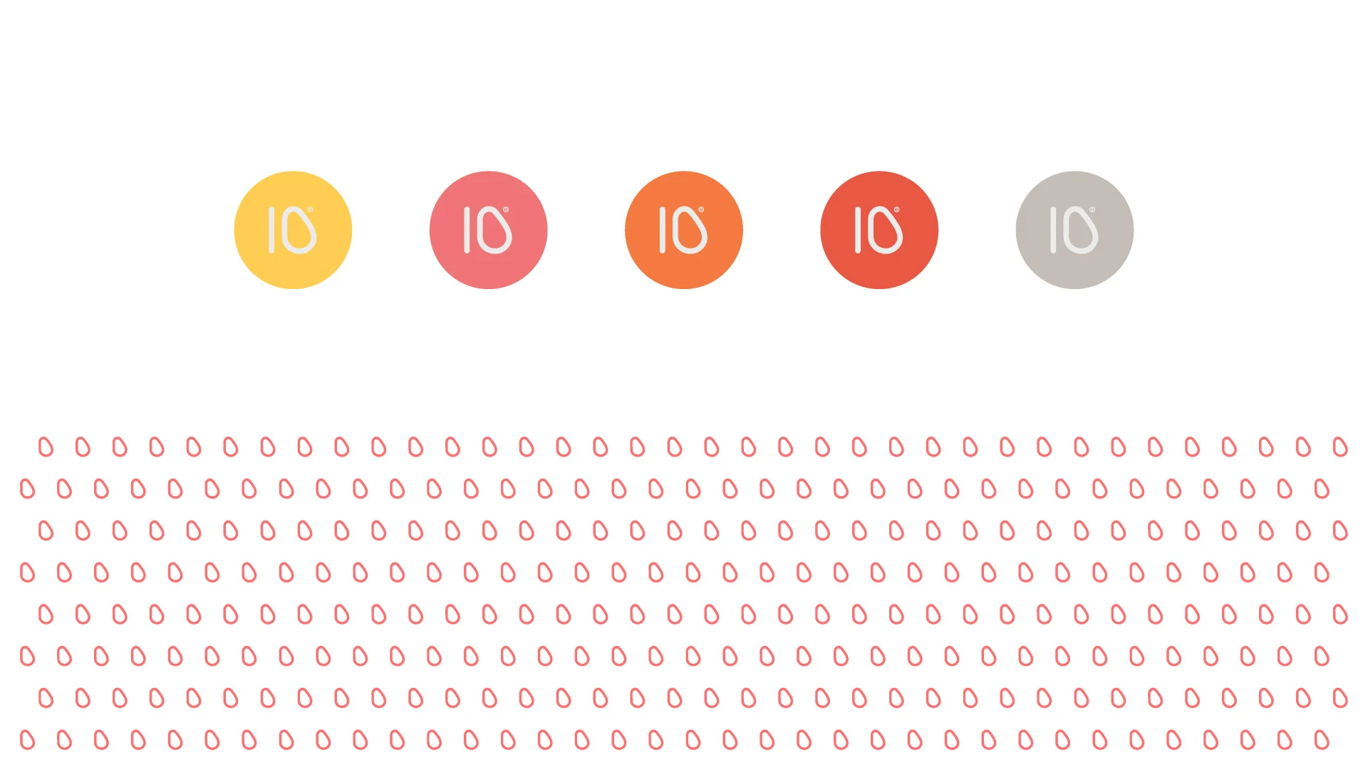
A warm palette changes the feel of a healthcare environment
Coral defines the brand's character, while yellow, blue, green, and secondary shades support a lively, welcoming atmosphere, closer to a comfortable European hotel than a cold examination room.
#F16F6F#E7CEB5#716263#797FBC#DB7496#85C4E0#7DBC83#E18D78#EEC47C


Applications
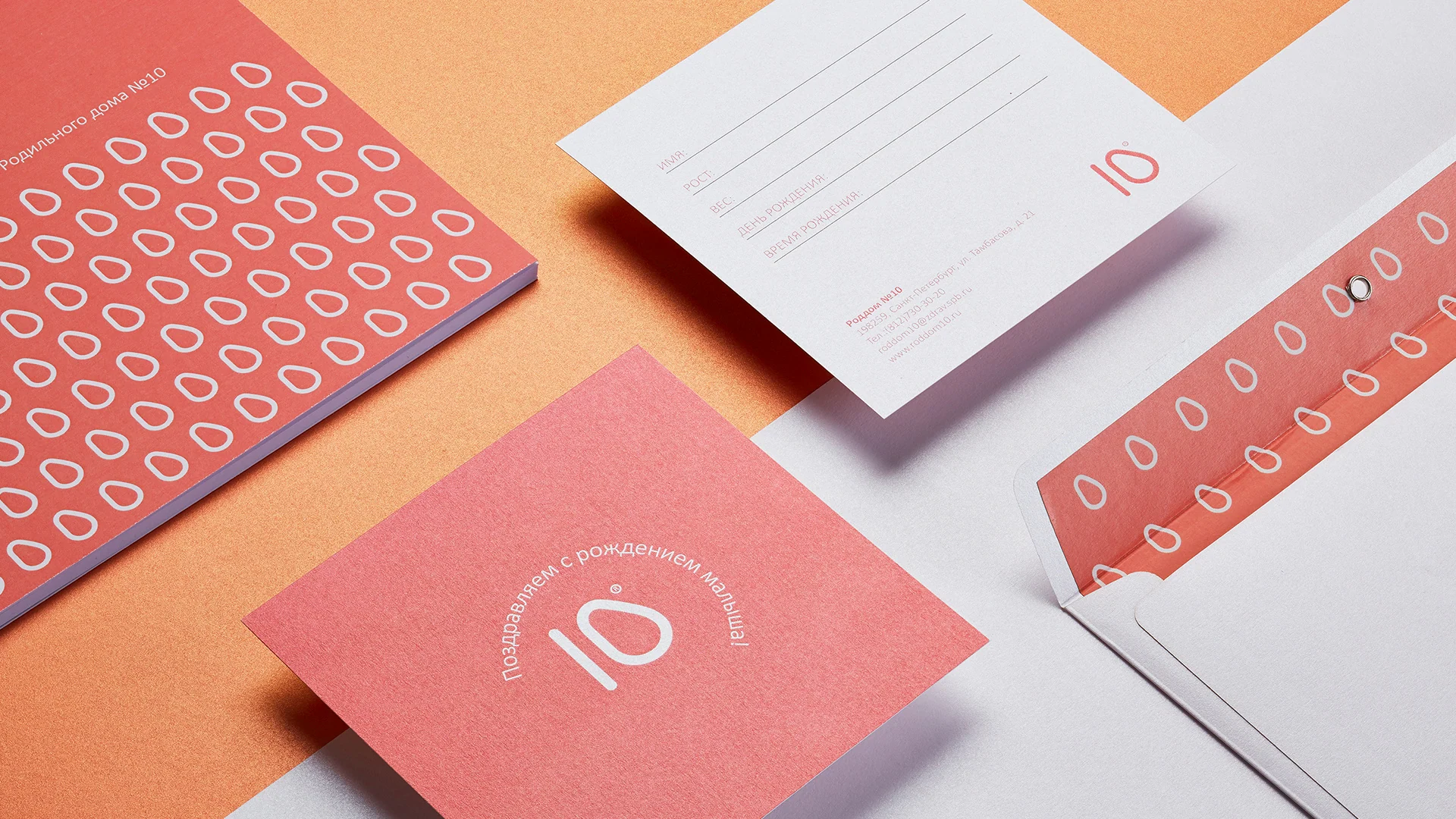
The identity accompanies families before and after birth
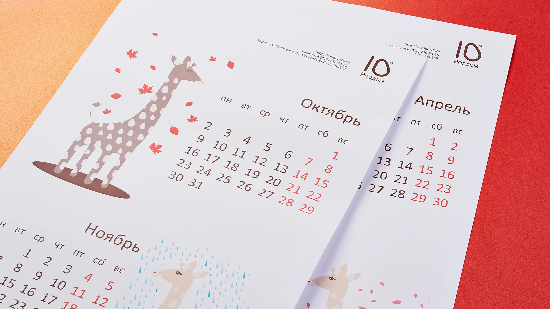
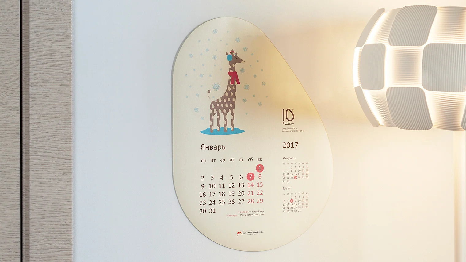
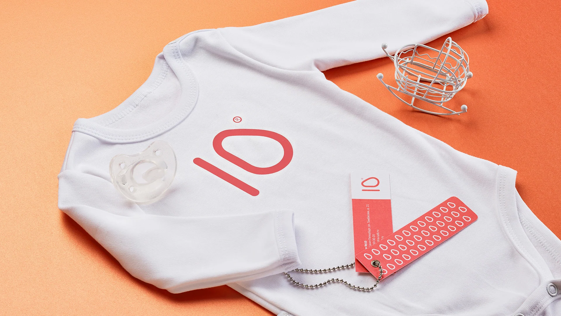
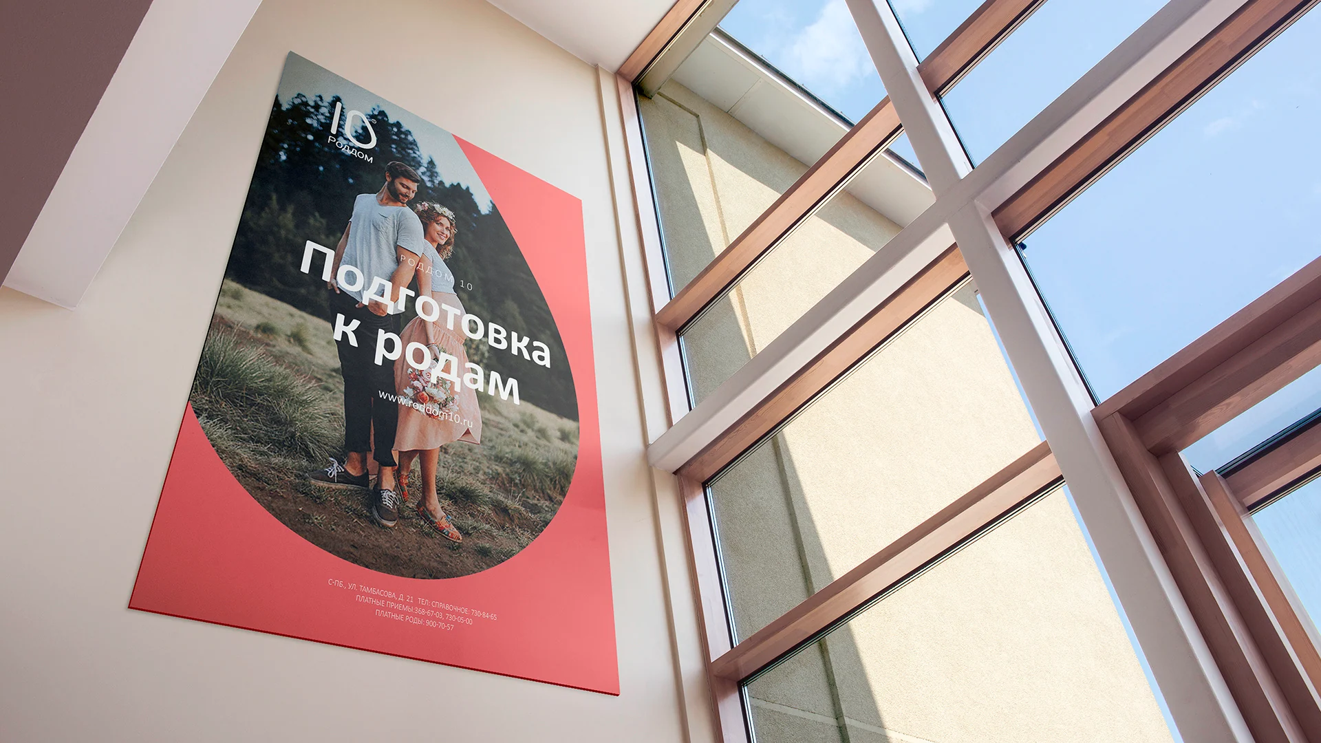
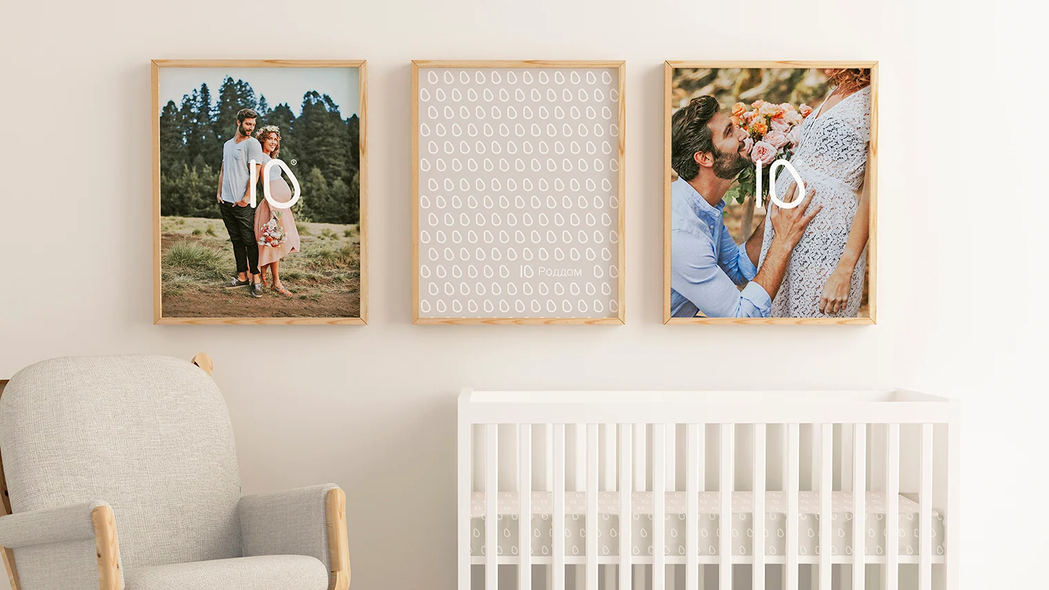
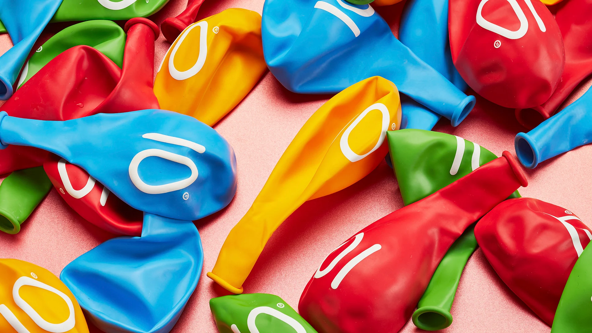
We extended the system to documents, a calendar, newborn clothing, congratulatory materials, and celebration items.
Digital service concept
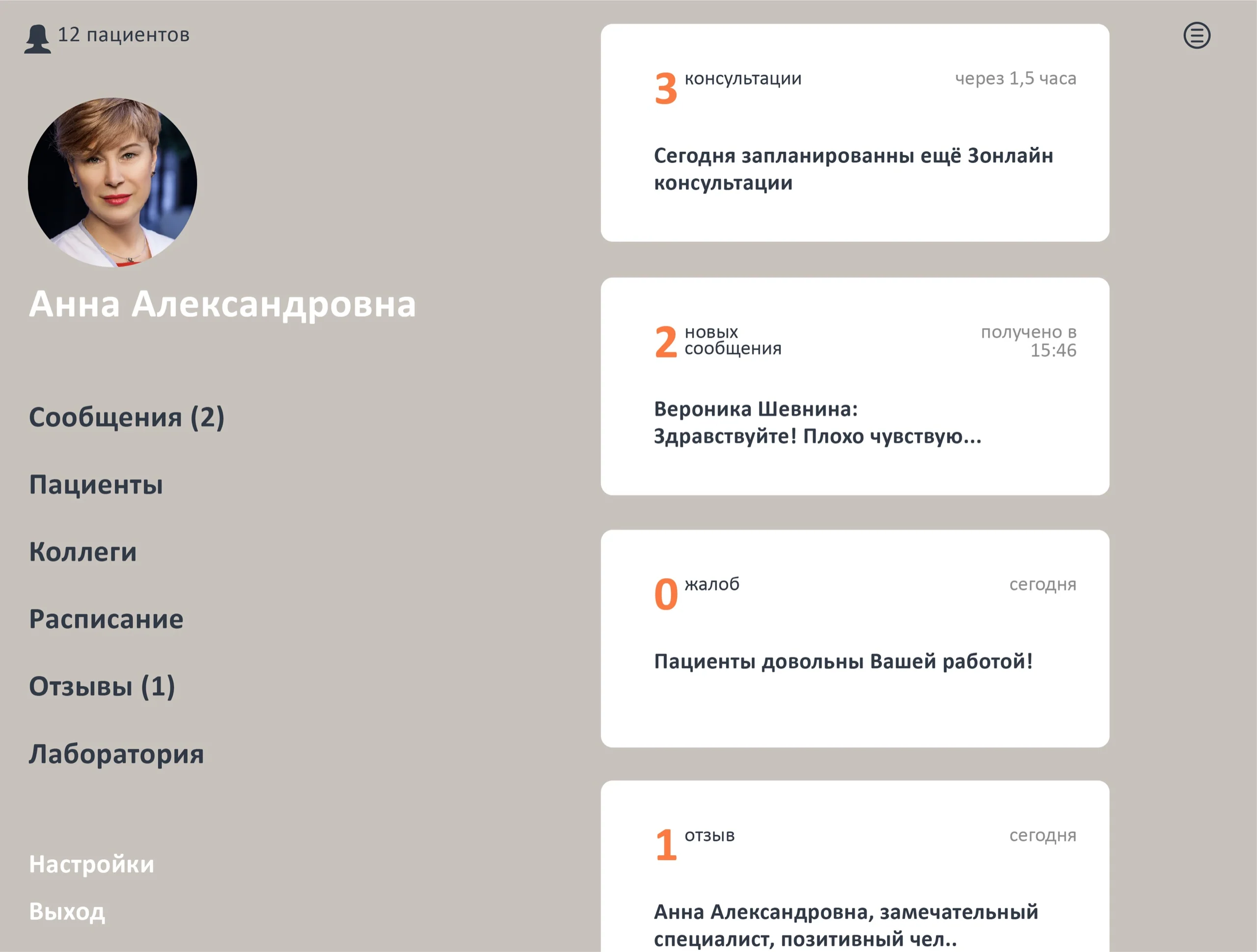
The same calm language works in an interface for doctors
In the design concept, color establishes priorities and large cards make time-sensitive information easier to scan.
Wayfinding
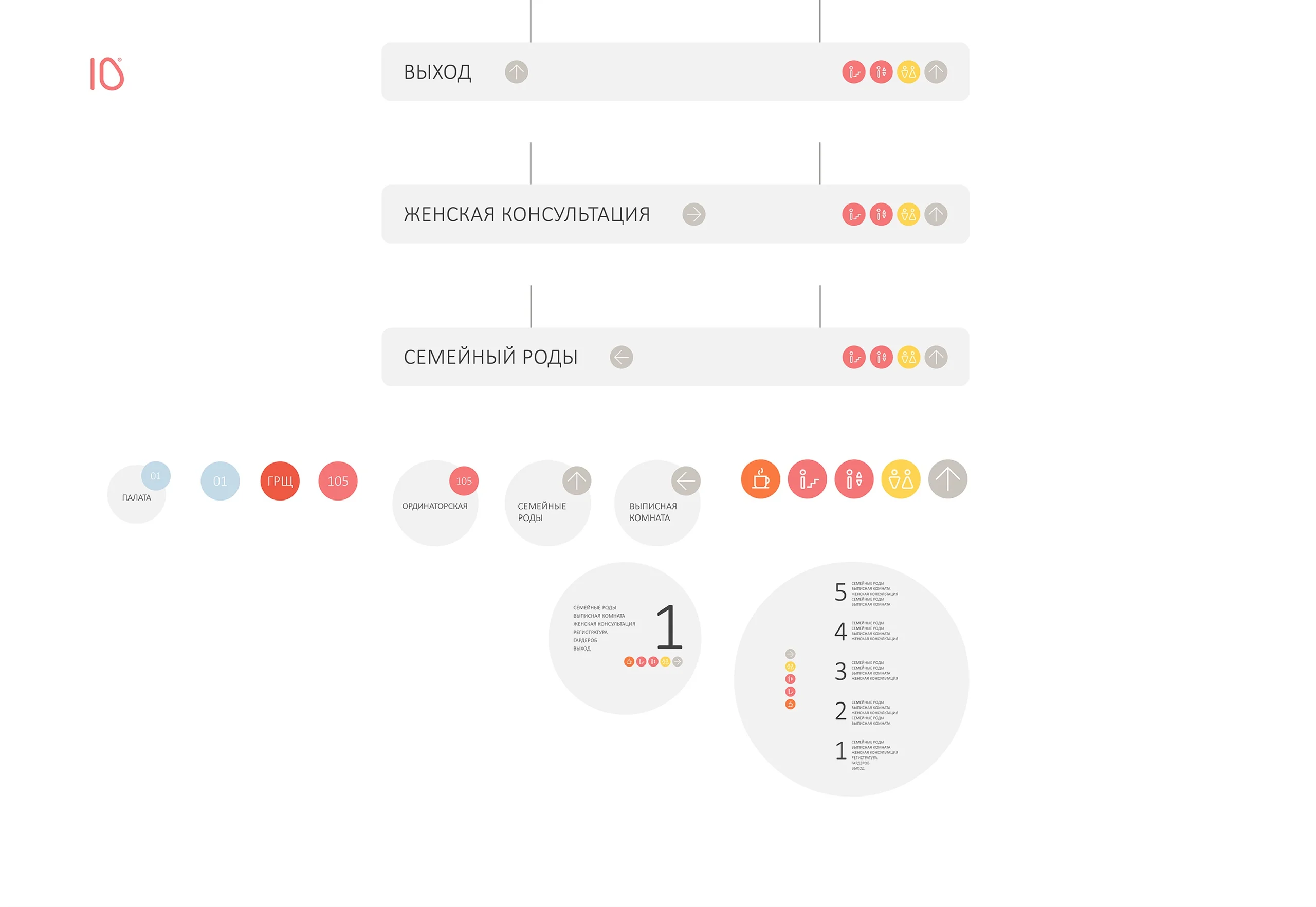
Circular modules connect floors, rooms, and routes
The signage family develops the symbol's shape: the floor number becomes the main landmark, while colored pictograms distinguish functions and directions.
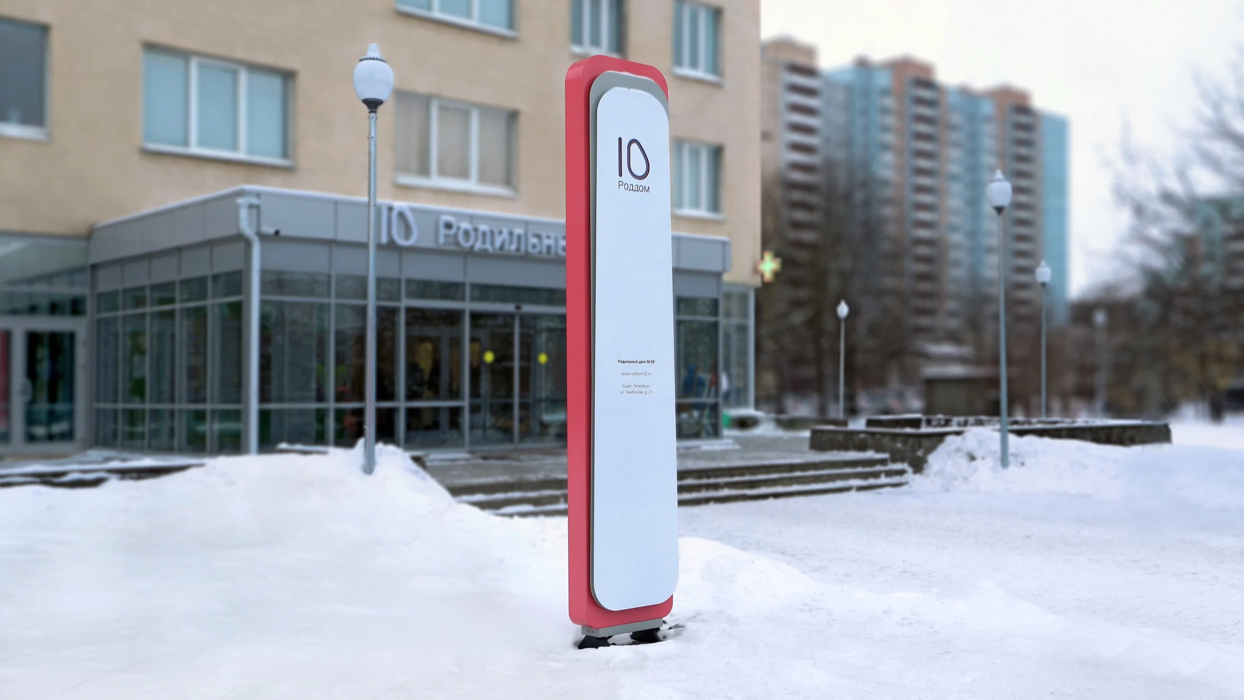

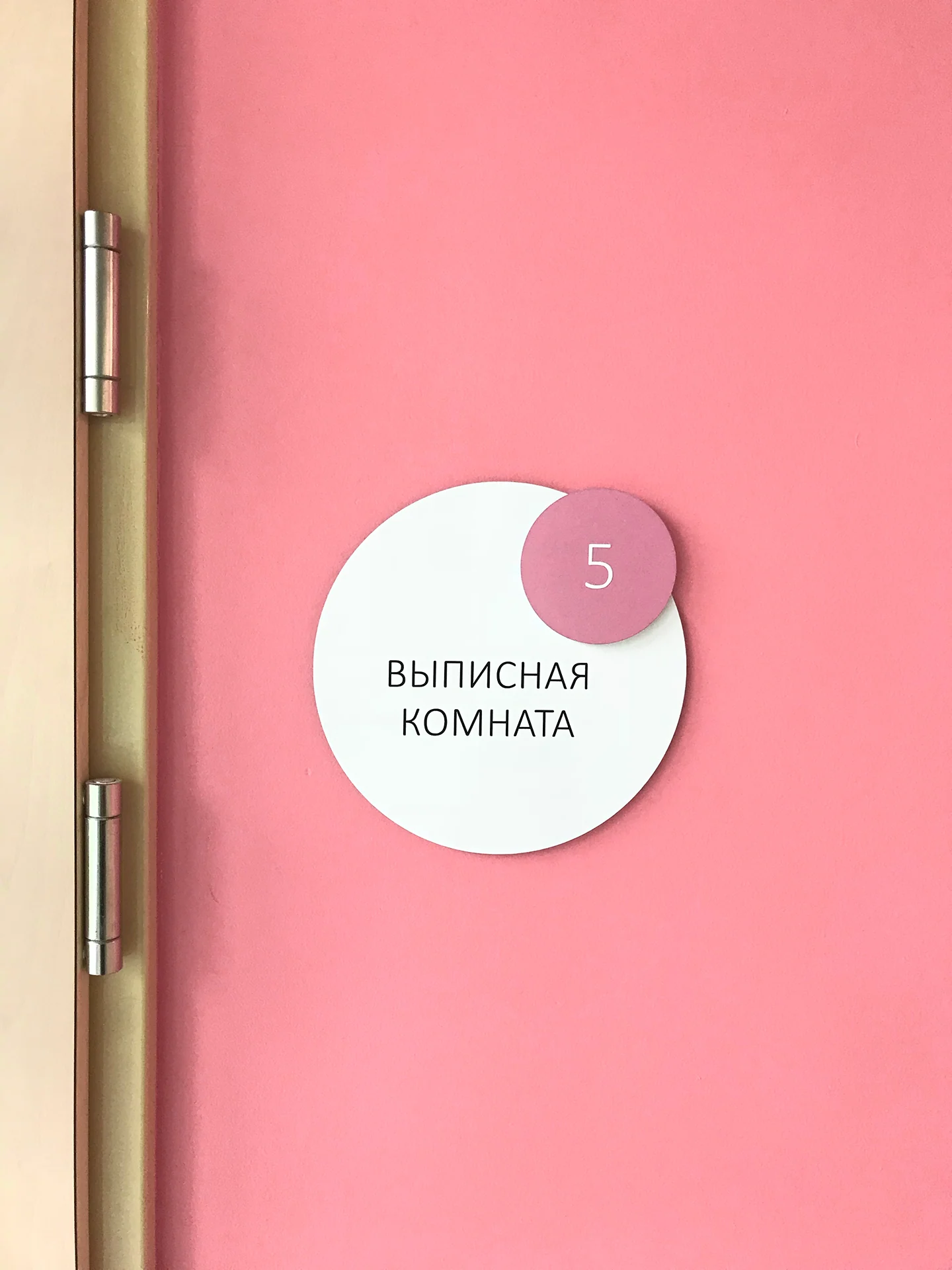

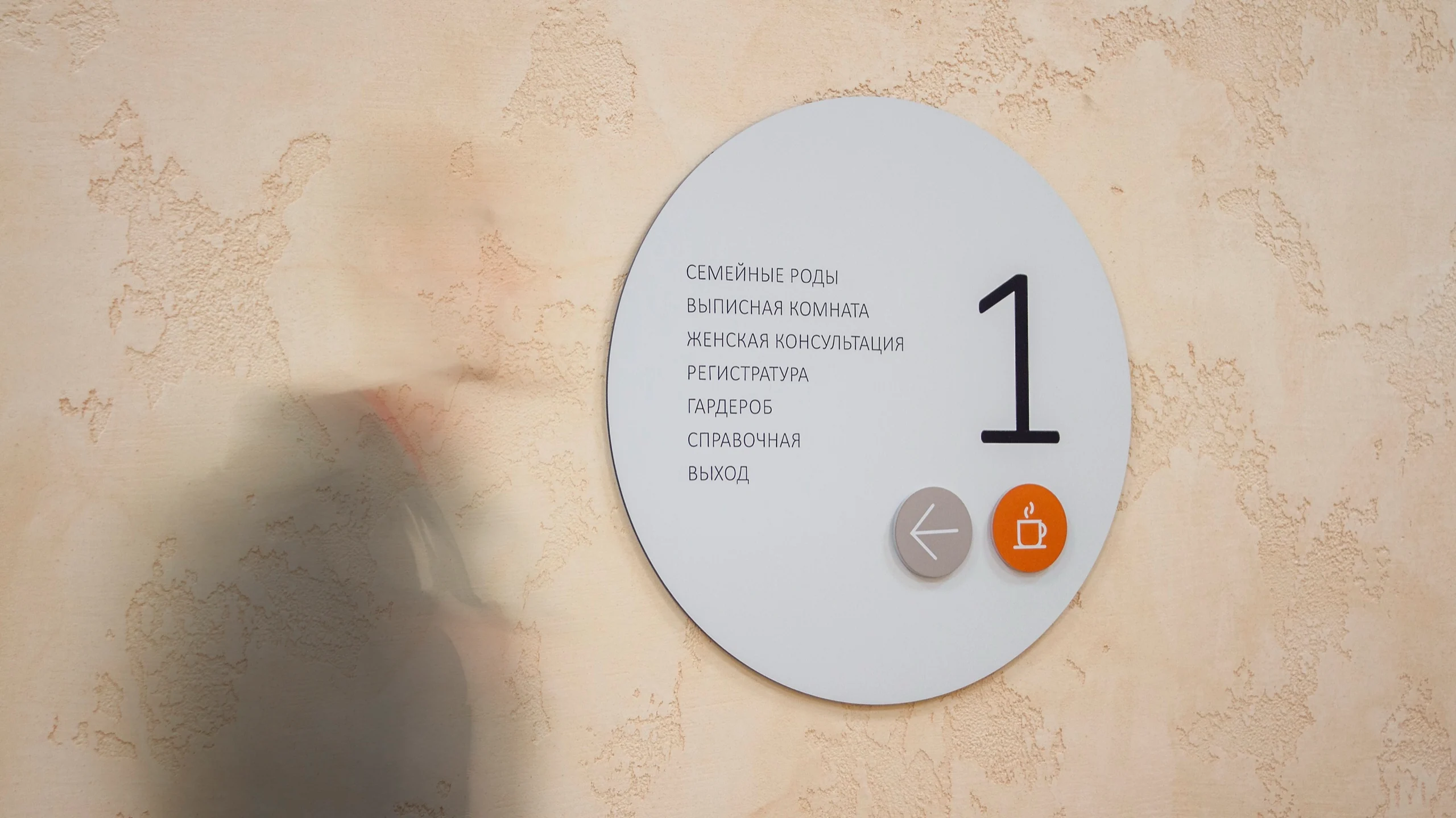
The photographs show the implemented graphics and wayfinding. Architecture and interior design were outside GORYANIN BROTHERS' stated scope.
Project outcome
One mark grew into a consistent brand and spatial system
The number 10 became a clear, self-contained identity. It works on documents, materials for parents and children, digital channels, and wayfinding.
The system developed in stages, from the mark and brand book to facade signage, an outdoor totem, and interior signs, while retaining the brand's warmth.
- Visual concept and brand symbol
- Logo and usage rules
- Palette, pattern, and typography system
- Brand guidelines
- Branded and informational materials
- Digital/app concept
- Wayfinding system and icons
- Facade signage and outdoor totem
Project scope
GORYANIN BROTHERS × Maternity Hospital No. 10
Related healthcare case study
Research Institute–Regional Clinical Hospital No. 1
Identity and wayfinding for a major medical complex: a mark, color coding, 3D map, and signs.
Explore the case study Medical wayfinding ↗
The first conversation
Medical brands need clarity and a human voice
Tell us about your challenge, audience, and environment. We will identify where to begin: the mark, overall system, digital, or the wayfinding journey.
Discuss your challengePhone+7 921 791-93-18
OfficeSt. Petersburg
Atlantic City, 126B Savushkina Street
Atlantic City, 126B Savushkina Street