

Identity · guidelines · packaging · digital
ROYAL WEDDING / 21ROYAL
WEDDING
A style that makes an impression at first sight.
View case studyThe brief
Identity for a premium wedding agency
Brand mark and logoTaglineVisual identityGuidelinesPackaging designBusiness and gift applicationsDigital concept
Royal Wedding is a premium wedding agency in St. Petersburg, operating since 2005. Its new identity needed to reflect an established reputation and work equally well in celebratory and restrained settings.
We created an image without showy glamour or false grandeur. It reflects the scale of the event, but personal feeling remains central: graphite, warm metal, white porcelain, and precise typography create contemporary luxury beyond short-lived trends.
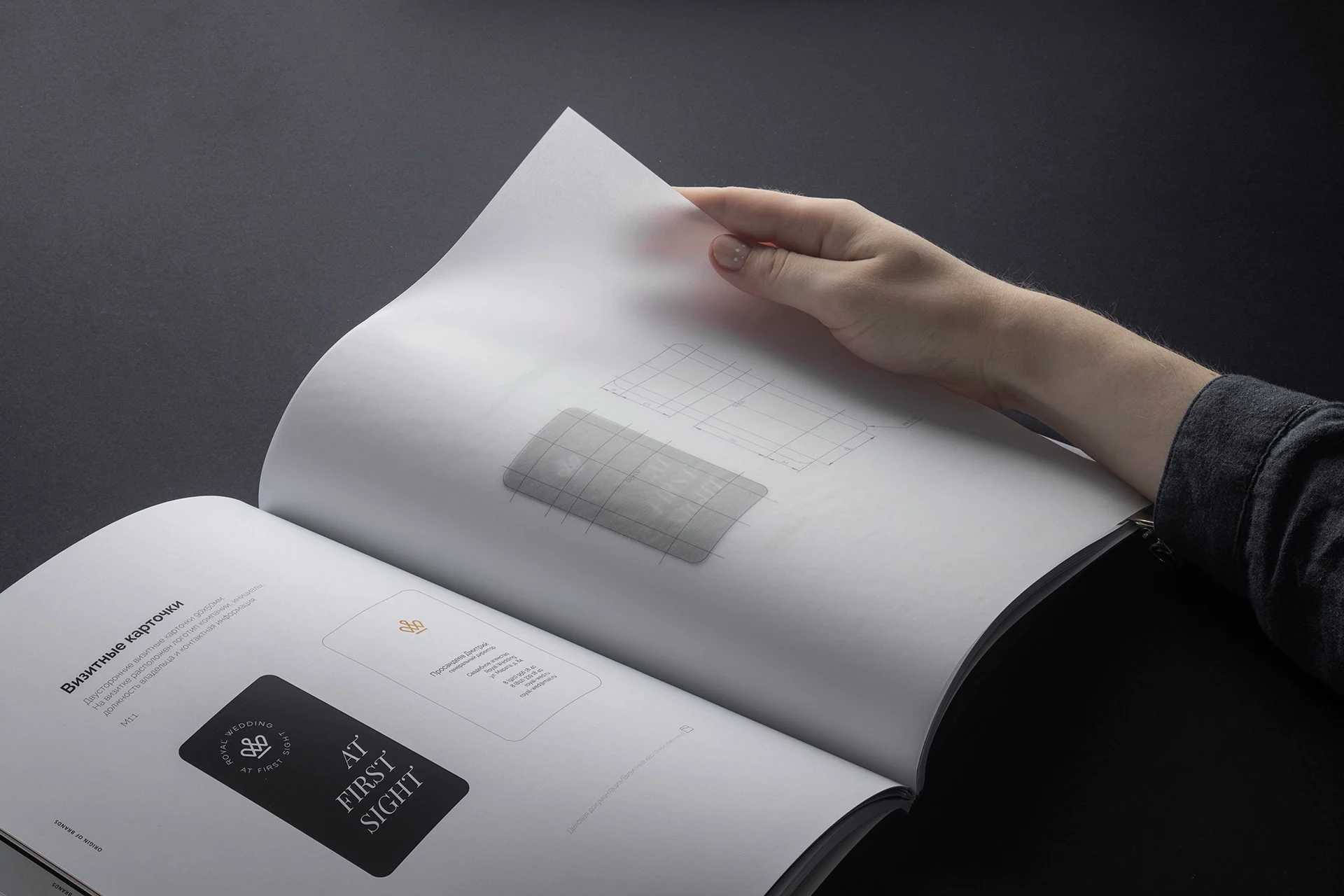
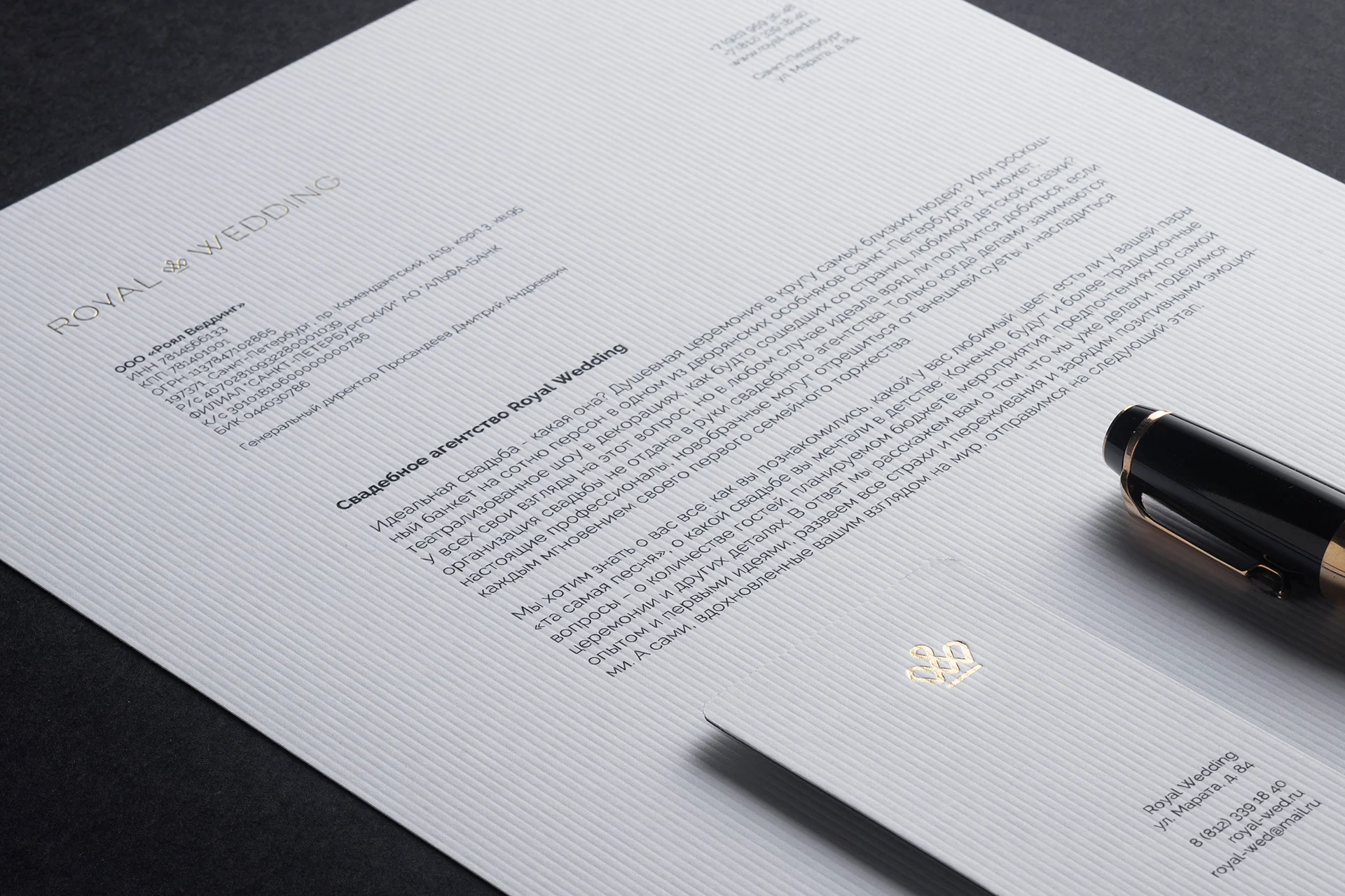
We developed the system from a mark and tagline into guidelines, gift packaging, business materials, table settings, signage, and the agency website.
Brand mark
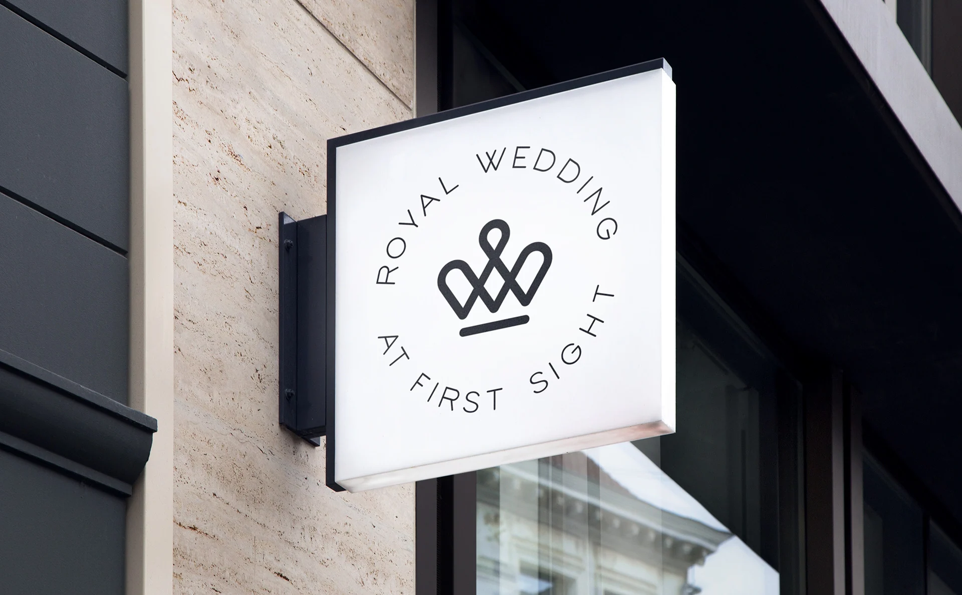
Wedding agency logo: crown, wordmark, tagline
The brand lockup has three independent parts. They can be used together or separately while remaining recognizable at different scales.

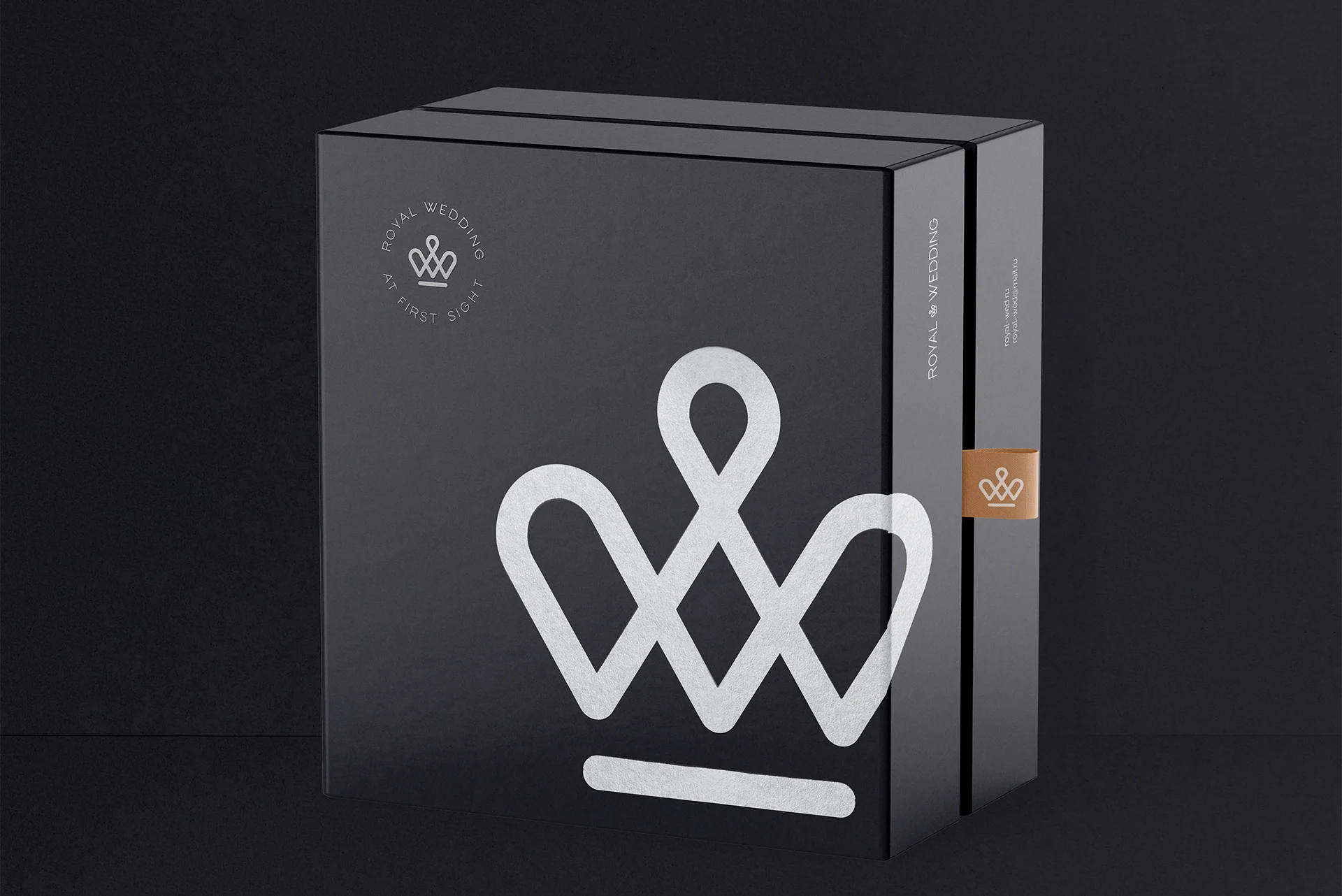
The crown's shape echoes the letter W. Its closed line suggests infinity, while the form resembles both a knot and a jewelry pendant.
- 01CrownA symbol of unity, reliability, and a promise
- 02Royal WeddingCustom rounded lettering without excessive decoration
- 03At first sightAn emotional touchpoint that reveals the brand's character
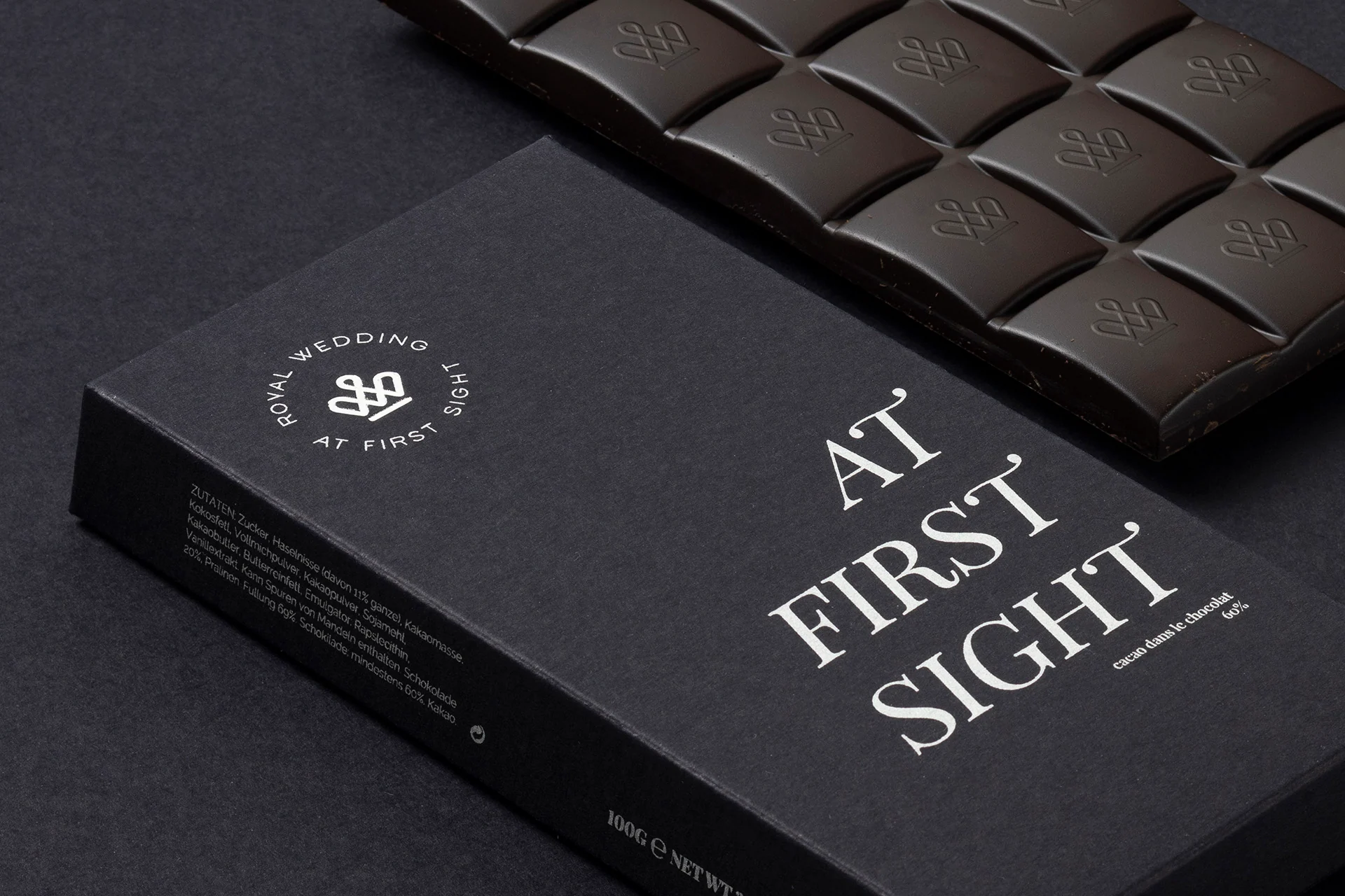
Verbal identity
AT FIRST
SIGHT
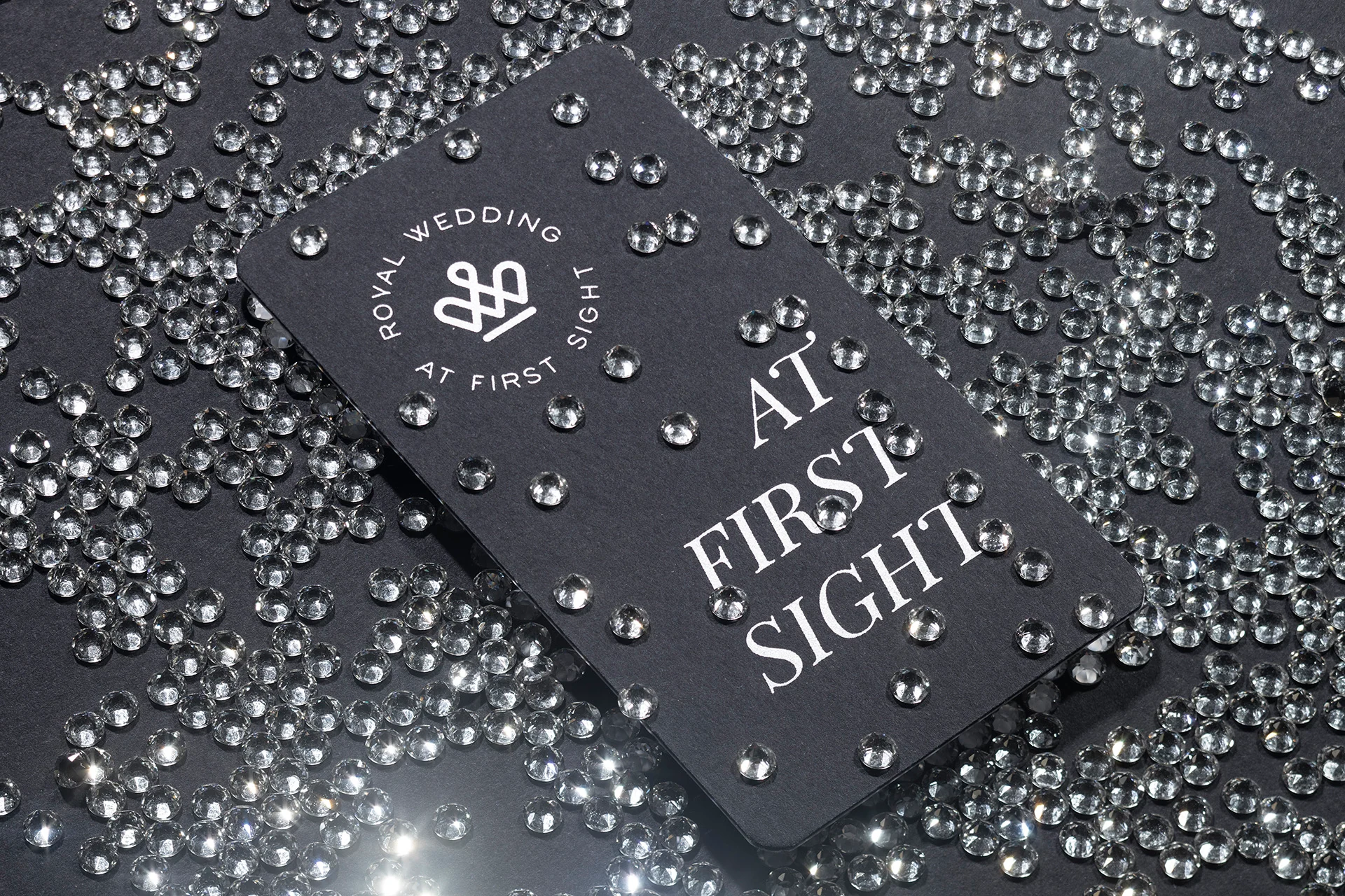
“At first sight” is deliberately unfinished, inviting each person to supply the word “love.”
The first meaning speaks to the couple and their feelings. The second speaks to the agency: choosing the team for a major life event should feel right from the first meeting. The tagline connects an emotional promise with confidence in the service.
Brand applications
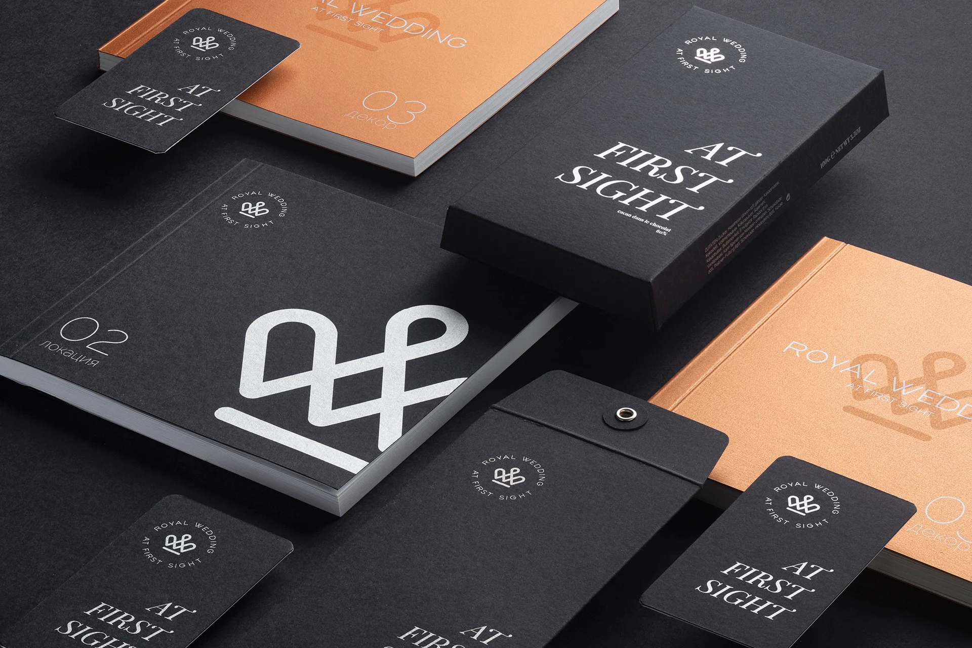
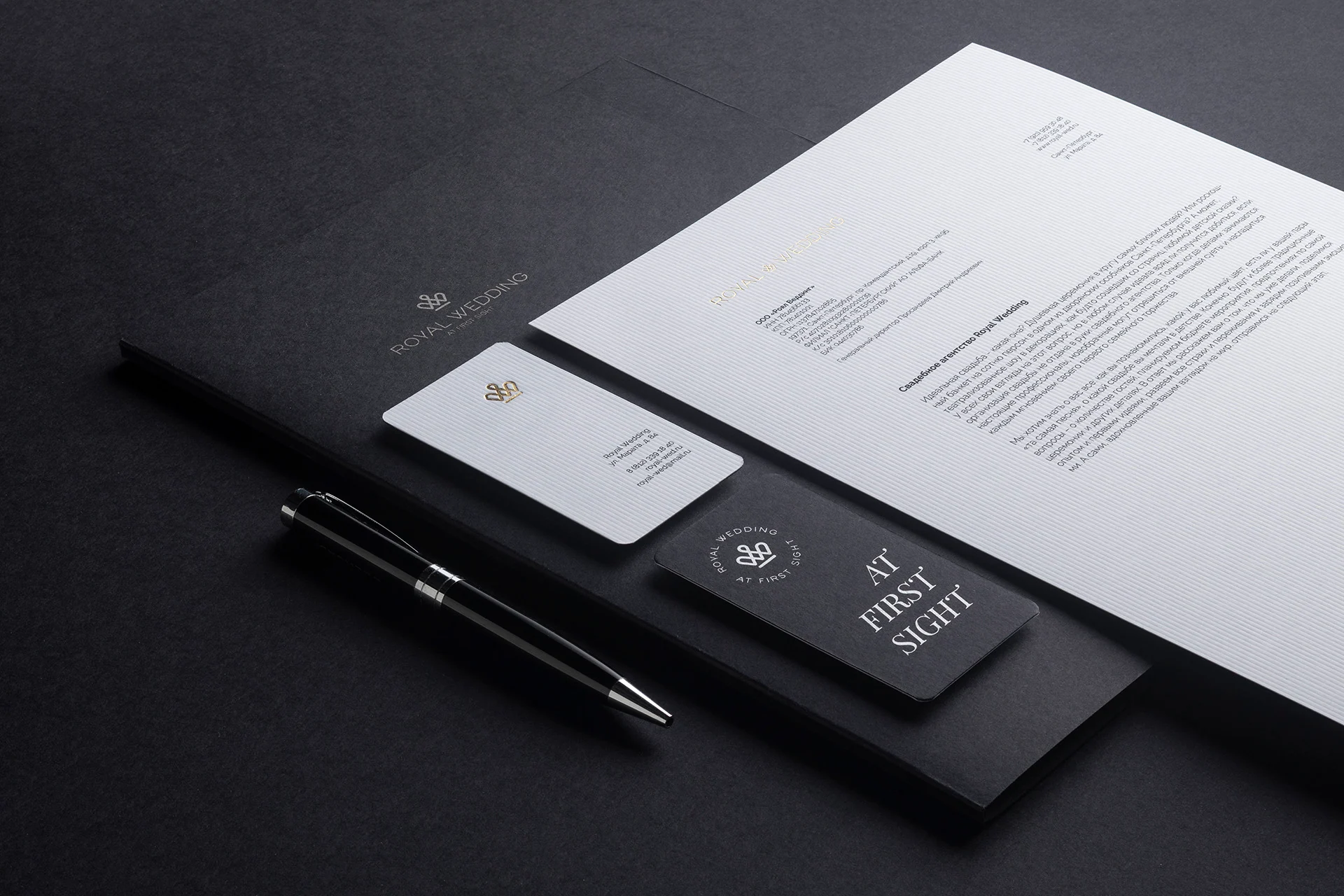
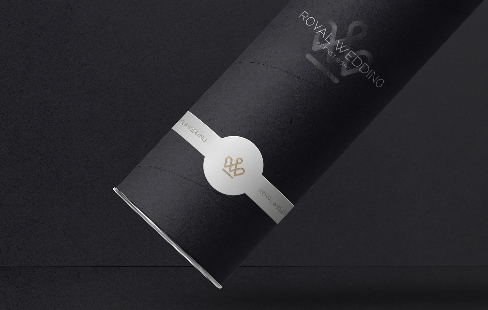
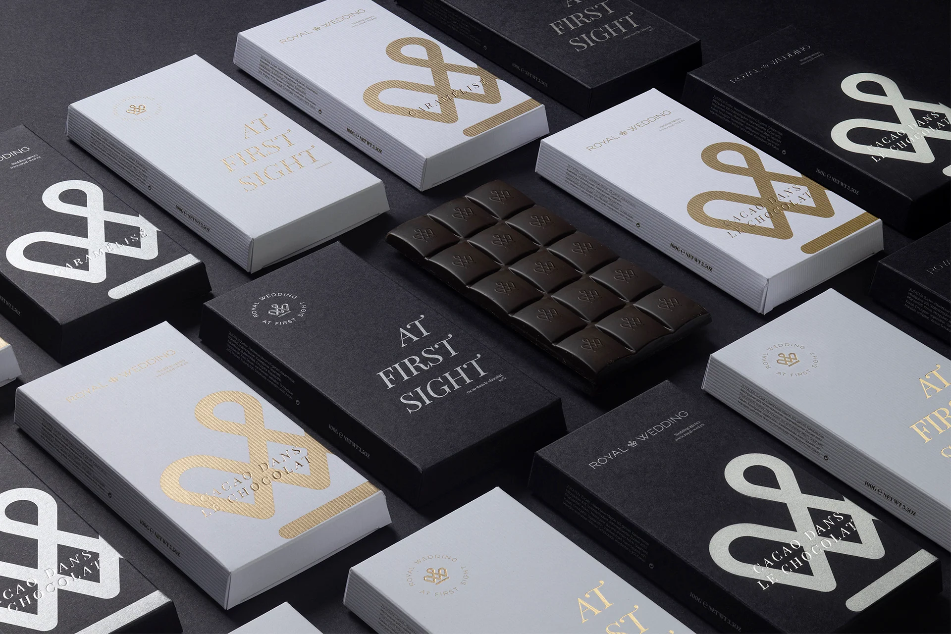
Identity on packaging and business materials
The system changes intensity, not character. Graphite and silver are restrained, warm metal adds ceremony, and a white background keeps the identity light.


Digital and space
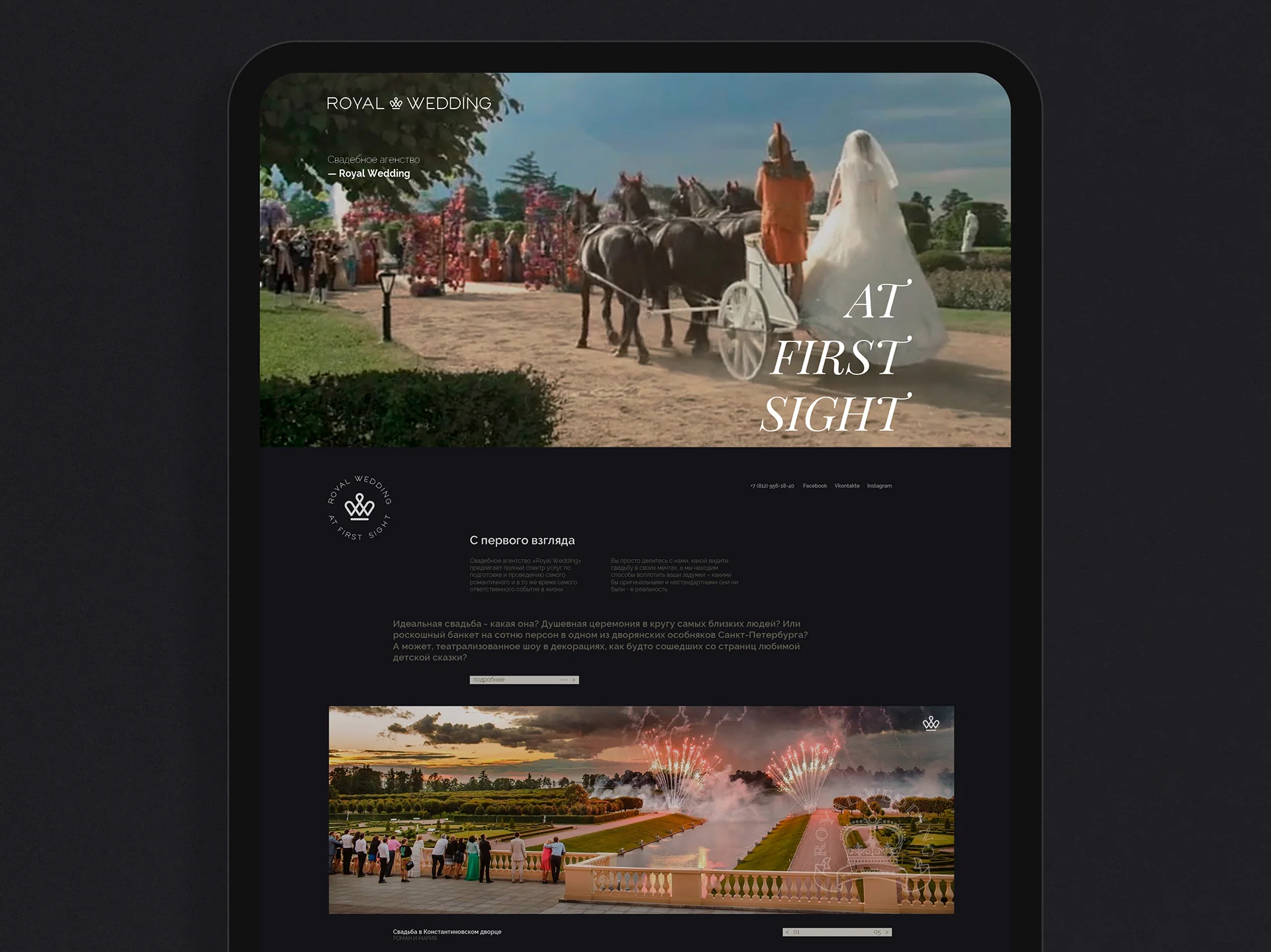
Wedding agency website and sign design
In digital, we kept the same editorial logic: large photography, generous space, calm typography, and the brand symbol as a point of orientation. In physical space, the system works through proportion and material rather than decoration.
Art direction and photography
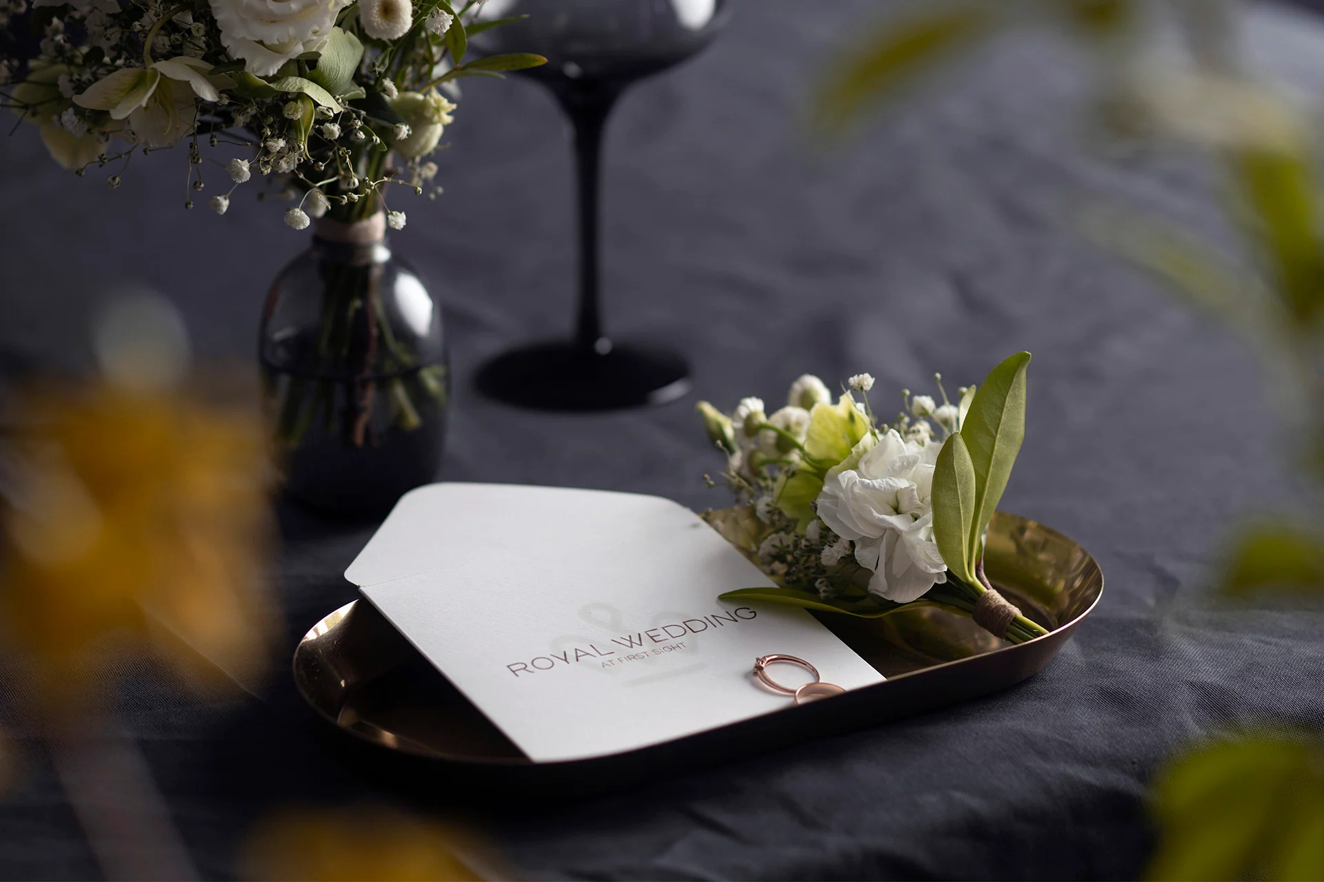
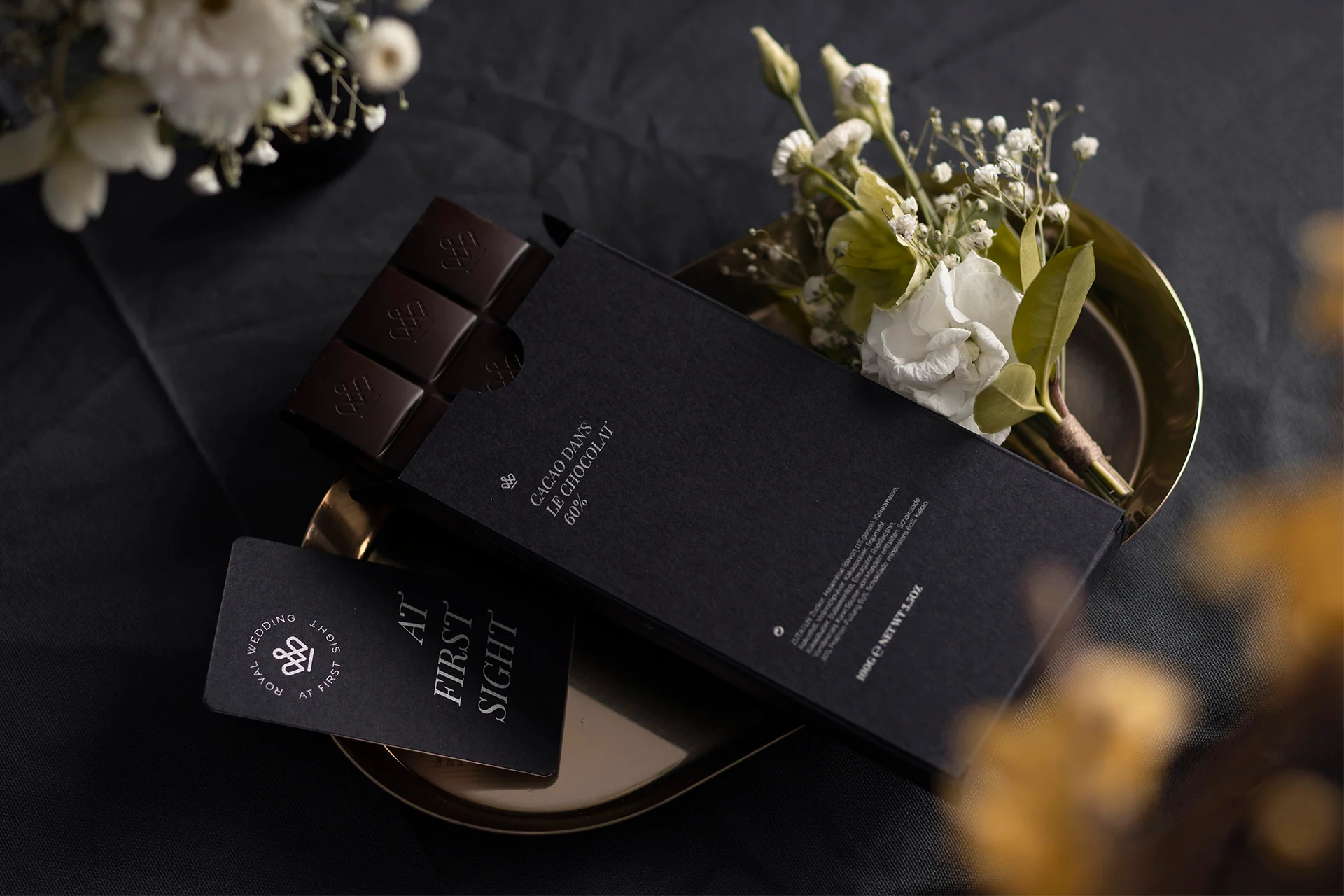
Tactility over ostentatious luxury
Matte surfaces, metal, porcelain, flowers, and soft light convey the event's atmosphere through details.

01 / 04
Project outcome
A complete brand system for a premium service
We created an expressive yet restrained system for Royal Wedding. It works equally naturally on a chocolate box, business stationery, porcelain, signage, and a website.
The project was shortlisted for Pentawards in 2021. More importantly to us, the identity remains relevant years later because it is built on a clear idea and carefully balanced proportions, rather than a decorative device.
- Brand mark and logo
- The tagline At first sight
- Color and typography system
- Guidelines
- Business applications
- Gift packaging
- Porcelain and table settings
- Website and sign concept
- Art direction and photography
Next case study
SPK
Identity, premium and standard packaging, 3D modeling, production, and photography for a private cheese dairy.
View project →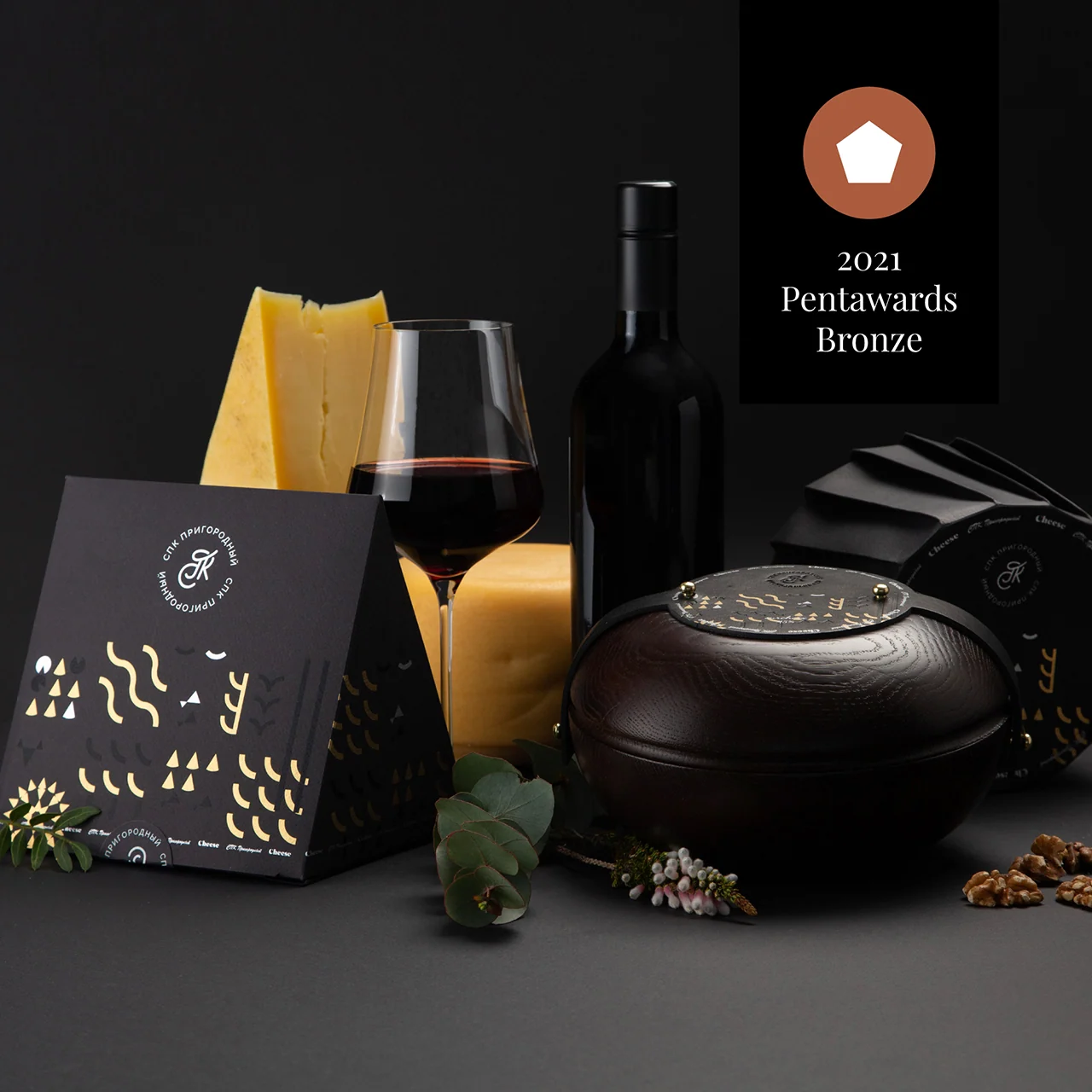 Identity · packaging · production
Discuss a project
Need a brand people trust at first sight?
Let's discuss your service's character and build a system that works from the first meeting to every detail.
Discuss a projectPhone+7 921 791-93-18
OfficeSt. Petersburg
Atlantic City, 126B Savushkina Street
Atlantic City, 126B Savushkina Street