


The brief
An internet provider for new neighborhoods
Scrollnet is a telecommunications company operating in the Leningrad Region. We created its new brand image for young families buying homes in modern residential developments.
We first defined who the brand speaks to. Audience characteristics informed the communication tone and visual language.
The brand needed to be clear, friendly, and memorable: technological without feeling impersonal.
NamingLogoVisual identityPaletteIllustrationsWebsite UX/UI
Naming
A name with movement built in
We formed the name Scrollnet from two ideas: scroll — scrolling a page and net means network. Together, they form a simple digital metaphor connected to a familiar online action.

Brand mark
Scrolling became a symbol
The logo is built around the Scrollnet wordmark. A stylized double L expresses the movement of scrolling and extends the name's meaning.
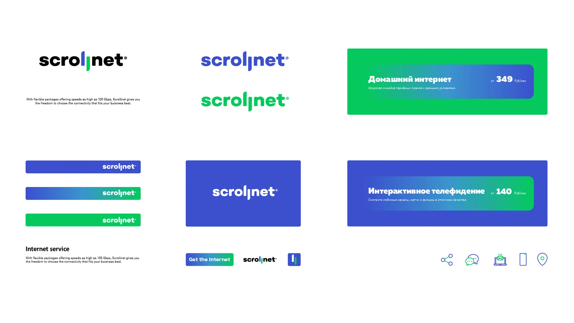
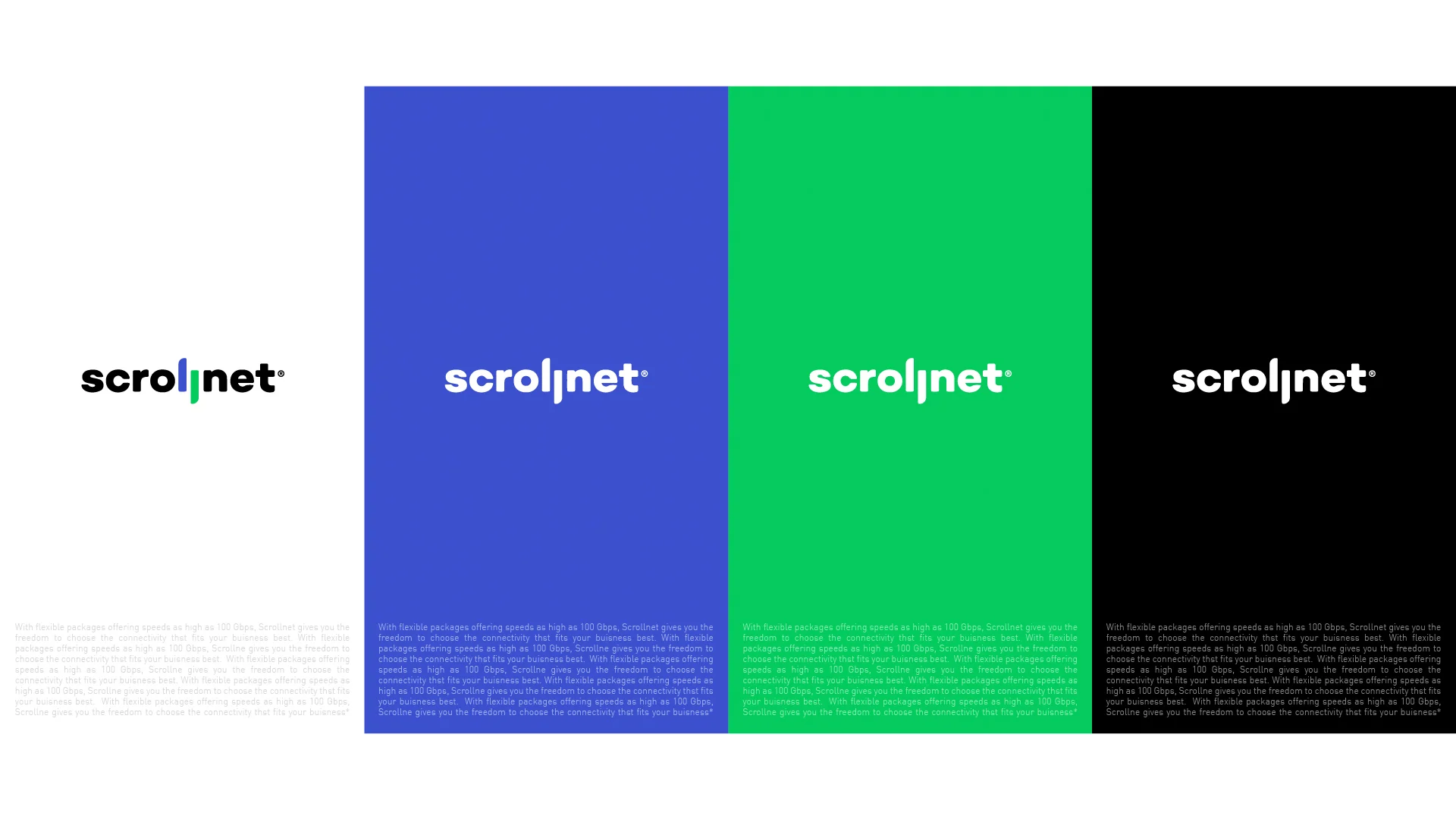
Illustration system
Services gained a visual language of their own
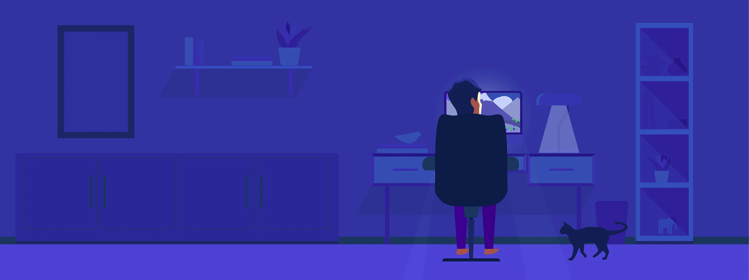
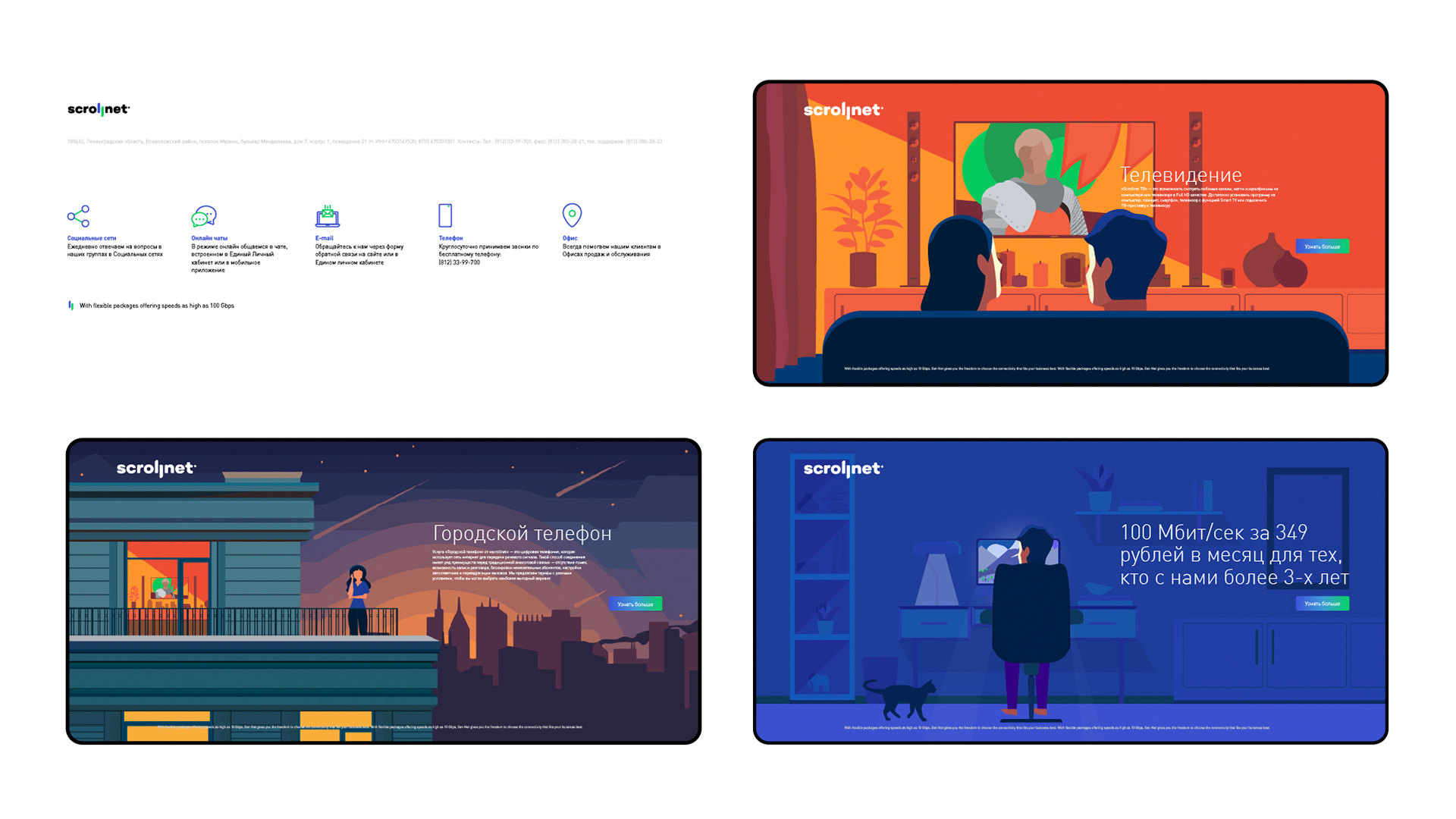
We created a series of illustrated scenes for Scrollnet. They explain digital services through familiar everyday situations and keep the brand recognizable across formats.


Website UX/UI
The identity continued on-screen
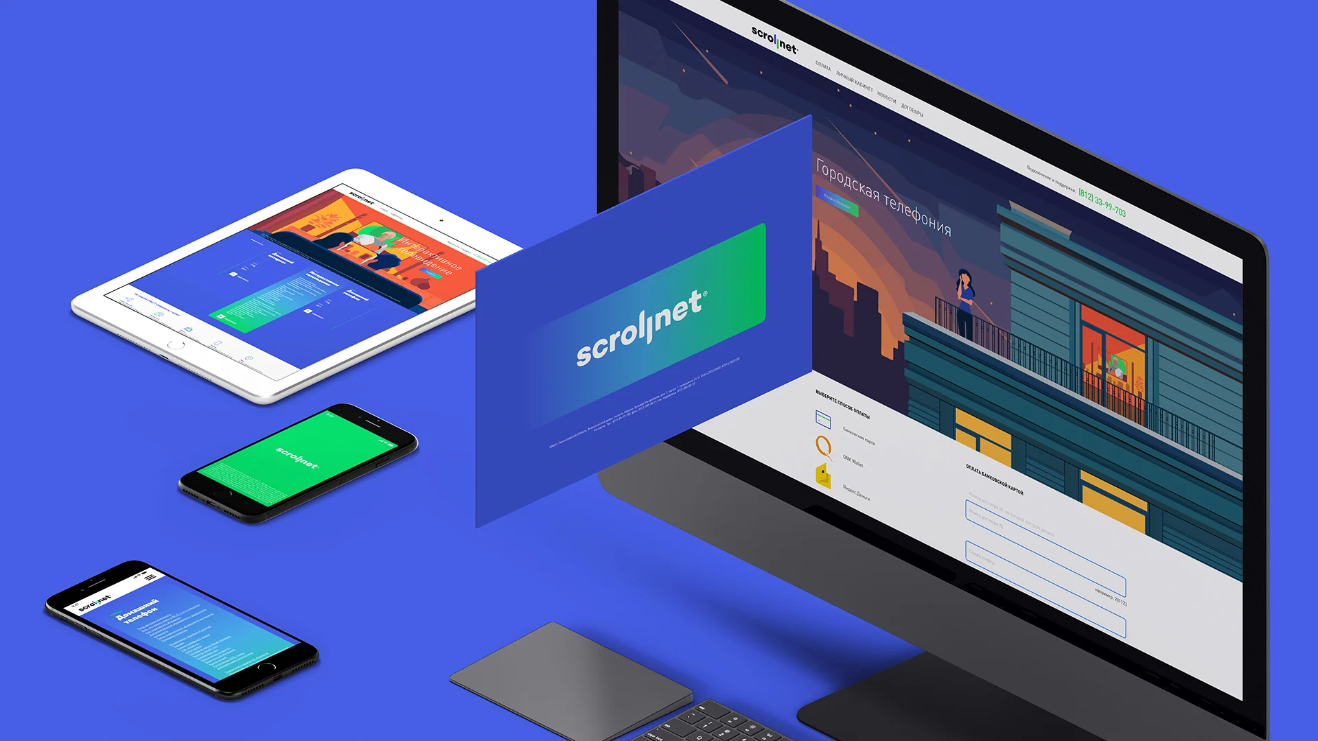
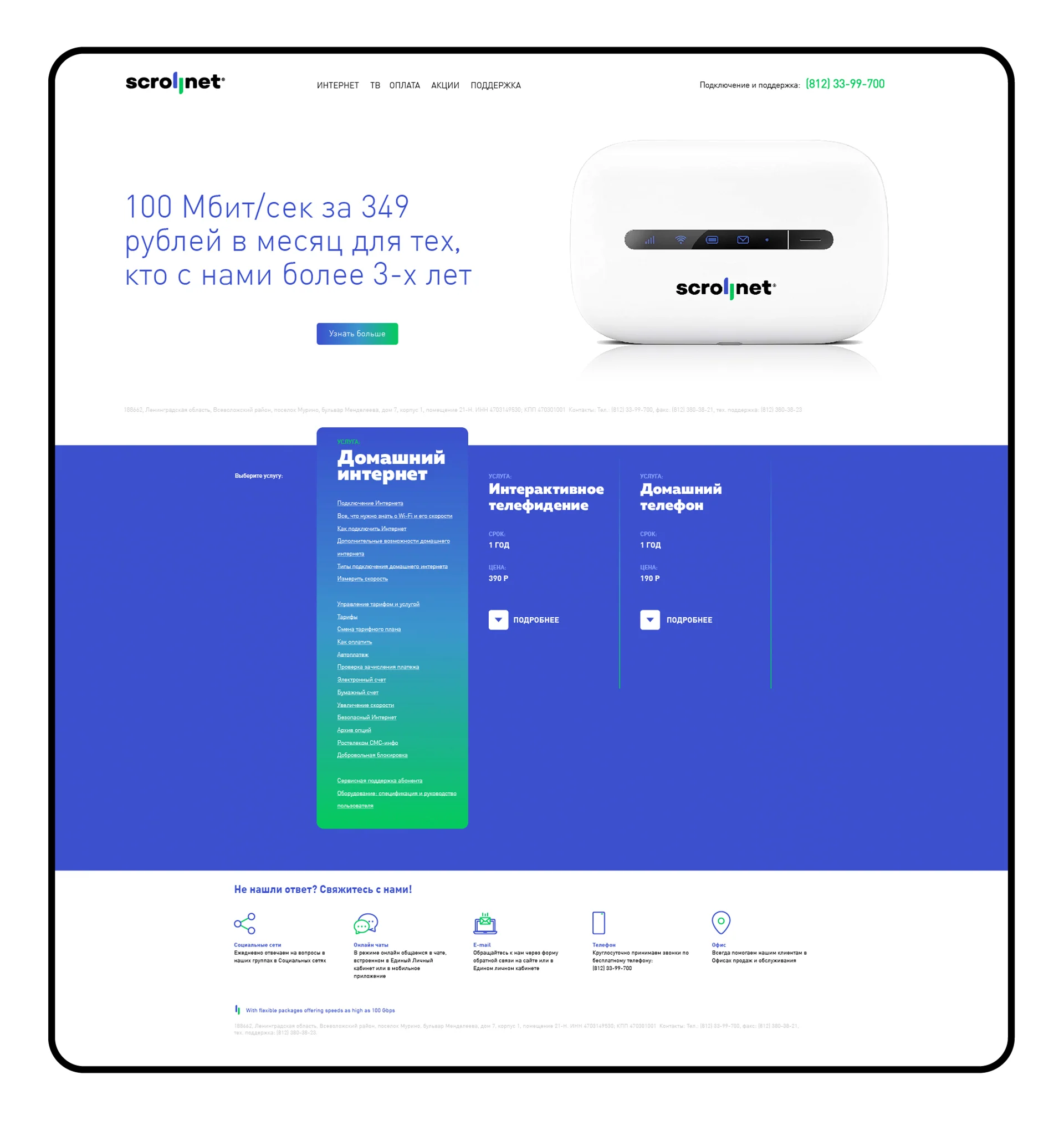
The website design brings together the logo, brand palette, illustrations, and interface elements. The digital environment became a direct extension of Scrollnet's personality.
System in use
One character across formats
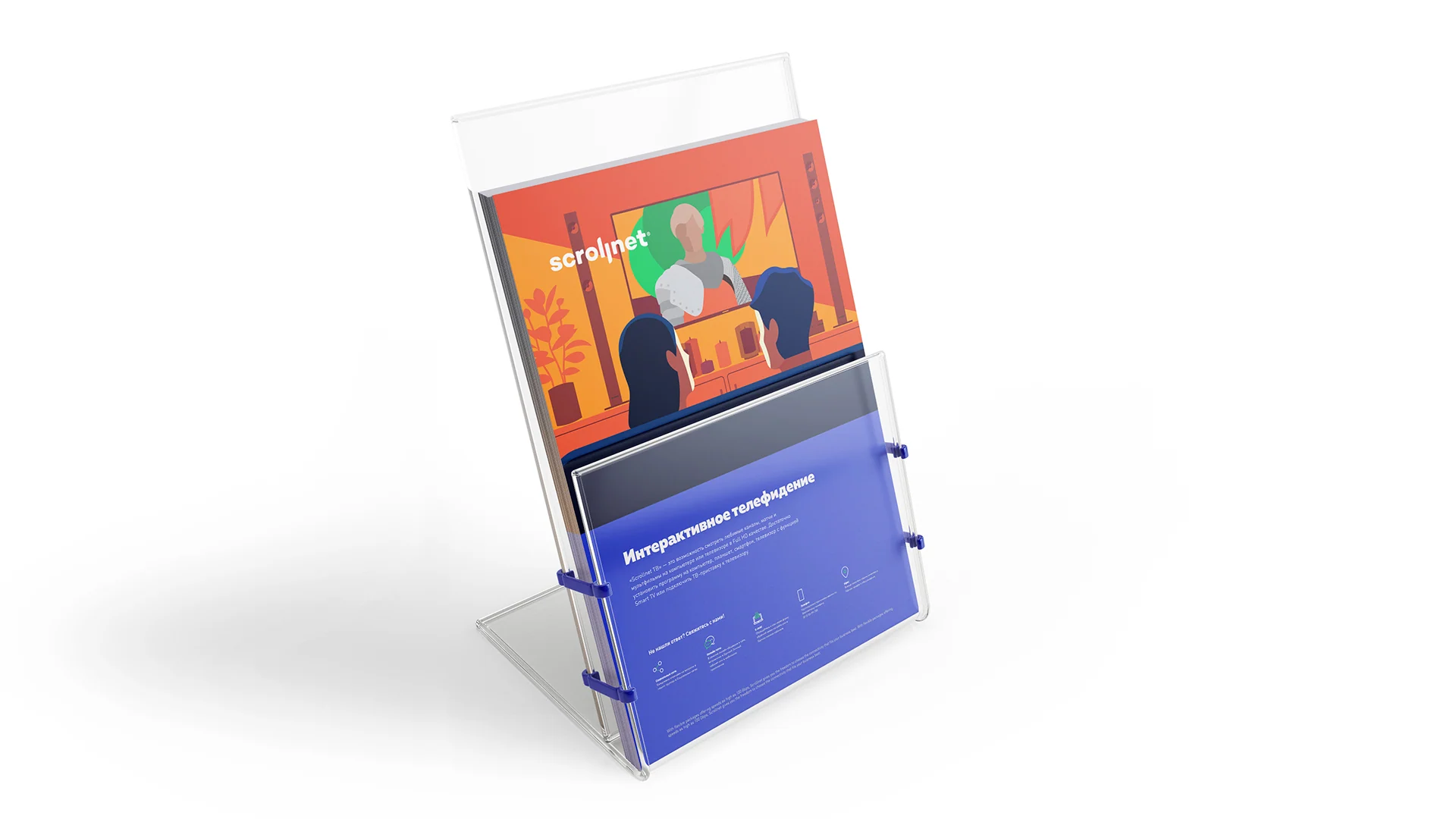
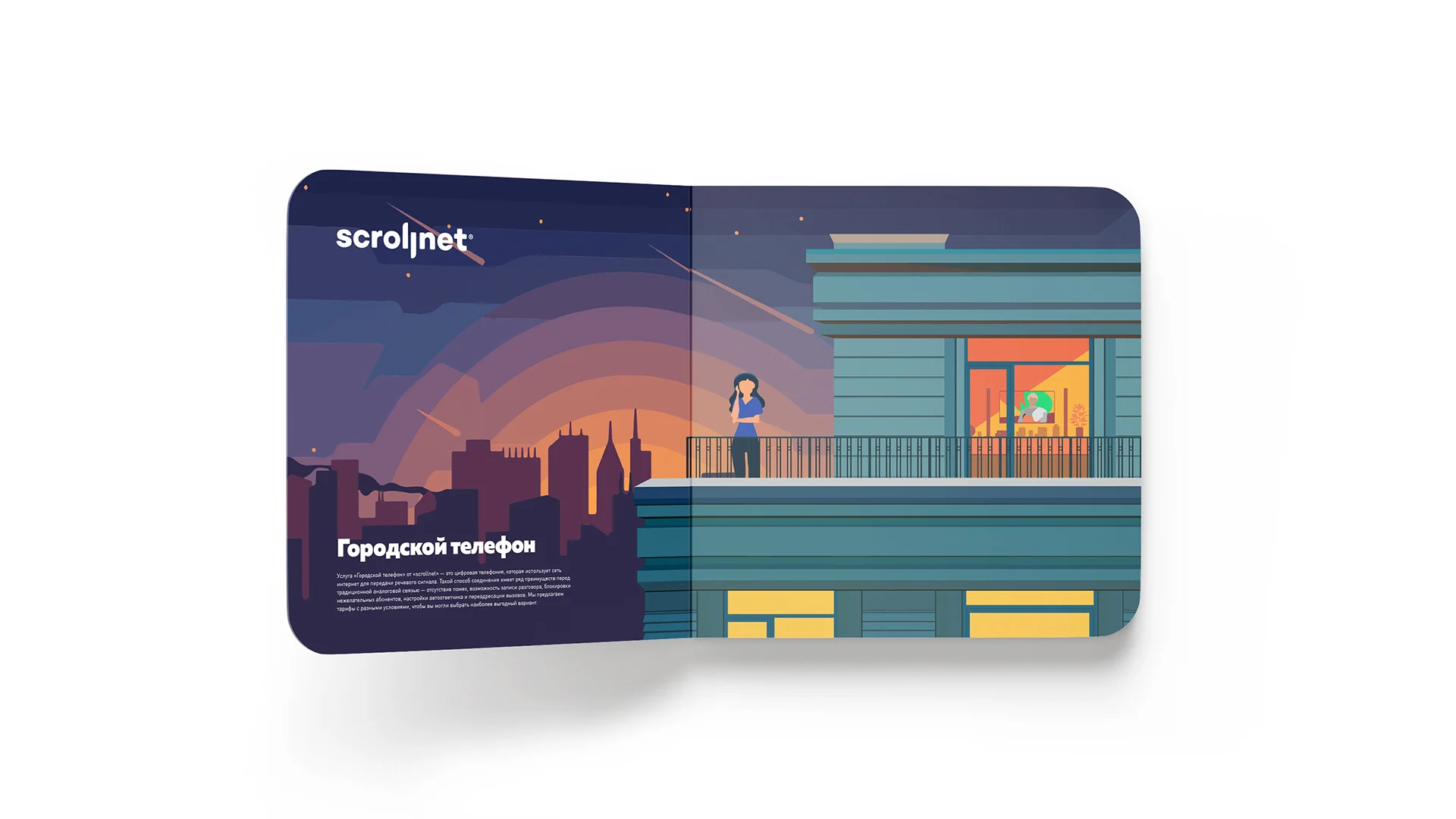
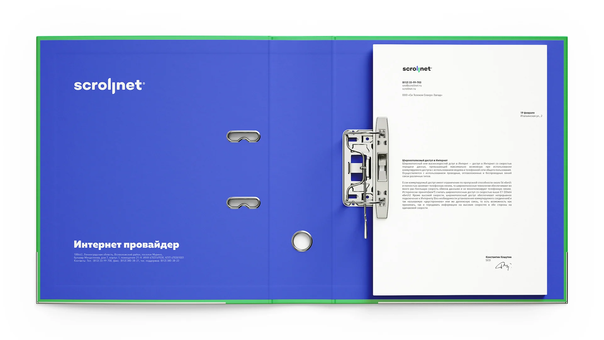
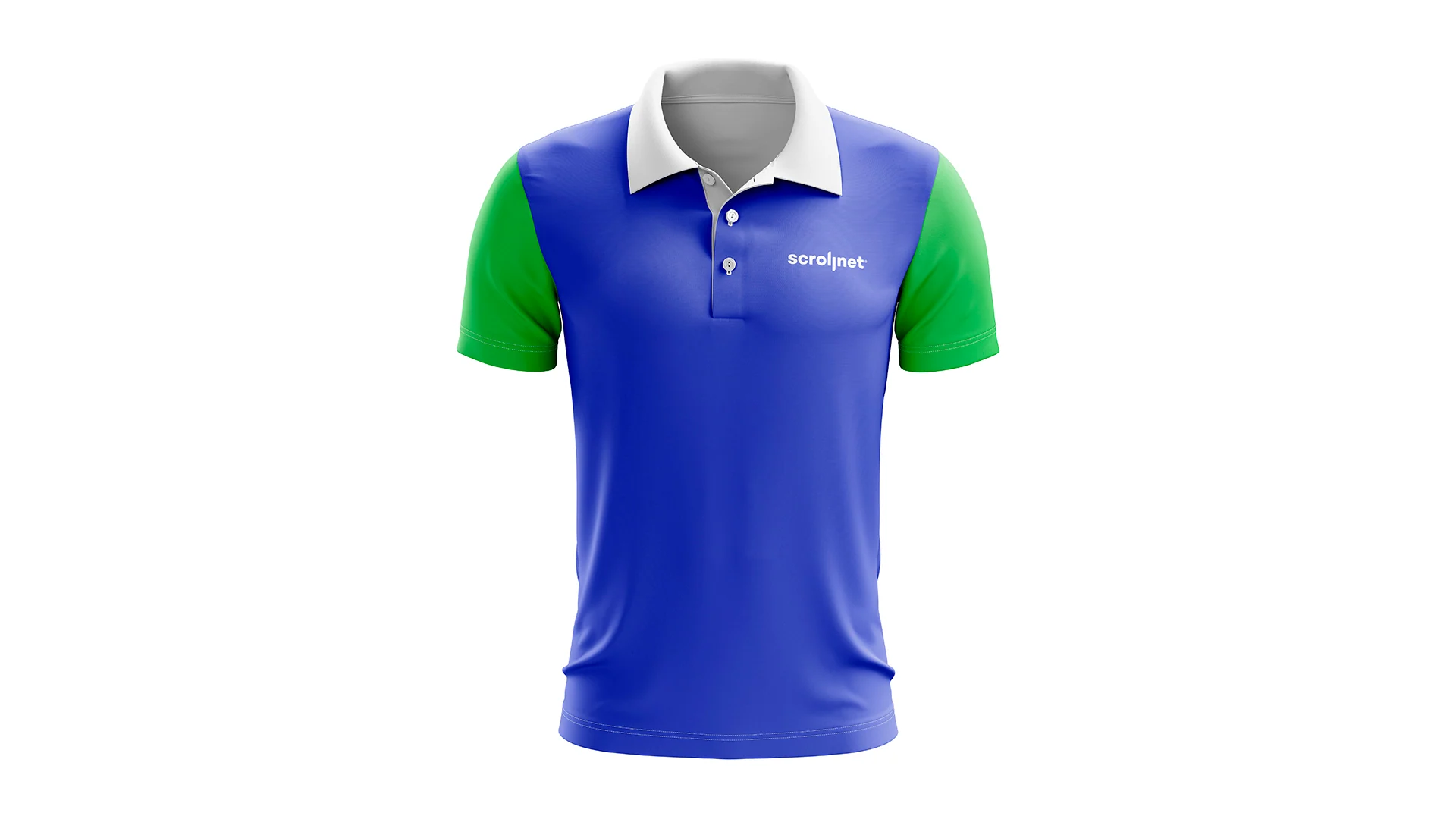
We showed how the brand language moves from screens to stationery, presentation materials, and corporate clothing. Every format retains the brand's color, mark, and friendly tone.
Project outcome
From name to digital environment
Naming, symbol, color, illustrations, and web design revolve around one idea: clear movement within a network.
Every element develops the name's meaning and helps Scrollnet speak in one visual language.
- Scrollnet naming
- Tone of communication
- Logo and double L
- Blue-green palette
- Illustrated scene system
- Website UX/UI
- Brand application visualizations
Project scope
GORYANIN BROTHERS × Scrollnet
Next case study
STEK
Identity, illustrations, and website for a woodworking company. Another project where one visual language runs from the brand image to the digital experience.
Explore the case study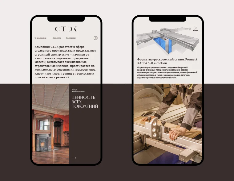 Identity · illustrations · website ↗
The first conversation
A digital service needs a clear name and a lively character
Tell us what your brand needs to explain and change. We'll find the right idea, build a visual language, and extend it into interfaces and communication.
Discuss your challengePhone+7 921 791-93-18
OfficeSt. Petersburg
Atlantic City, 126B Savushkina Street
Atlantic City, 126B Savushkina Street