
Woodworking production · 2019

Value across generations
The brief
Show modern production without losing the value of craftsmanship
STEK produces furniture, architectural woodwork, and turnkey interiors. The company needed a cohesive image for business communication, its production environment, and its website.
We began by rebuilding the visual identity and brand language. The aim was to connect the precision of modern equipment with the experience of people who know the material and stand behind the result.
The project included visual identity, production process illustrations, website, system guidelines, and manufacturing photography.
PositioningIdentity13 illustrationsWebsite UX/UIPhotographyBrand guidelines
The unifying idea
Value
of every generation
A well-made object lasts beyond a single season. It preserves the material, the maker's work, and its personal significance, which endures over time.
This idea became the foundation of the brand system: calm, precise, and designed to last.
Brand system
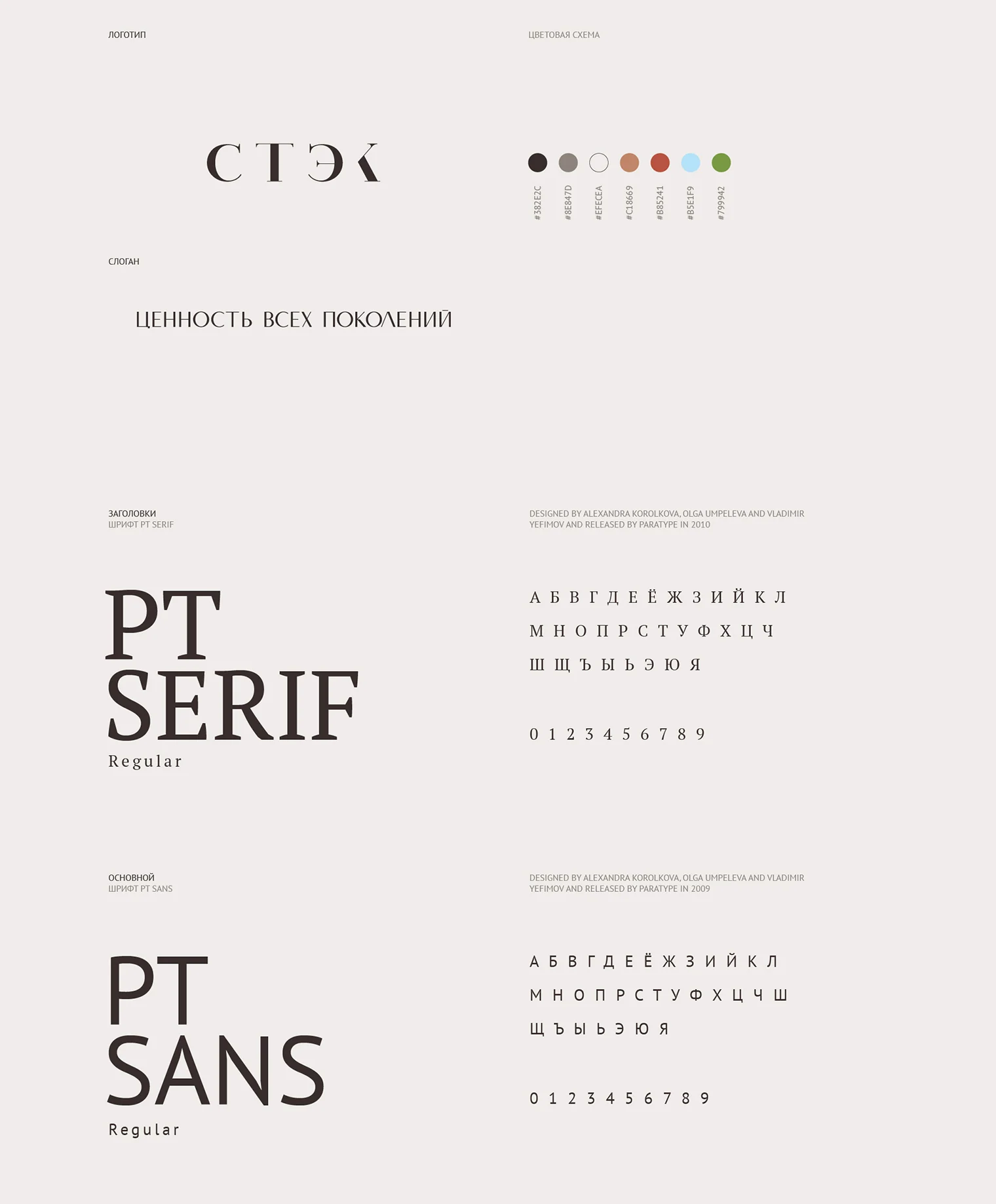
A precise foundation and generous white space
The wordmark consists of four letters with a distinctive K. Restrained typography, a linen background, and a contrasting palette create a calm, professional identity.
Production process
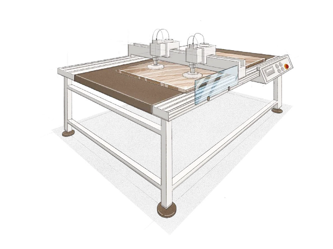
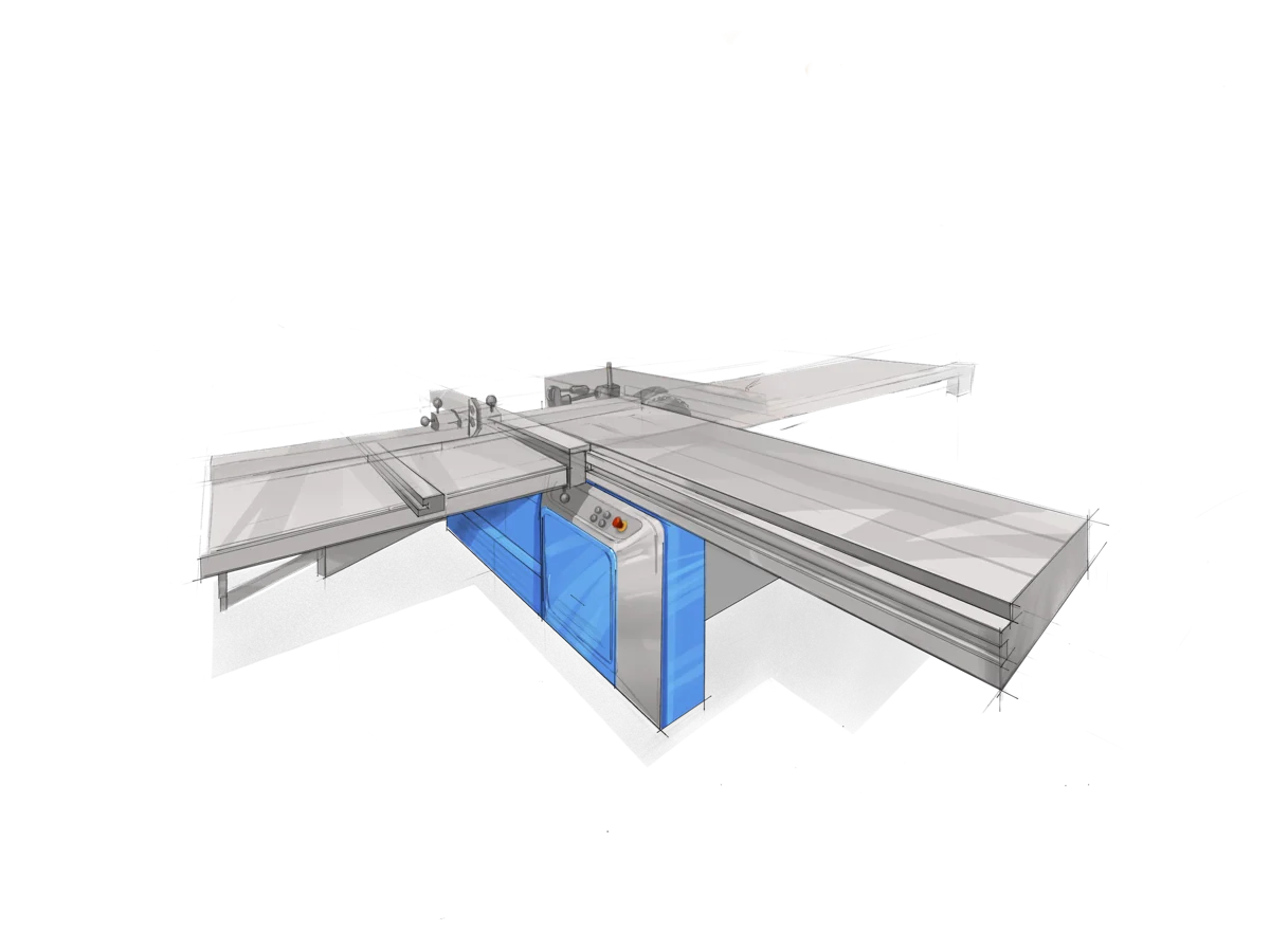
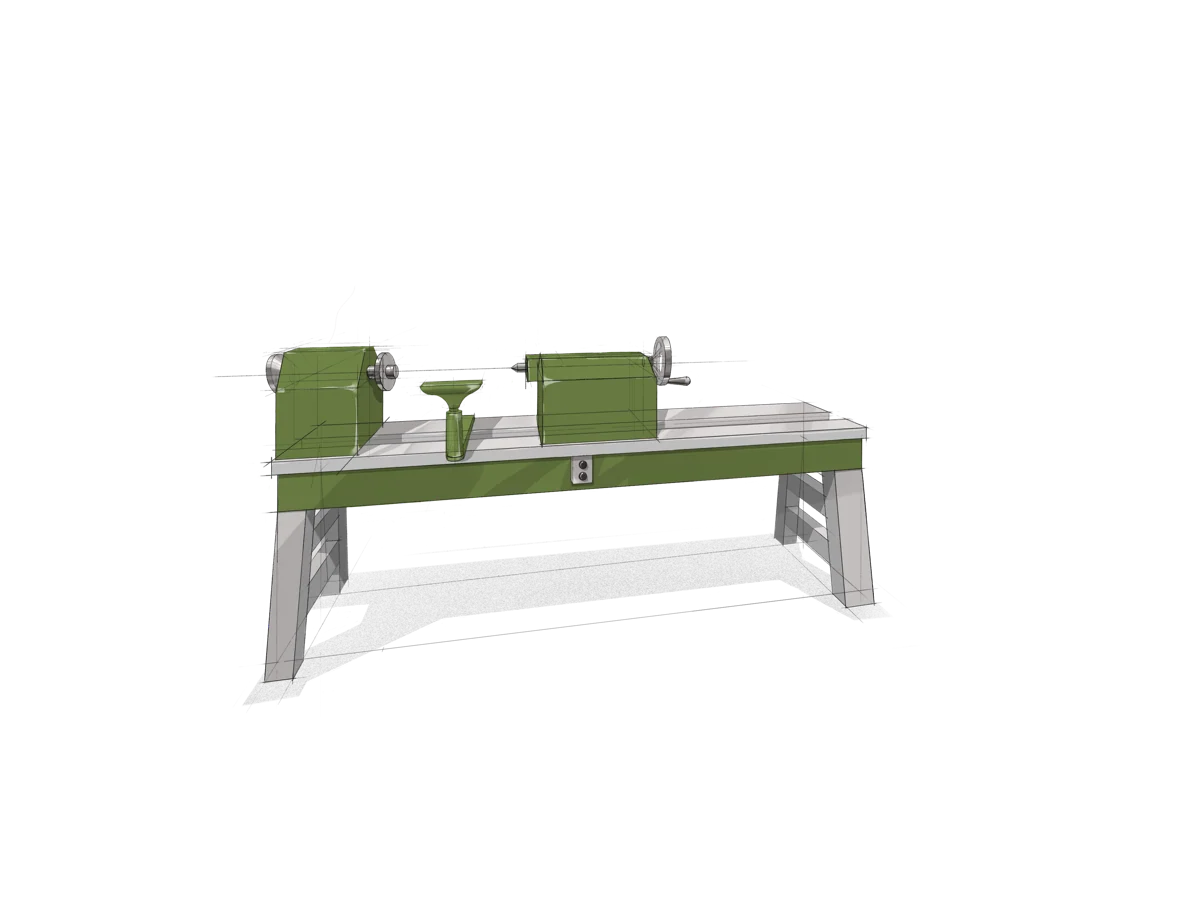
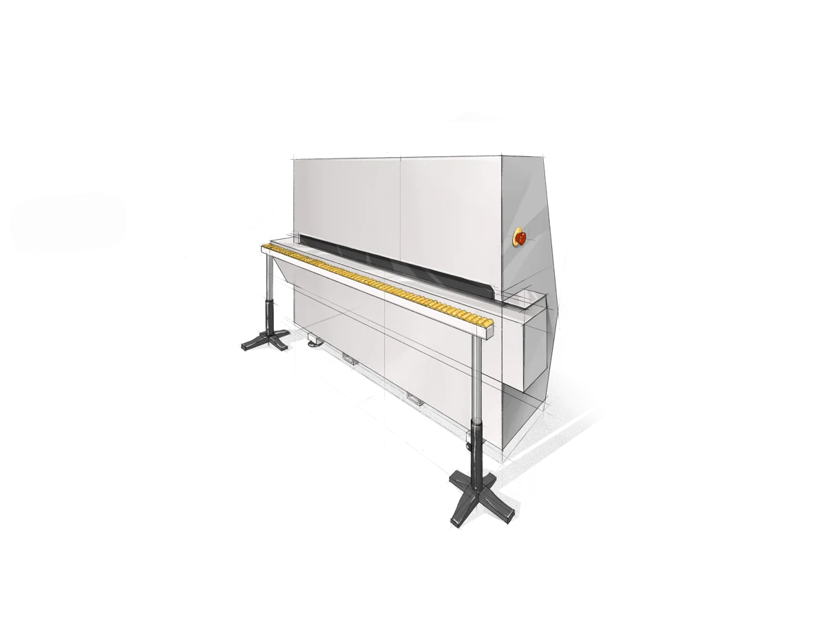
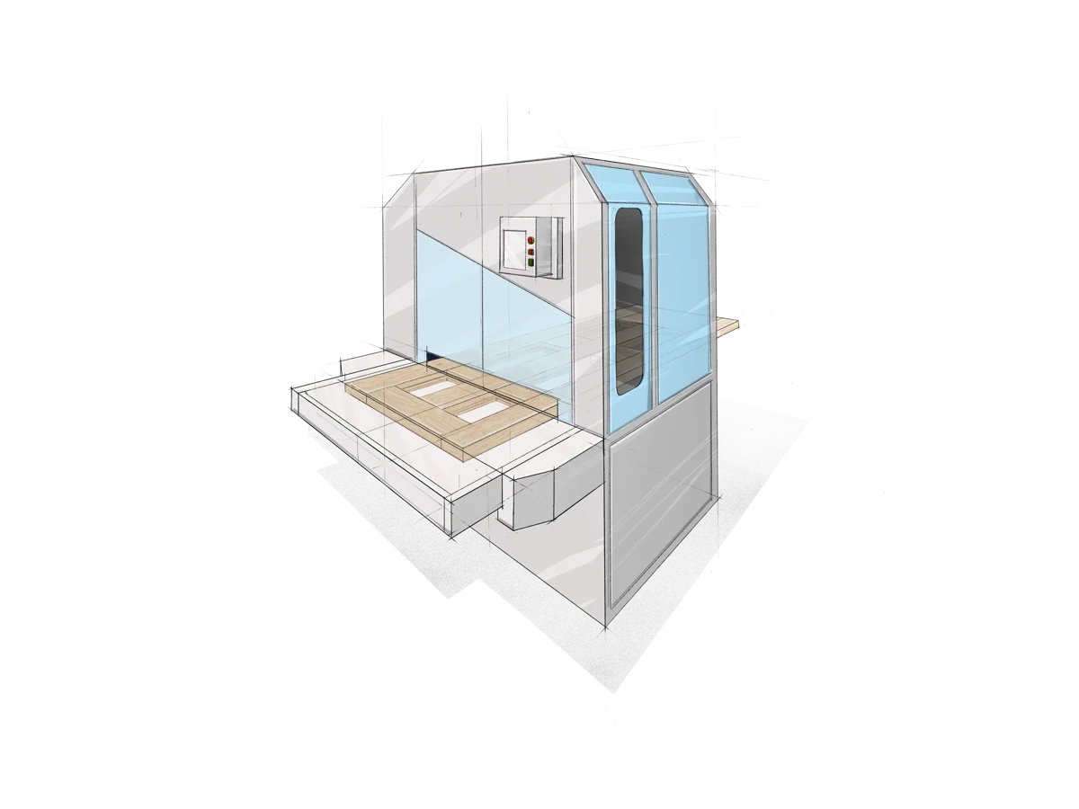
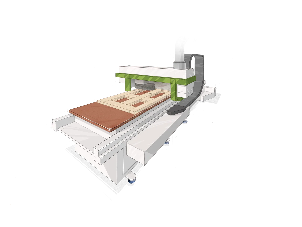
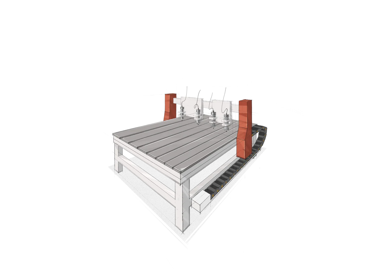
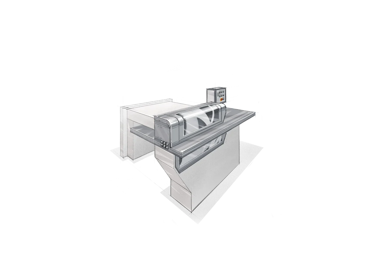
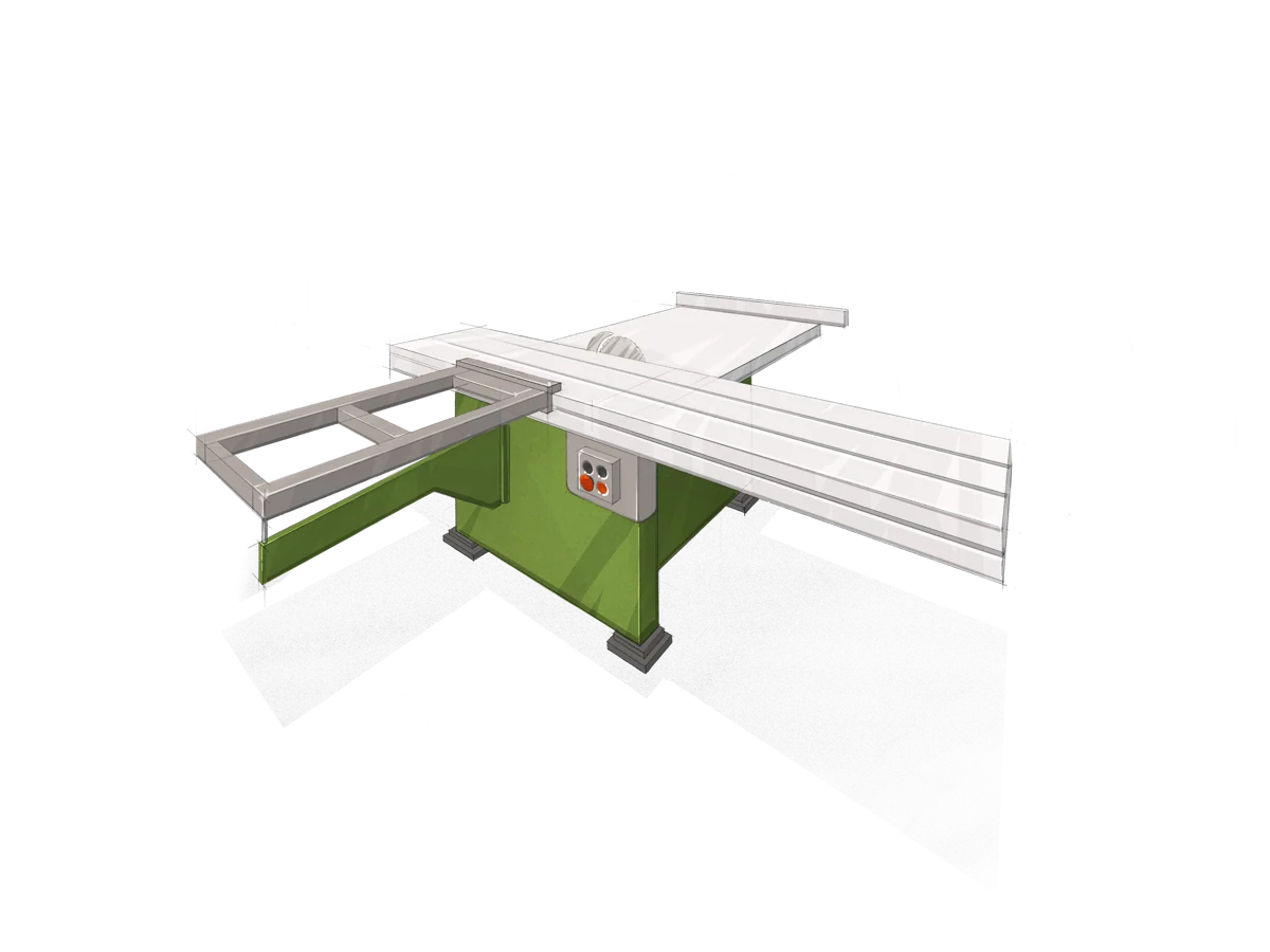
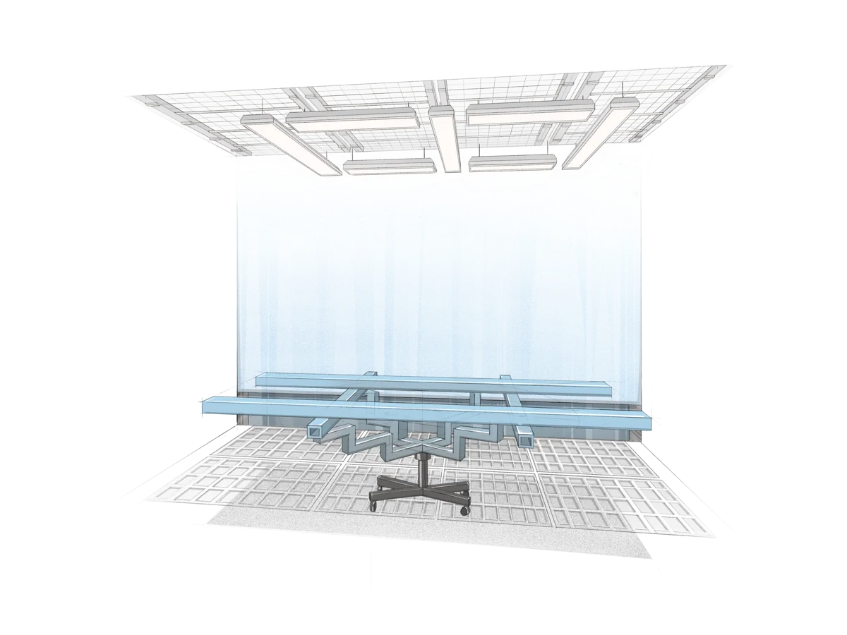
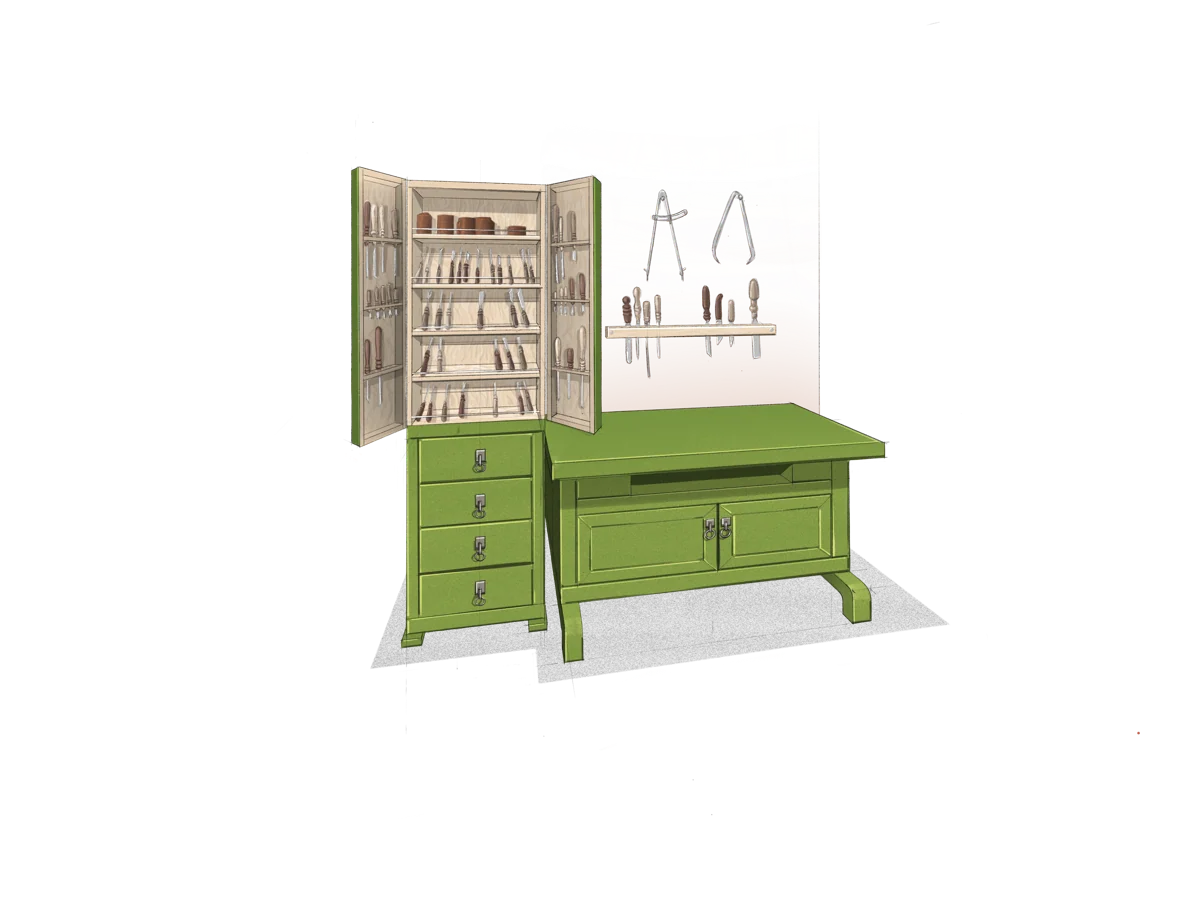
Thirteen illustrations form a clear journey
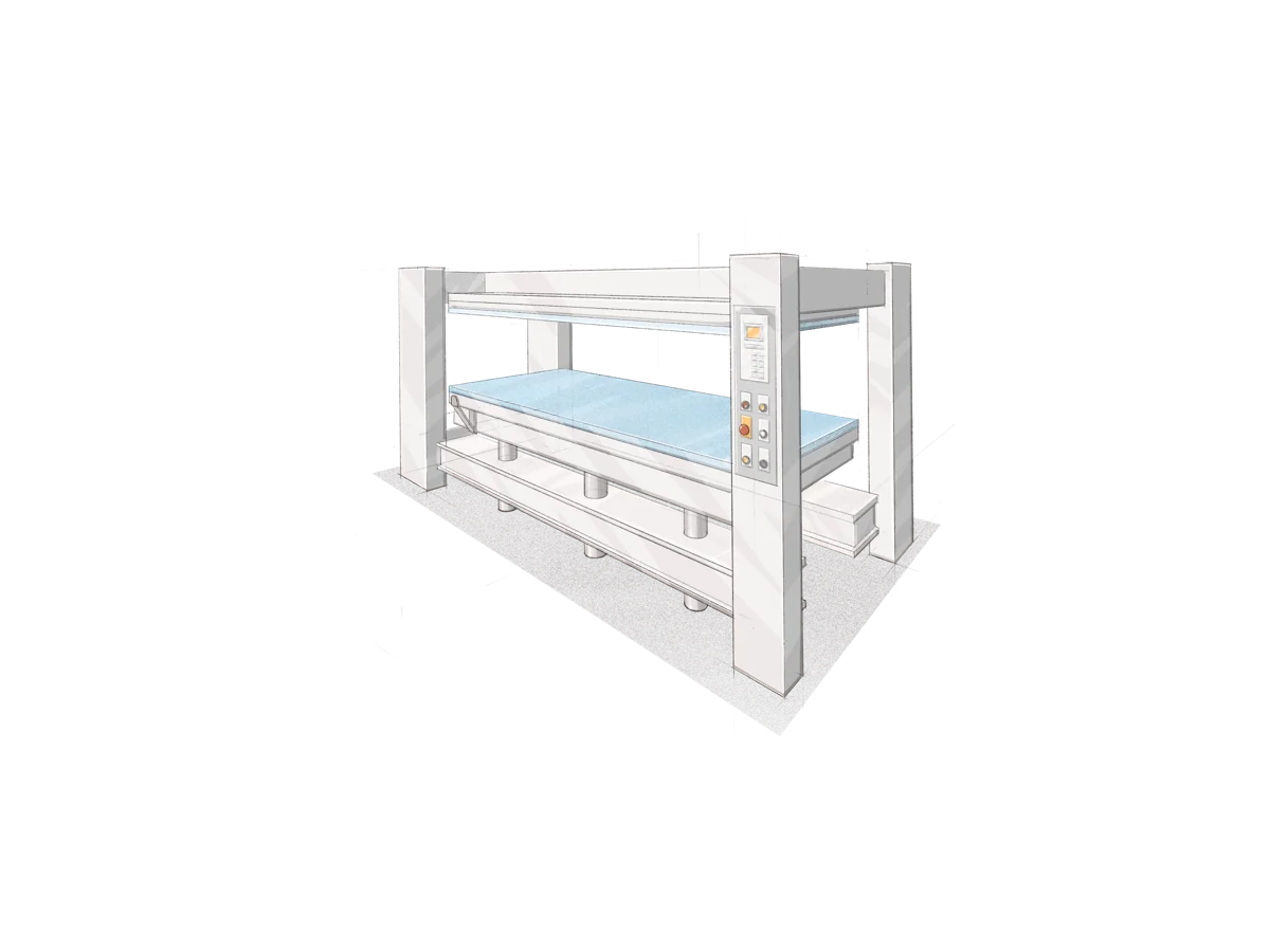
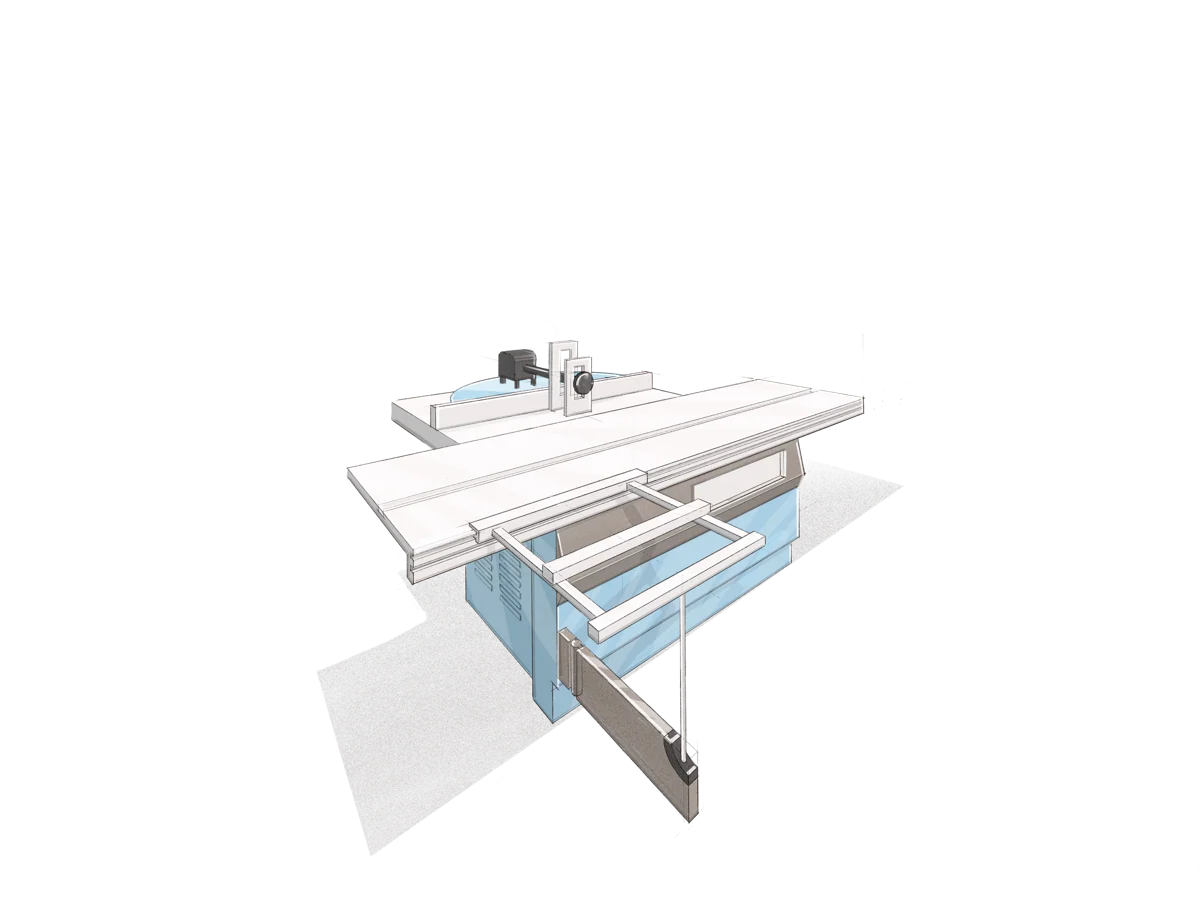
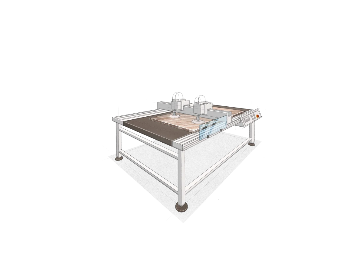
For the website, we illustrated STEK's actual machinery and equipment. The illustrations show the production principle: modern technology supports craftspeople rather than replacing handwork. Every object still begins with human experience and skill.
Website UX/UI
Production shown as a sequence of decisions
The website connects the company story, catalog, process diagram, and completed interior examples. Equipment illustrations show different operations as one process.
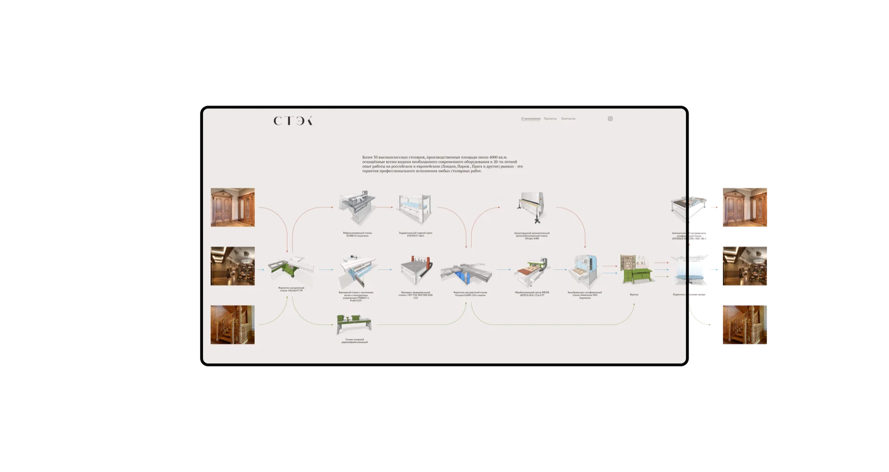
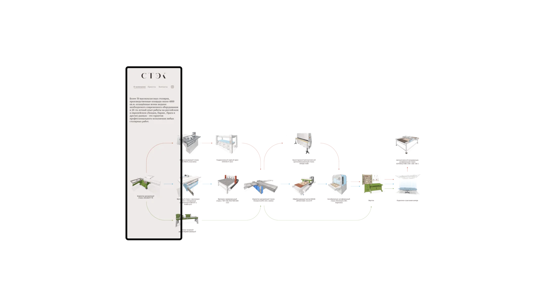
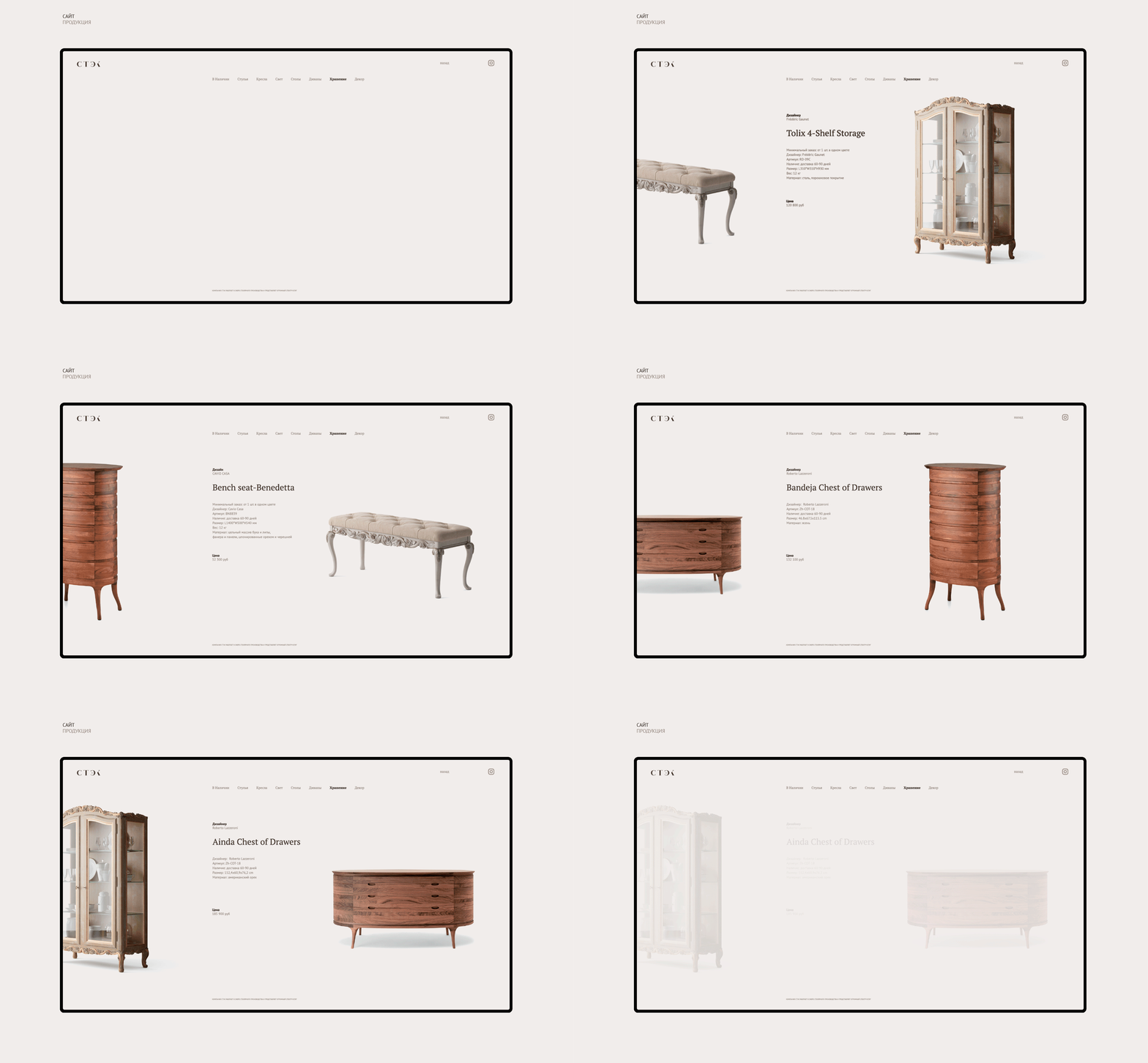
Catalog and production diagram in motion
Manufacturing photography
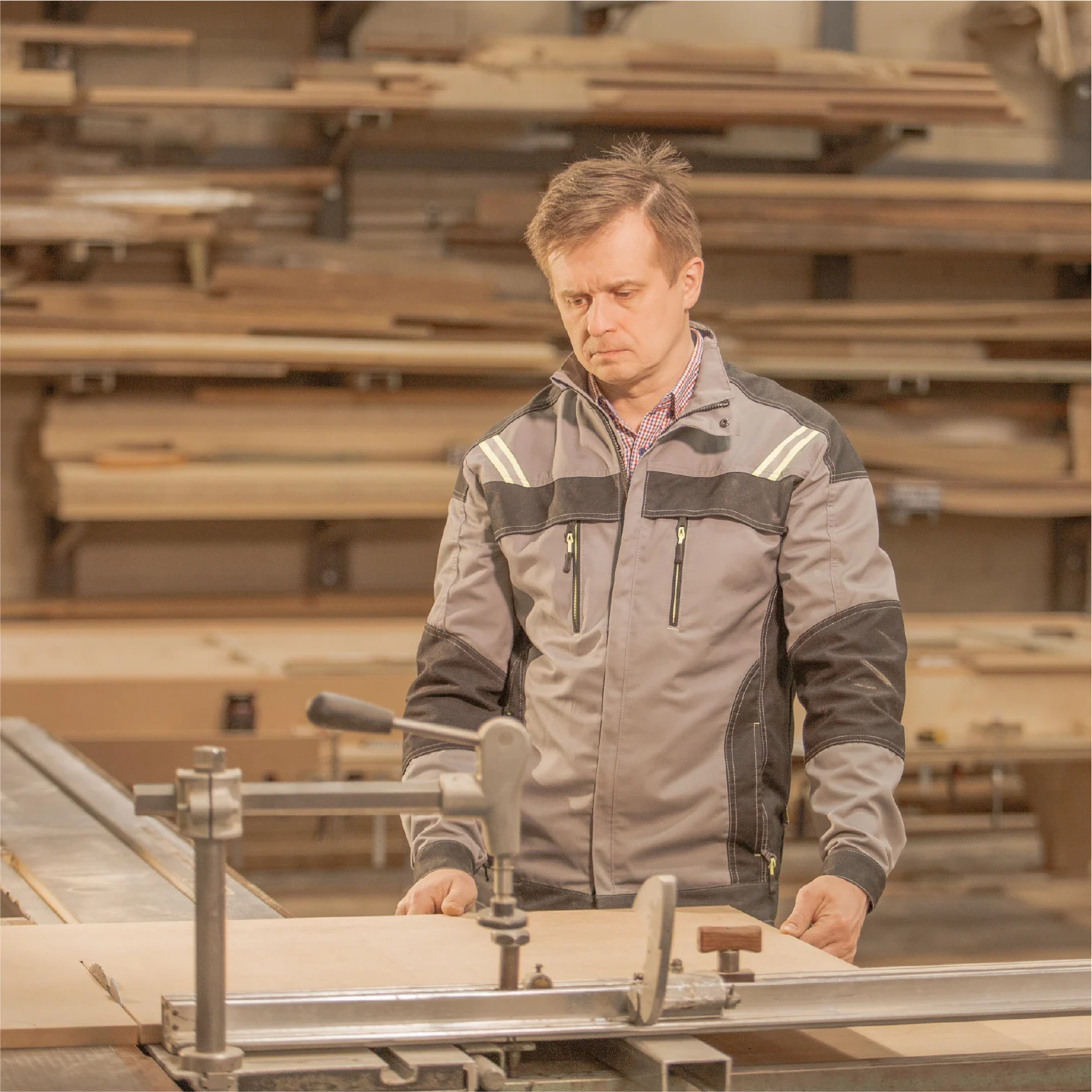
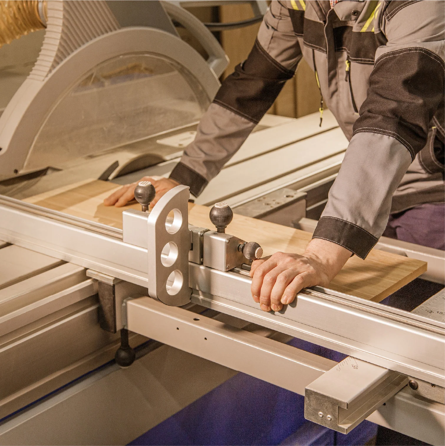
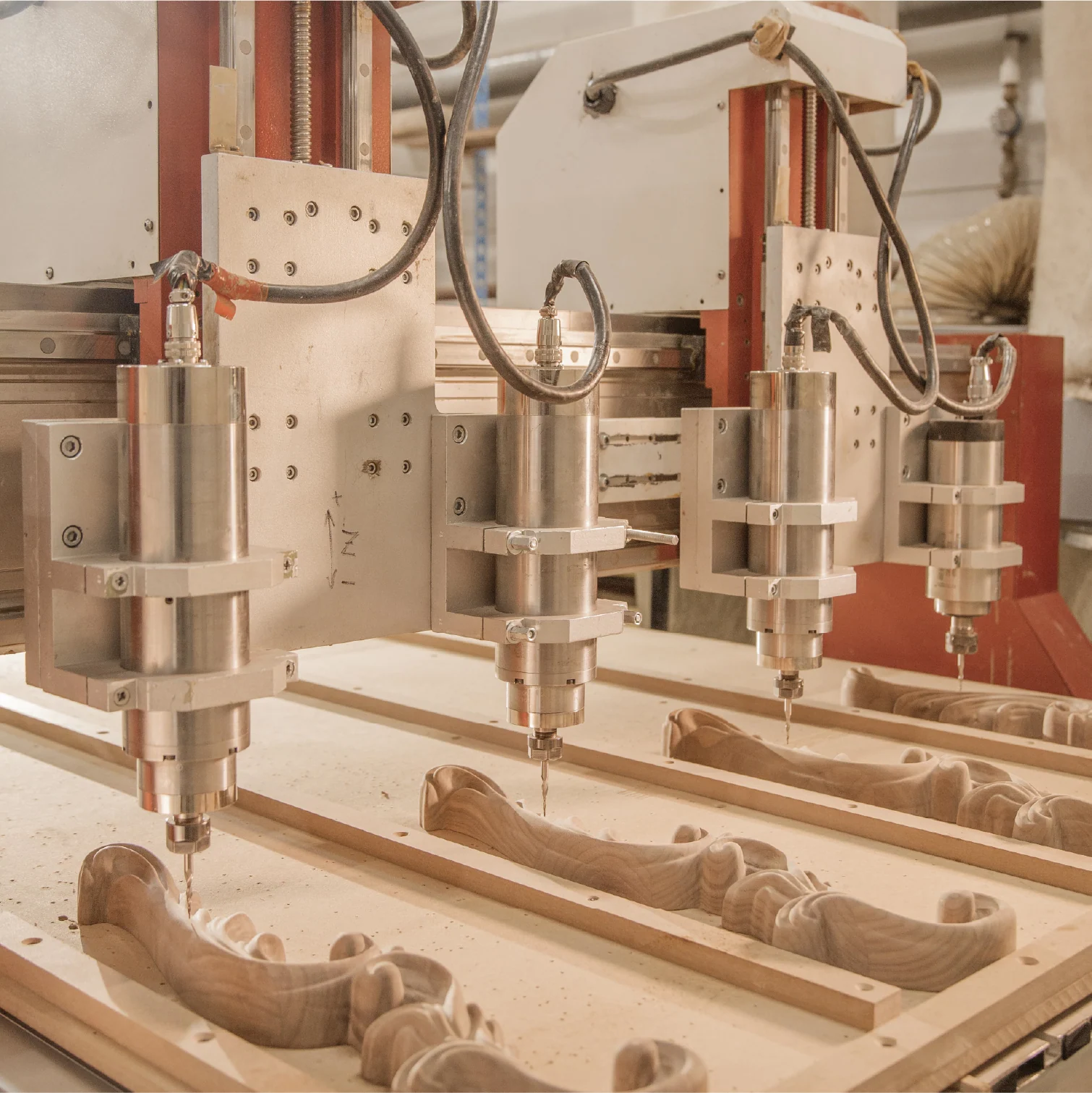
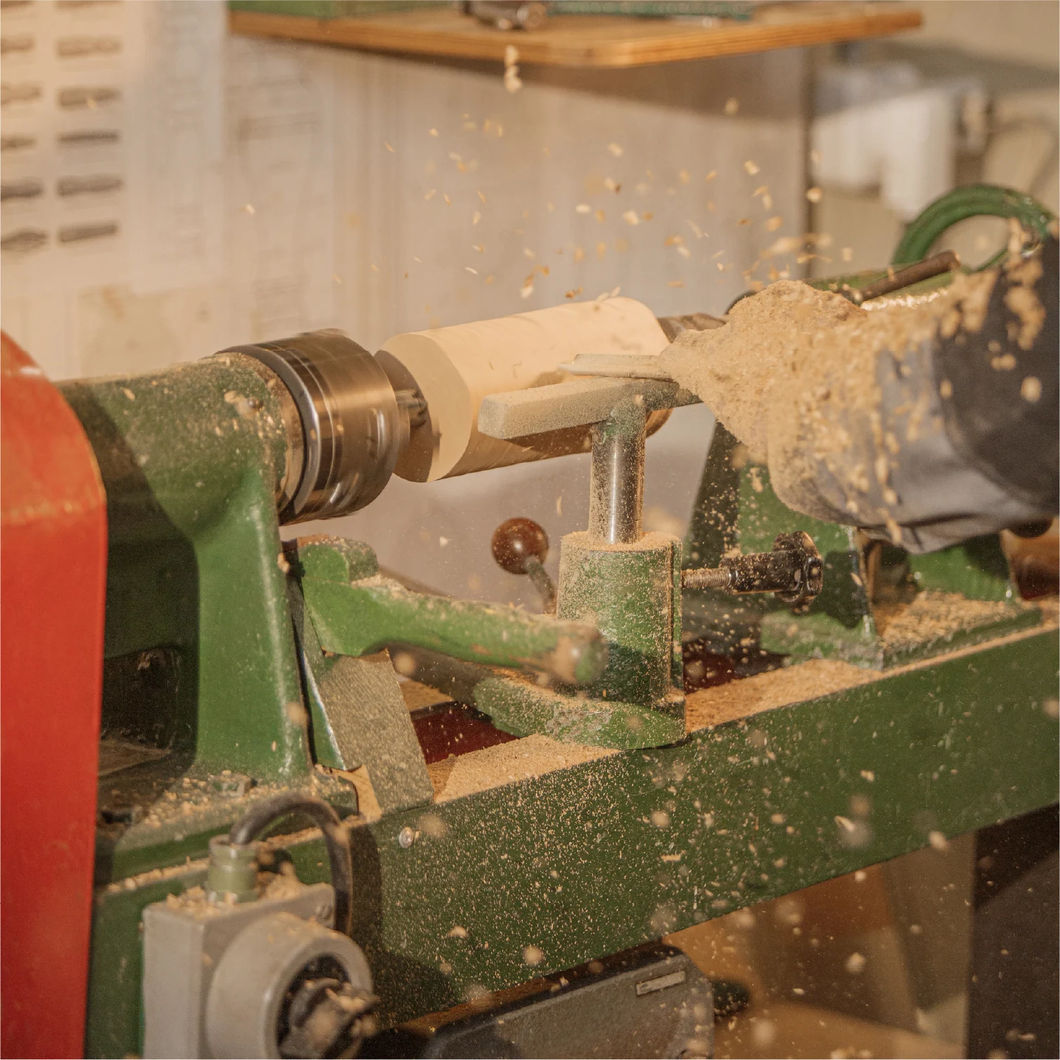
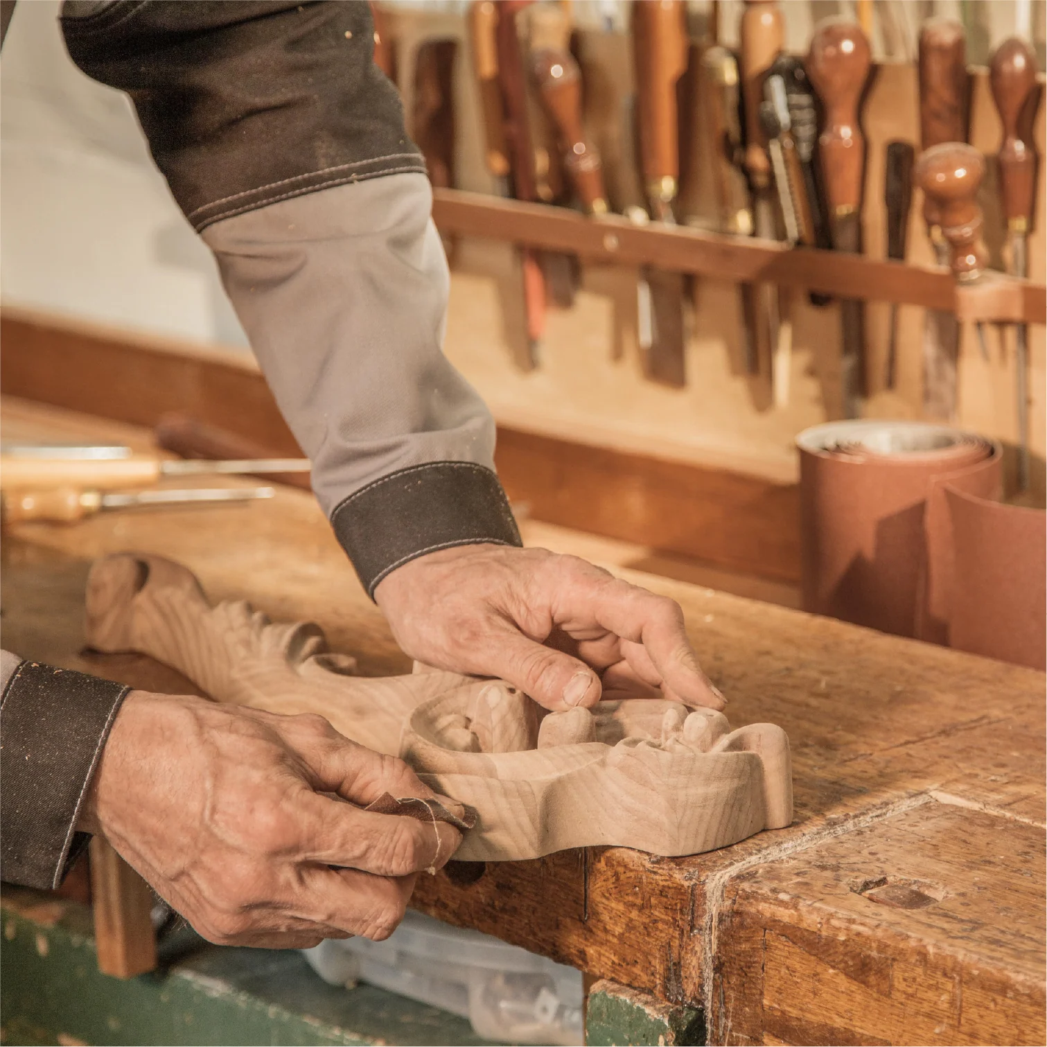
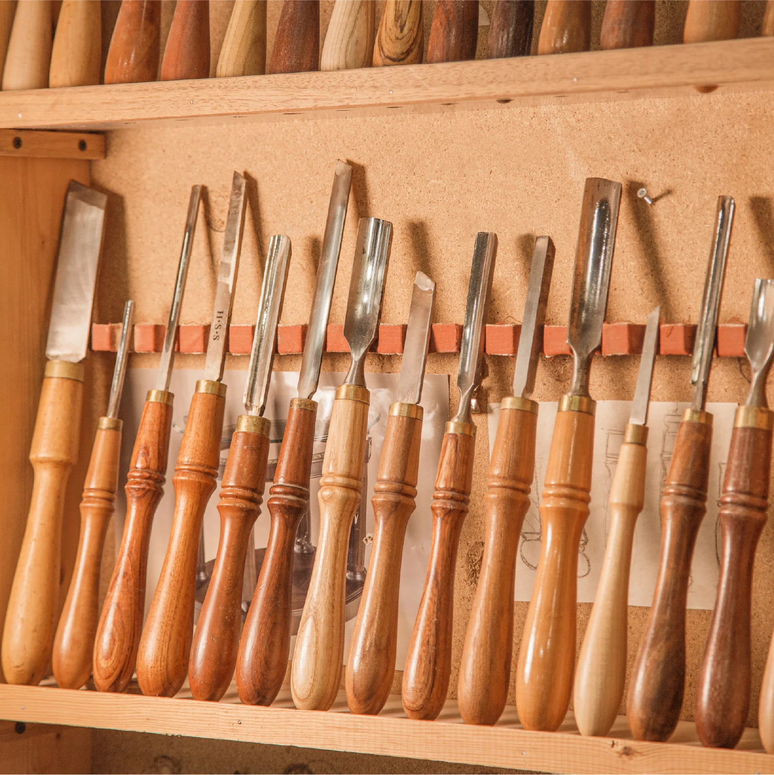
Precision visible in the hands, material, and process
Photography became a distinct part of the brand language. We showed a real sequence of work, from equipment setup and machining to finishing by hand.
01 / 06
Brand applications
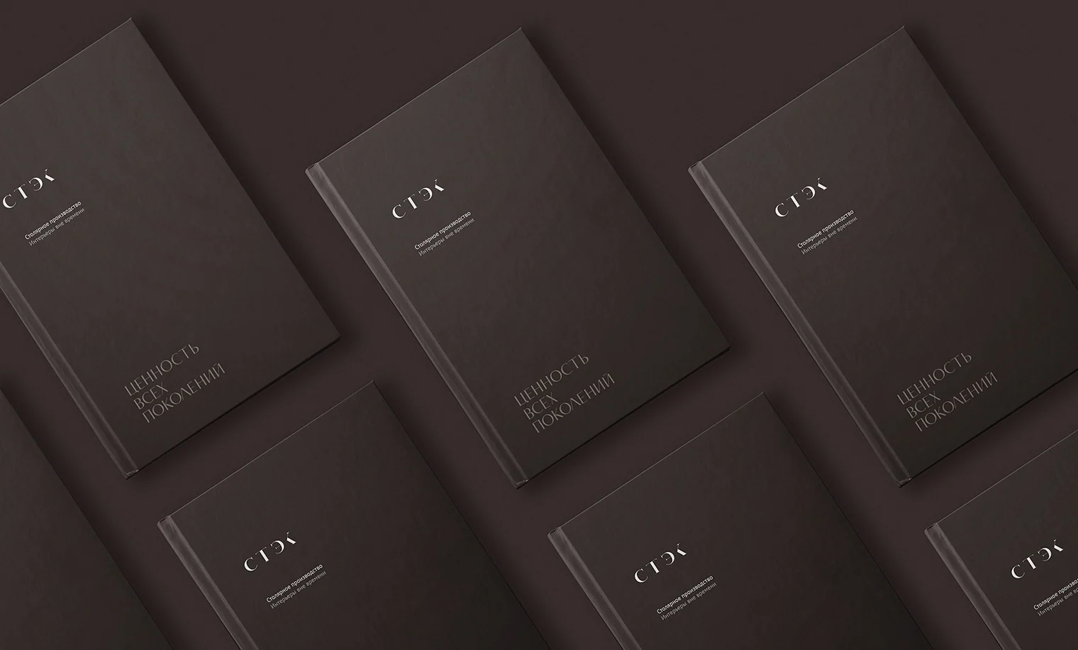
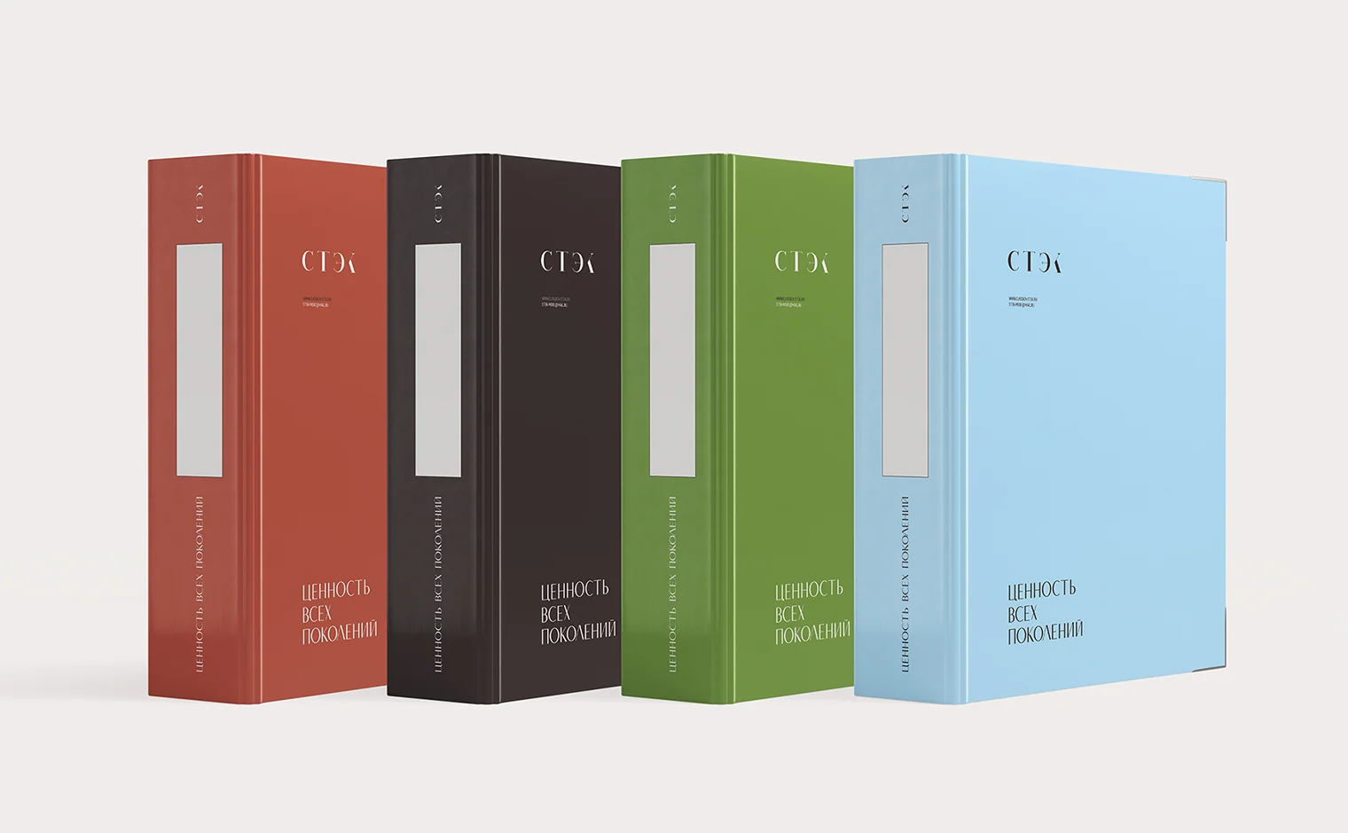
Brand book and color series of folders
The guidelines established the brand system's rules. A separate series of colored folders was designed for different types of materials.
Project outcome
One identity connected craft, production, and digital
We built a calm, lasting system where modern technology complements human experience. The mark, palette, illustrations, photographs, and website speak with one voice.
The project presents manufacturing through a clear work sequence, from equipment and materials to the finished result.
- Positioning and unifying idea
- Logo and brand system
- “Value across generations” tagline
- 13 equipment illustrations
- Website UX/UI and responsive layouts
- Manufacturing photography
- Guidelines and application system
Project scope
GORYANIN BROTHERS × STEK
Next manufacturing case study
A Space of Possibilities
Identity for a furniture studio that turns complex choices into clear solutions.
Explore the case study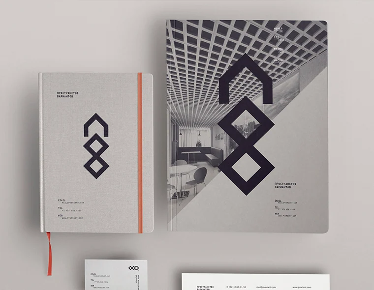 Furniture studio identity ↗
The first conversation
A manufacturing brand needs a system visible in its work
Tell us what you create and how your process works. We'll find the right idea, build a visual language, and connect it to real touchpoints.
Discuss your challengePhone+7 921 791-93-18
OfficeSt. Petersburg
Atlantic City, 126B Savushkina Street
Atlantic City, 126B Savushkina Street