


Six meaningful screens rather than a set of disconnected services.
Digital · international logistics · 2018
Global
Forwarding
We designed and built a single-page website that explains complex project logistics through color, technical graphics, and motion.
View case studyThe brief
Show the engineering complexity of shipping without an overloaded corporate website
SGF Global Forwarding handled international transport of heavy and oversized equipment for the oil and gas, wind energy, and mining industries.
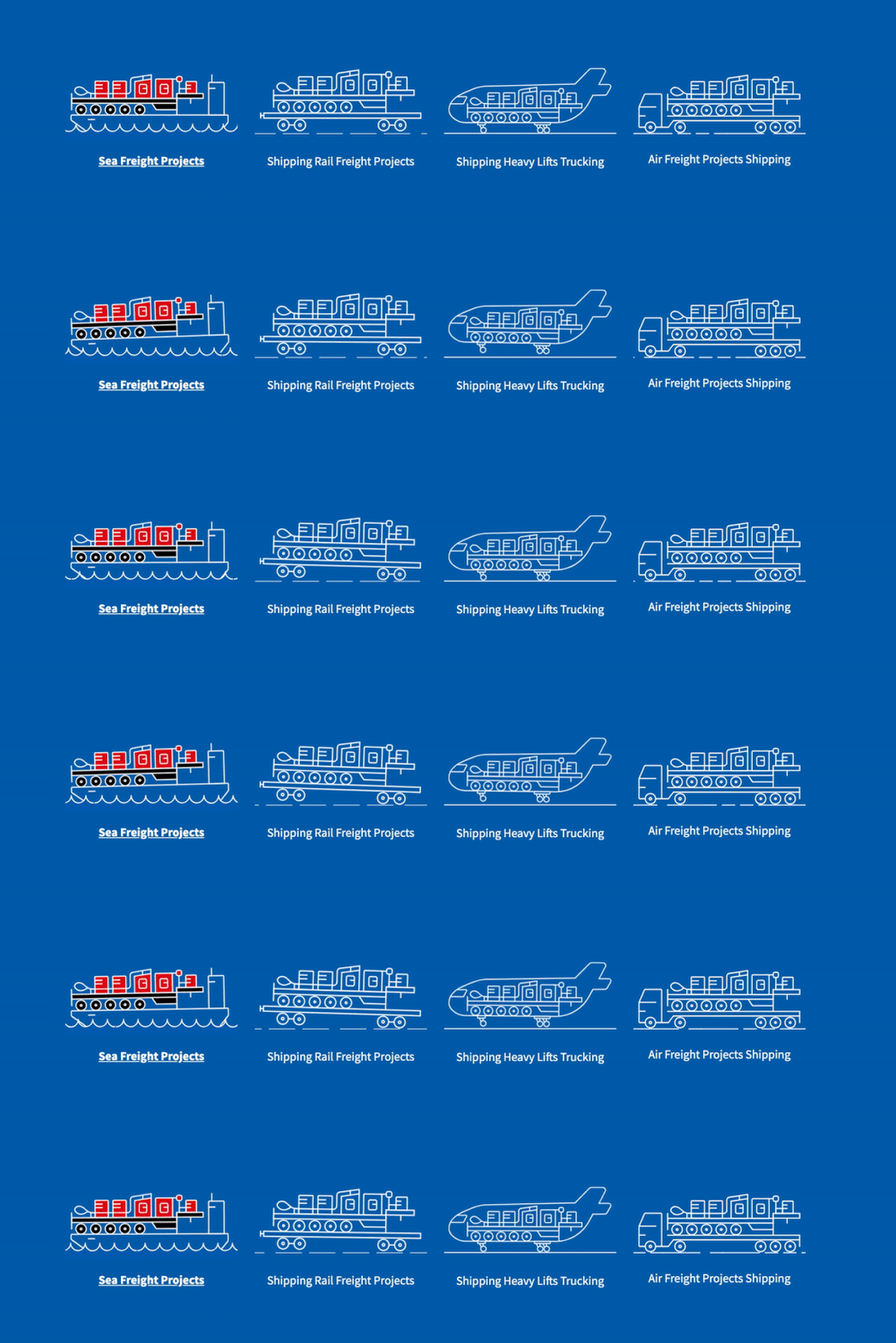
The task was not a simple business-card website, but a coherent one-page story: who leads the project, how a multimodal route is planned, where the risks lie, and what distinguishes sea, rail, heavy road transport, and air.
We developed the design concept and responsive interface, coded the page, and populated it with client content. The website's structure makes complex logistics understandable.
A high-contrast system for different industries and transport modes.
Sliders, hover states, and scroll-linked graphics.
A complete experience for desktop, tablet, and phone.
Interface system
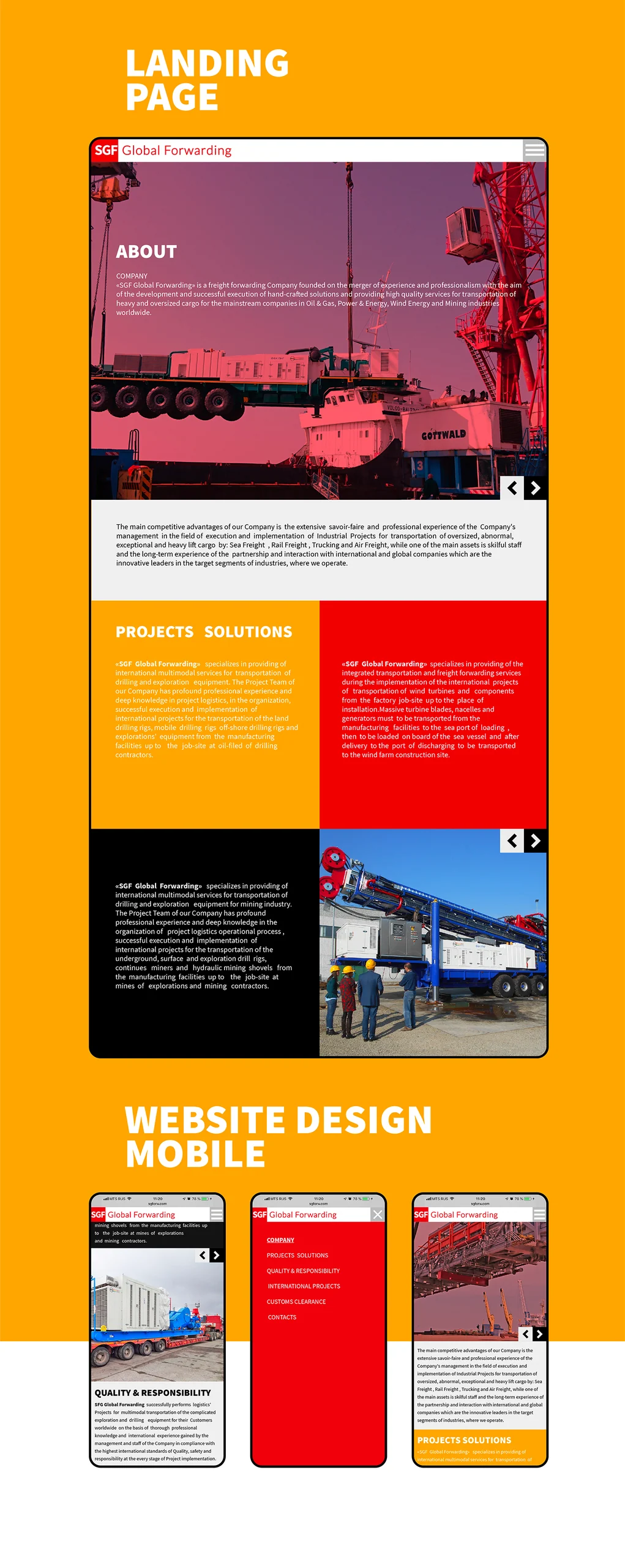
Color separates the scenarios. The grid organizes complex content.
Source Sans Pro, a disciplined modular grid, and three signal colors define the website's language. Red tells the company's story, orange distinguishes industry solutions, and blue unifies international transportation.
Source Sans ProAa
Typography does not compete with technical photographs and diagrams. Large headings guide the reading journey; compact text explains operational details.
ABCDEFGHIJKLMNOPQRSTUVWXYZ
abcdefghijklmnopqrstuvwxyz
0123456789 / & →
abcdefghijklmnopqrstuvwxyz
0123456789 / & →
Working reconstruction
The website itself is the case study's main exhibit
We reconstructed the final SGF version from desktop, tablet, and mobile designs, original SVGs, photographs, and a recording of the working page.
Scroll the website inside the window, switch the sliders, and explore four transport modes. The interface adapts to the window size.
Motion as explanation
The equipment moves as sequentially as cargo along a route
Animation serves a purpose: it distinguishes transportation methods, supports transitions between sections, and makes the technical process readable.
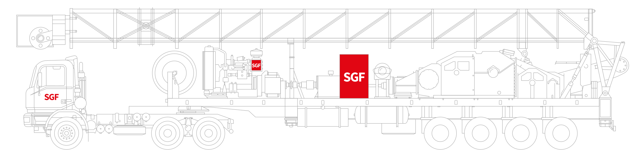 Scrolling controls the path of a large illustration
Responsive system
One sequence, three interface scales
On tablets and phones, the site does not become a miniature desktop copy. Modules rearrange, color blocks retain their order, and fixed navigation becomes a full-screen menu.
Project outcome
The corporate website works like a map of a complex project
SGF gained a responsive page where structure, color, and motion guide visitors from the company's specialization to specific transport services, quality control, and customs clearance.
The case study shows how digital can explain a B2B service through a clear sequence of actions and real project materials rather than abstract promises.
- Single-page website design concept
- Information architecture
- Desktop, tablet, and mobile UX/UI
- Technical SVG illustrations
- Sliders and scroll-based motion
- Front-end development and content population
- Launch preparation
Project scope
GORYANIN BROTHERS × SGF
Related case study
VSK BUILDING
Website and brand system for a company that designs and delivers technically complex spaces.
Explore the case study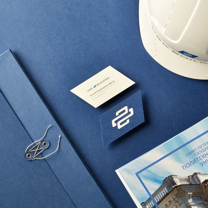 B2B digital ↗
The first conversation
Complex B2B products can be explained clearly
Tell us what the client needs to understand and what action they should take. We will build the journey from structure and copy to interface and launch.
Discuss your challengePhone+7 921 791-93-18
OfficeSt. Petersburg
Atlantic City, 126B Savushkina Street
Atlantic City, 126B Savushkina Street